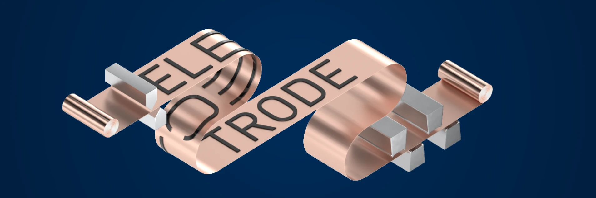
Dürr Dark Mode
Dürr's corporate design is bright and friendly. The restrained base colors and the dynamic accent colors come to life in the large white surroundings. To set accents that ultimately also emphasize the white, a high-contrast dark mode with particularly dark gray and blue tones can be selected in a few places.
Table of contents
Elements of the Dark Mode
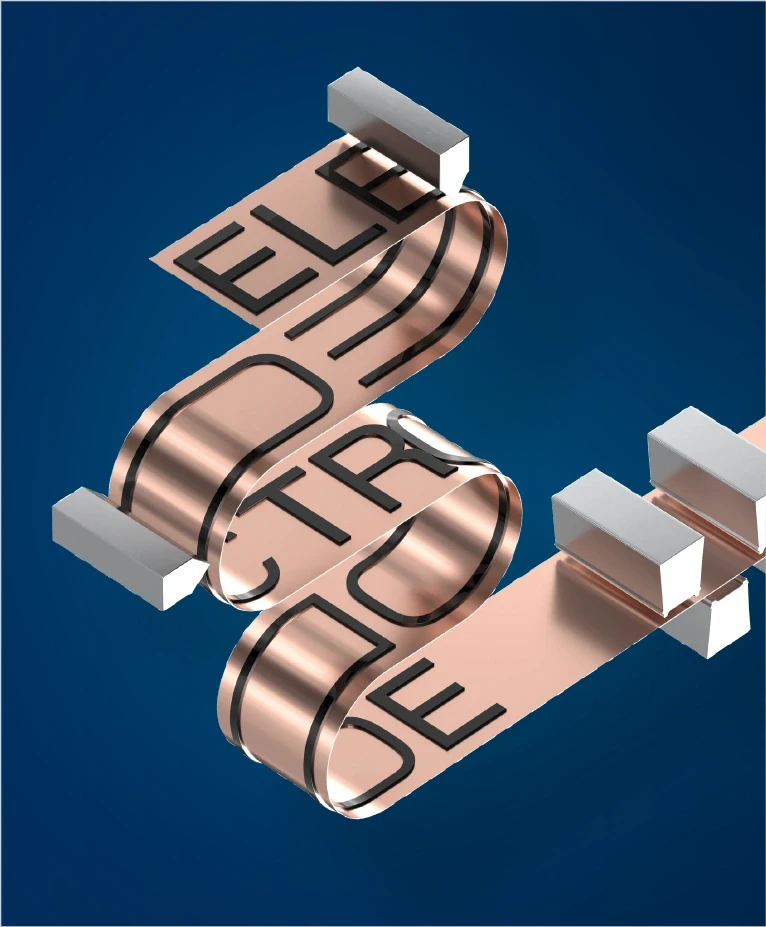
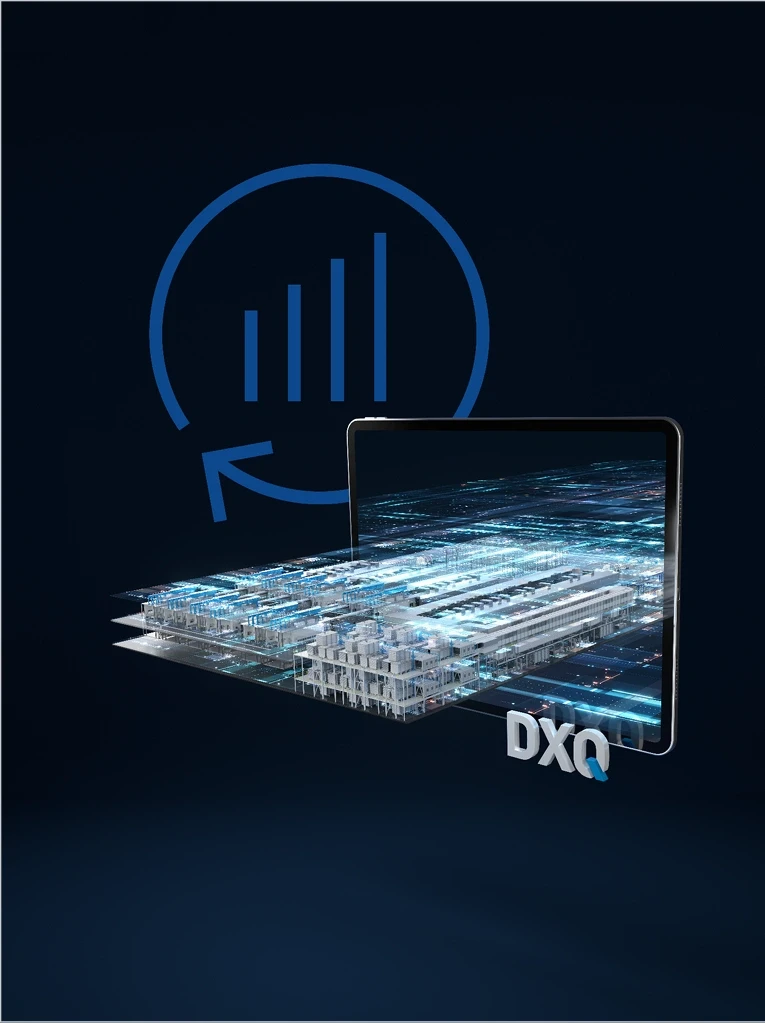
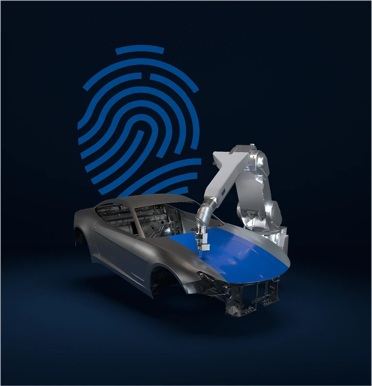
In principle, the same design elements are used that make up Dürr's corporate design. However, a dark background has an impact on other design elements. Slight contrasts, where otherwise strong color differences are present, not only ensure the use of a white logo. The color of the big type and running text must also be adjusted accordingly. Here, it is recommended to use white or light gray. Since the accent colors also work on dark backgrounds, reframe and quick link remain in digital light blue or innovation green.

Do.

Do.

Do.

Don't.

Don't.

Don't.
Colors
The focus is on two shades each of gray and blue, which provide sufficient contrast to black and the reference colors Basic Blue and Dark Gray. The two shades of New Blue and New Gray are almost always used as a gradient. In exceptional cases, the gradient can also be extended to include black or the dark colors, Basic Blue and Dark Gray, for an even stronger contrast. A mixture with light colors (Digital Light Blue or Light Gray) would be too colorful and is not desired.

New Blue 1
C | M | Y | K: 100 | 75 | 25 | 65
R | G | B: 0 | 32 | 65

New Blue 2
C | M | Y | K: 100 | 75 | 15 | 50
R | G | B: 0 | 44 | 90

Basic Blue
C | M | Y | K: 100 | 70 | 0 | 15
R | G | B: 0 | 70 | 142

New Gray 1
C | M | Y | K: 100 | 80 | 50 | 65
R | G | B: 0 | 23 | 45

New Gray 2
C | M | Y | K: 95 | 75 | 40 | 45
R | G | B: 20 | 45 | 70

Dark Gray
C | M | Y | K: 45 | 25 | 15 | 60
R | G | B: 82 | 95 | 107

Digital Light Blue
C | M | Y | K: 100 | 0 | 0 | 0
R | G | B: 0 | 159 | 227

Innovation Green
C | M | Y | K: - | - | - | -
R | G | B: 68 | 214 | 44

Light Gray
C | M | Y | K: 7 | 3 | 5 | 8
R | G | B: 227 | 230 | 229
Usage
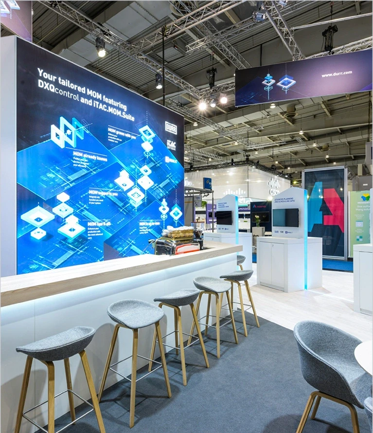
To ensure that the corporate design continues to be perceived as bright and friendly in the future, dark mode should only be used to a limited extent as a highlight. Not every medium is equally suited to it. The use of dark mode is therefore reserved for key visuals and their applications, films, exhibition walls and presentations. While dark mode can be used consistently in films and individual key visuals, in other media only about 25% to 33% should be colored in order to maintain the bright overall impression.
