Brochures
Brochures have not lost any of their value with the arrival of the digital age – quite the opposite. This compact print medium is a valuable form of advertisement in sales and at trade fairs, but also as a digital download. Product brochures have a very clear focus. They give a concise summary of the customer benefits and Dürr’s expertise.
Table of contents
Application
Structure
The standard format of the closed brochure is 210 x 280 mm. All of Dürr’s product brochures follow the same structure, but can vary according to topic and scope. To begin with, the focus is on the customer’s needs, which are met with specific product solutions from Dürr throughout the brochure.
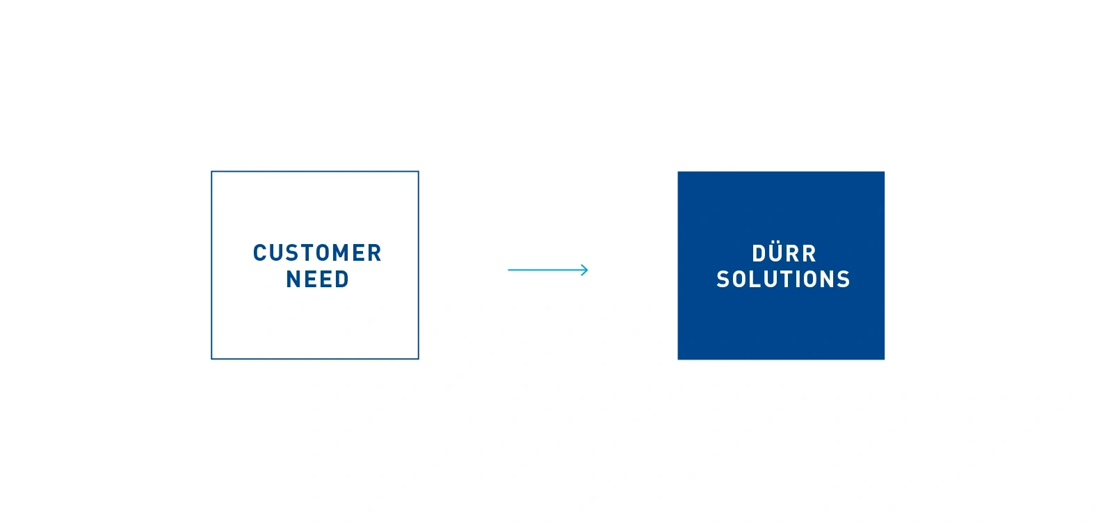
Structure – from customer needs to specific solutions from Dürr.
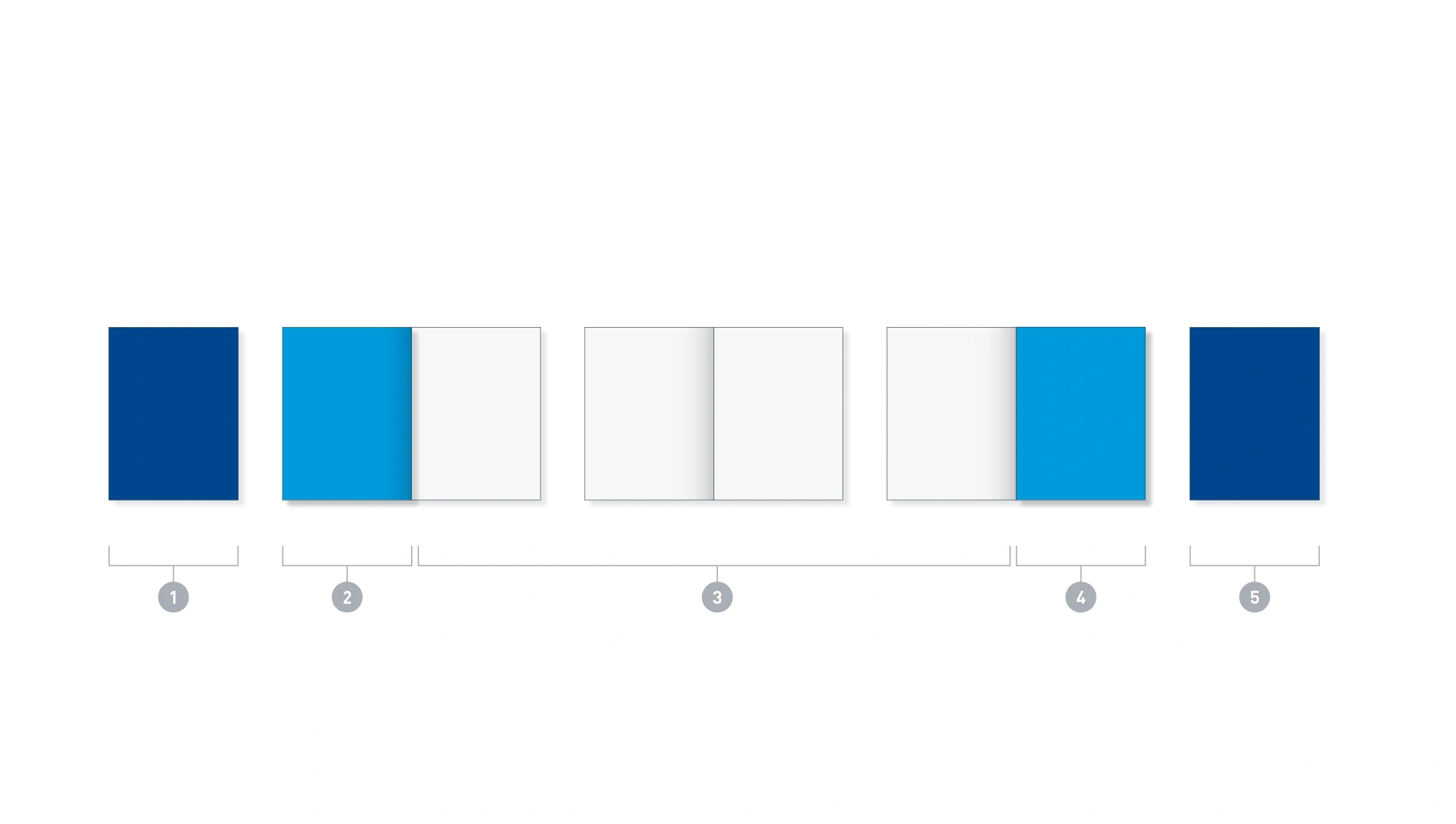
Basic version structure – an eight-page brochure given as an example. The cover (1) and back page (5) form the brochure’s eye-catching outer pages. Fixed opening and closing pages (2 and 4) then provide the introductory and concluding information.
- Front
- Opening page/s: here 1 page
- Pages for content: variable content
- Closing page/s: here 1 page
- Back page
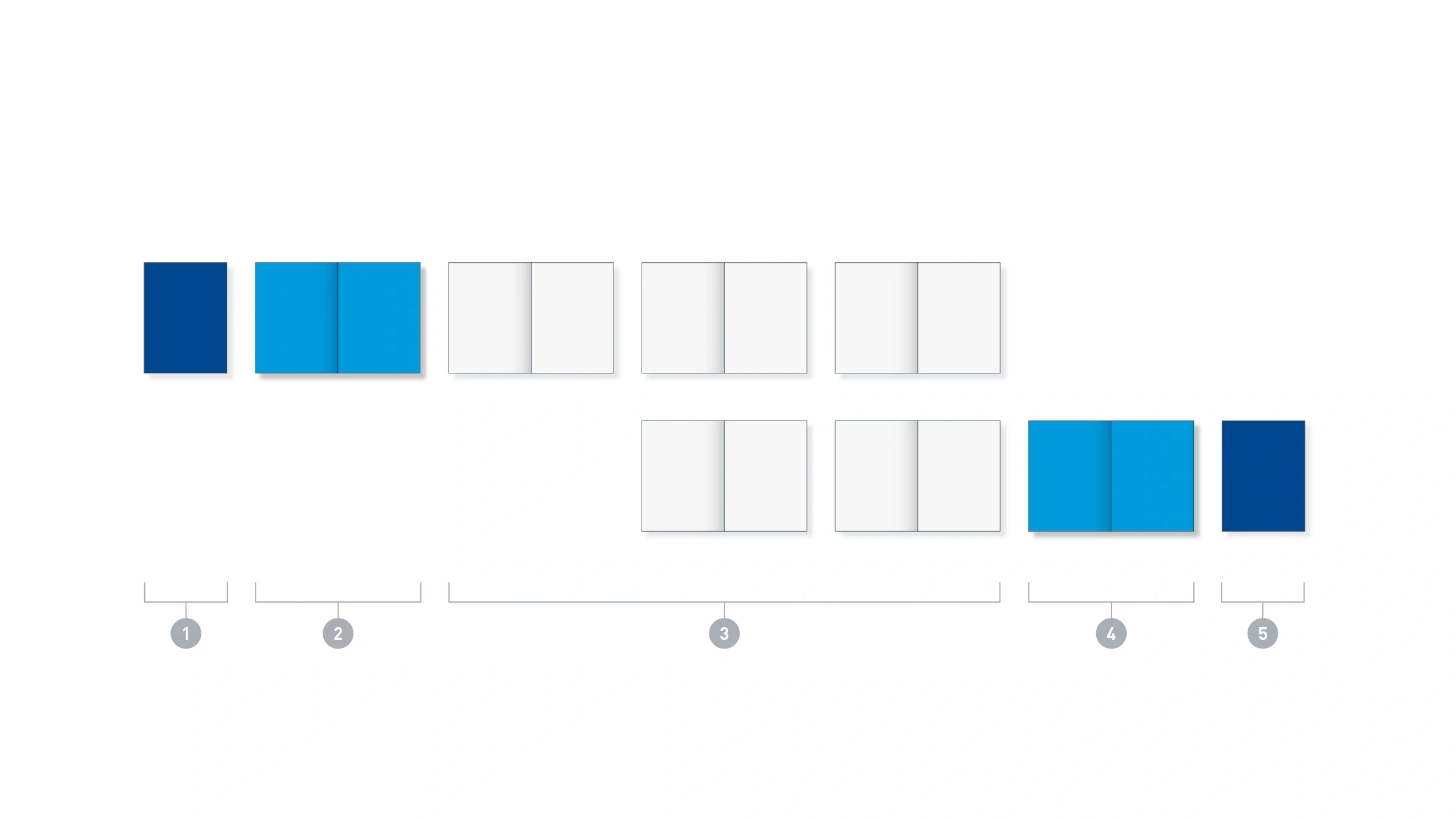
Long version structure – a 16-page brochure given as an example
- Front
- Opening page/s: here 2 page
- Pages for content: variable content
- Closing page/s: here 2 page
- Back page
Page types
Fixed page types and design elements are familiar to readers and make Dürr brochures more instantly recognizable.
Outer pages
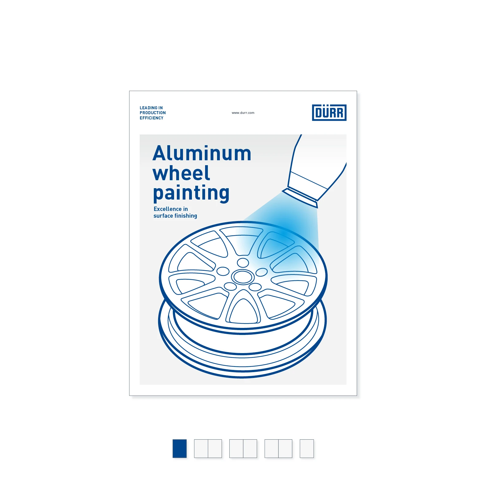
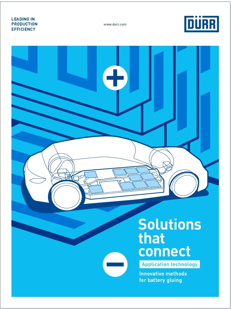
Cover – the cover displays the brochure’s core topics through words and images and encourages the customer to read on. It should be easily readable and accessible. The image can be an illustration or a photograph.
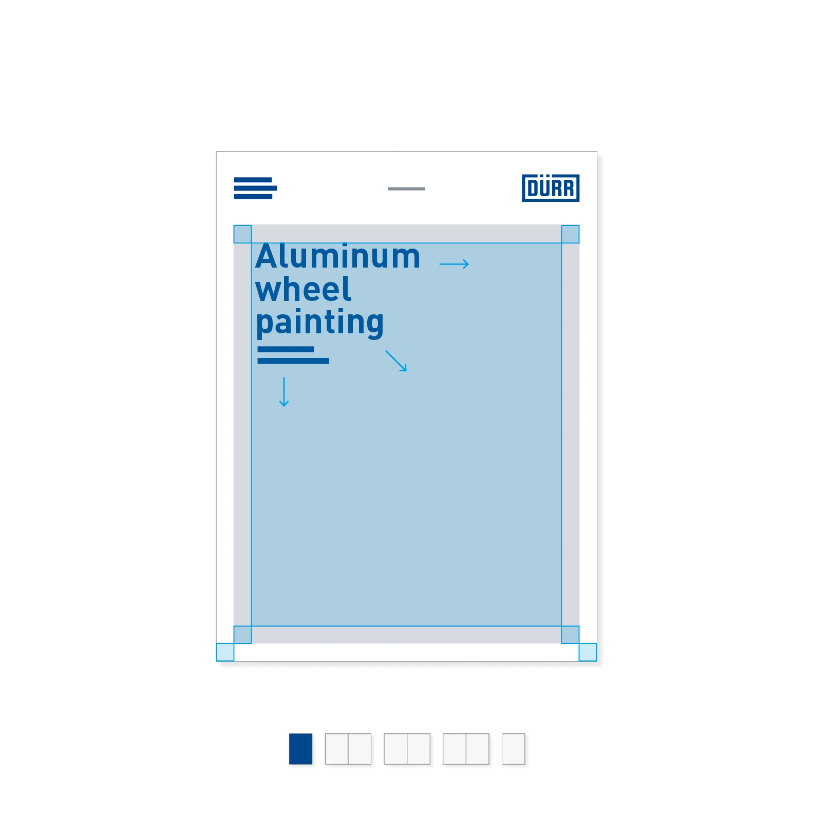
Cover typography – the headline and subheading can be placed anywhere within a defined area, background image permitting.
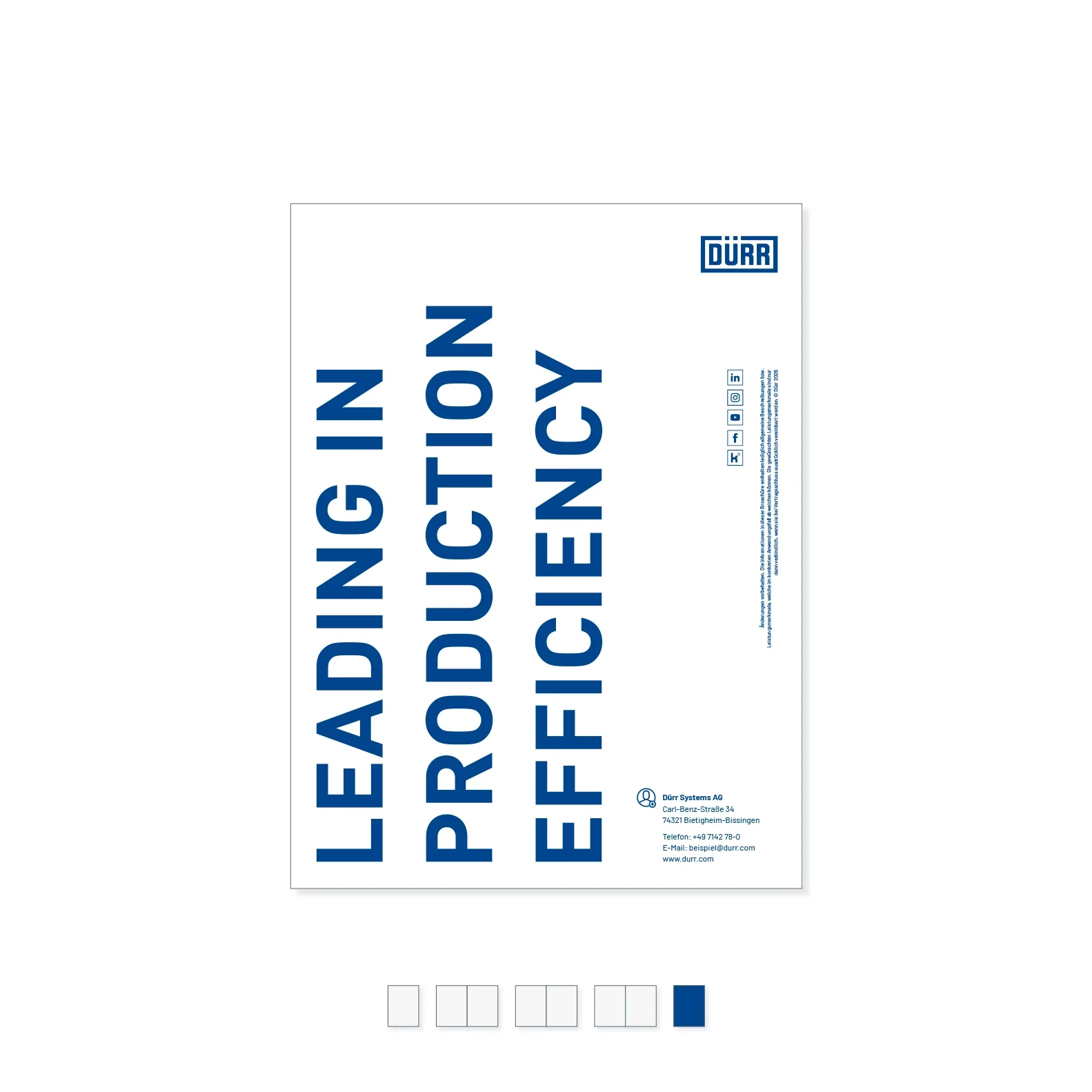
Back page – the back page is identical across all brochures. A change to the content is possible only in exceptional circumstances.
Transitional pages
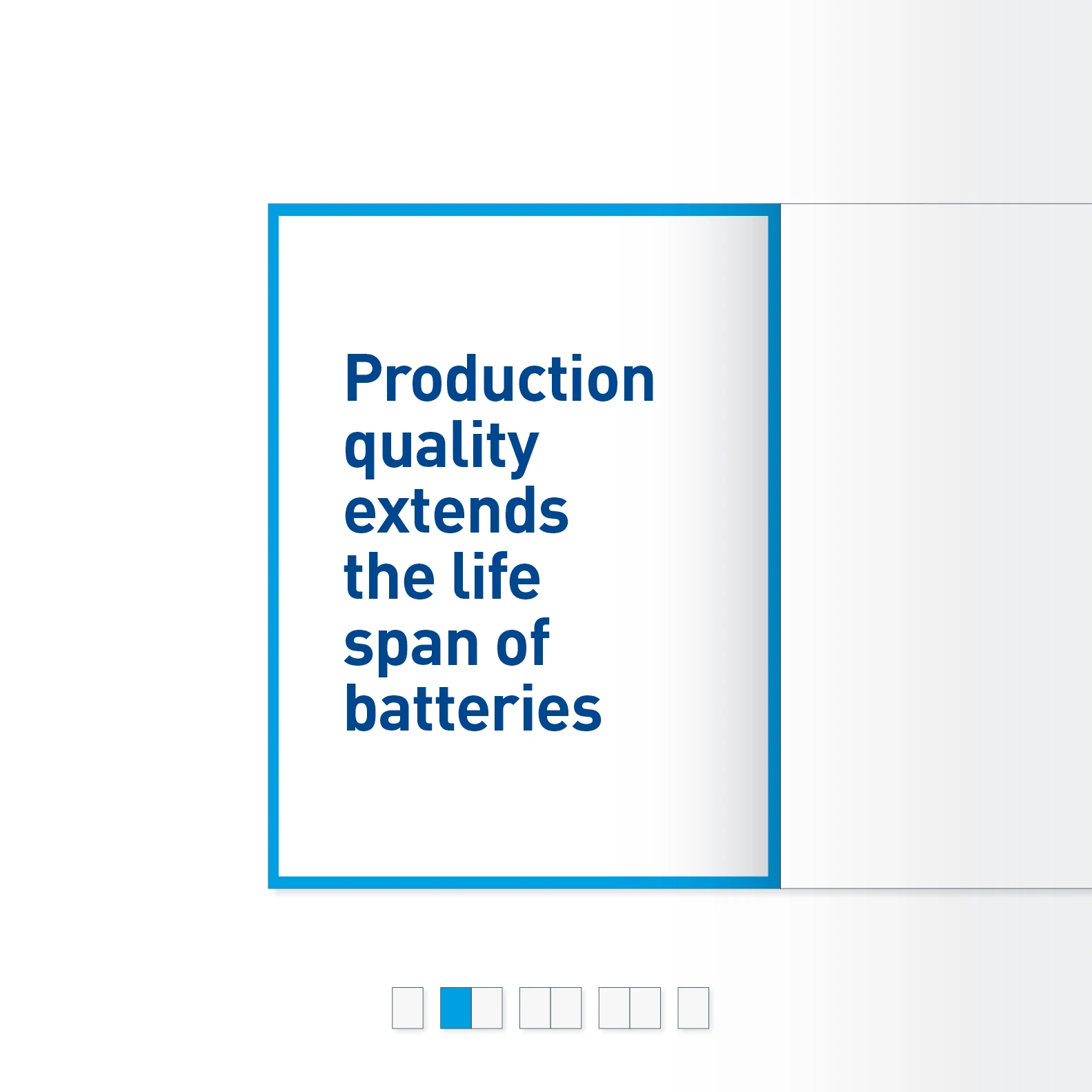
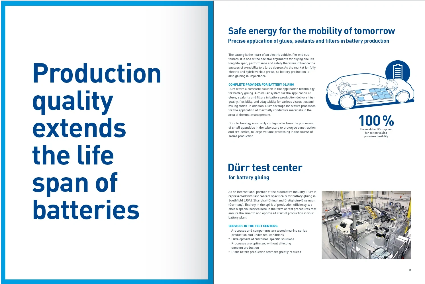
Statement on U2 – a brochure beginning with a strong statement that stands out in large font. The bleed-edge re-frame helps to highlight the statement.
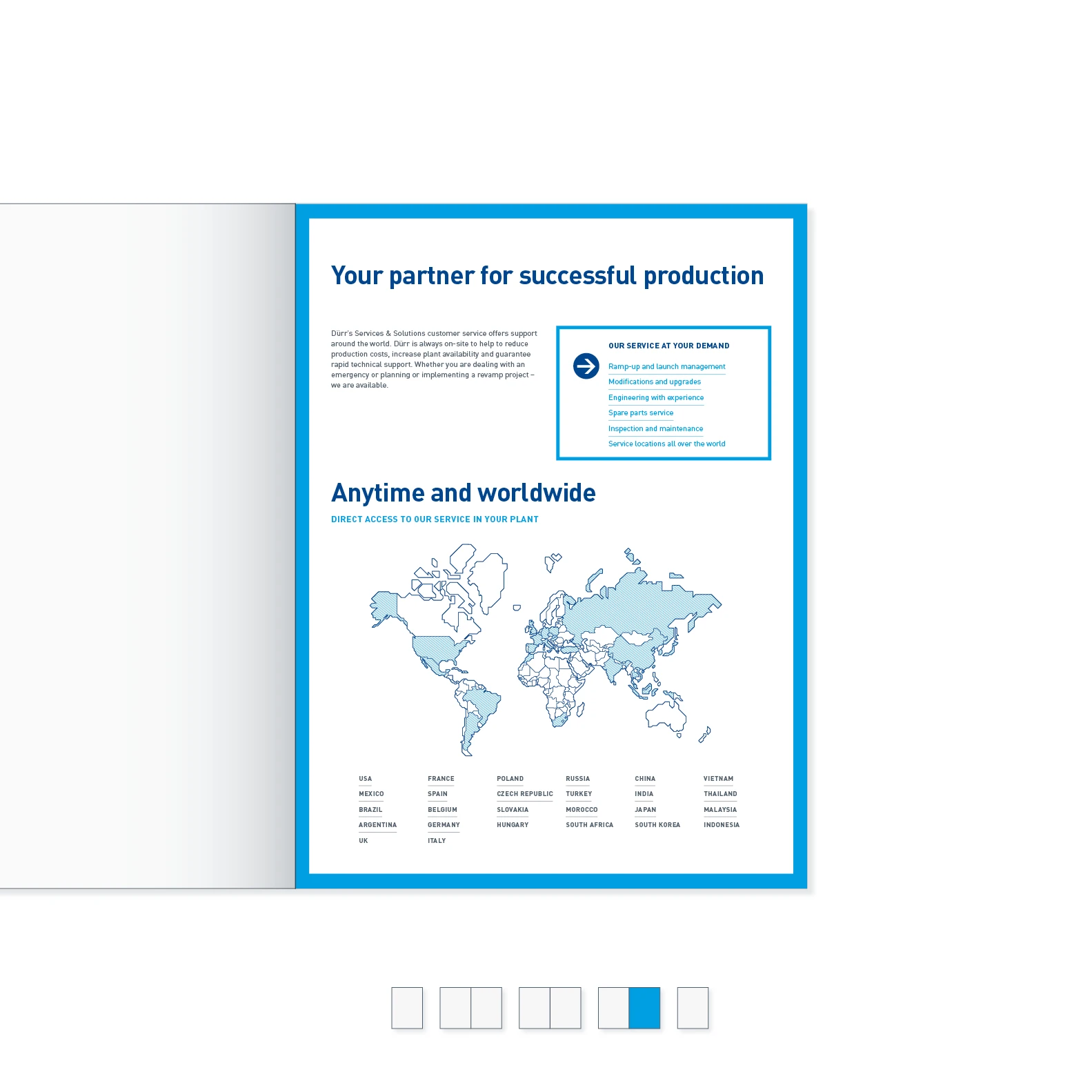
Closing page on U3 – services and contact details are standard content for the closing page. The bleed-edge re-frame helps to highlight and pinpoint the information.
Inside pages
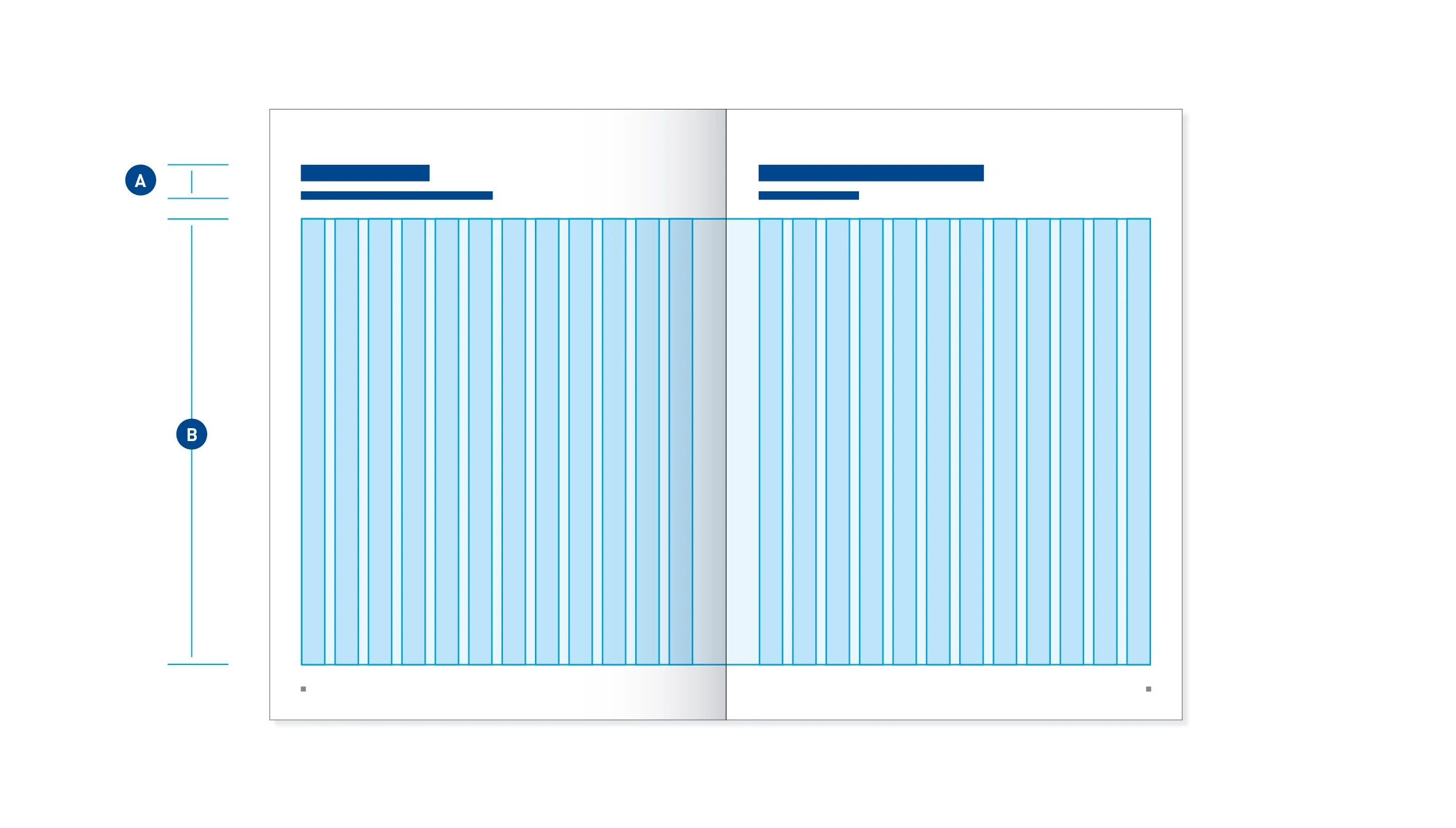
Print space – the space for the headline (A) is fixed. The 12-column grid in print space (B) allows for great flexibility in placing objects.
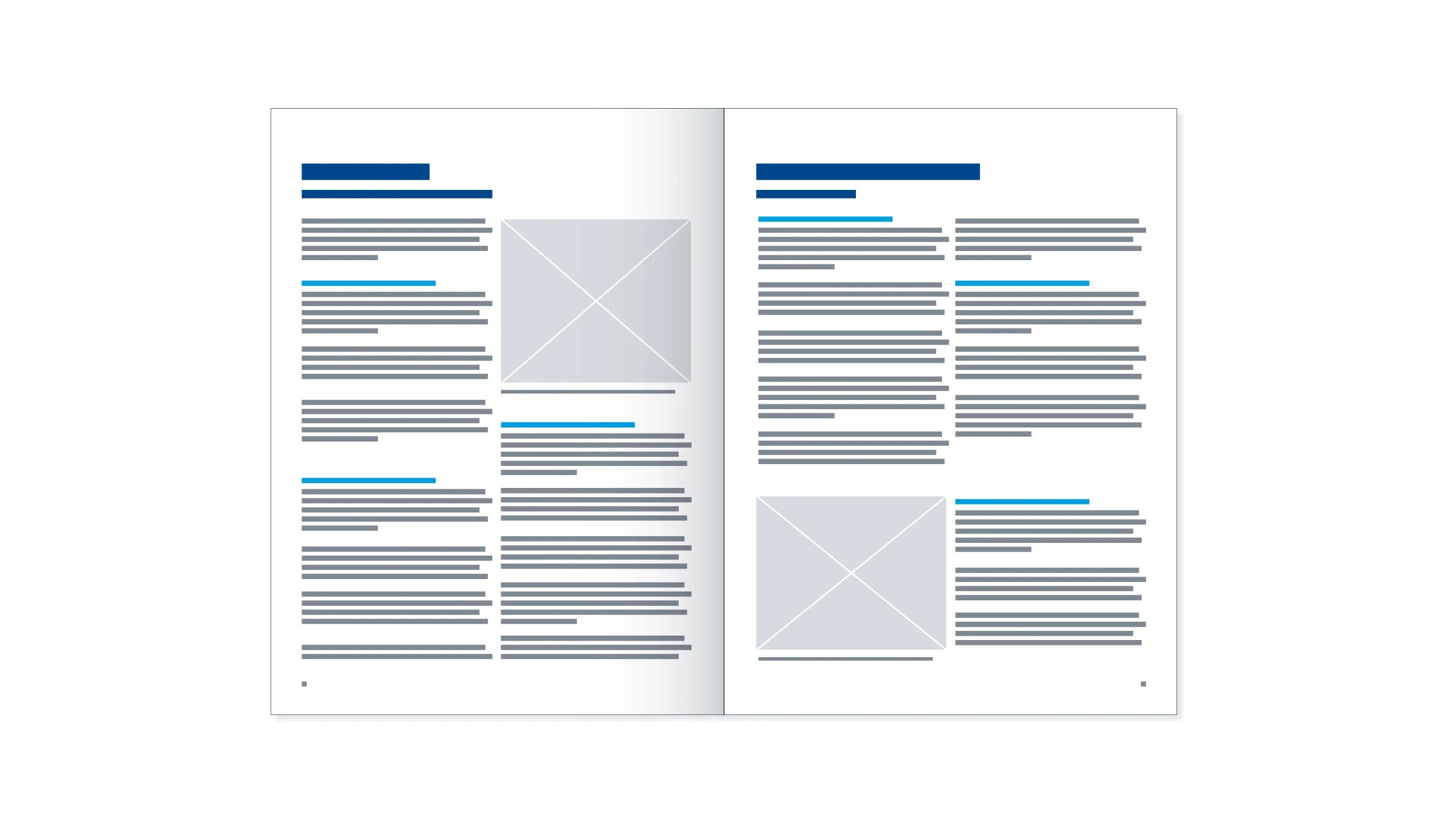
Column division – the image and textual elements are generally divided into two columns.
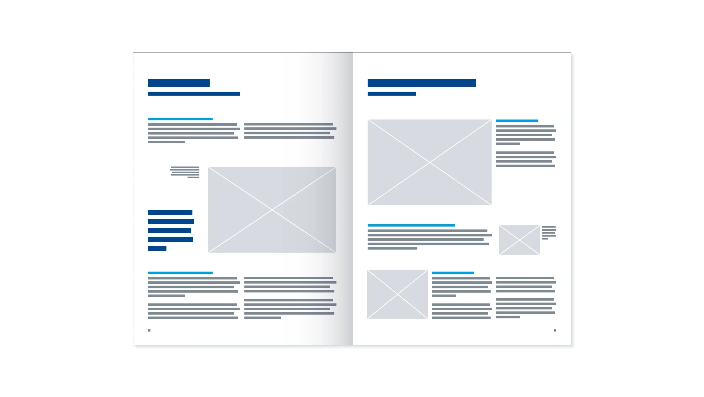
Variation – the two-column layout can be changed to add variety.
Design details
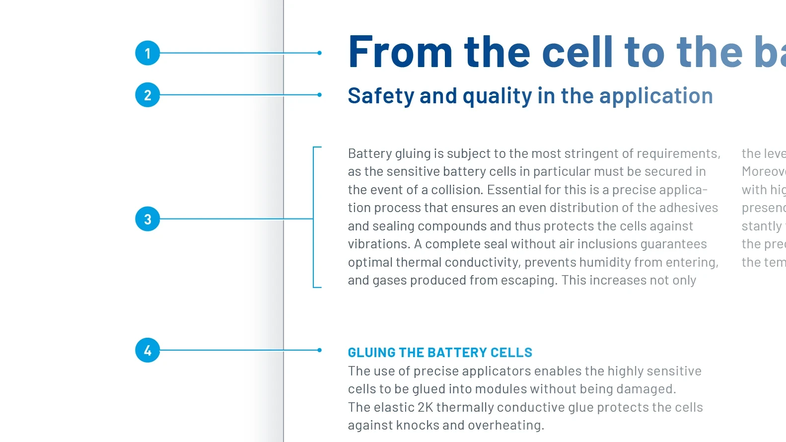
Typographical formatting
- Headline: Barlow Bold, 30 pt, LS 32 pt, Basic Blue
- Subheading: Barlow SemiBold, 15 pt, LS 18 pt, Dark Blue
- Running text: Barlow Regular, 9 pt, LS 12 pt, Dark Gray
- Intermediate headline: Barlow Bold, uppercase, 9 pt, LS 12 pt, spacing +30, Digital Light Blue
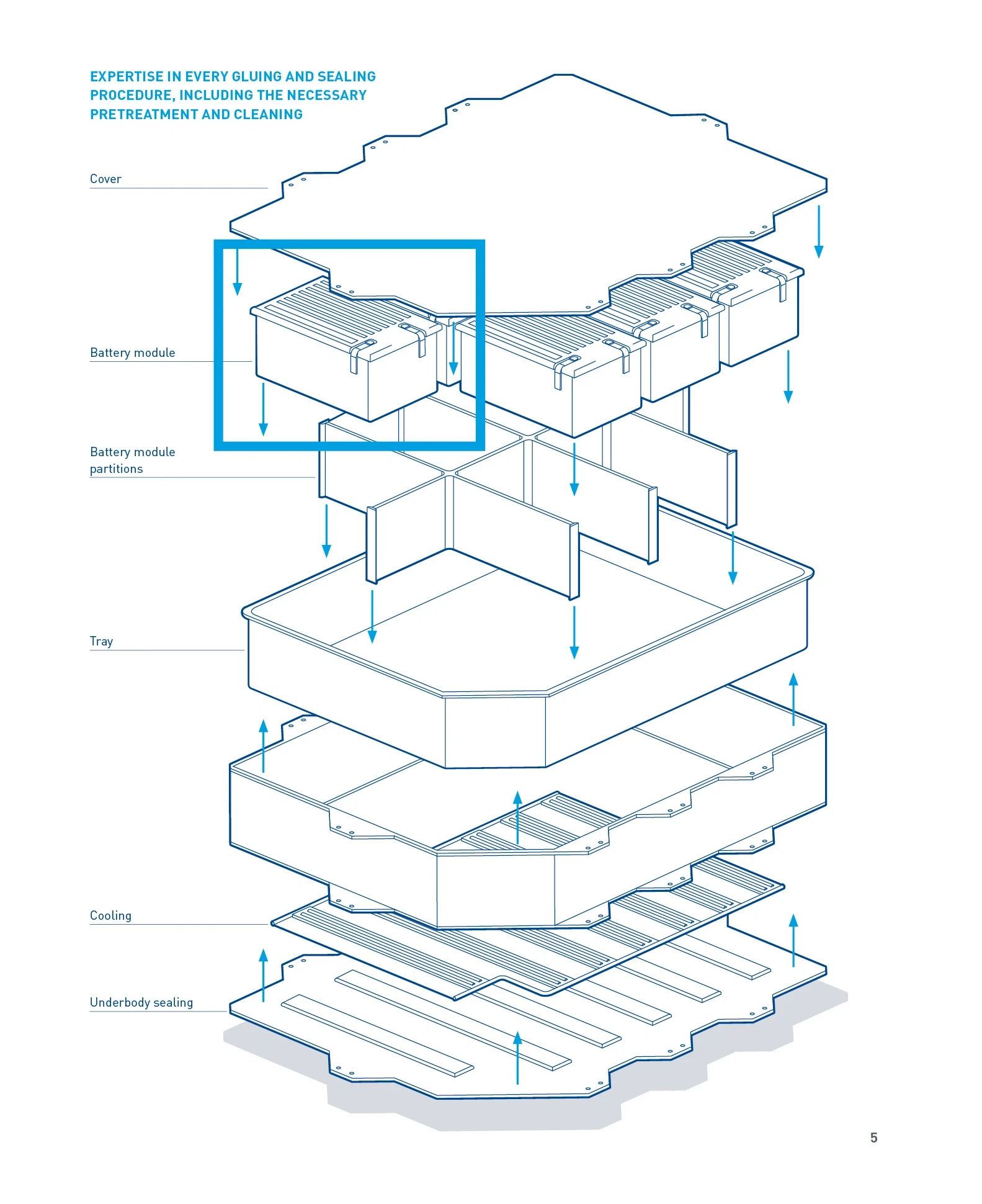
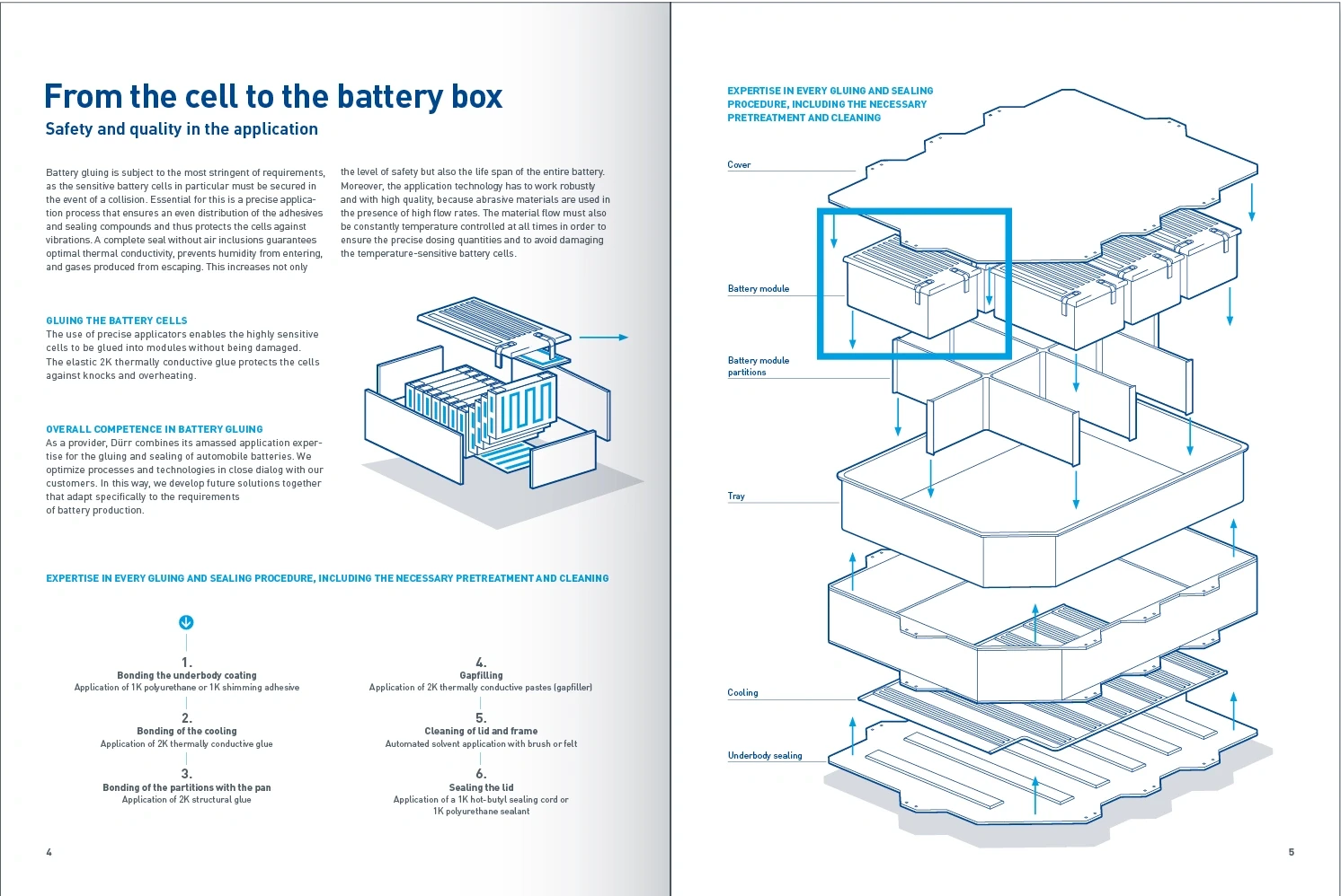
Technical illustrations – ideally suited to clearly illustrating complex topics. They also have increased esthetic appeal. Combined with images and typography, they add variety to the way in which information is displayed.
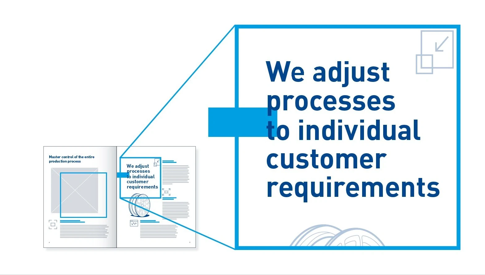
Pull quotes – quotations and pull-quotes highlight important statements and catch the reader’s attention. They also add variety and break up the structure.
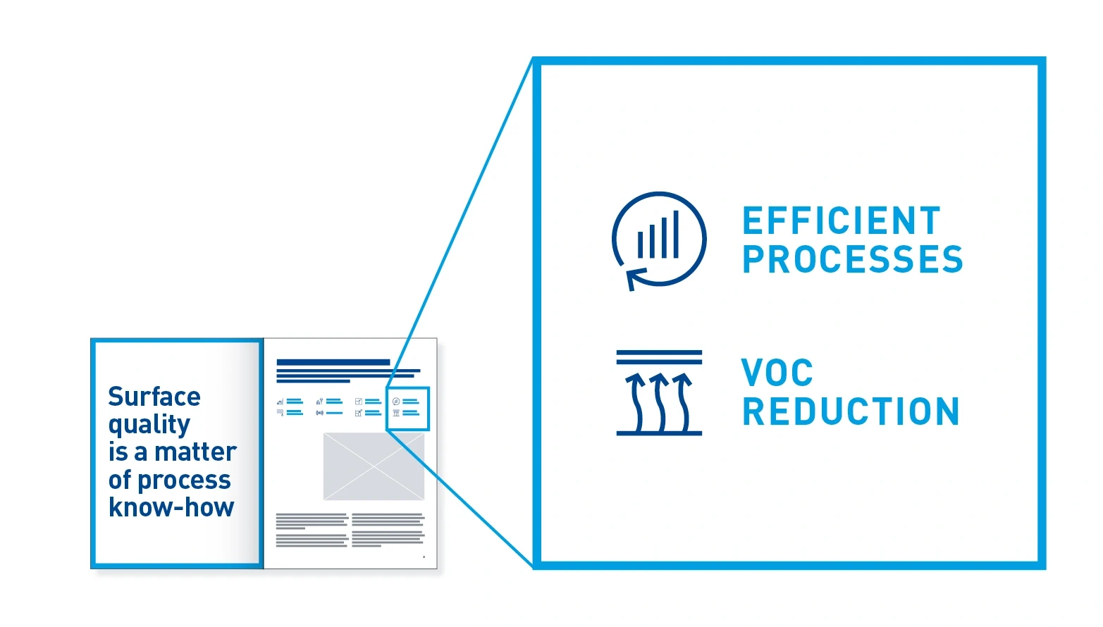
Icons – help to draw in the reader and add variety to the layout. They translate abstract concepts into accessible visual language.
