Product data sheets
Product data sheets are some of the main communication media used for presenting products and references. They are concise and focused, concentrating on the key information concerning the product in question. The Corporate Design elements help to present this information in a way that is striking as well as detailed and precise.
Use
Product data sheets explain the precise properties, advantages and possible uses of a product and summarize the range of services provided by the business areas. They are a quick way of providing information and serve as a memory aid for interested parties. They are used for presentations in house and at trade fairs or are offered as PDF downloads on durr.com.
Design principles
Each product data sheet is a double-sided loose sheet (front and back). The set format is 210 x 280 mm. The design of the front depends on the size of the image and the quantity of text.
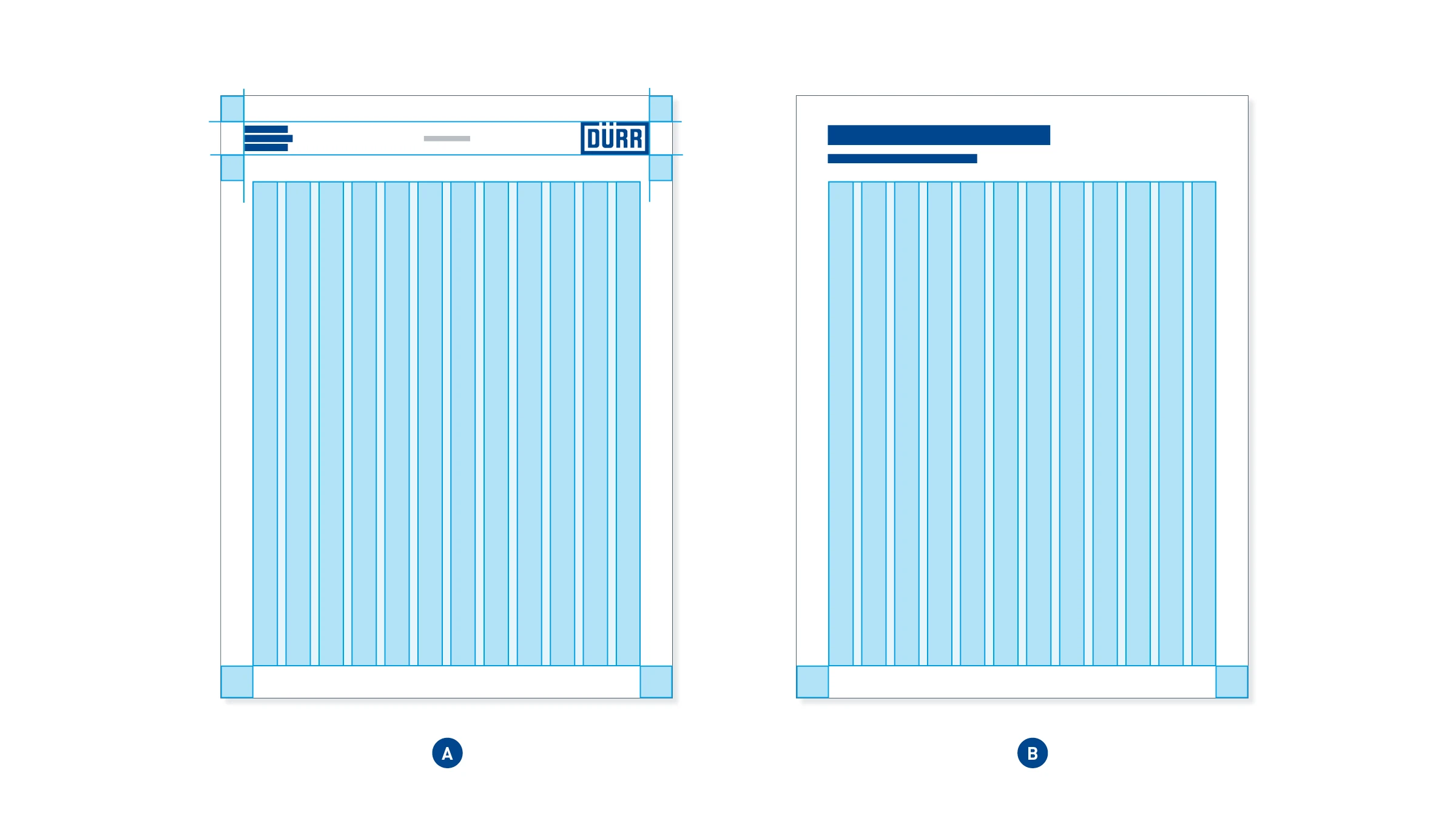
Print space and grid – the print space of the sheet is identical on the front (A) and back (B). It sits horizontally in the center of the format and has identical margins at the left, right, and bottom. The top margin is defined by the height of the logo header. The print space is subdivided into a 12-column layout grid.
Design of the front
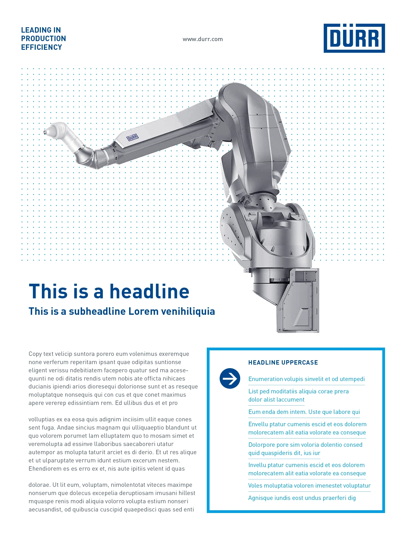
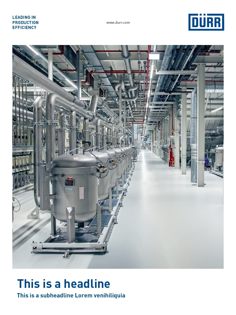
The design of the front of a product data sheet is always based on the same design principle used for Dürr print media. From top to bottom, the layout is as follows: Logo header, meaningful cover image, headline. On product data sheets with more content, copy and benefits can also be included.
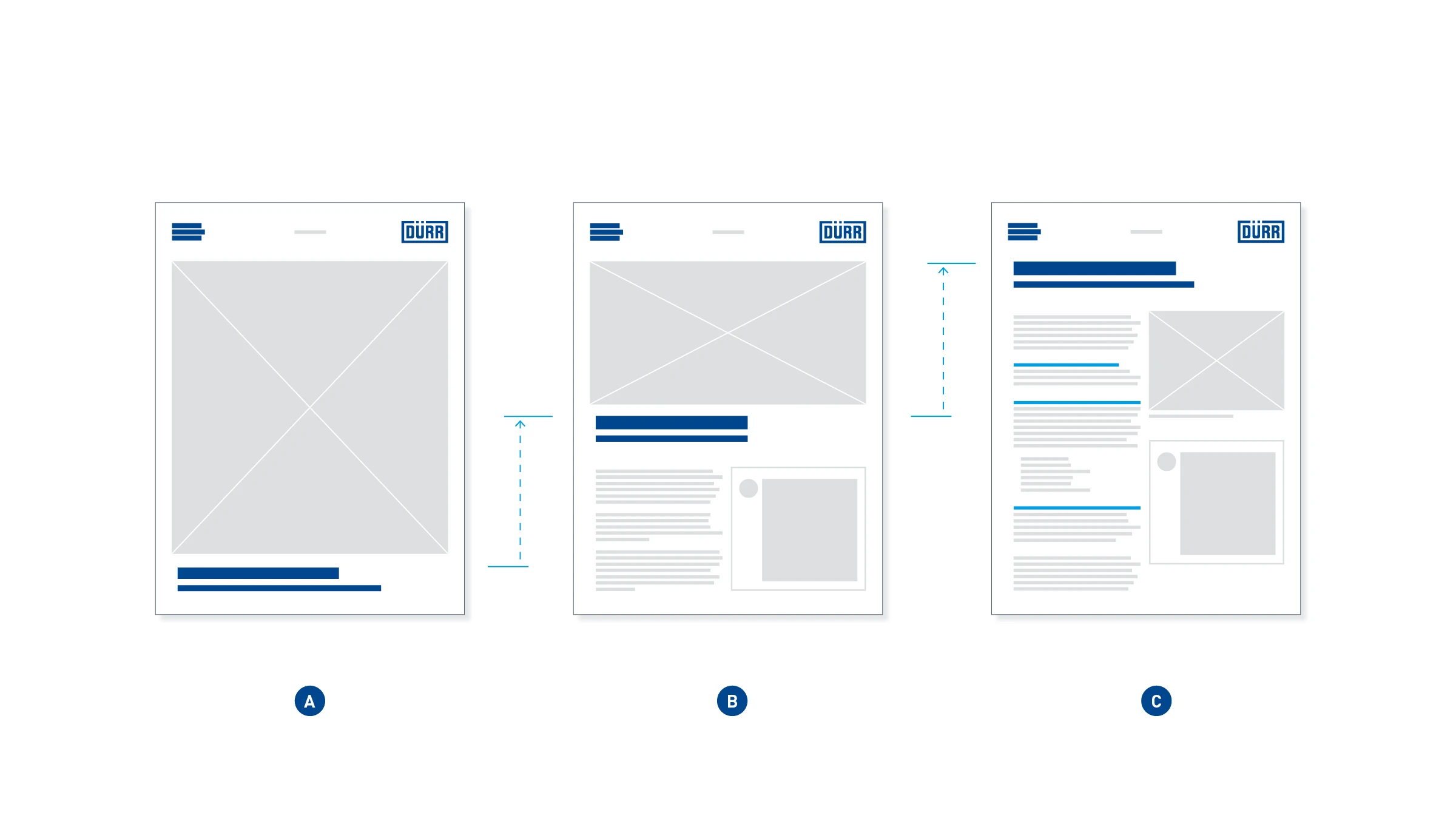
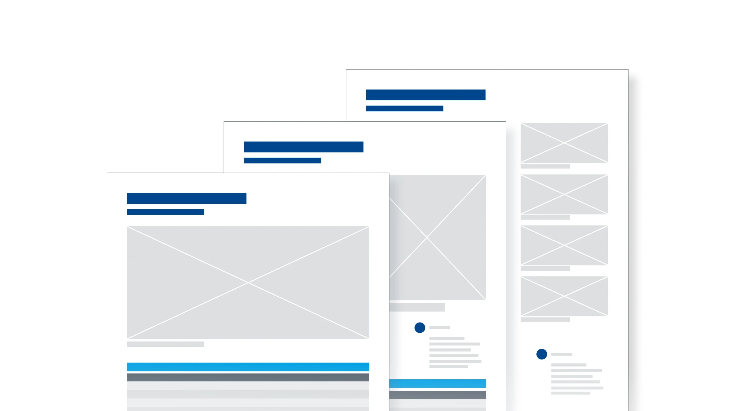
Variable front – Depending on requirements, the front of the data sheet can have one of three different layouts. The version with the full-page motif (A) is used with high-quality image material and thus little text is required. As the quantity of text increases, so the image area becomes smaller and the headline shifts upward (B). It is also possible to dispense entirely with large images, in order to optimize the utilization of space (C). This version is only used in exceptions and is not described further below. A template is available under Downloads for all versions.
VARIANT WITH FULL-PAGE MOTIF
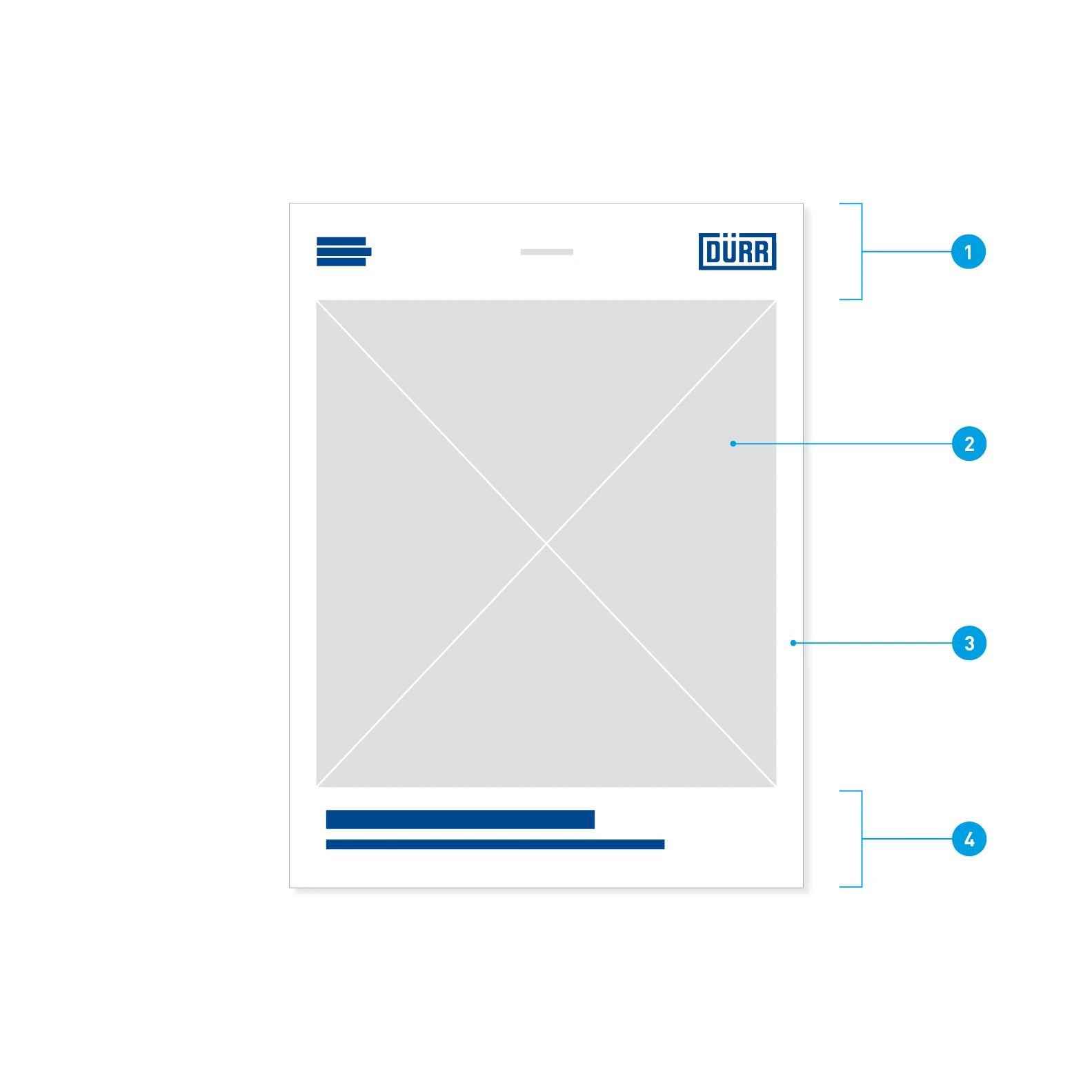
Elements of the front with full-page motif
- Logo header
- Image
- Frame
- Headline area
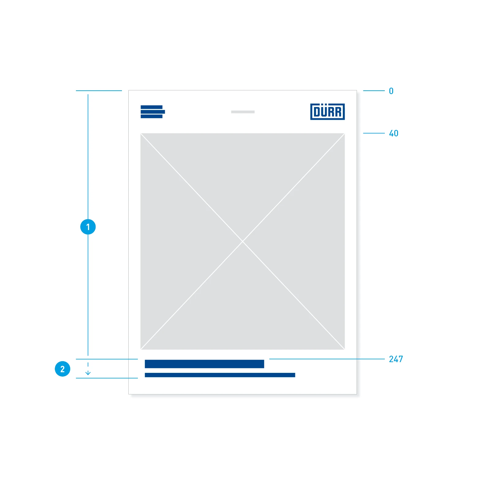
Positions – fixed and flexible areas. Position indications in millimeters.
- Logo header and image: fixed position and height
- Headline element: fixed top edge, variable up to the print space margin
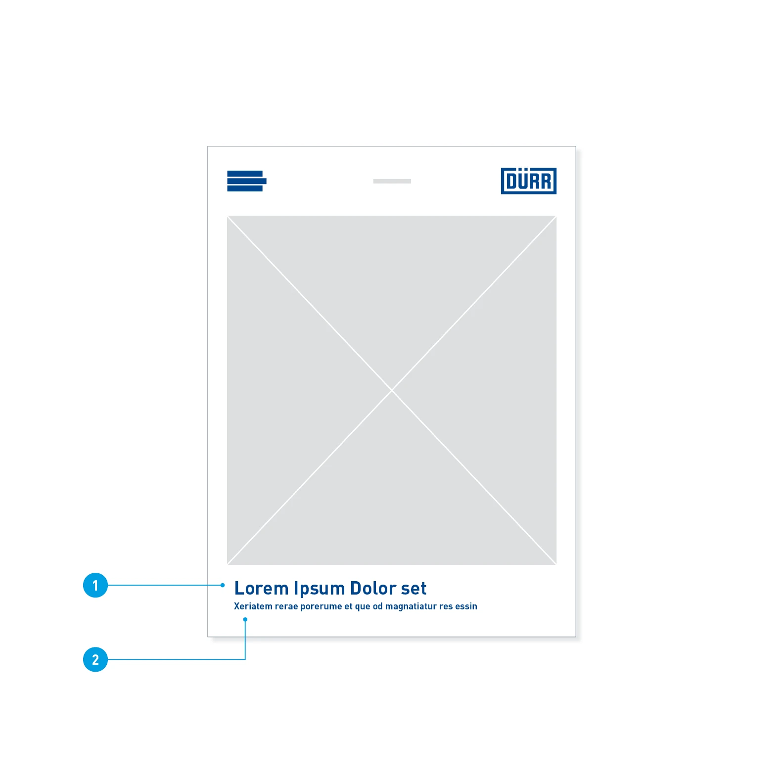
Font sizes and colors on the front
- Headline: Barlow Bold, 30 pt, LS 36 pt, Basic Blue
- Subheadline: Barlow Bold, 15 pt, LS 24 pt, Basic Blue
VARIANT WITH HALF-PAGE MOTIF
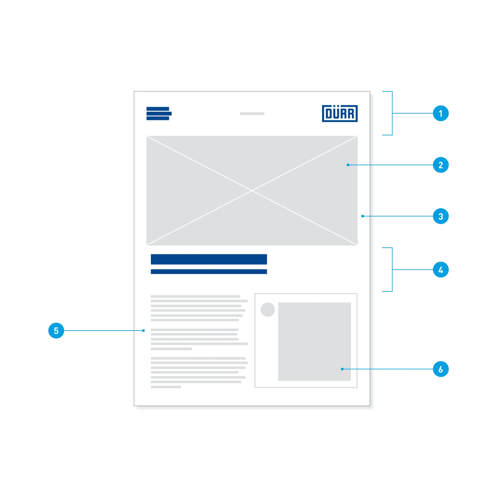
Front design with half-page motif – this variant offers more space in the lower half for further content such as copy and benefit elements. The design principle is nevertheless retained.
- Logo header
- Image
- Frame
- Headline area
- Copy
- Benefit element with re-frame
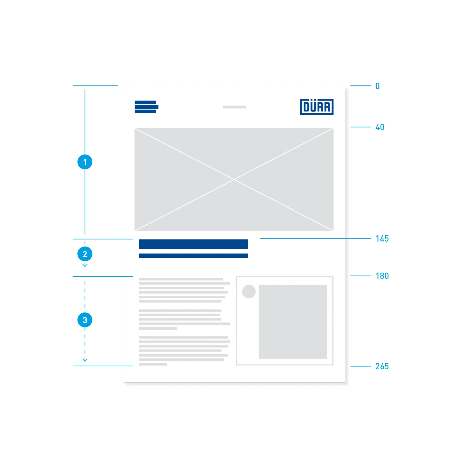
Positions – fixed and flexible areas. Position indications in millimeters.
- Logo header and image: fixed position and height
- Headline element: fixed top edge, variable bottom edge
- Content area: fixed top edge, variable up to the print space margin
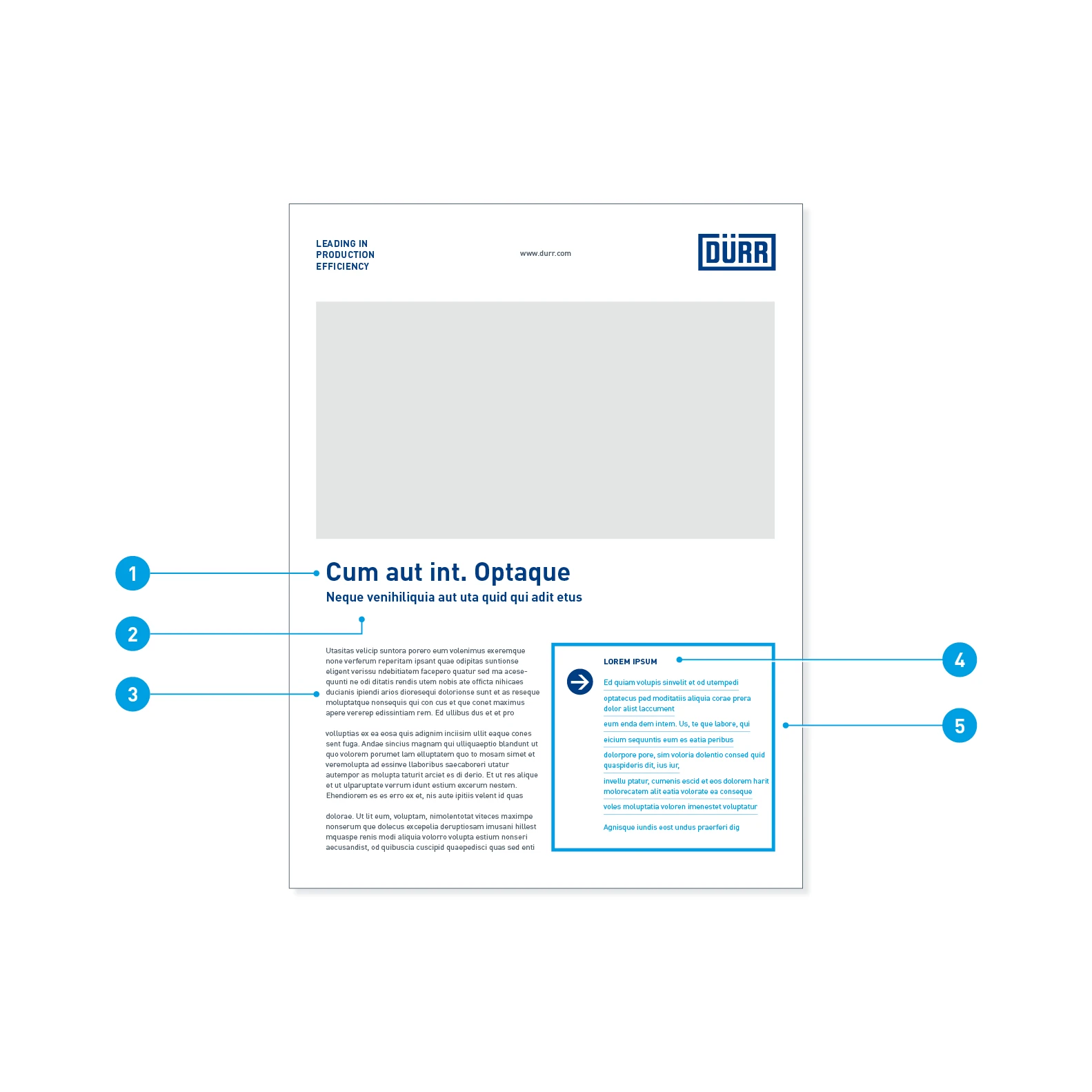
Font sizes and colors
- Headline: Barlow Bold, 30 pt, LS 36 pt, Basic Blue
- Subheadline: Barlow SemiBold, 15 pt, LS 24 pt, Basic Blue
- Continous text: Barlow Regular, 9 pt, LS 12 pt, Dark Gray
- Benefits headline: Barlow Bold, 9 pt, LS 12 pt, upper case, Basic Blue
- Benefits list: Barlow Regular, 9 pt, LS 12 pt, Digital Light Blue
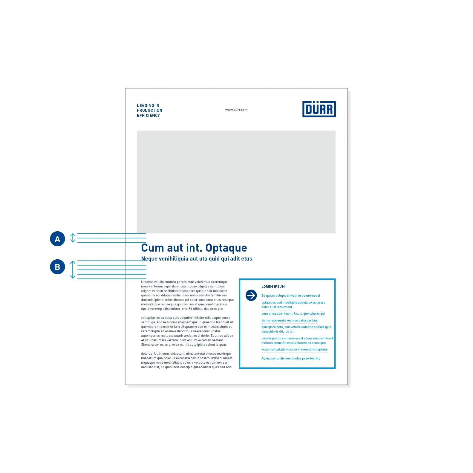
Spacings – spacing between the elements (A): 2 grid units, spacing between heading and copy (B): 4 grid units.
Design of the back
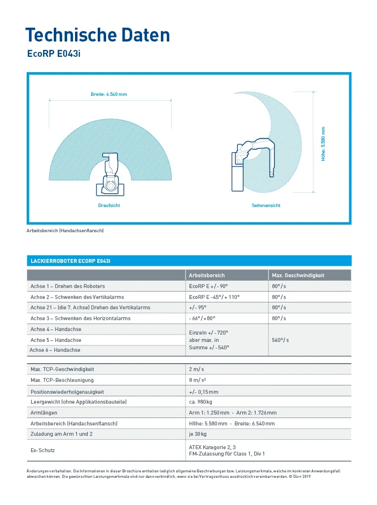
The back is particularly characteristic for the data sheet. The layout communicates the contents precisely and in detail, but at the same time remains flexible. It combines technical illustrations with product photography and tables. Depending on the depth of information, the text-to-image ratio on the back may vary.
APPLICATION EXAMPLES

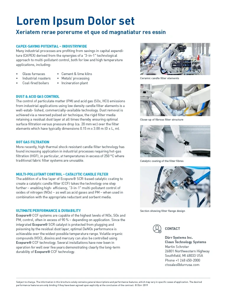
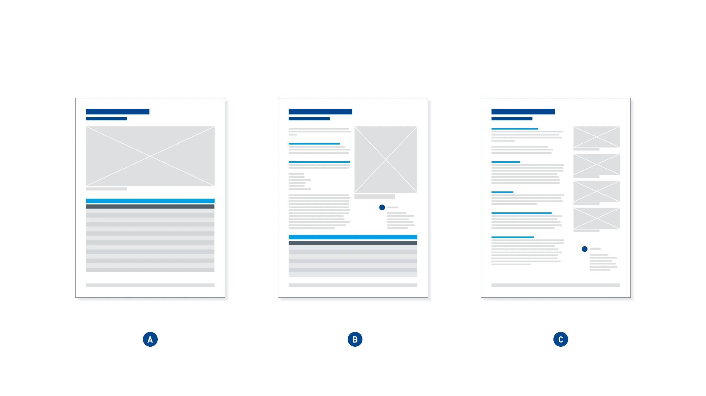
Back variants – within the design grid, image and text can be varied: large image with table (A), medium image with table and text (B) or text with several small images (C).
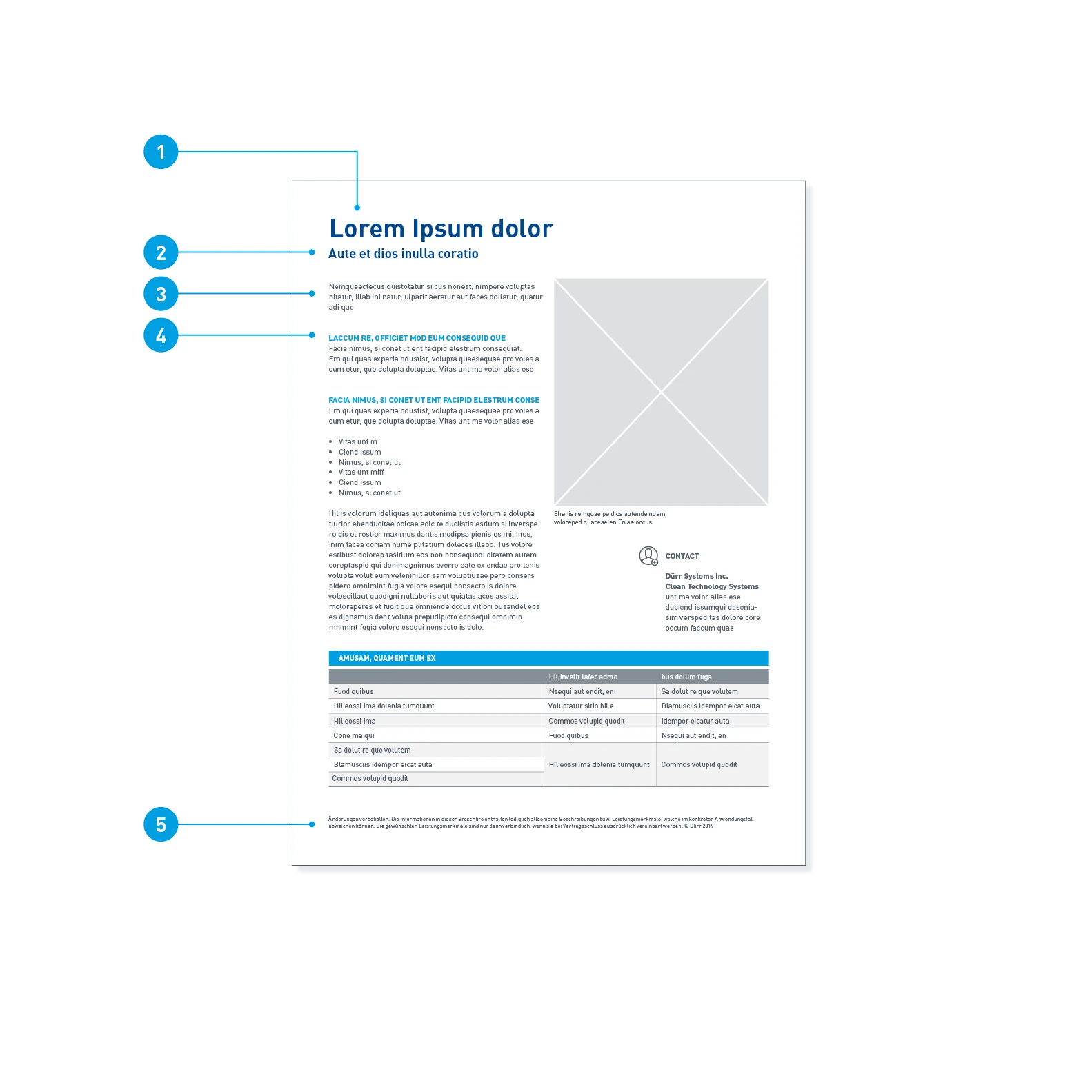
Font sizes and colors
- Headline: Barlow Bold, 30 pt, LS 36 pt, Basic Blue
- Subheadline: Barlow SemiBold, 15 pt, LS 24 pt, Basic Blue
- Continous text: Barlow Regular, 9 pt, LS 12 pt, Dark Gray
- Intermediate headline: Barlow Bold, 9 pt, LS 12 pt, upper case, Digital Light Blue
- Footnote: Barlow Regular, 6 pt, LS 8 pt, Dark Gray
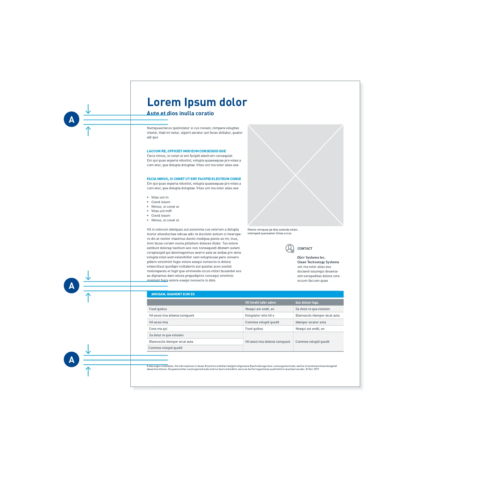
Spacings – the spacings between two elements (A) amount to at least 2 grid units.
Recurring design elements
The elements used are to be understood as building blocks. Their use is optional – however, their application follows clear guidelines.
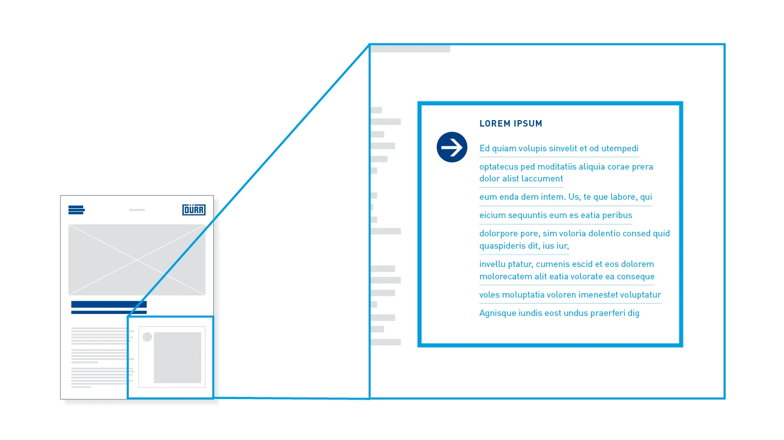
Benefit element with re-frame – product benefits are always emphasized by the re-frame and pointed out with a blue arrow icon.
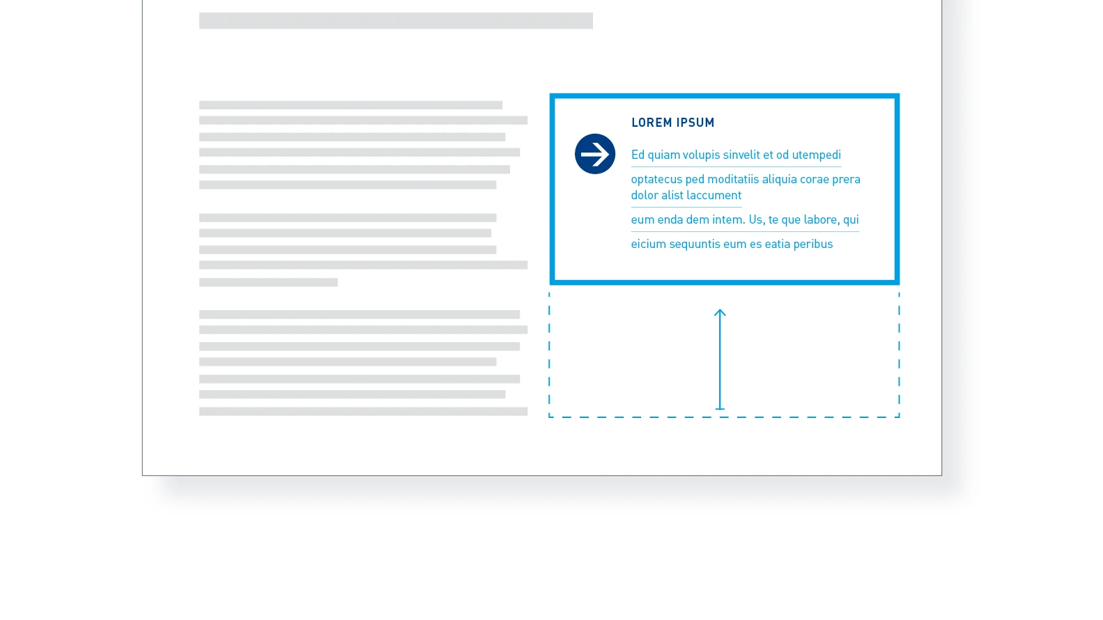
Flexible re-frame – the re-frame adapts to fit the text.
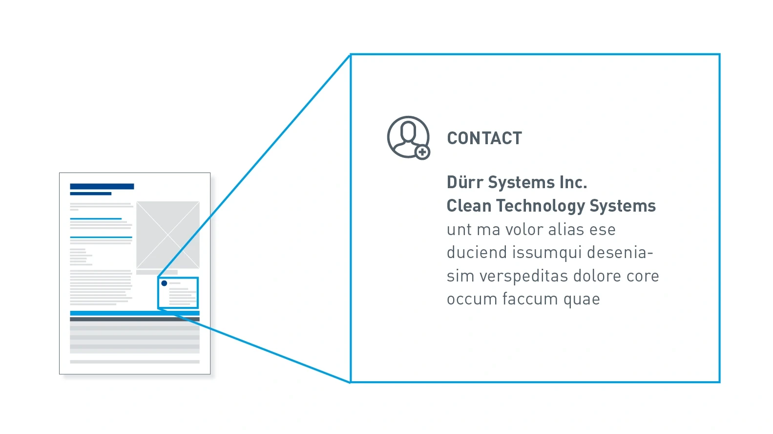
Contact element – contact details are presented in conjunction with the contact icon and can always be found on the back in the bottom-right corner.
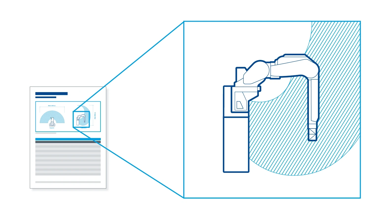
Technical illustrations – the illustrations have a standardized outline style.
Tables
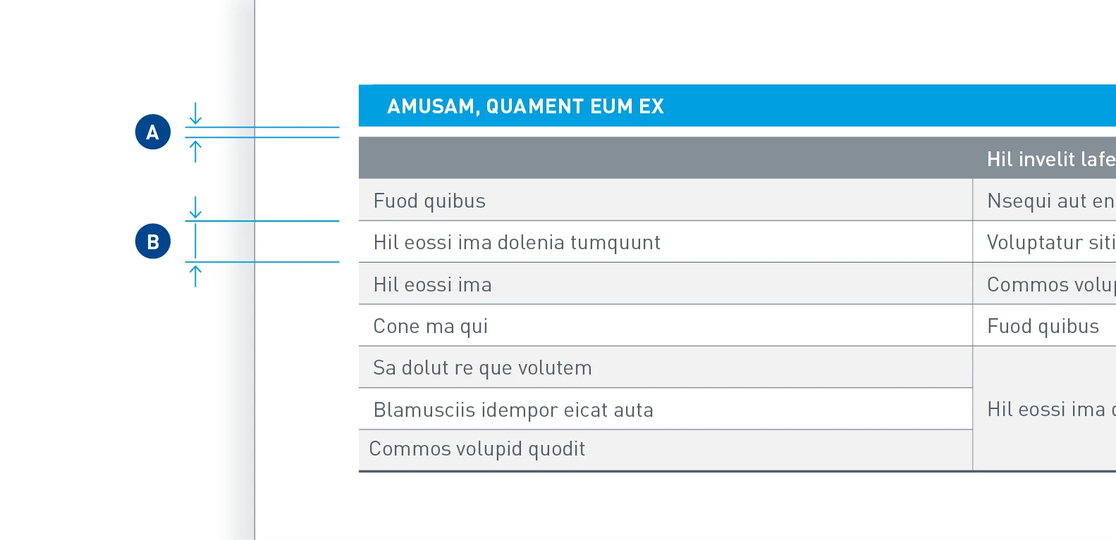
Table spacings – the spacing between header and table (A) is 1.5 mm. The line height (B) is 6 mm.
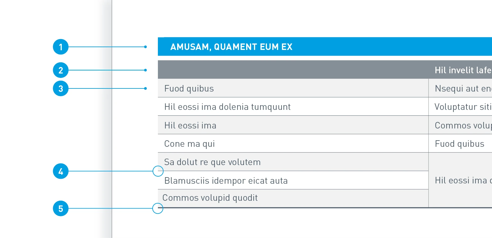
Table formatting – for quick visual guidance, we use Digital Light Blue for the header; the rest of the table is factual and informative.
- Header: Background in Digital Light Blue, font color White, Barlow Bold, 8.5 pt, upper case
- Column header: Background 70% Dark Gray, font color White, Barlow Medium 8.5 pt
- Cells: Background alternately 50% Light Gray and White, font color Dark Gray, Barlow Regular, 8.5 pt
- Cell line: 0.5 pt, 100% Dark Gray
- Final line: 1 pt line thickness, 100% Dark Gray
