Roll-ups
Dürr’s roll-ups are both striking and informative. They can be used flexibly and added to as required. The design elements of the new Corporate Design can be flexibly combined. This provides scope for a multitude of applications.
Table of contents
Application
Roll-ups are usually used for presentations at in-house exhibitions and conferences in order to summarize the advantages of the products and the range of services offered by the business units. The formats may vary from manufacturer to manufacturer and from country to country, in which case format adjustments are proportional.
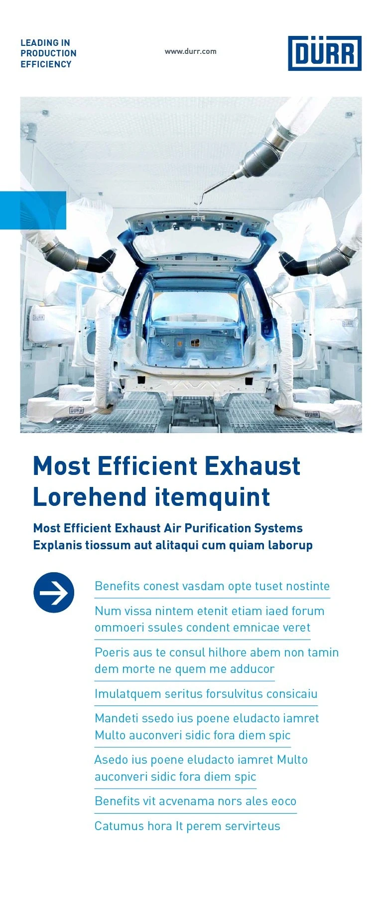

Design principles
The layout of a roll-up is based on Dürr’s basic design principles. The elements are structured as follows from top to bottom: Header area, expressive image, headline and the optional Benefit element. The logo header always contains the Dürr claim, the Dürr URL and the logo.
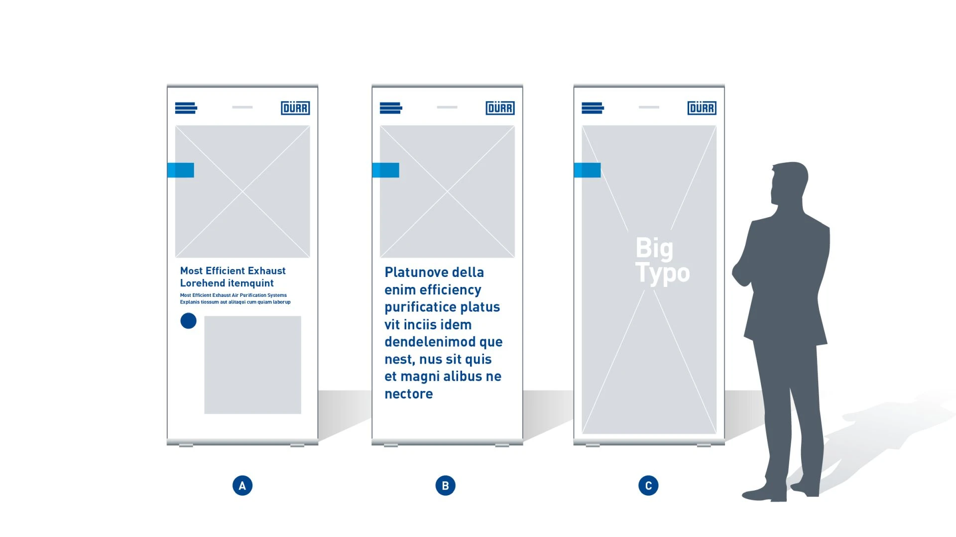
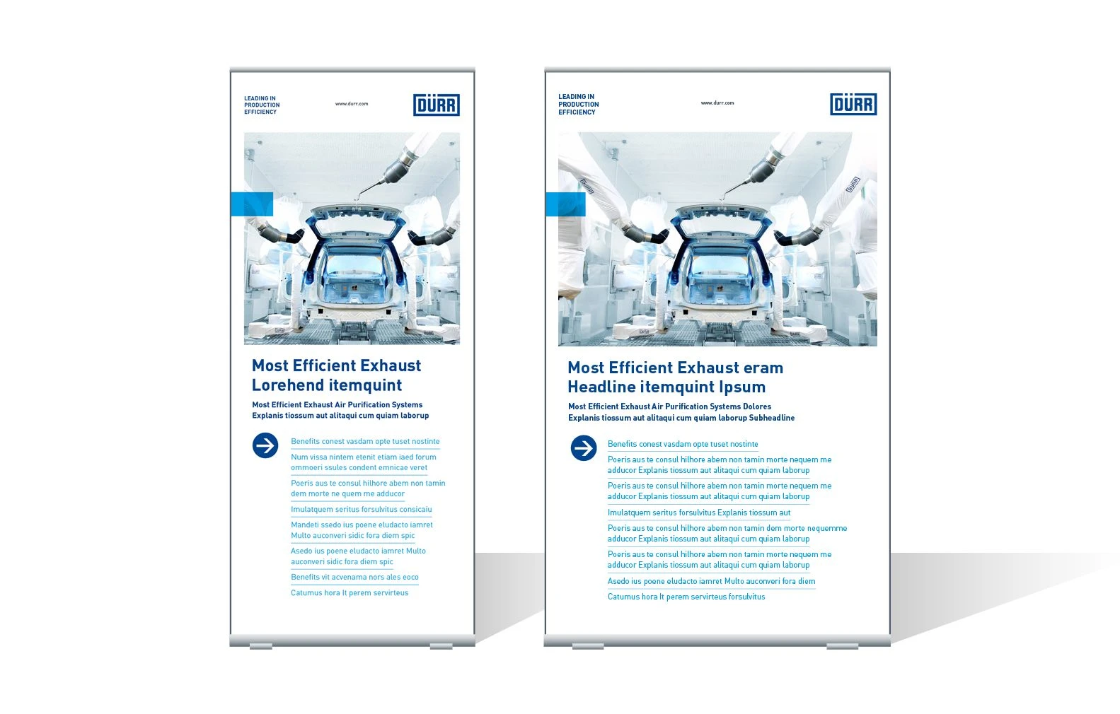
Basic roll-ups – Depending on the intended use, different Basic variants can be used. These variants are arranged here from left to right, from detailed to striking: Basic Benefit (A), Basic Statement (B) and Basic Image (C). The roll-ups work in series and can therefore be freely combined with each other.
Basic variant
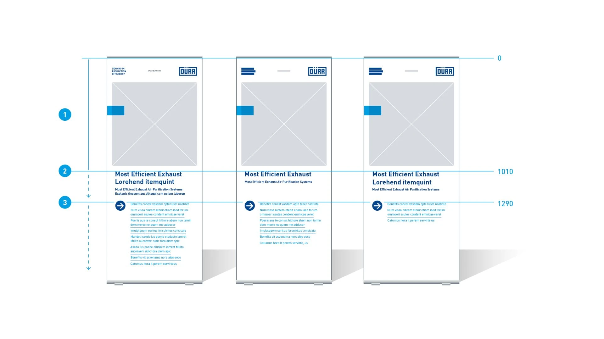
Flexible text lengths – The layout specifies fixed top edges. The text lengths are flexible from there downward.
- Logo header and image area: Fixed position and height
- Headline: Fixed top edge and flexible bottom edge
- Benefit element: Fixed top edge and flexible bottom edge
Basic Benefit variant
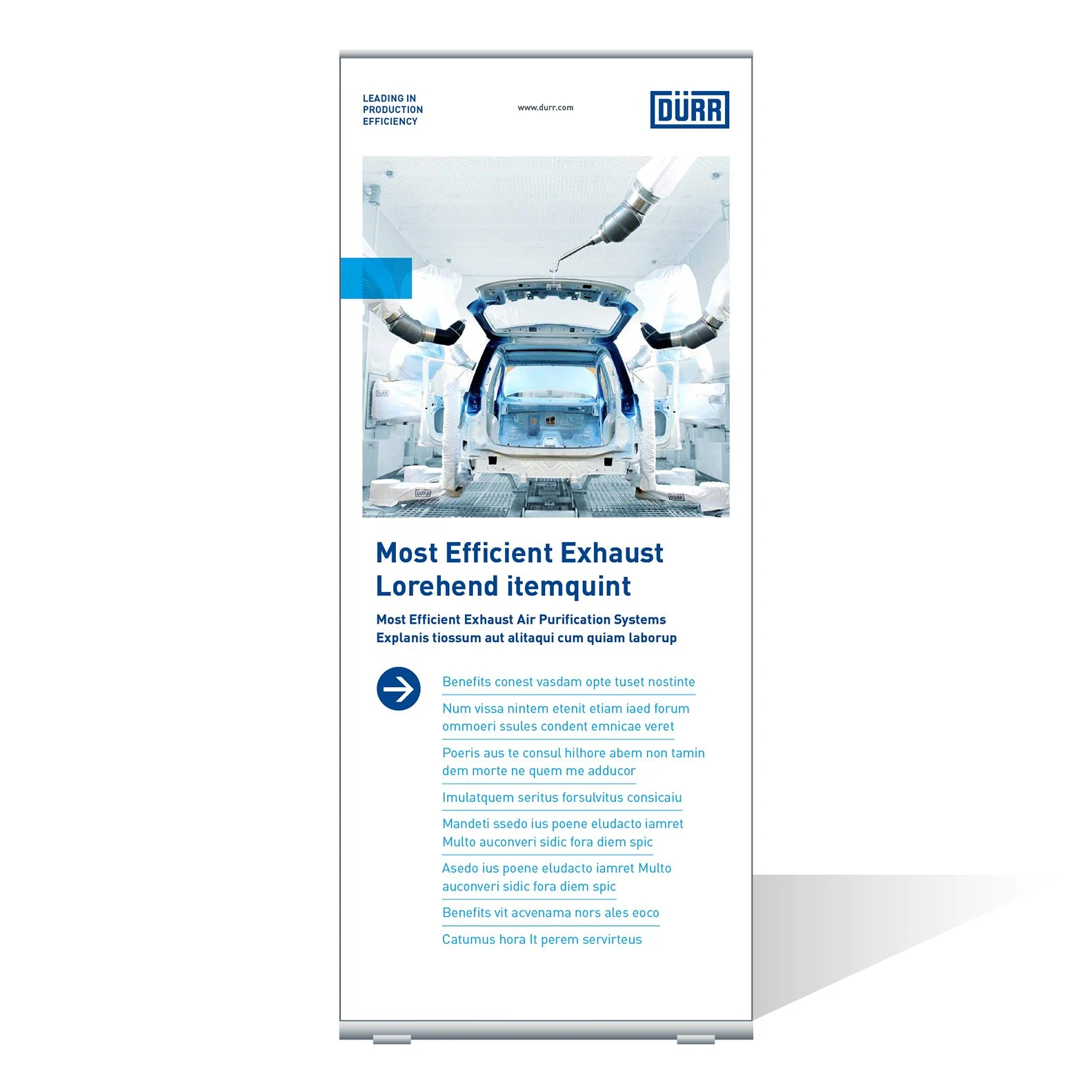
Example of a Basic Benefit roll-up – This is the most frequently used variant. It includes most of the elements as well as the largest amount of text.
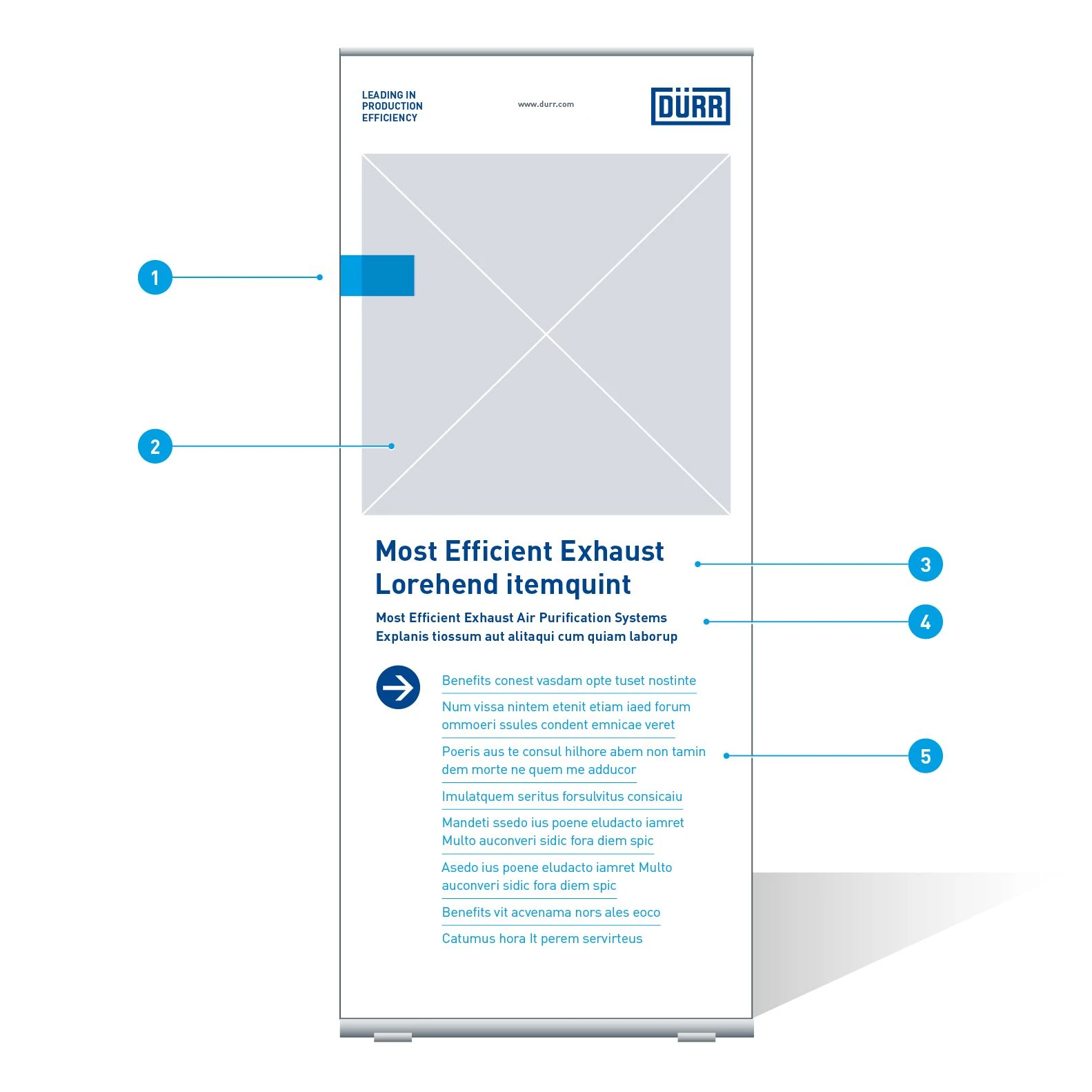
Elements of a Basic Benefit roll-up
- Quick-Link
- Image: Half-format
- Headline: Barlow Bold, 168 Pt, ZAB 194 Pt, Basic Blue
- Sub-headline: Barlow SemiBold, 80 Pt, ZAB 99 Pt, Basic Blue
- Benefit element: Barlow Bold, 80 Pt, ZAB 105 Pt, Digital Light Blue
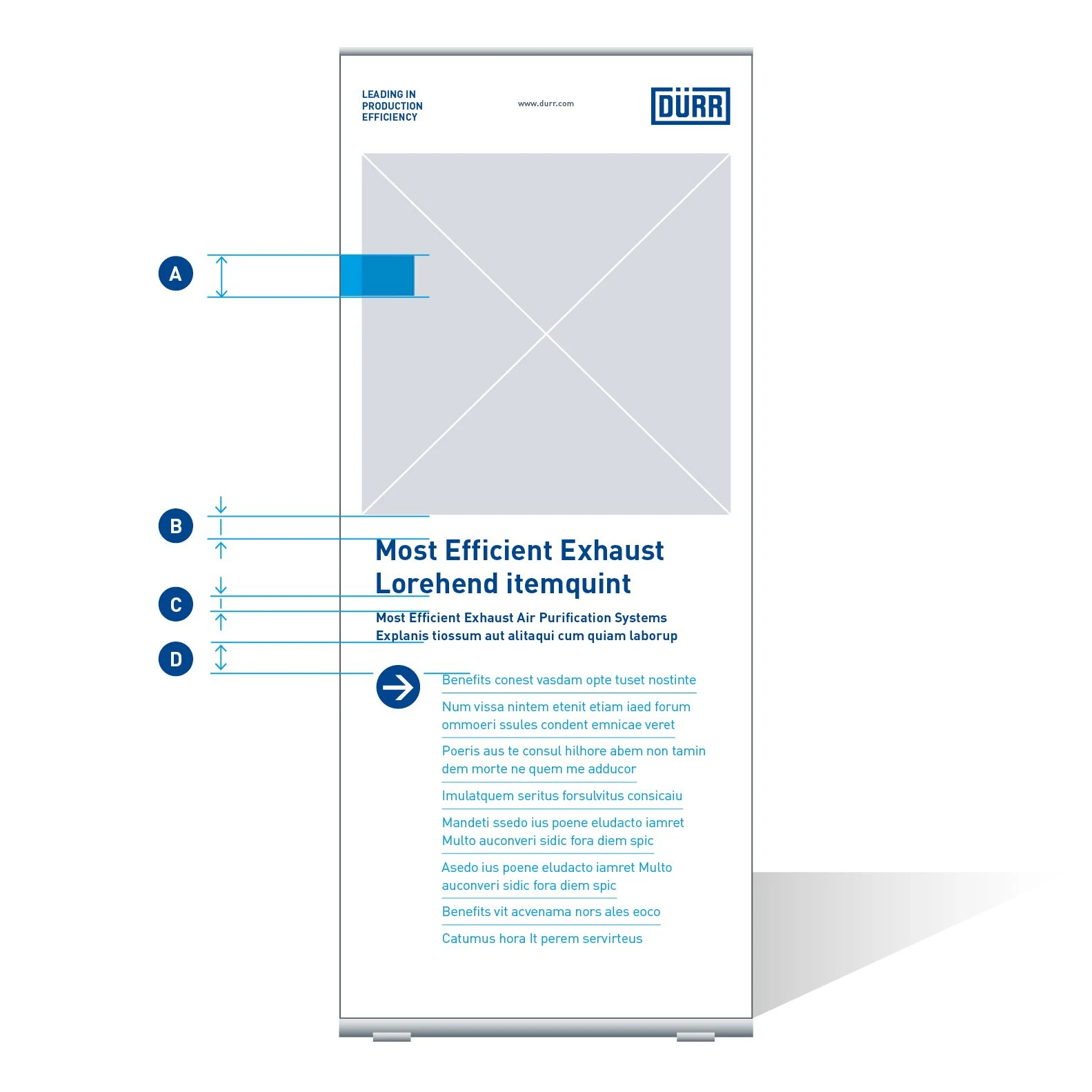
Distances of a Basic Benefit roll-up – (A) 85 mm (B) 51 mm (C) 39.5 mm (D) 70.5 mm
Basic Statement variant
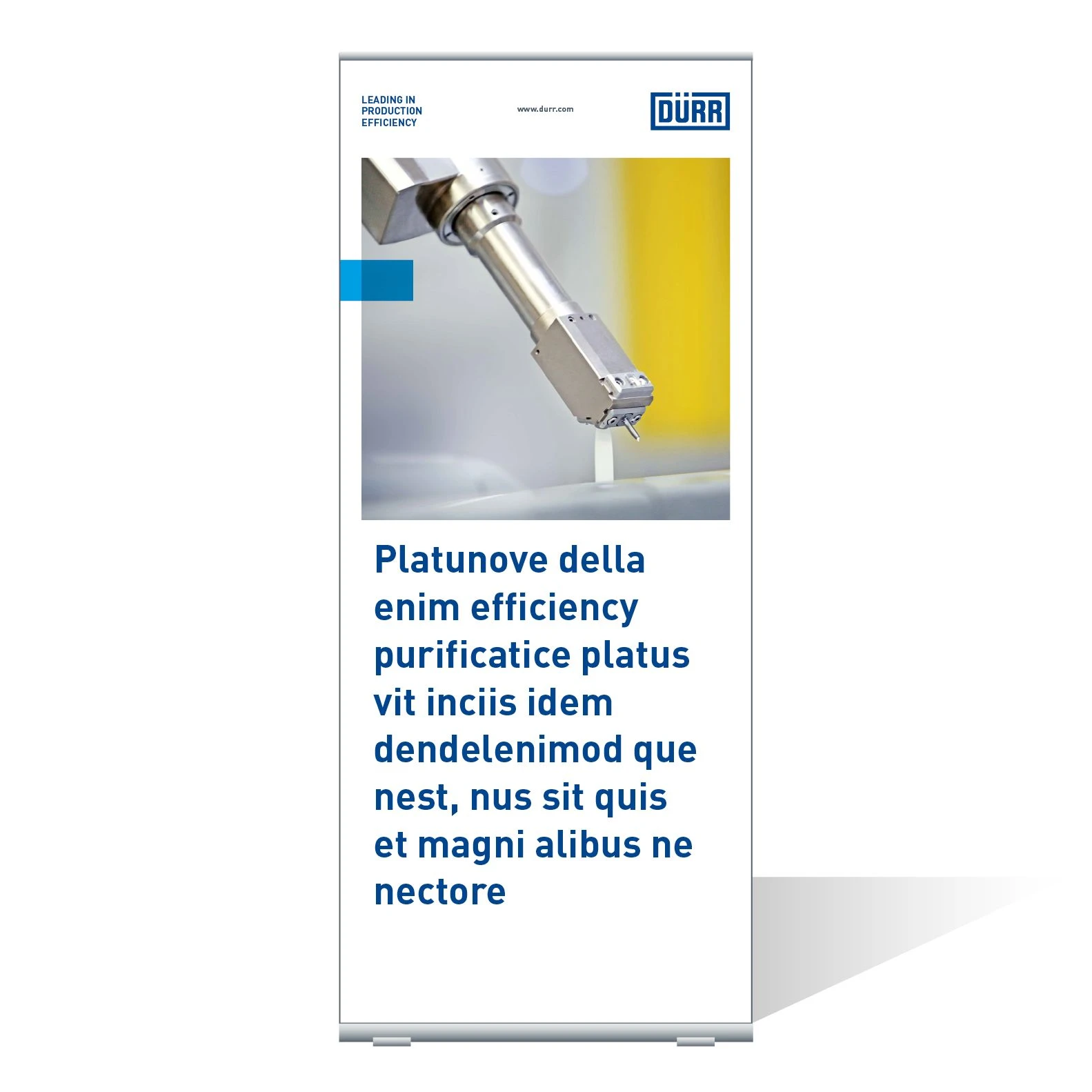
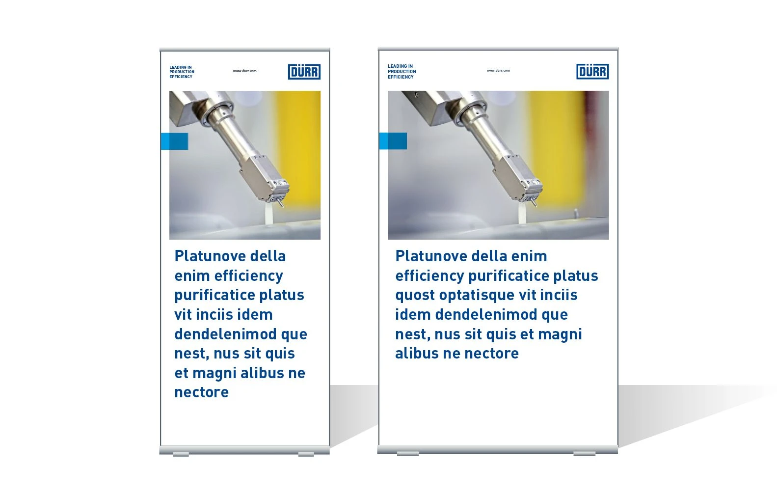
Example of a Basic Statement roll-up – An expressive text or quotation is combined with the image element here.
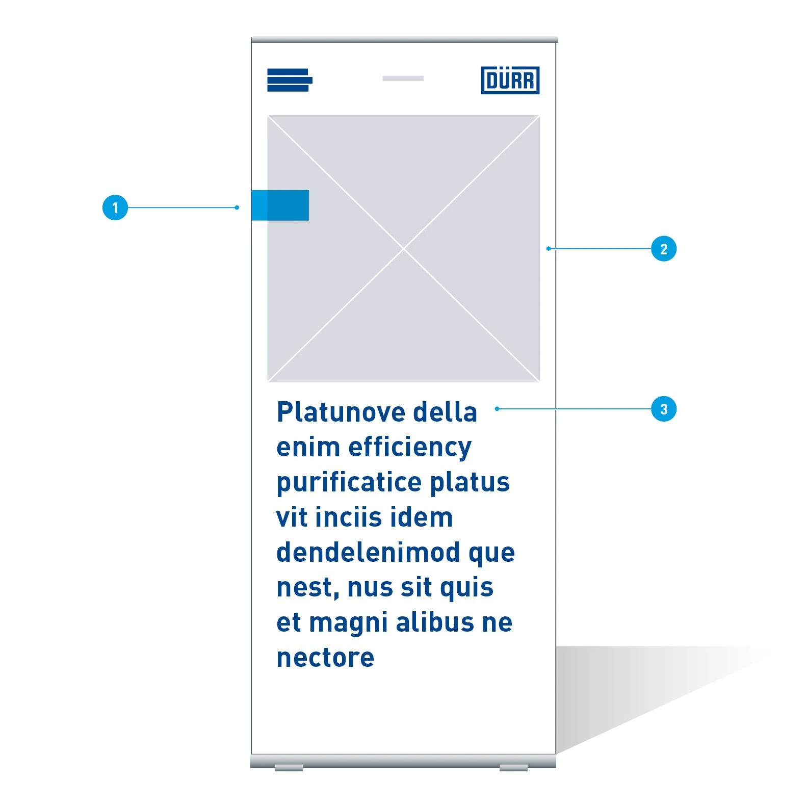
Elements of a Basic Statement roll-up
- Quick-Link
- Image: Half-format
- Statement: Barlow Bold, 226 Pt, ZAB 277 Pt, Basic Blue
Basic Image variant
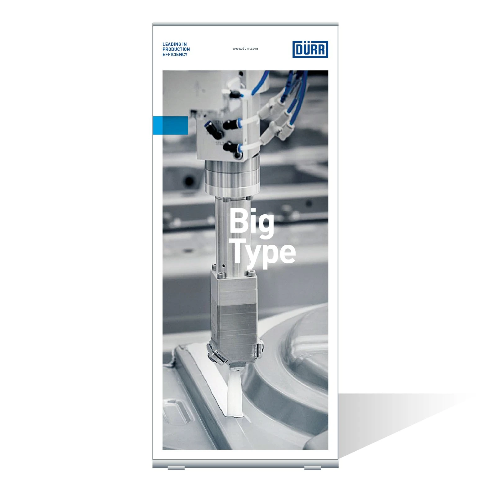
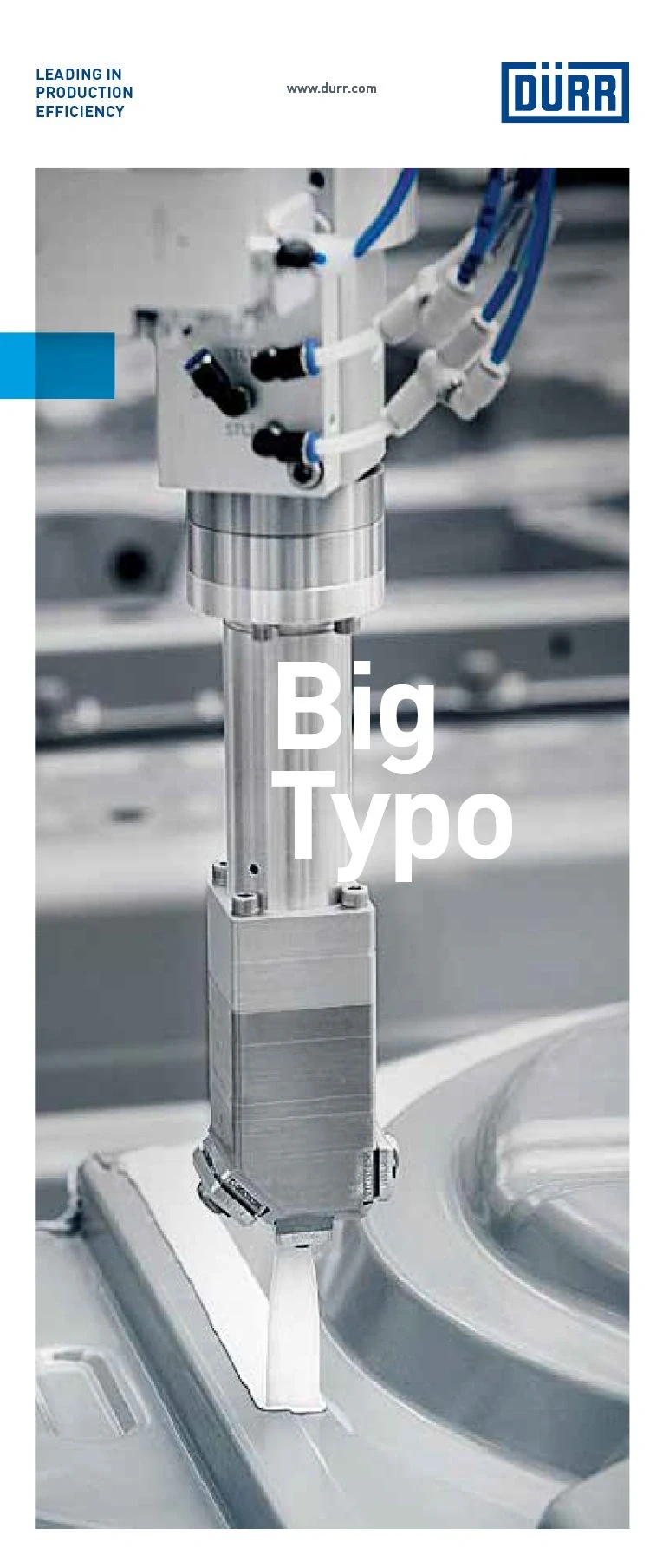
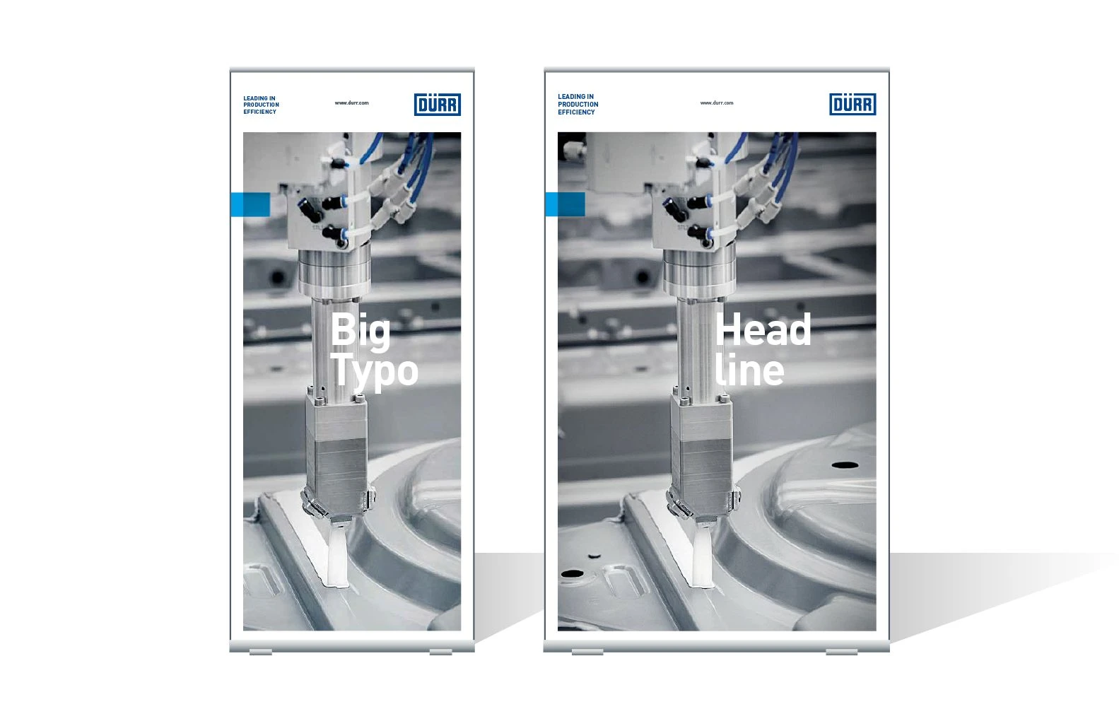
Example of a Basic Image roll-up – Based on the principle of the Dürr poster, a compact Big Type headline is placed freely on the image.
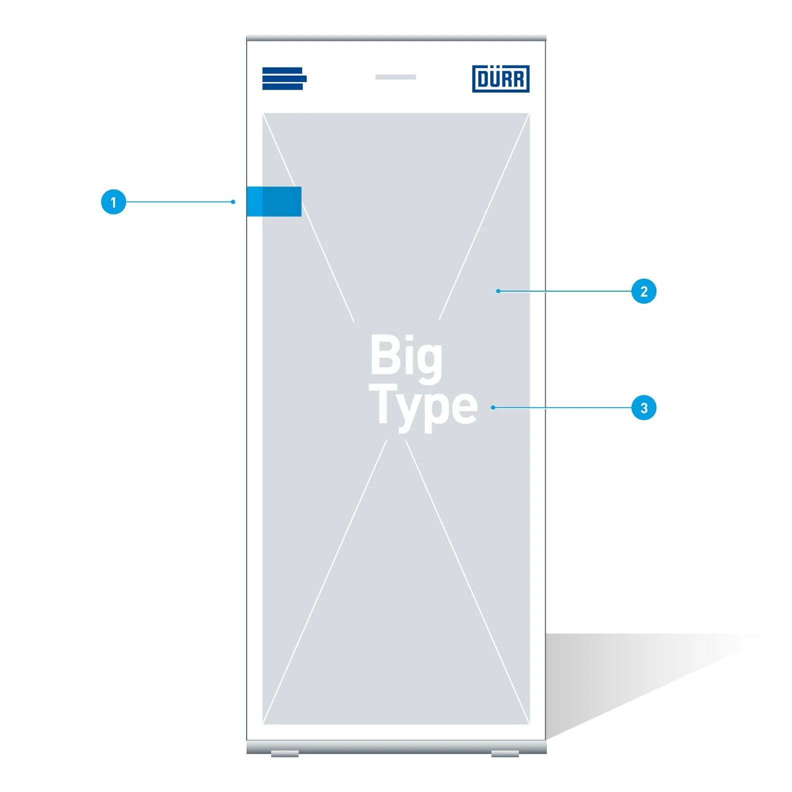
Elements of a Basic Image roll-up
- Quick-Link
- Image: Full-format
- Big Type headline: Barlow Bold, multi-line, variable font size, font color white or basic blue
Re-Frame variant
The Re-Frame variant of the roll-up can be used to produce a special highlight in the room or in a series of roll-ups. The Re-Frame in Digital Light Blue frames the format.
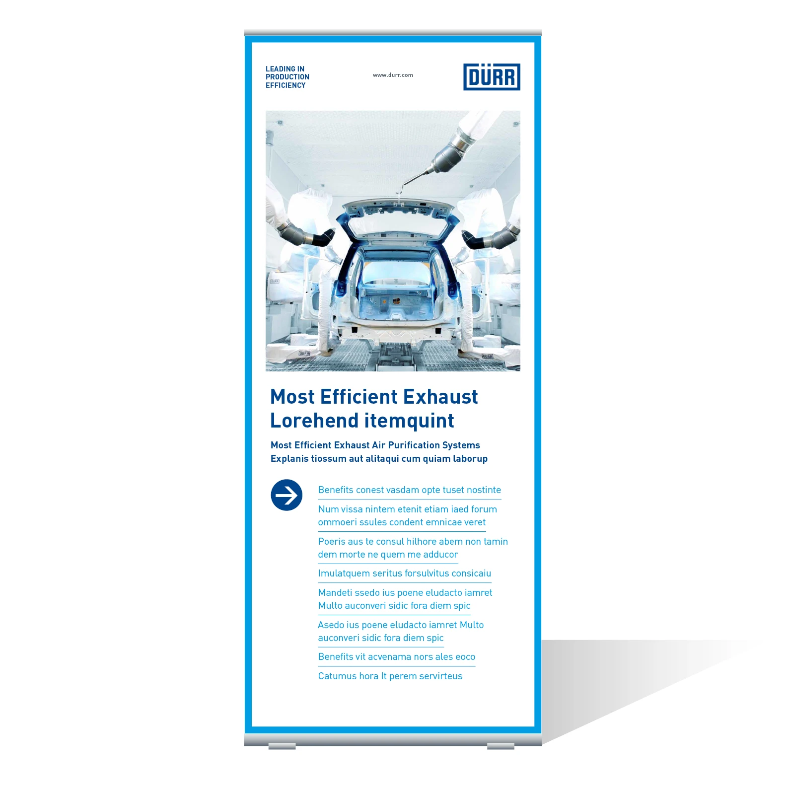
Example of a Re-Frame roll-up – The Re-Frame variant corresponds to the Basic variant in all its components. Only the Quick-Link is replaced by the Re-Frame, which runs around the entire format of the roll-up.
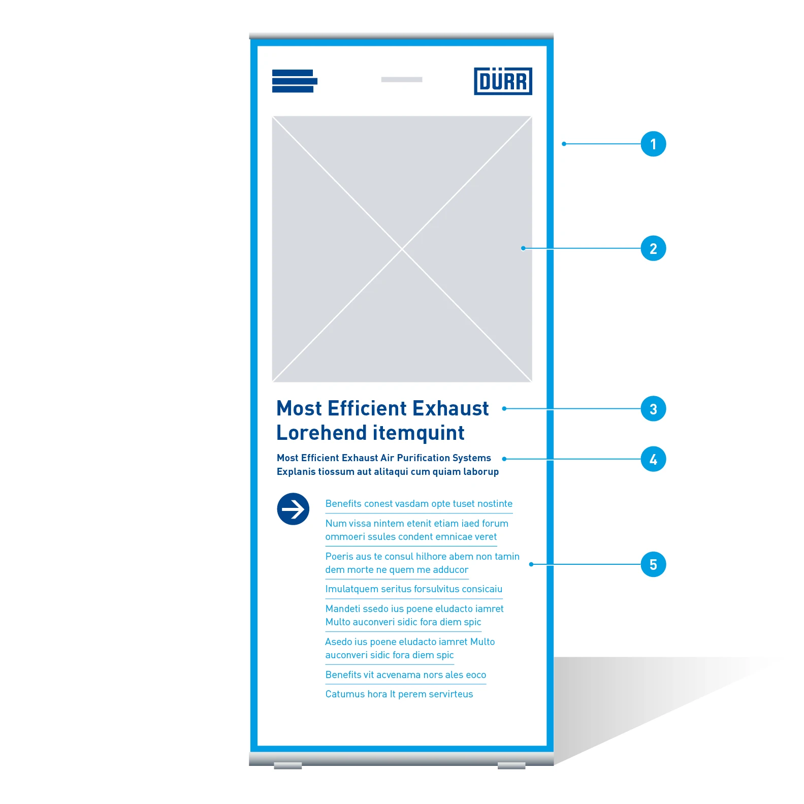
Elements of a Re-Frame roll-up
- Re-Frame: Thickness 20 mm
- Image: Half-format
- Headline: Barlow Bold, 168 Pt, ZAB 194 Pt, Basic Blue
- Sub-headline: Barlow SemiBold, 80 Pt, ZAB 99 Pt, Basic Blue
- Benefit element: Barlow Regular, 80 Pt, ZAB 105 Pt, Digital Light Blue
Wide roll-ups
In a wide variant of roll-ups, the font sizes and positions of the elements are retained. This rule only applies to the portrait format, i.e., as long as the width does not exceed the height.
