Design elements
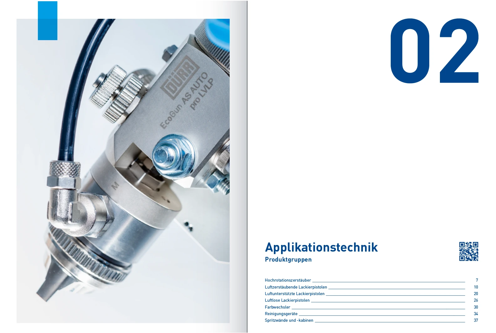
Dürr Corporate Design is based on three distinct design elements: Re-Frame, Quick-Link and Big Type. The reduced design language of the elements allows their free and flexible use. This enables the creation of informative, playful and striking designs that nevertheless appear uniform and always make it clear that they come from Dürr.
Table of contents
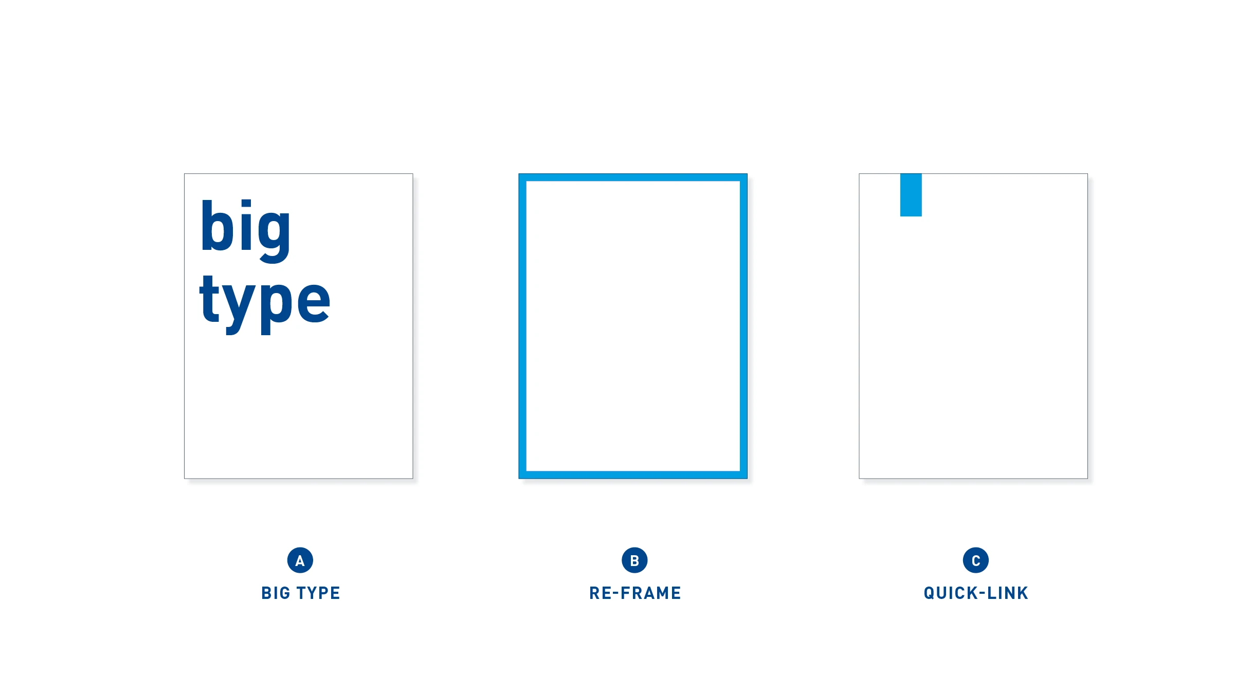
Design elements – Big Type, Re-Frame and Quick-Link – these elements make it possible to recognize our brand in design terms.
Big Type
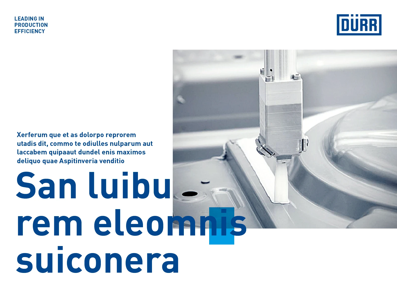
The big typography stands for our self-awareness and mission consciousness, our technology leadership, conviction and attitude. It is the striking complement to the conveyance of detailed information. It is used either for powerful keywords or for statements.
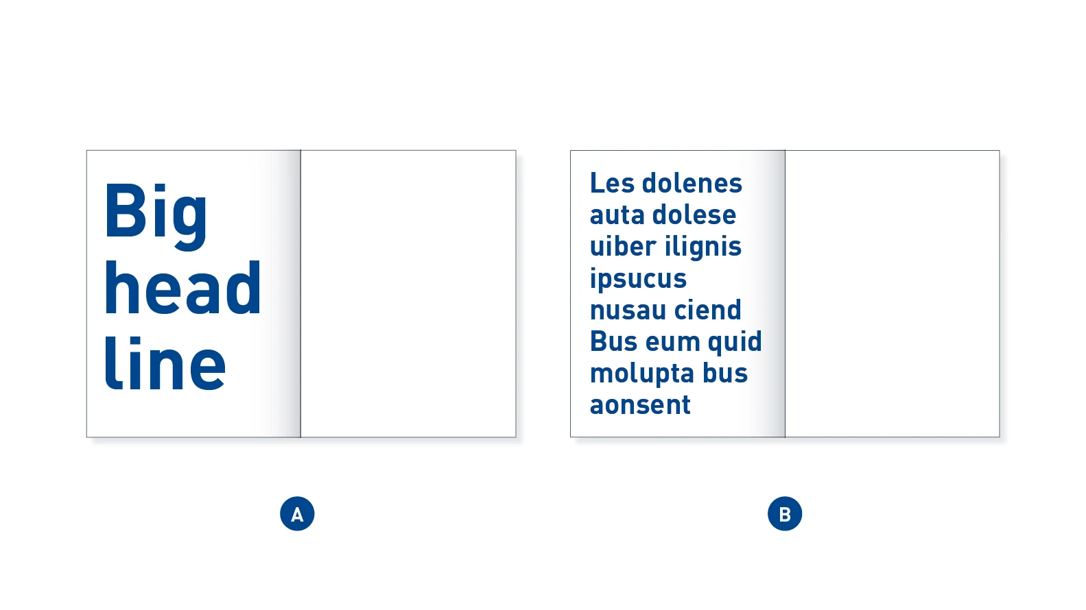
Big Type – A Big Type is short and concise, but immediately noticed due to its size (A). The statement is longer and more expansive (B). It can be a quote or a punchy statement. Both variants can fill the format, but also be shown scaled down to suit the layout.
Application examples
Re-Frame
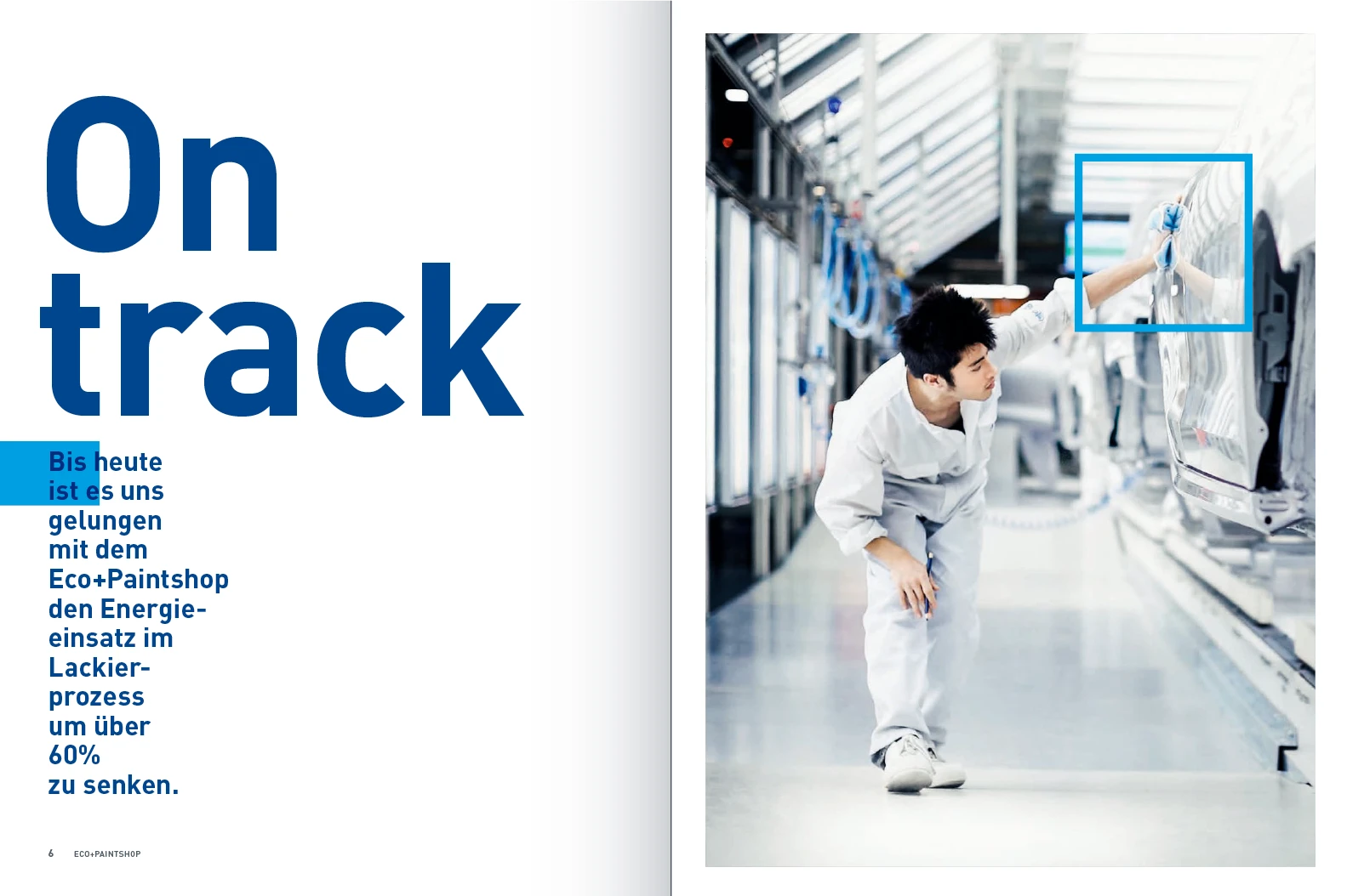
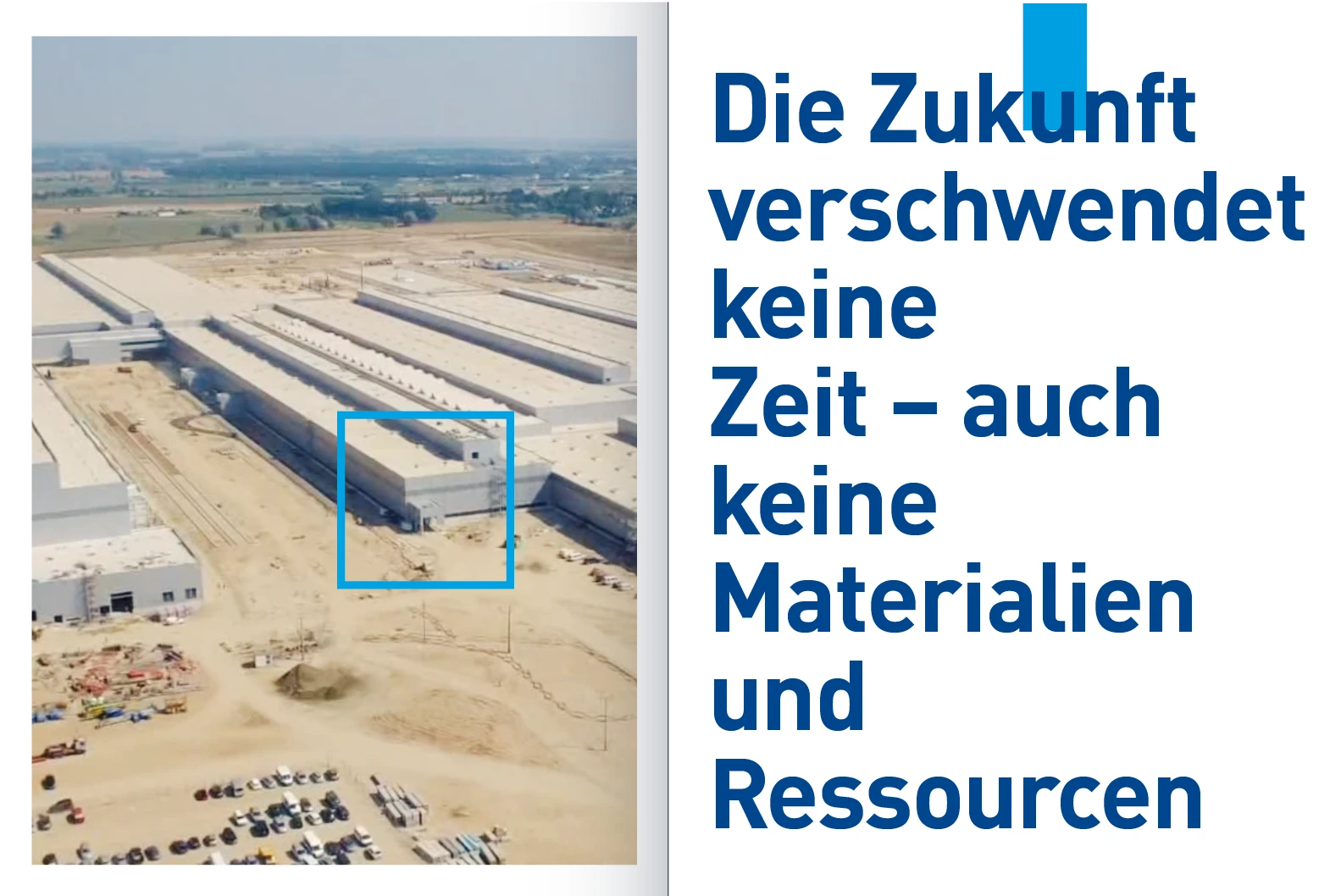
The Re-Frame stands for focusing, re-thinking, a passion for detail, and questioning. The design element encompasses certain details in the layout or holds content together. It is flexible in size and shape, and adapts to requirements.
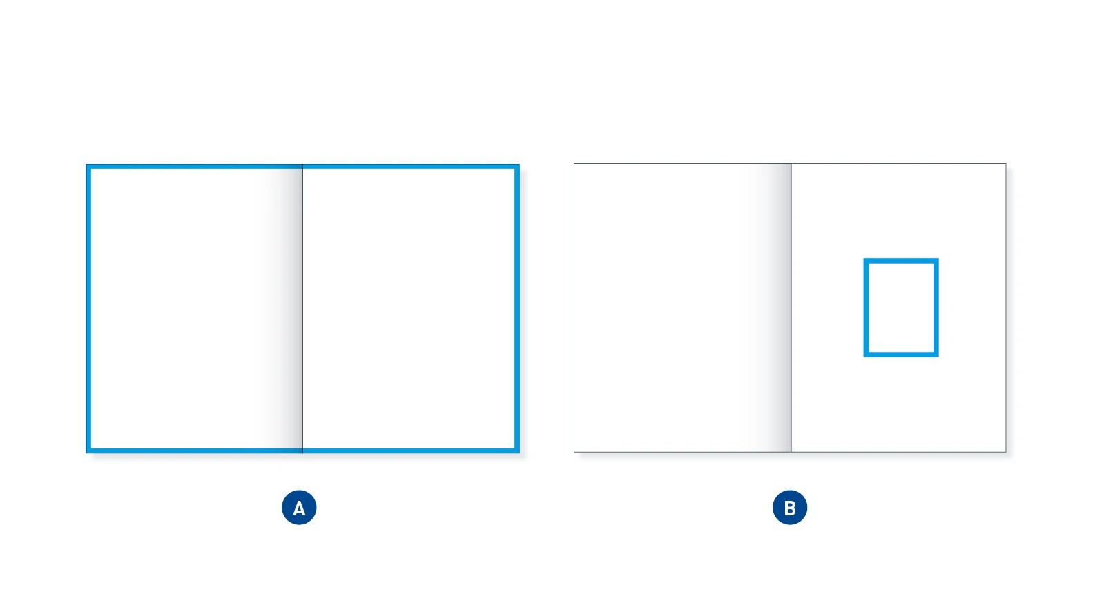
Formal Re-Frame – The formal Re-Frame frames and accentuates either the entire contents by moving to the edge of the format (A) or by emphasizing individual elements through focused framing (B). These elements can be images or texts or both.
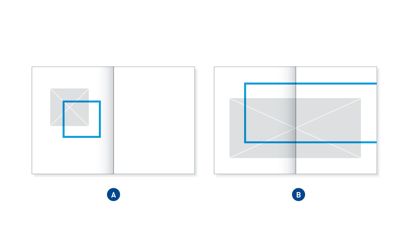
Offset Re-Frame – The offset Re-Frame focuses on certain areas of an image by extending beyond the edge of the image (A). If we were to speak about a sequence of images, the Re-Frame would be “temporally” ahead of the image. This can also extend beyond the edge of the medium and thus remains open for the content of the next page (B).
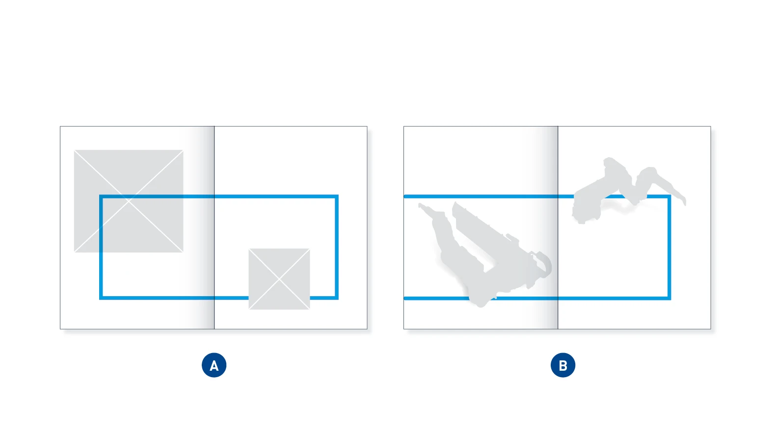
Connecting Re-Frame – The connecting Re-Frame combines free elements. It sits in front of or behind them, thus creating a connection between the objects without constricting them. It symbolizes systems, processes and content-related connections.
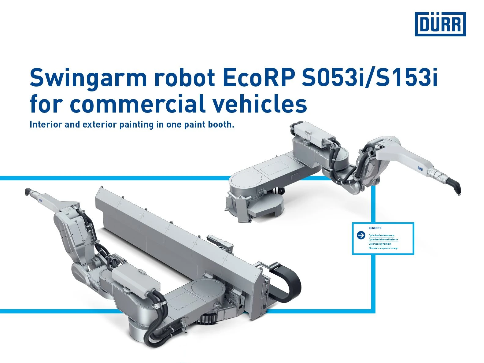
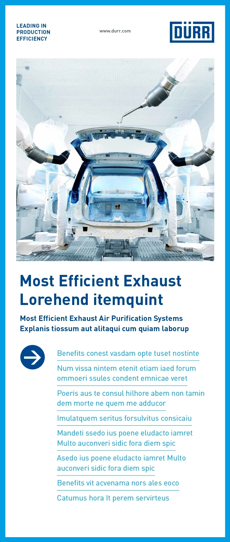
APPLICATION EXAMPLES
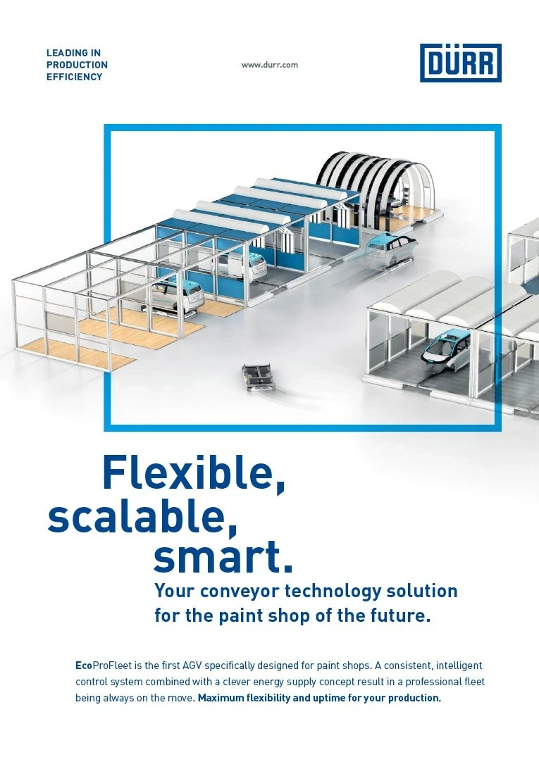
Quick-Link
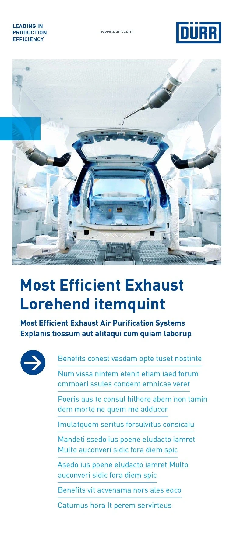
The Quick-Link stands for connection, cohesion, emphasis and networking. It structures the layout, functioning as an eye-catching feature and anchor point for viewers and readers. The Quick-Link connects elements such as images and text with one other or anchors an object to the edge of the medium.
WIDTH-TO-HEIGHT RATIO
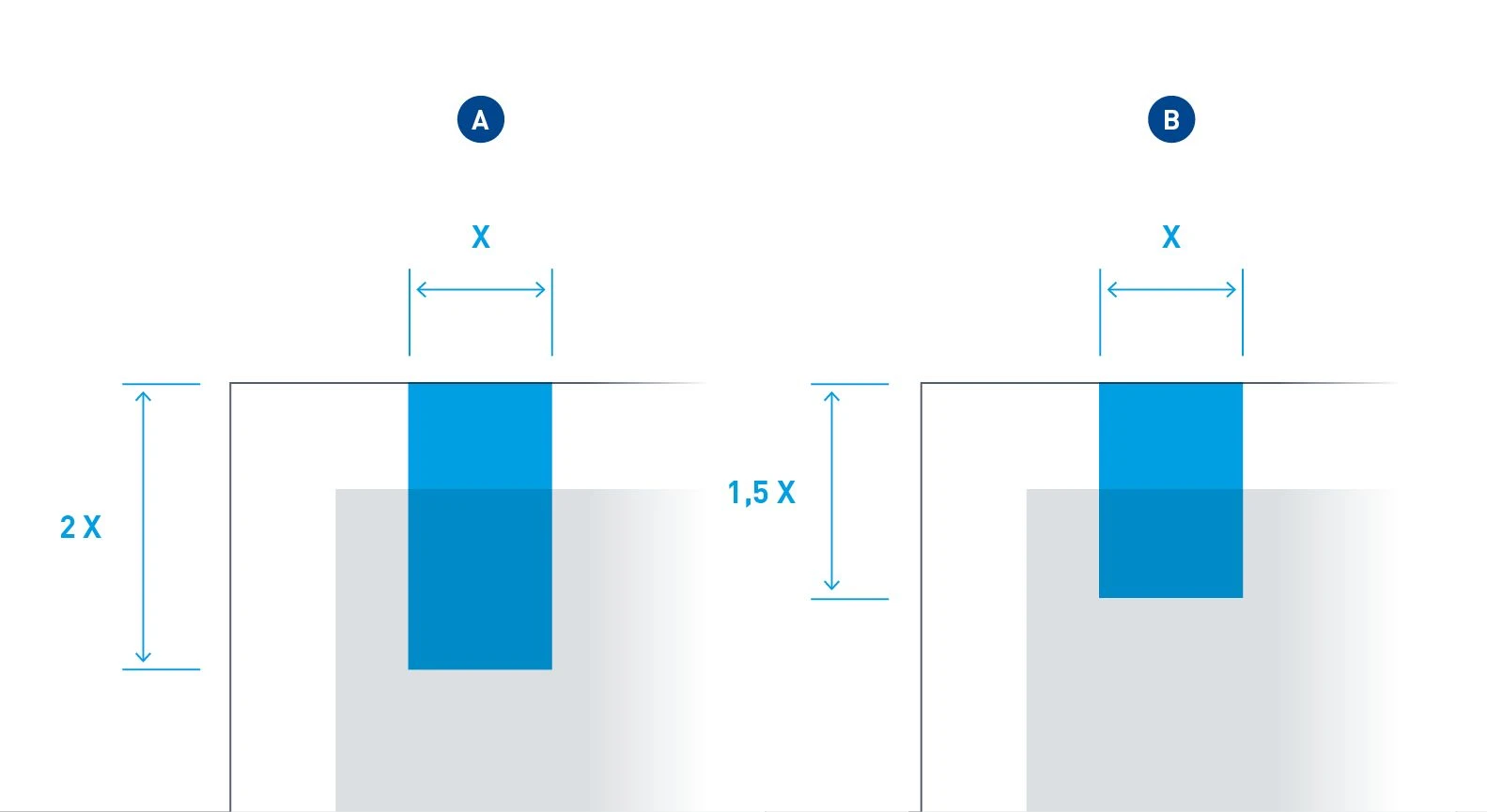
The standard design of the Quick-Link has a width-to-height ratio of 1:2 (A). Other ratios are possible, but they should be between 1:1.5 (B) (minimum length) and 1:2 (maximum length).
APPEARANCE
Depending on the background, the Quick-Link can provide coverage or appear transparent. In combination with an image, a Quick-Link with a transparent appearance must always be used to reinforce the connection between the two elements. In this case, the Quick-Link is used in “multiplied” form. Its opacity remains 100 percent. On all other backgrounds, only Quick-Links that provide coverage are used. In the same way, all Office applications must be used with a covering Quick-Link.
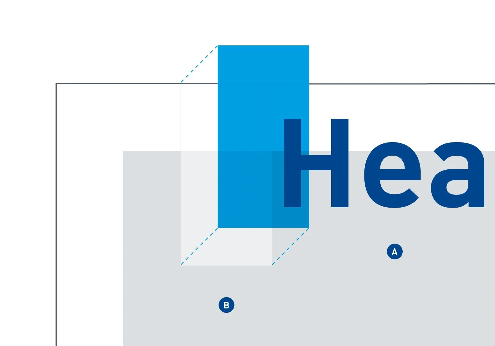
The transparent appearance relates only to the background. In combination with text, the text (A) is on the top layer, in other words, on top of the Quick-Link, and is unaffected by the transparency. Depending on the brightness of the image, an additional white transparent layer (B) can be used to ensure the best possible appearance and the correct shade of blue for the Quick-Link.
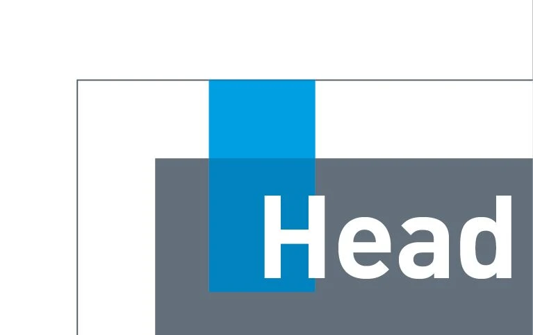
Do.
With a white layer – The color of the Quick-Link makes its full impact when the Quick-Link is combined with a dark image.
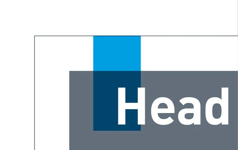
Don't.
Without a white layer – The color of the Quick-Link looks very dull and distorted on a dark background.
POSITIONING
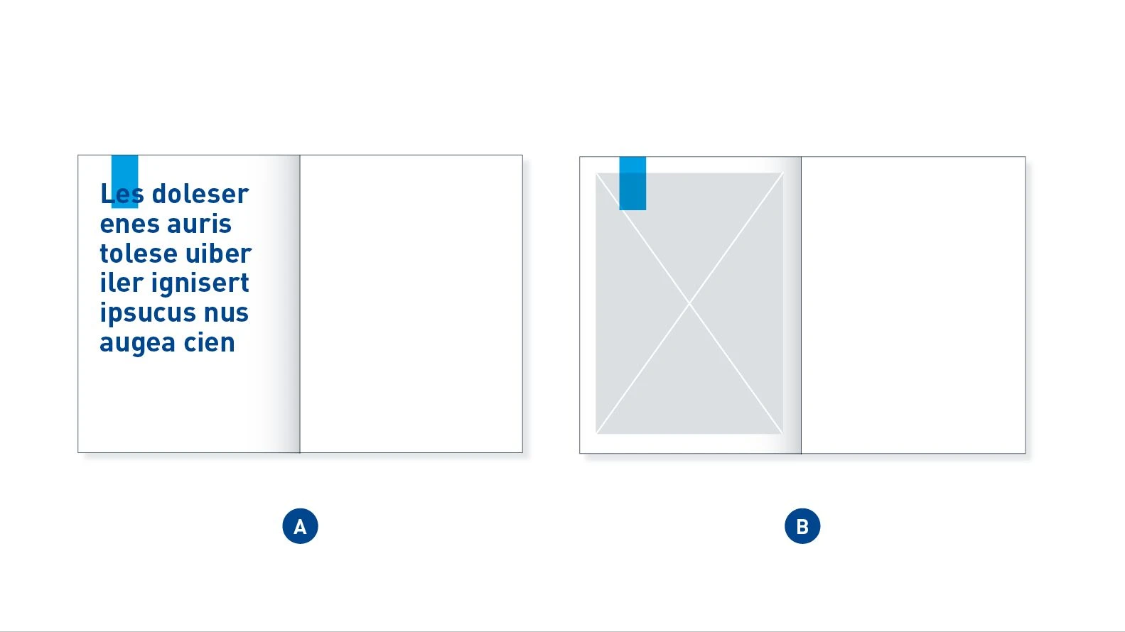
Edge-bound Quick-Link – In most cases the Quick-Link is edge-bound and overlaid with a text element (A) or positioned over an image element (B).
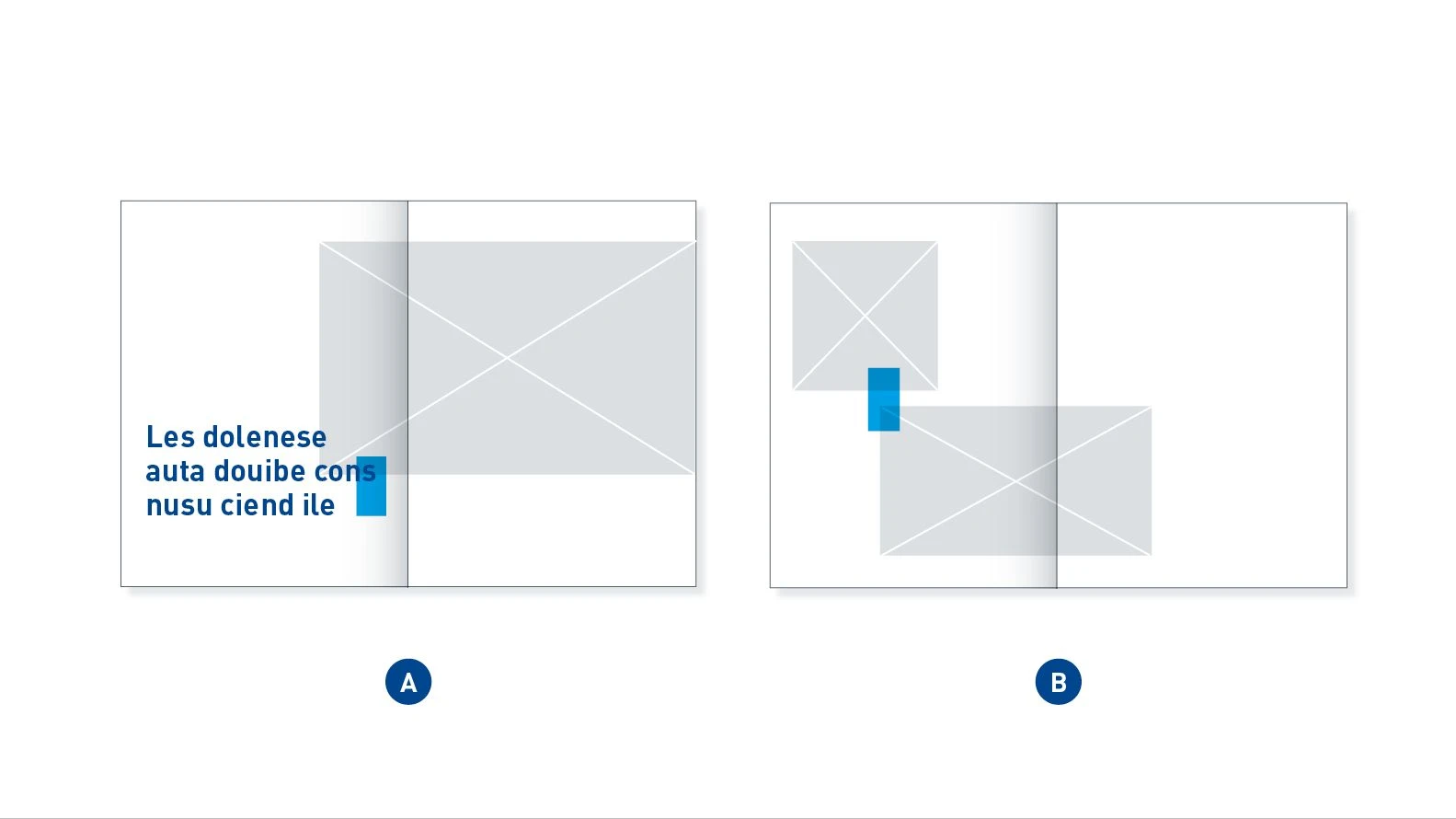
Moving Quick-Link – The Quick-Link can be used as a connection between two elements which have content that needs to be linked. It can link an image and a Big Type (A) or two images (B).
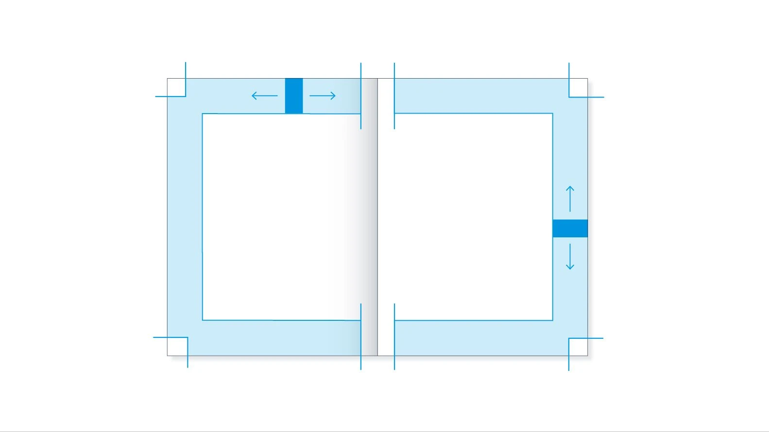
Use of the Quick-Link – The edge-bound Quick-Link can be positioned anywhere within the blue shaded area. Only one Quick-Link may be used on a page or double page.
INCORRECT POSITIONING
The Quick-Link should be positioned in a balanced relationship to the font size. It should be seen as a connecting element in the layout and not used for an unintended purpose, as in the following incorrect examples.

Don't.
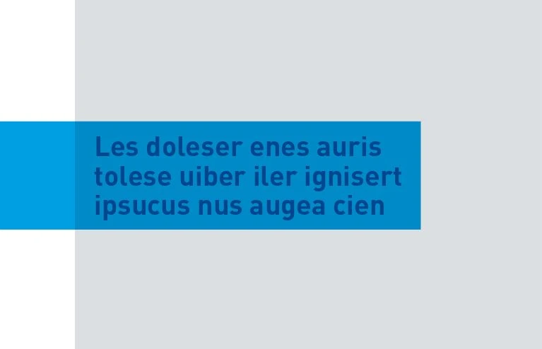
Alignment – The Quick-Link should not be aligned flush with the text, but should instead overlap it.
Don't.
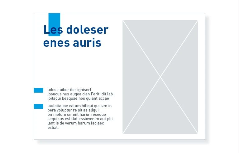
Proportions – The Quick-Link should not give the impression of being a text box. This is the result of a font that is much too small and the incorrect design of the Quick-Link, which is framing the text.
Don't.
Repetition – The layout should have only one Quick-Link as a highlight. More than one Quick-Link should not be used.
Don't.
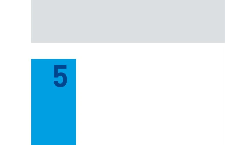
Page number – The Quick-Link must not be connected with the area around the page number.
Application examples
