The logo
Our logo is timelessly modern. It comprises the Dürr wordmark and the geometrically designed frame. The precise design conveys the values that Dürr has always stood for.
TABLE OF CONTENTS
Basics
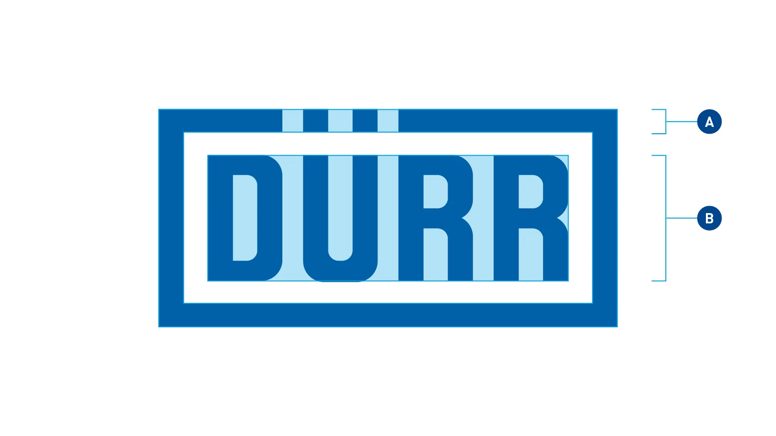
The Dürr logo as the basis of our Corporate Design – The logo comprises the wordmark Dürr (B) and the logo frame (A). The logo stands for the Dürr brand and those of its subsidiaries that don’t have their own logo.
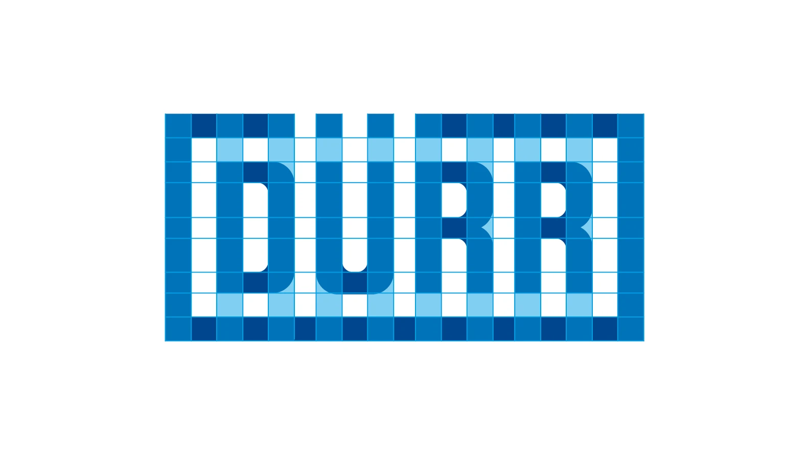
Basic geometrical arrangement – The logo is geometrically designed and based on a grid with regular distances. Uniform line widths give it a powerful effect, whatever the size used.
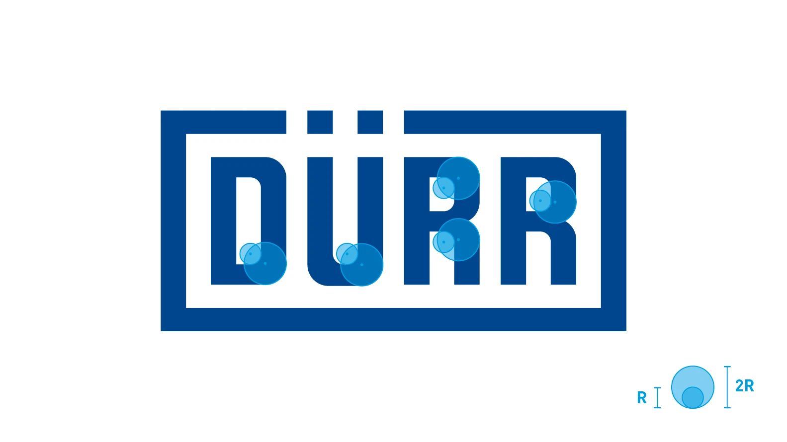
Corners and roundings – Two different radii are use for the roundings of the logo. The outer radius (2R) is twice the size of the inner radius (R).
COLOR VARIANTS OF THE LOGO
A logo is the face of a brand and of particular importance. It should only ever be shown in one color. To strengthen the brand, the color variants are kept to a minimum. More extensive color variants are not allowed. 3D effects such as shadows, flattened edges or relief are not allowed either.
Basic Blue on White – This is the most frequently used form.
Logo in Dark Gray – This reserved, monochrome variant is only used in exceptional circumstances.
Negative variant – The white negative variant is used on single-color backgrounds and on dark images.
Use of the logo
BACKGROUNDS OF THE LOGO
The logo may only be used in a single color, positively or negatively. Filling the logo background with white is not allowed. Attention must be paid to the contrast with the background. The logo form must be clearly identifiable.
Do.
Do.
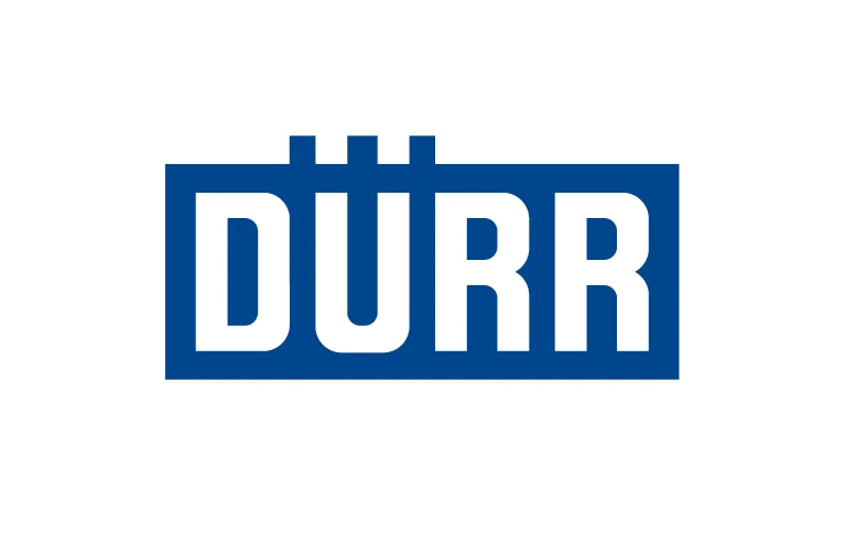
Don't.
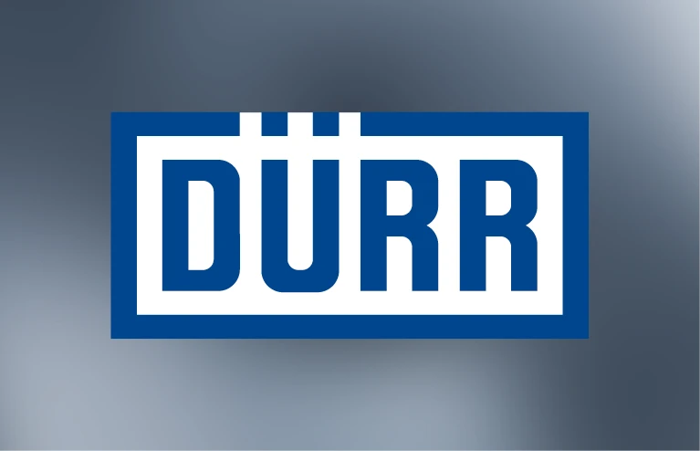
Don't.
THE LOGO ON IMAGES
Ensure there is sufficient contrast between the logo in the foreground and the background. The logo should stand out clearly. The background should be a uniform, calm area.
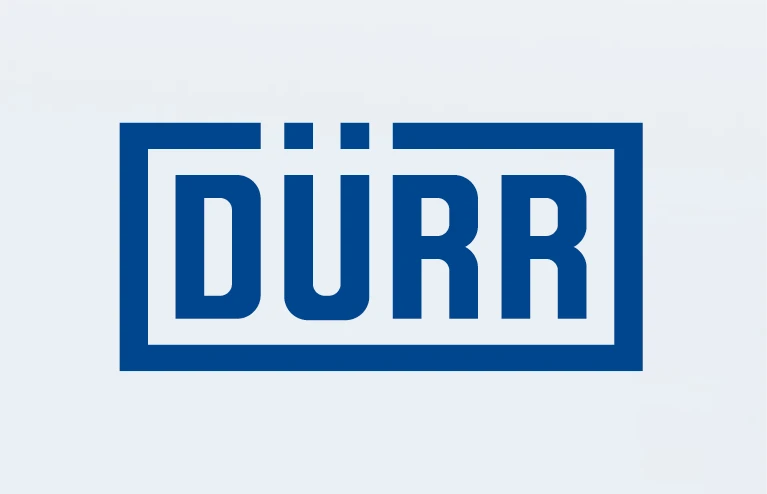
Do.
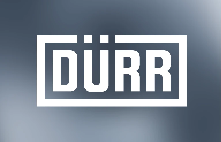
Do.
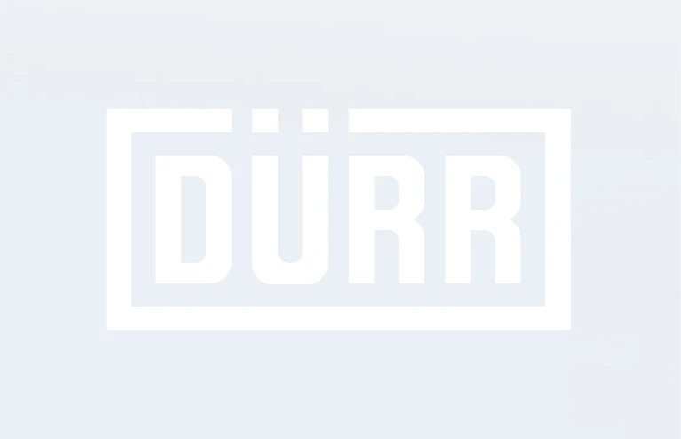
Don't.
Don't.
THE LOGO’S CLEAR SPACE
To strengthen the Dürr brand, we basically use the original logo without any additions. It must not be combined with text or other elements. An exception to this rule are the logos of the subsidiaries, which have an appended name.
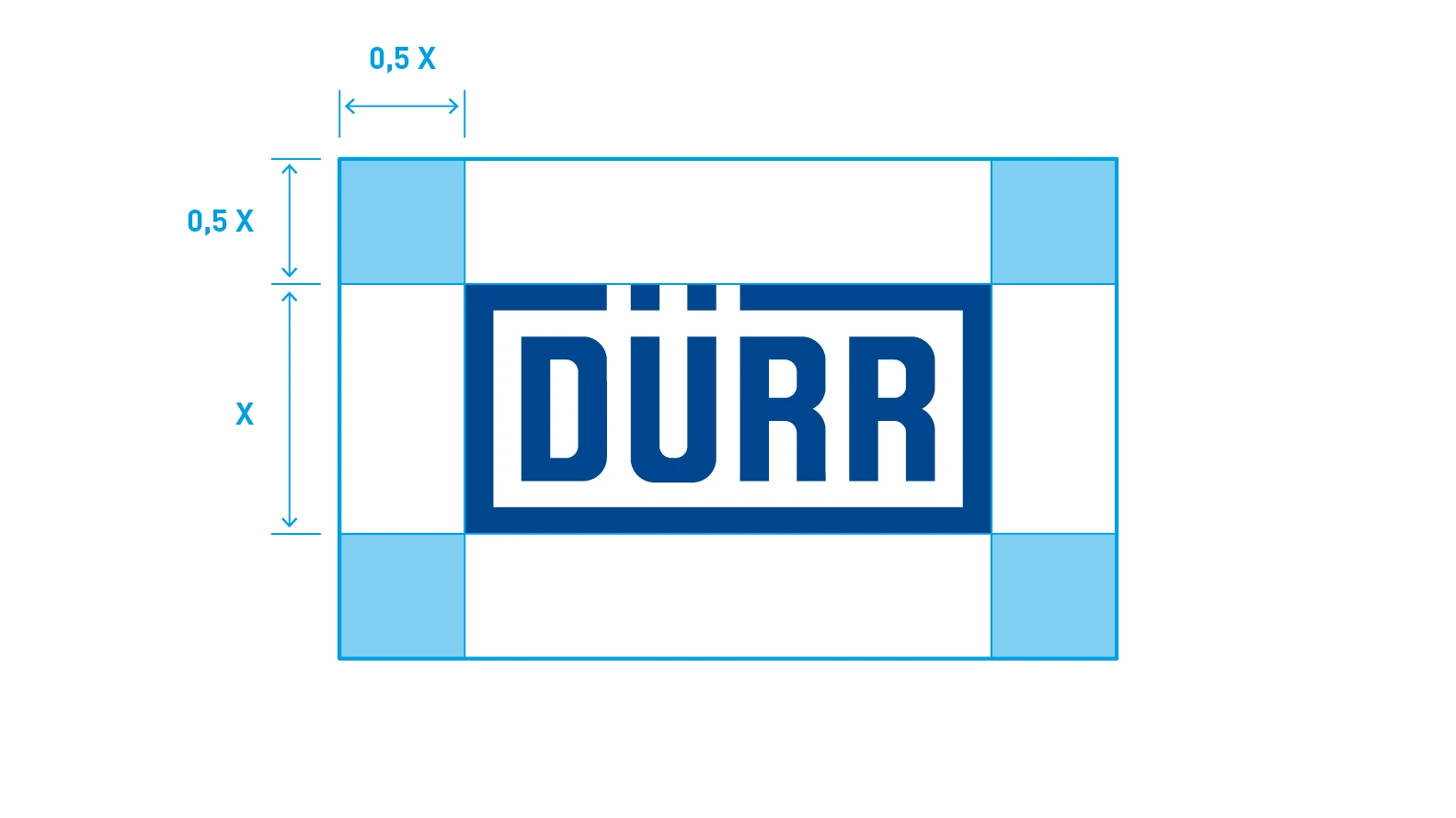
The minimum distance – In the layout, the logo is always placed at least half the logo height (X) from other layout elements. The appended names of the subsidiaries are the exception to the rule.
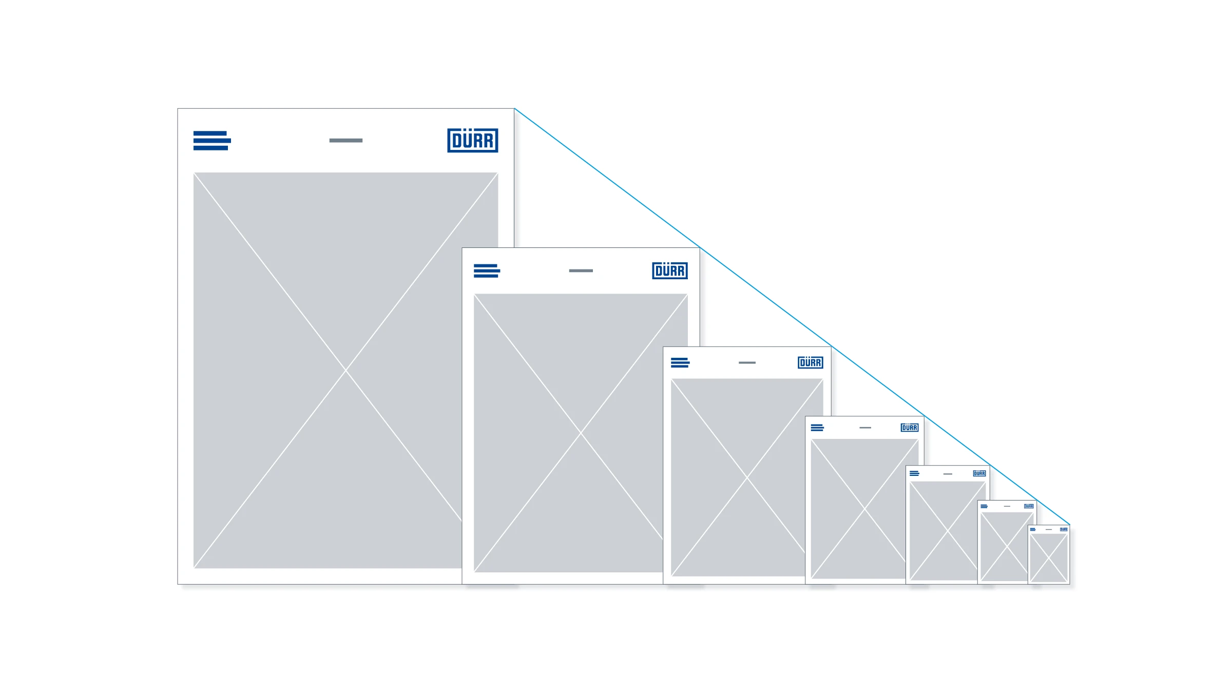
Placement of the logo
The positioning of the logo in the medium is just as important for its impact. Consistent placement gives a medium the typical character of the Dürr brand.
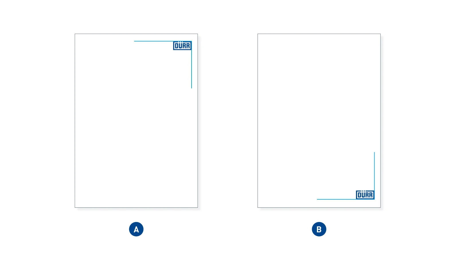
The logo position – The logo may in principle be placed in any corner of the medium. However, it is most frequently used in the upper-right corner of the format (A), and somewhat less frequently in the lower-right corner (B).
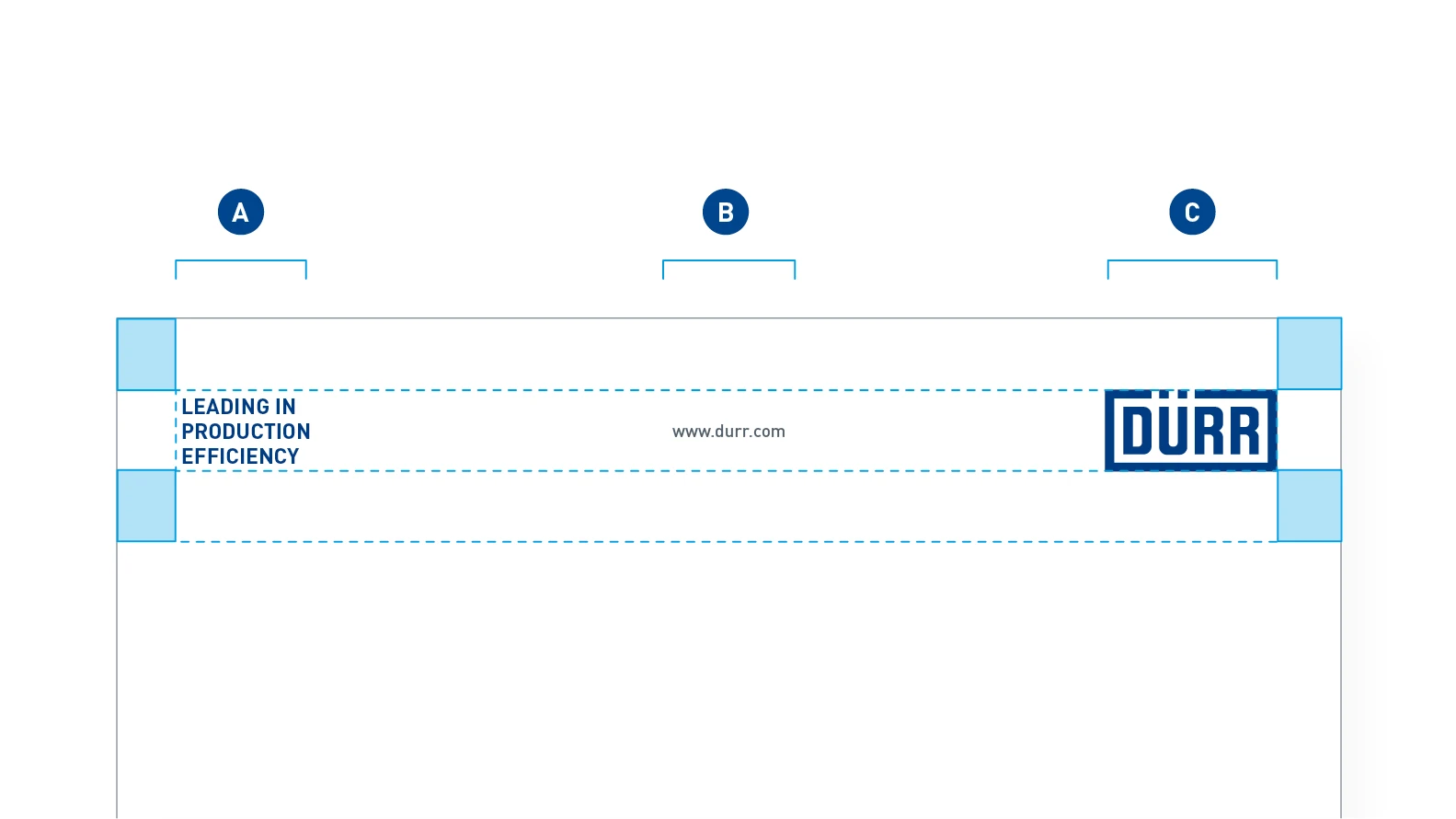
Standard logo header – The logo header is a frequently recurring layout element. It is mainly used in communication media aimed at the customer. The header forms a unit consisting of the Dürr claim (A), Dürr URL (B) and Dürr logo (C). The logo and claim complement each other in opposing corners. The Dürr URL (B) is centered in the print space.
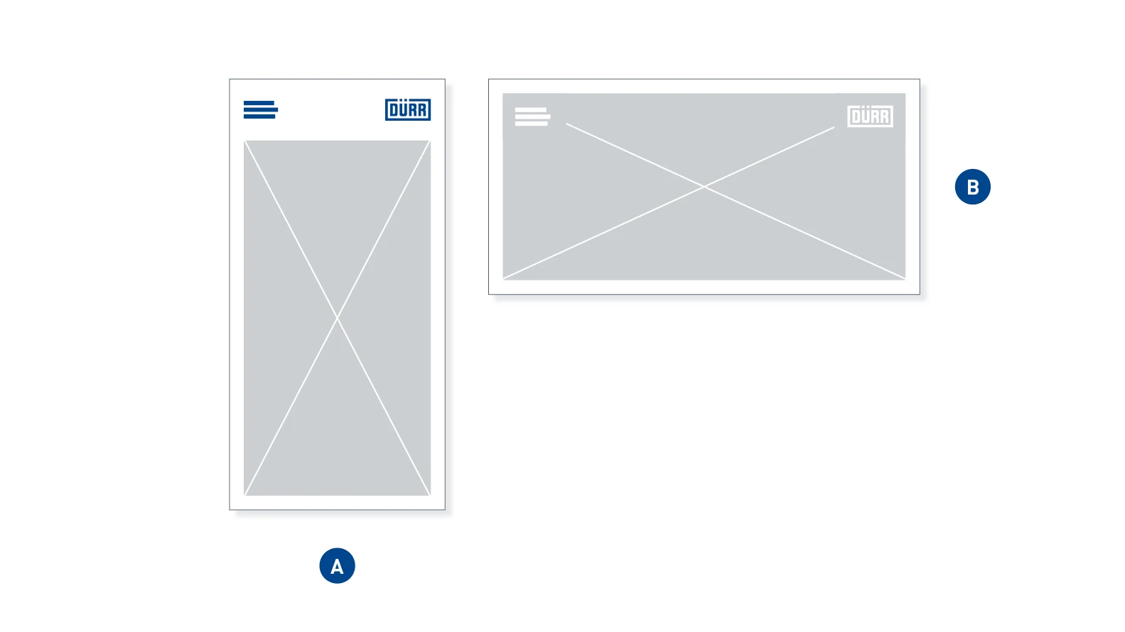
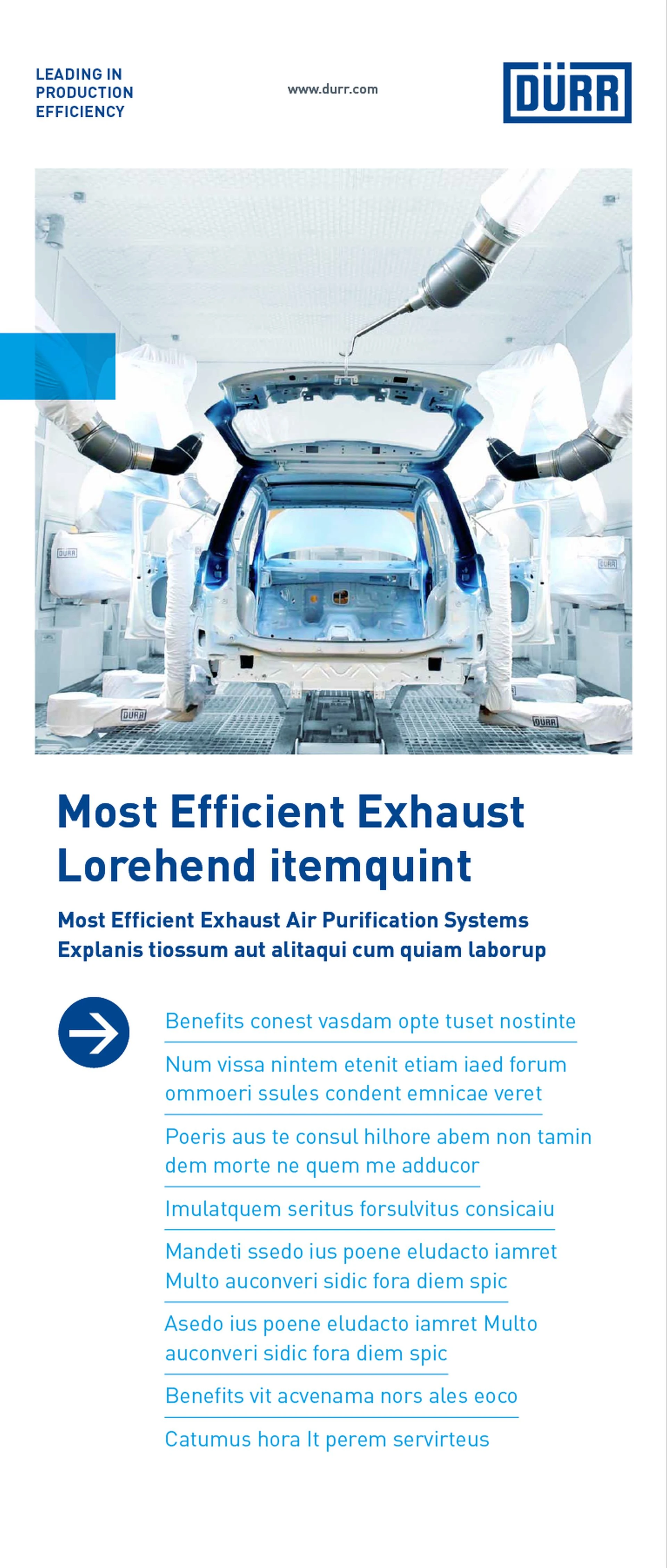
Logo header without URL – The URL is not required for extreme portrait and landscape formats such as DIN Long portrait (A) and DIN Long landscape (B).
SIZE DEFINITIONS
For printed external communication media, the height of the logo (A), the height of the logo header, and the width of the surrounding frame (B) are fixed for each DIN format. The following table defines these for the most common formats.
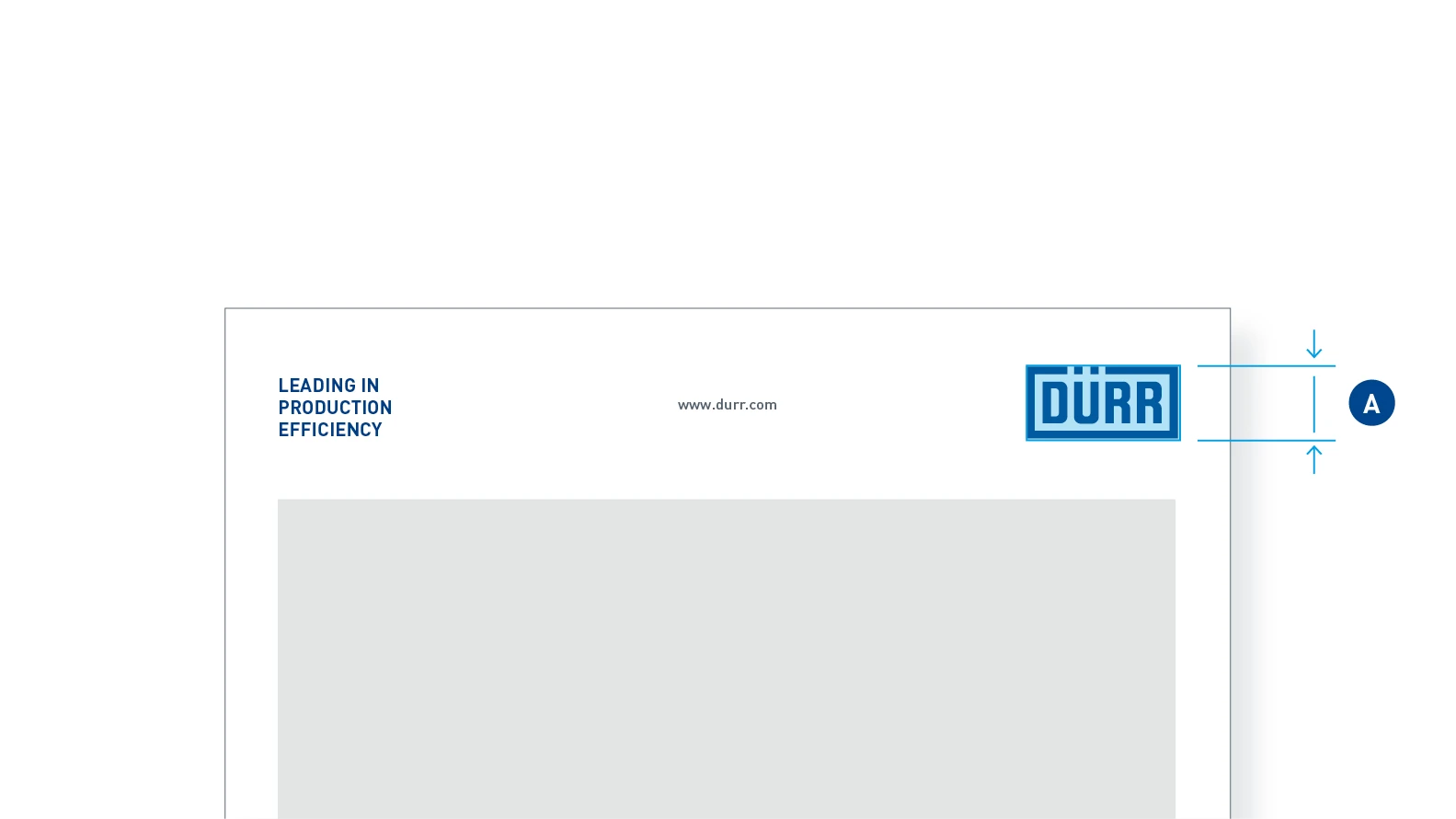
A – Logo height
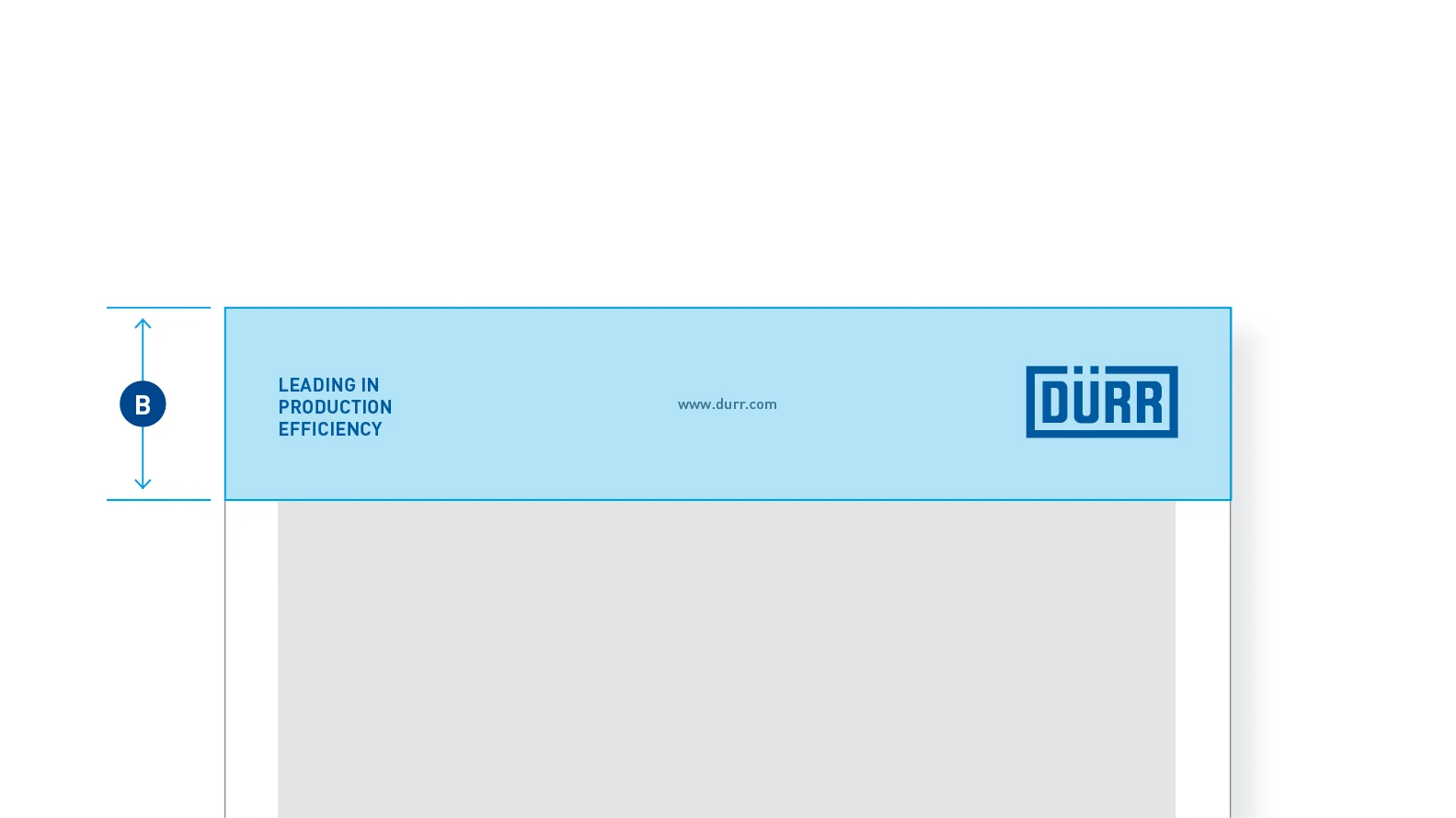
B – Logo header height
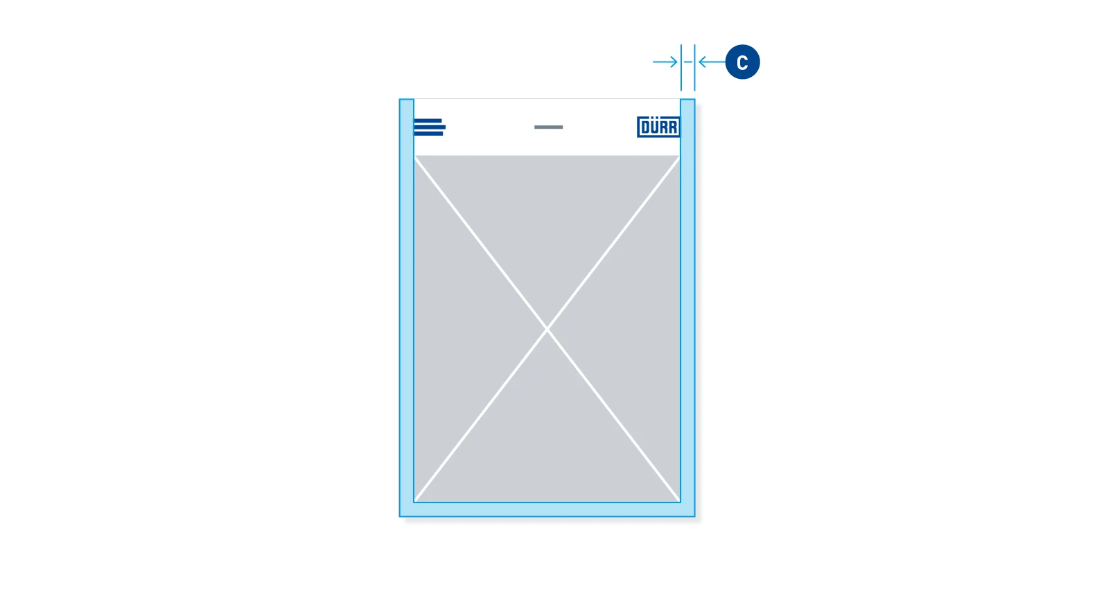
C – Margin
STANDARD DIMENSIONS FOR DIN FORMATS
| Portrait and landscape formats | (A) Logo height | (B) Logo header height | (C) Margin width | |
| DIN A0 (841 x 1189 mm) | 60 mm | 160 mm | 40 mm | |
| DIN A1 (594 x 841 mm) | 42 mm | 115 mm | 30 mm | |
| DIN A2 (420 x 594 mm) | 30 mm | 80 mm | 20 mm | |
| DIN A3 (297 x 420 mm) | 21 mm | 57 mm | 14 mm | |
| DIN A4 (210 x 297 mm) | 15 mm | 40 mm | 10 mm | |
| DIN A5 (148 x 210 mm) | 11 mm | 30 mm | 8 mm | |
| DIN A6 (105 x 148 mm) | 8.5 mm | 22 mm | 6 mm | |
| DIN Lang (105 x 210 mm) | 10.5 mm | 30 mm | 7 mm |
LANDSCAPE FORMATS
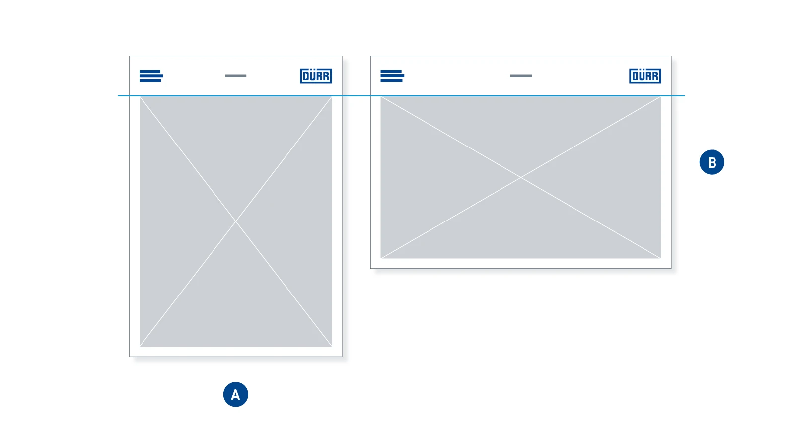
Logo header in landscape format – In portrait (A) and landscape format (B) with the same dimensions, most of the factors remain identical: Logo height and logo header height. Only the distances between the elements vary.
APPLICATION EXAMPLES
