Typography
Typography plays a decisive role in Dürr’s new Corporate Design. The typography used by Dürr can be loud and striking as well as quiet and serious. It is both linear and consistent as well as free and playful. And yet Dürr’s character is identifiable in all printed and digital media.
The house font Barlow
Barlow is a clearly drawn sans serif font that is particularly easy to read thanks to its open design and conveys content precisely. As Dürr's corporate font, it can be used in the new corporate design in a range of styles, from bold and confident to light and dynamic. Its balanced proportions and clear, uniform shapes harmonize with the linear appearance of the Dürr logo. With its modern, functional effect, Barlow supports consistent, confident brand communication across all media. It works reliably in small font sizes and at the same time appears strong and present in large headlines and striking applications.
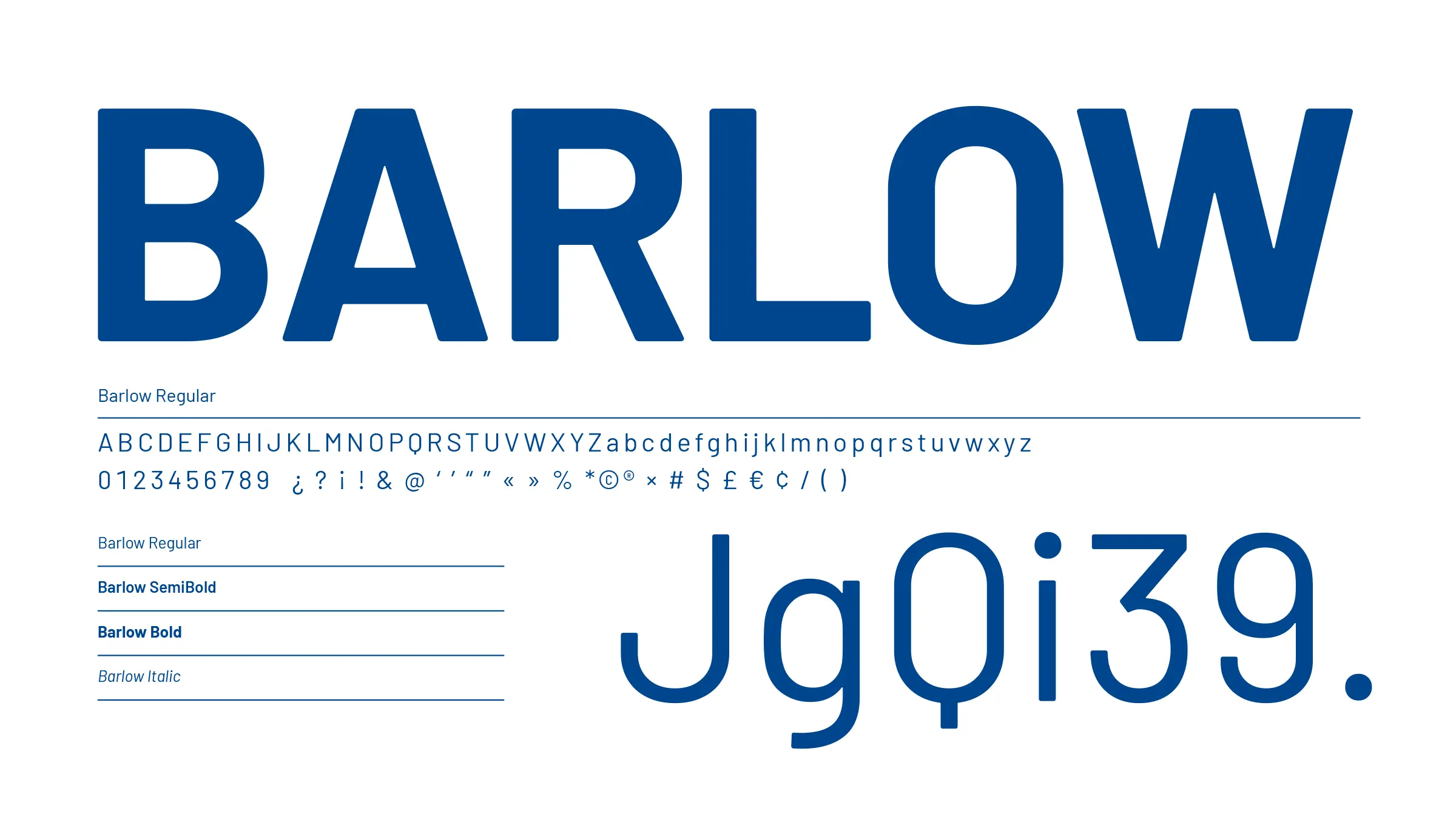
Typographic elements
| Font style | Use |
|---|---|
| Barlow Regular | Copy, captions |
| Barlow Semibold | Intermediate headlines in tables |
| Barlow Bold | Headlines, subheadlines, intermediate headlines, text excerpts |
| Barlow Italic | Only in exceptional circumstances for highlighting details, e.g. business cards |
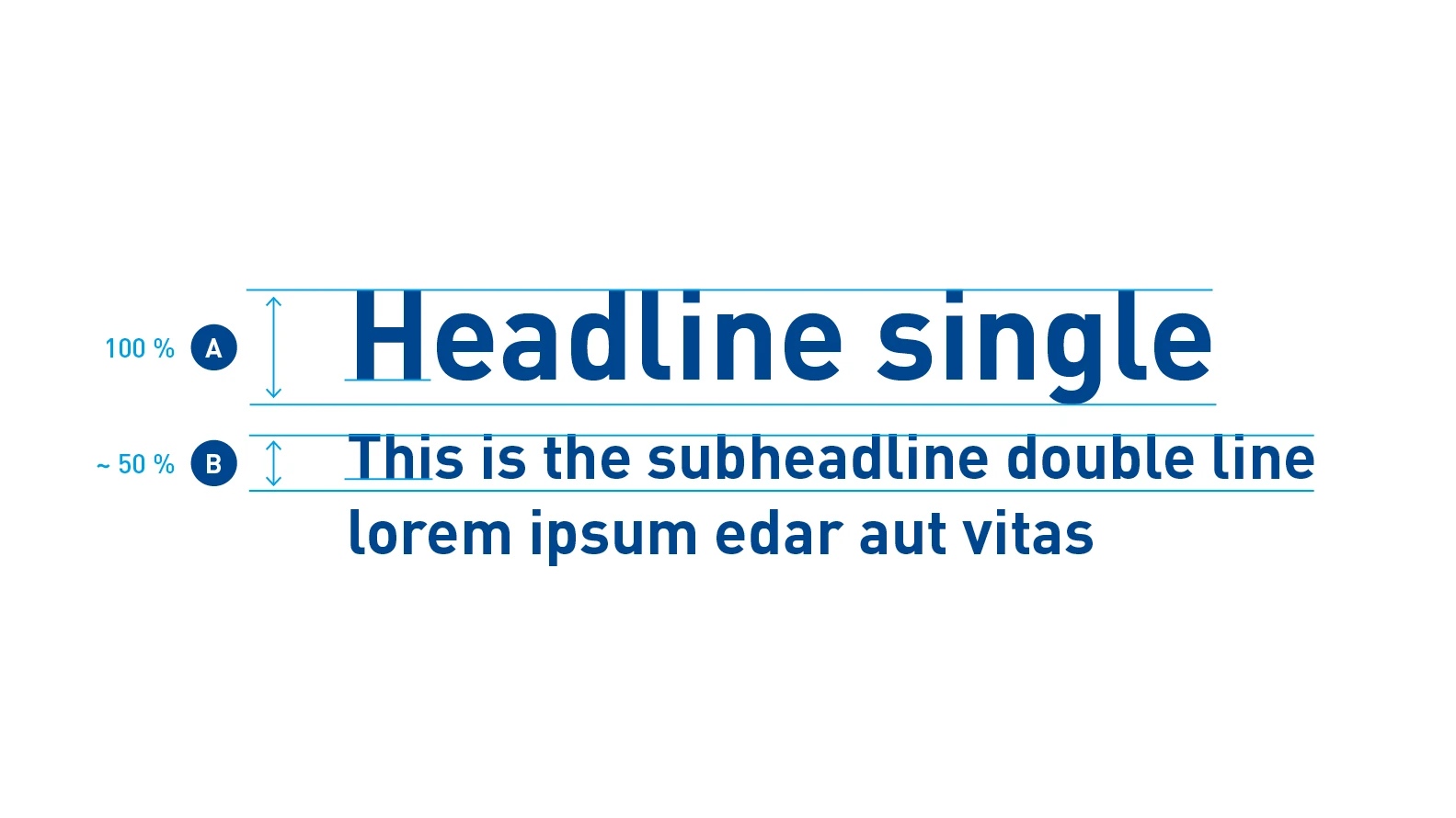
Headline element – Headlines are the visual anchor for the person viewing the layout. They structure a page and give it a long-range effect. In Dürr communication media, headlines and subheadlines are essentially formatted in Barlow Bold and Barlow Semibold in Basic Blue. The font sizes of the headline and subheadline are balanced in relation to each other. The guideline for the size of the subheadline in relation to the headline is 50 %. For special applications, the aspect ratio can also be varied by arrangement.
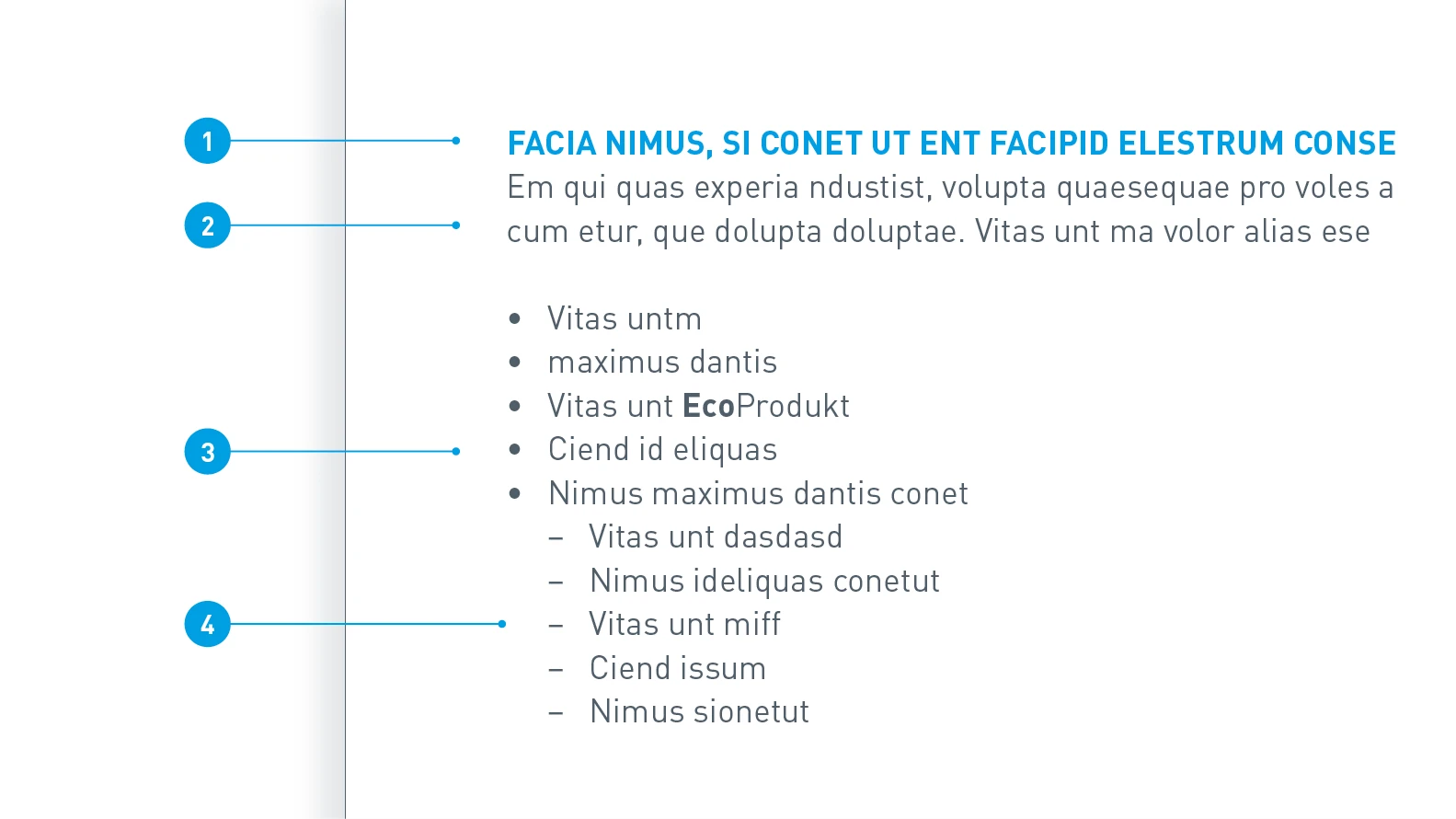
Copy formatting
- Intermediate headline: Barlow Bold, uppercase, text color Digital Light Blue
- Copy: Barlow Regular, text color Dark Gray
- List level 1: Barlow Regular, list character bullet point, text color Dark Gray
- List level 2: Barlow Regular, list character dash with indent, text color Dark Gray
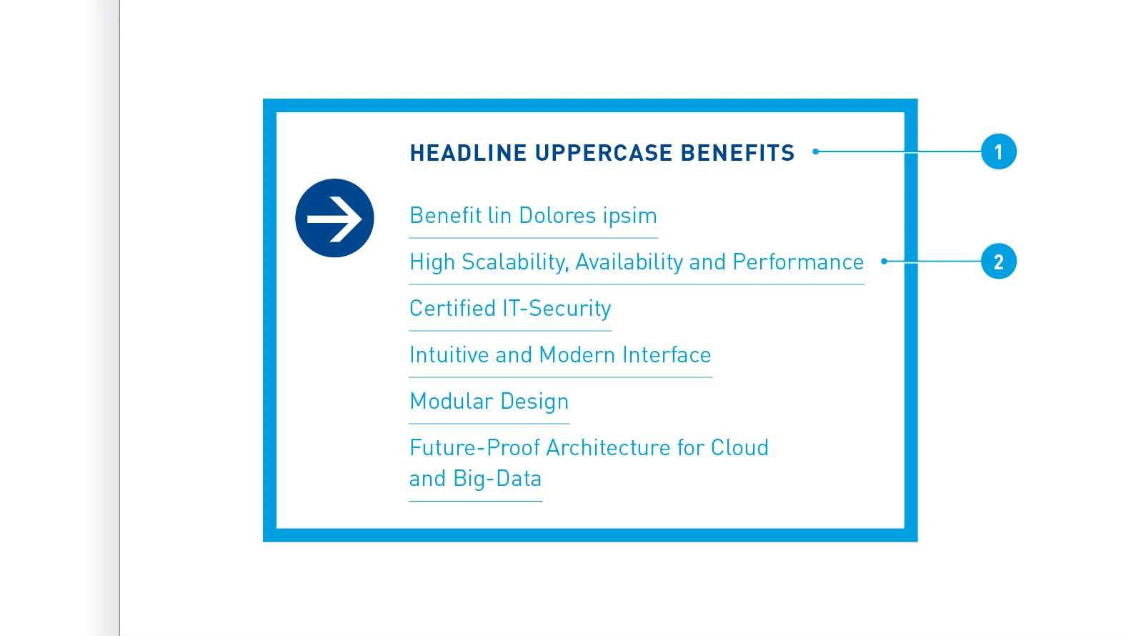
Benefit element formatting
- Subheadline: Barlow Bold, uppercase, text color Basic Blue
- Bulleted list: Barlow Regular, title case, text color Digital Light Blue, with paragraph line
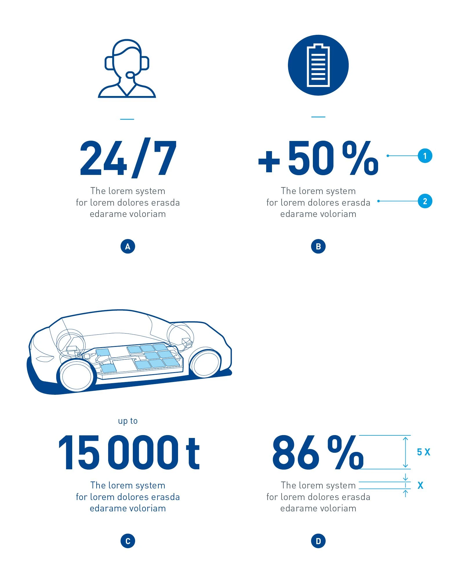
Key figure element – Key figure elements consist of Big Type and accompanying text. They can be combined as required with an icon (A), an inverted icon (B) or an illustration (C) or used as a stand-alone element (D). When used with an icon, the key figure element has an additional horizontal dash in Light Blue. The text should not exceed 4 lines or 100 characters.
Formatting of the key figure element
- Key figure: Barlow Bold, text color Basic Blue
- Text: Barlow Regular, title case, text color Basic Gray (or Basic Blue – in combination with an illustration)
The font size depends on the medium and the application. The ratio between the size of the key figure and the text must always be taken into consideration. It is 1:5.
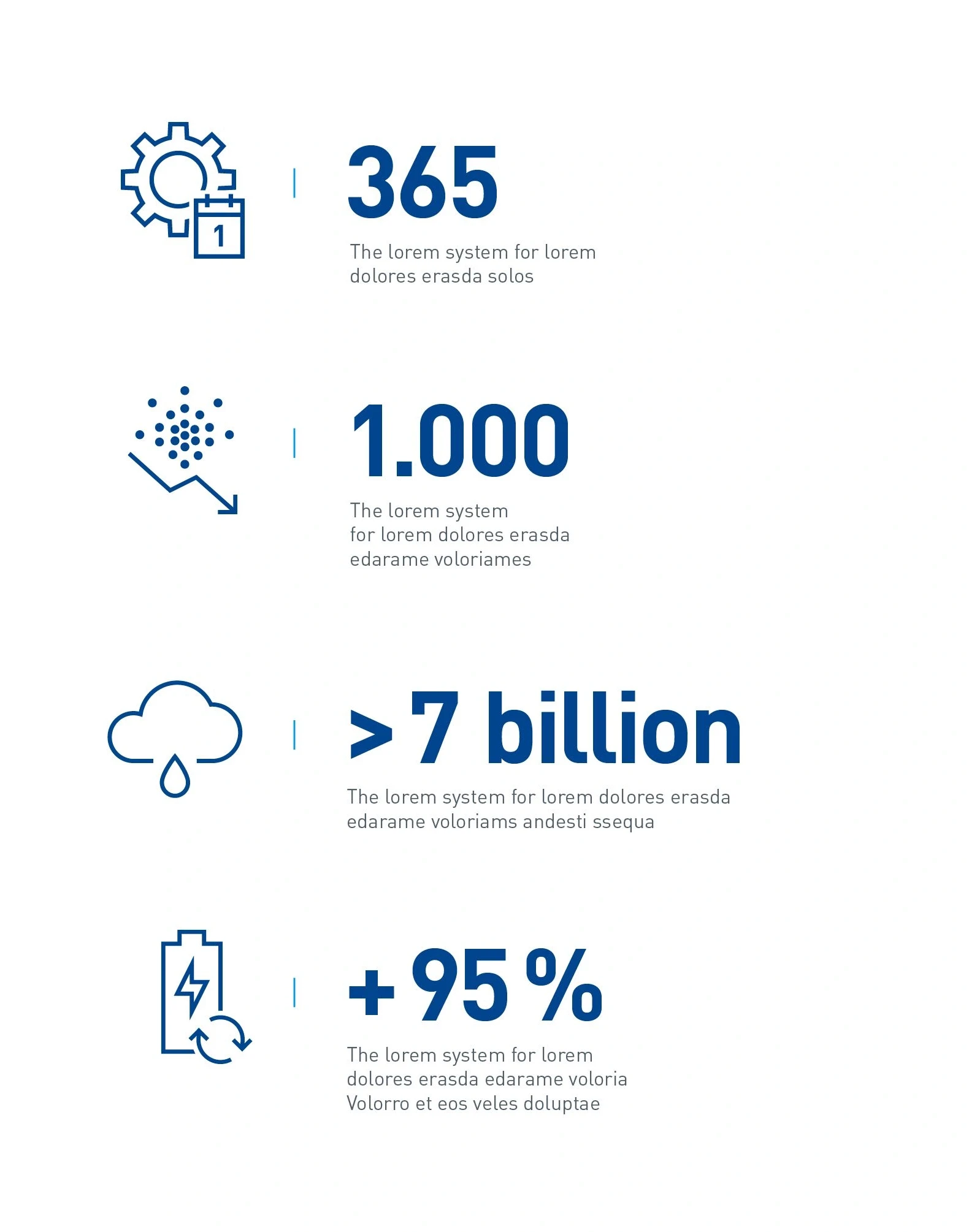
The horizontal design of the key figure element has a centrally positioned dash in Light Blue between the icon/illustration and the key figure in the same way as in the vertical alignment. The text is aligned flush left with the key figure. All the other design principles are unchanged and are based on those of the vertical alignment.
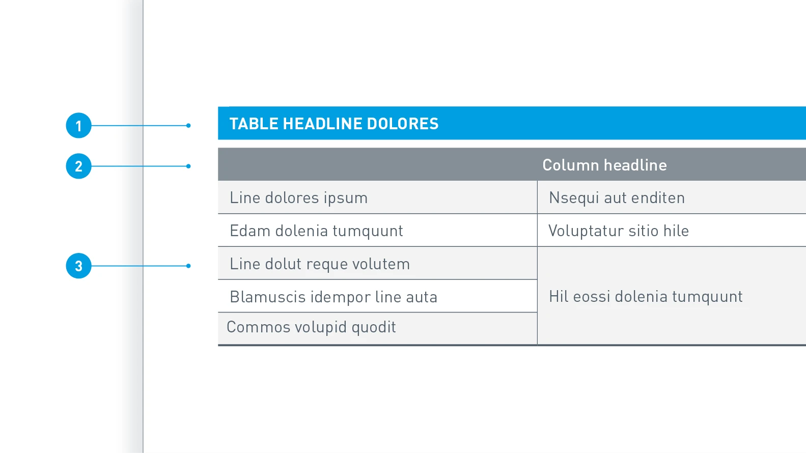
Table formatting – For quick orientation, we use Digital Light Blue for the background of the headline. The table contents have a factual and informative structure. The same font size is used throughout, including for the header.
- Header: Background in Digital Light Blue, text color White, Barlow Bold, uppercase
- Column header: Background 70 % Dark Gray, text color White, Barlow SemiBold, title case
- Cells: Background alternately 50 % Light Gray and White, text color Dark Gray, Barlow Regular
In terms of content, the address block can be enlarged or reduced, or even left out completely. The contents of the main or sub-brands are inserted depending on the sender of the medium. The respective media templates define the position of the block. Form and formatting remain constant in each application.
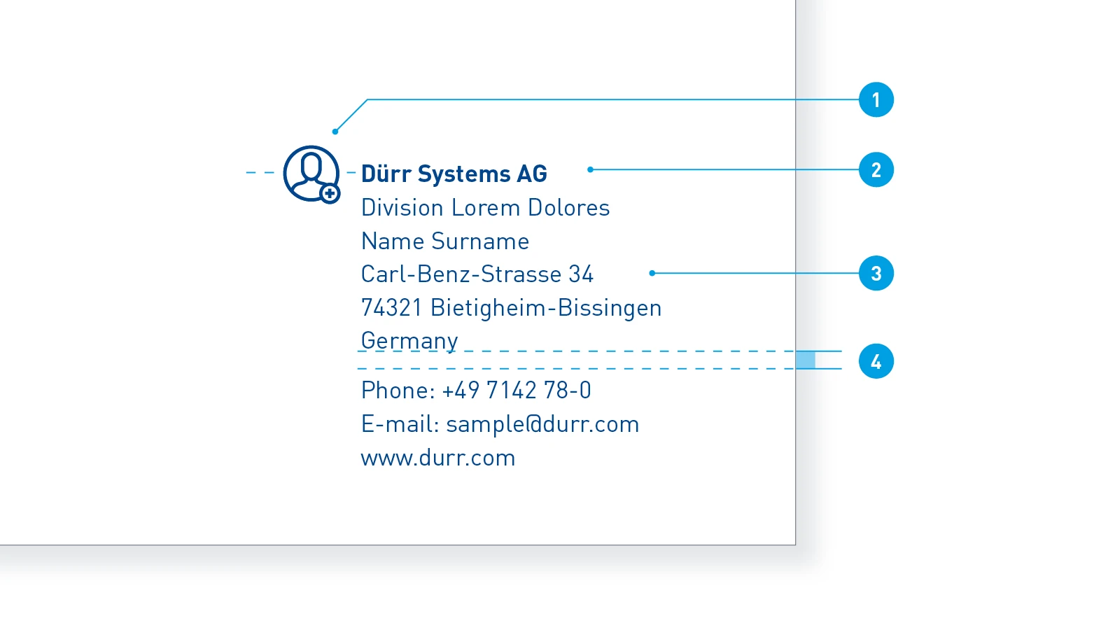
Use on rear – In most cases, the address block is used on the rear of print media, such as on brochures. The text color, like the surrounding elements on the rear, is 100% Basic Blue.
- Icon: Outline style in 100% Basic Blue
- Company name: Text color 100% Basic Blue, Barlow Bold
- Address: Text color 100% Basic Blue, Barlow Regular
- Spacing: 50% of the line spacing as additional spacing
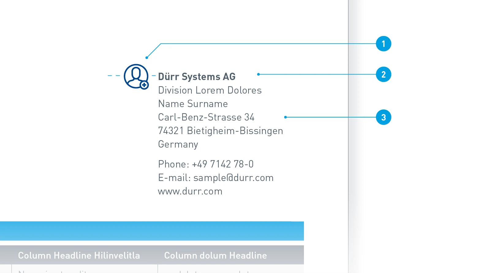
Use on contents page – With some media, such as the data sheet, it may be necessary to integrate the address block into the contents page for reasons of space. The text color then changes to 100% Dark Gray, while the Blue of the icon remains.
- Icon: Outline style in 100% Basic Blue
- Company name: Text color 100% Dark Gray, Barlow Bold
- Address: Text color 100% Dark Gray, Barlow Regular
APPLICATION EXAMPLES
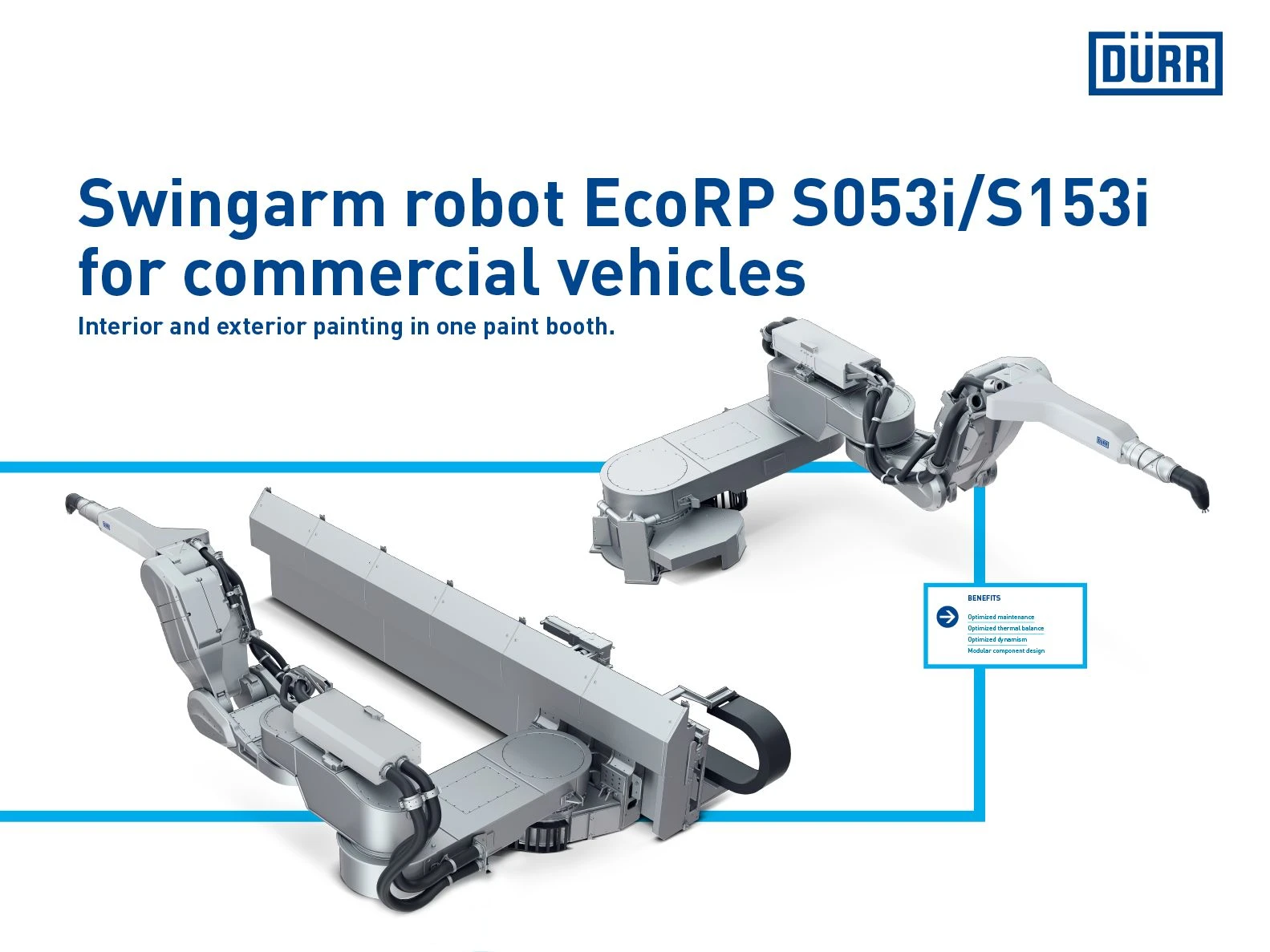
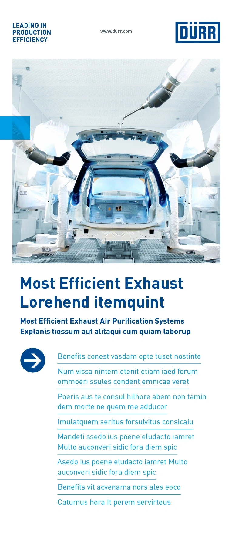
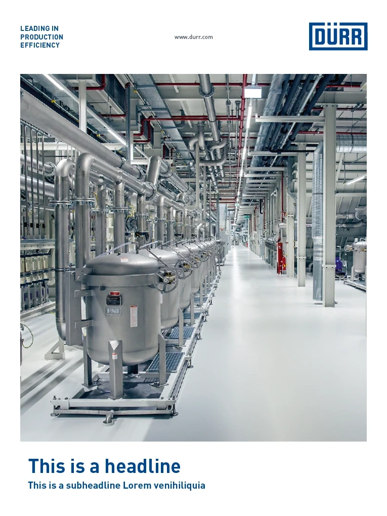
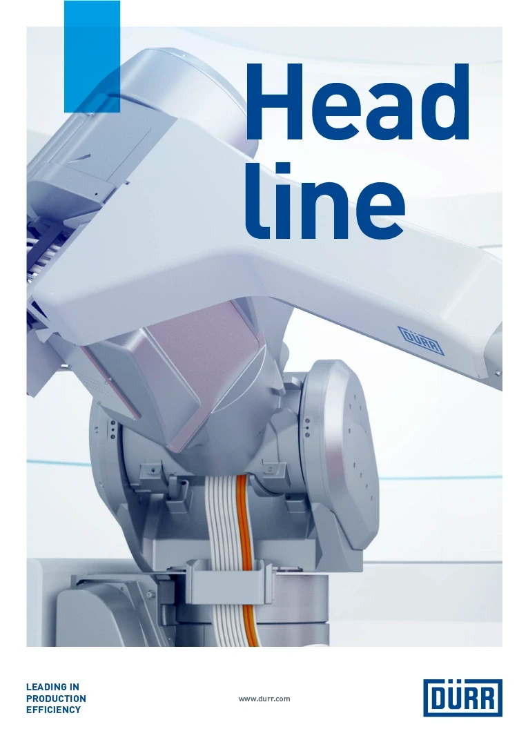
Barlow is used in all communication media that represent the Dürr brand externally: printed and digital communication media, films and animations as well as trade fair banners and machinery labeling.
The Office font Arial
Dürr uses Arial as the Office font. It is available almost without restrictions, i.e., worldwide and on every computer. It is straightforward to use and has a look of reliability, making it the ideal complement to Dürr’s in-house communication. It is balanced, objective and produces an easy-to-read, standalone typeface.
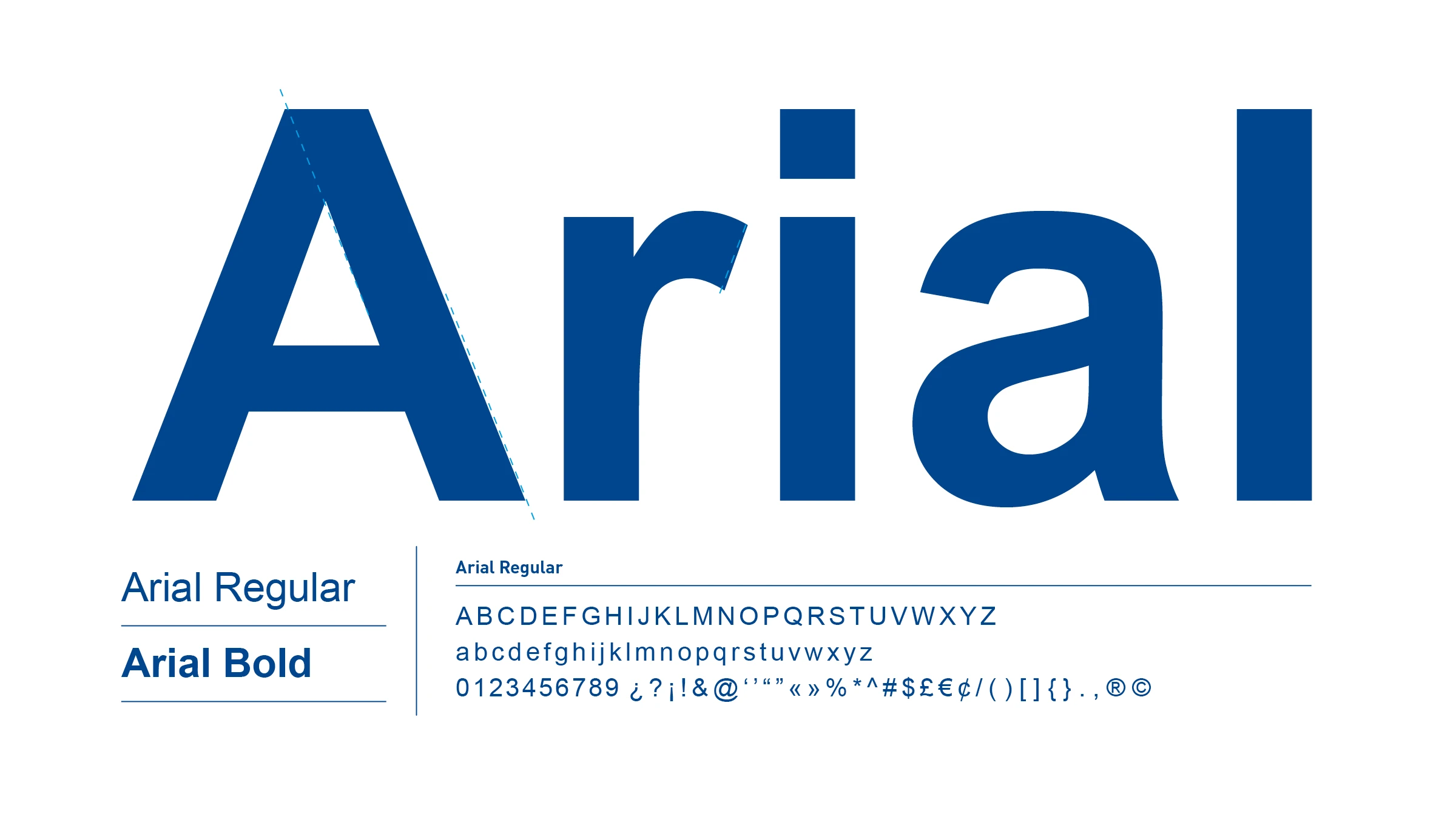
Arial font styles – Arial includes Regular and Bold font styles. Similar to Barlow, Arial Bold is used for headlines, subheadlines, intermediate headlines and highlighted text. Arial Regular is used for copy.
APPLICATION EXAMPLES
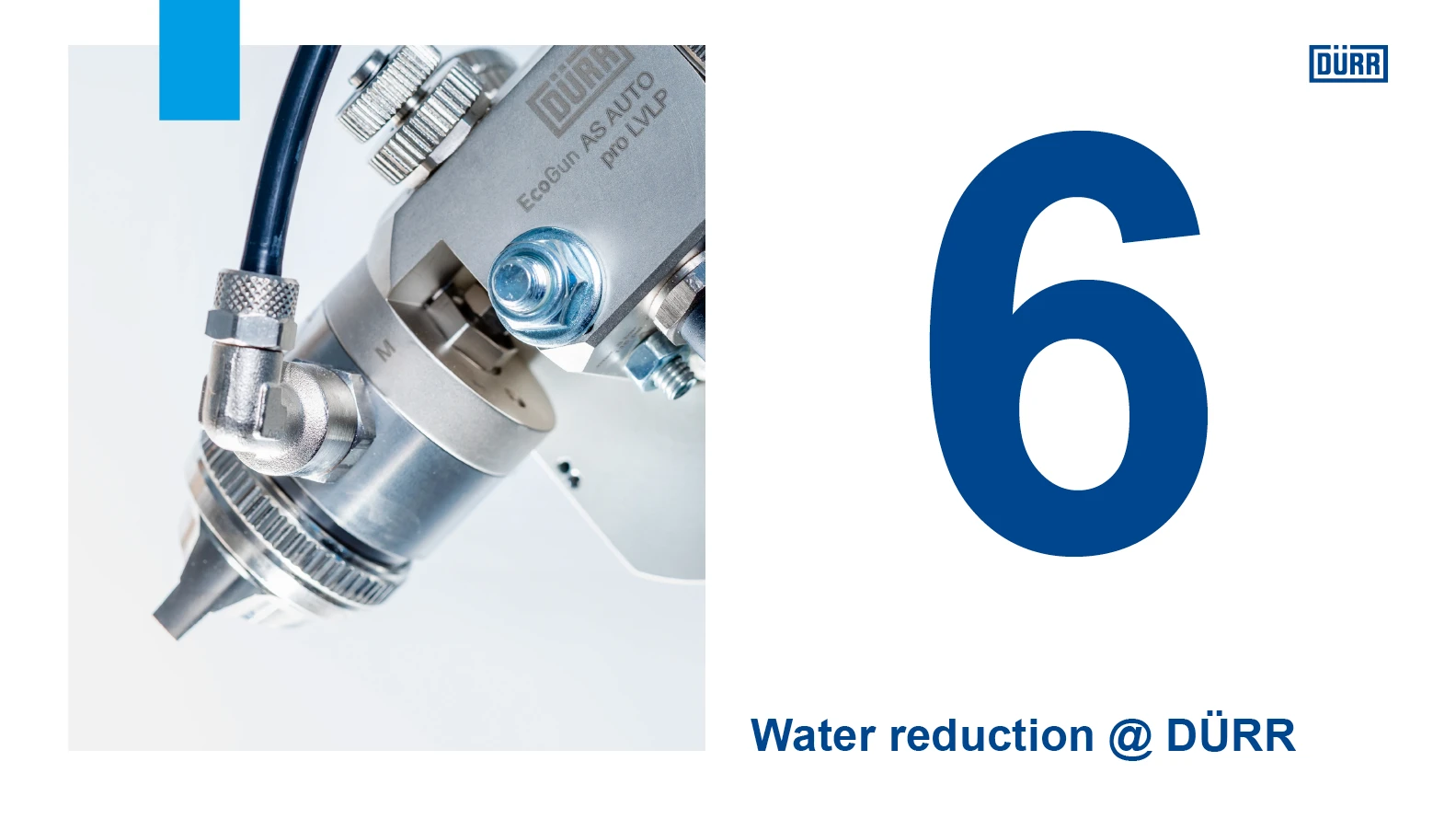
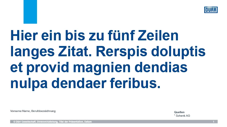
Arial is used in all of Dürr’s office communications, from PowerPoint to printed documents such as letterhead or operating manuals. It is also used as the copy font on the www.durr.com website.
Asian fonts
For Asian languages, different font families are used in printed and digital communication media because there is no single font suitable for all of them. These have largely replaced the Latin Barlow.
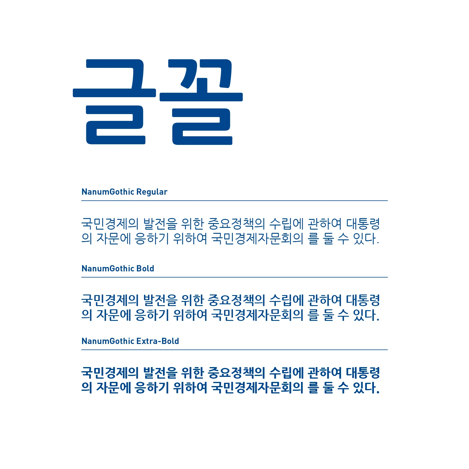
Font for Korea – NanumGothic
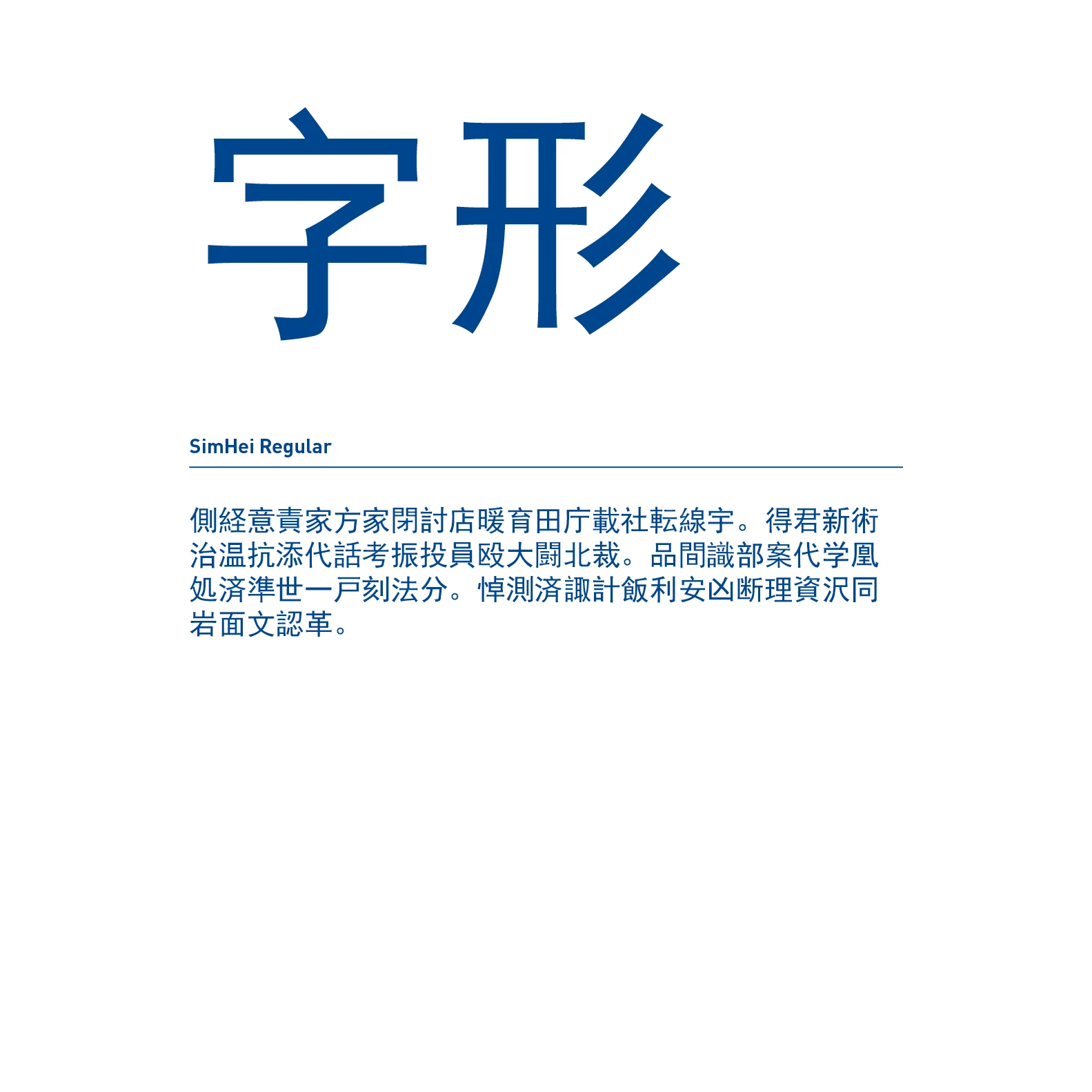
Font for China – SimHei
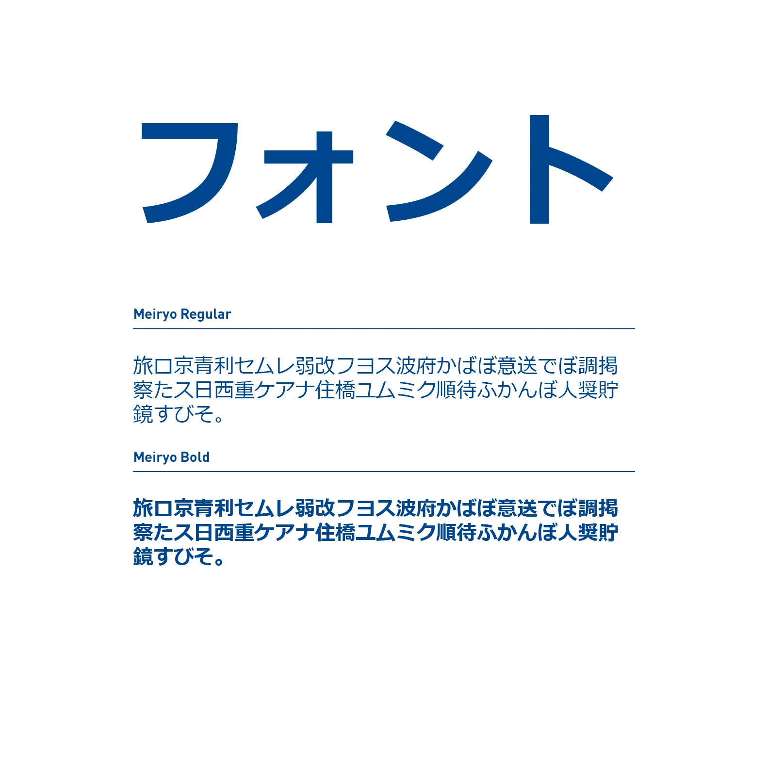
Font for Japan – Meiryo
COMBINATIONS
In principle, it is possible to combine an Asian font with Barlow. However, the formatted text passage should be a separate area, i.e., a separate text block or line. Special highlighting of numbers in Asian copy with Barlow is no longer required, except in the formatting of Dürr product names.
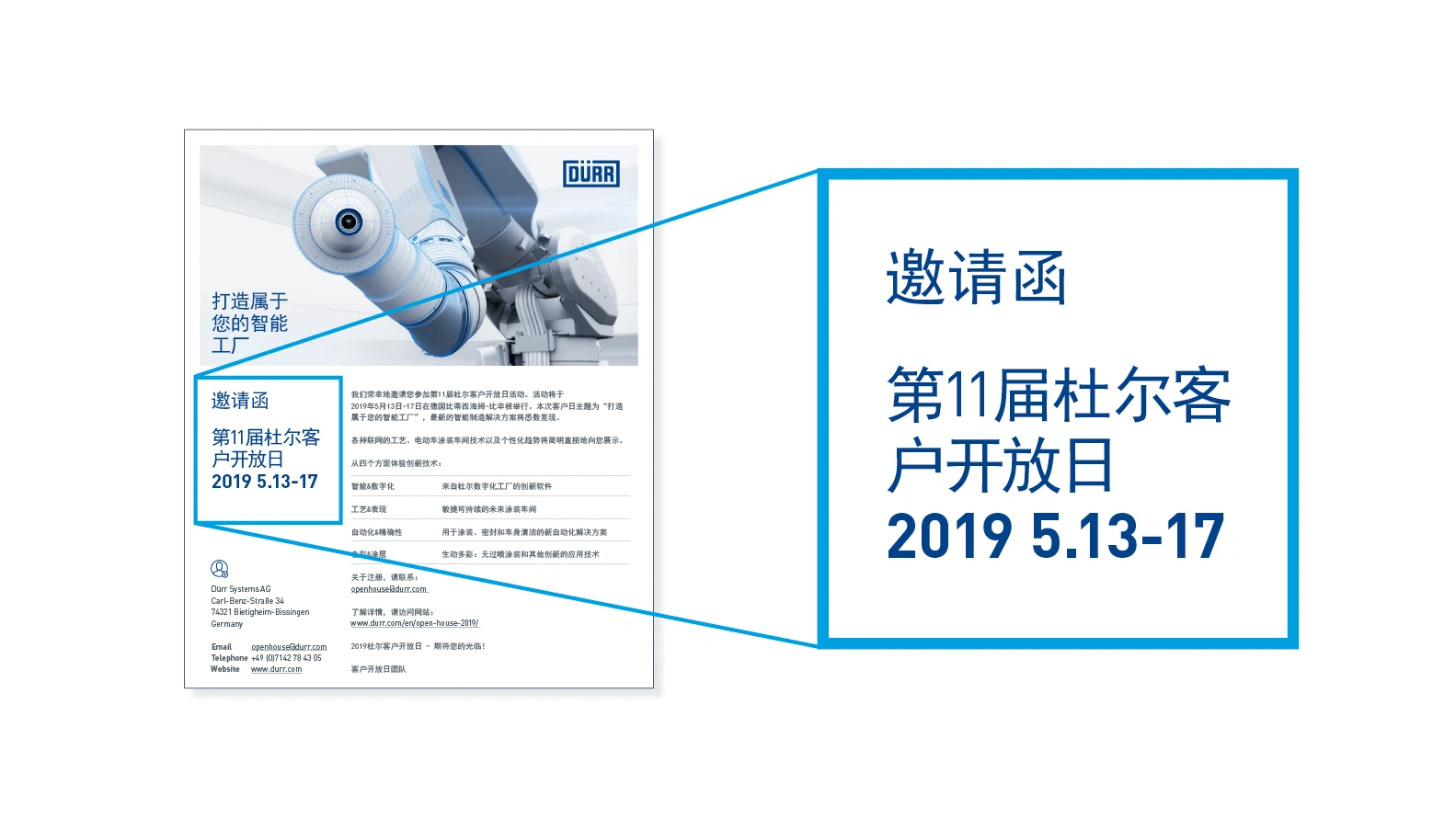
Integration of Barlow – Barlow is only used in separate text areas, for example, in headlines, product names or the Dürr address block.
APPLICATION EXAMPLES
