Animations
Real images and animations provide an additional dimension in the Dürr communication media. Animations allow complex processes to presented in an easy and understandable way. Products and systems can be experienced on an emotional level. The films of the new Corporate Design of Dürr consist of different formats and tonalities – from emotional-advertising to factual-explanatory.
Table of contents
Application examples
Film categories
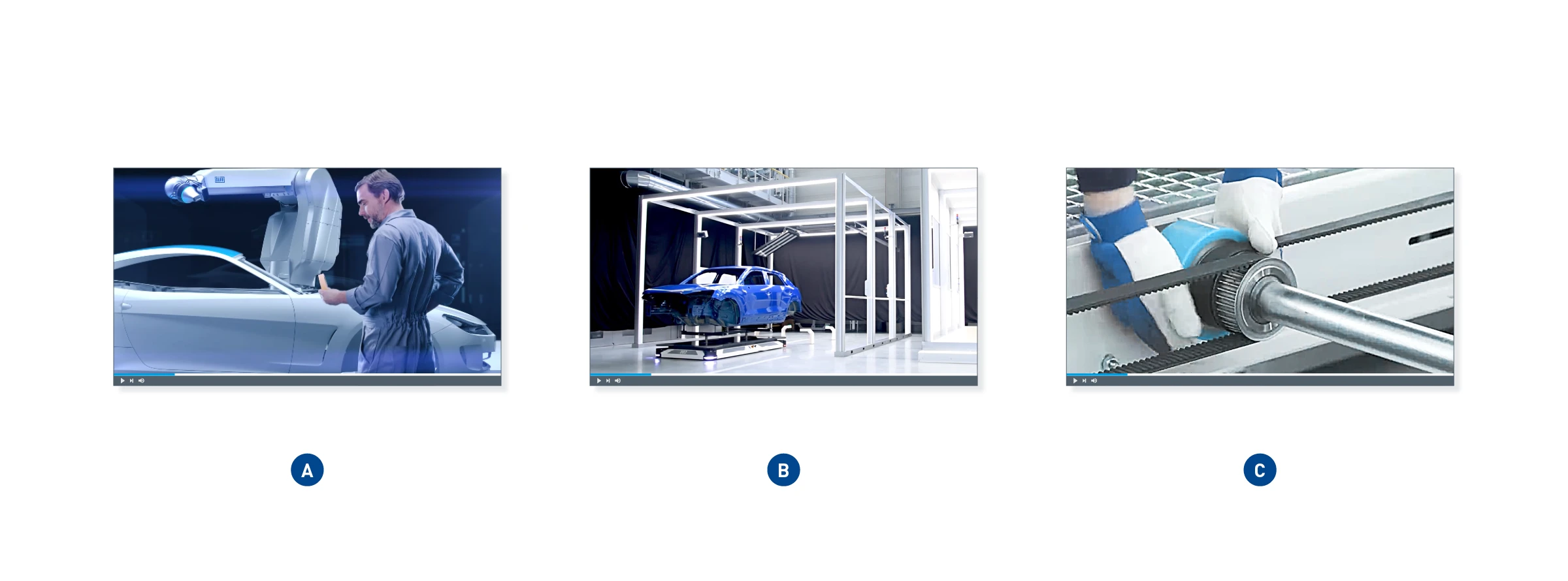
(A) Image film – This film category shows Dürr as a driver of innovation and serves the higher-level brand communication (brand loyalty). Dürr products or solutions are talked about using a story. Films or animations can be abstract, emotional, creative, entertaining, and playful.
(B) Product film – The product and its strongest benefits are in focus here. The way that functionalities and functional processes are used is presented in a simple, understandable, and objective way. Dürr competence and expertise is shown on the basis of the product presentation.
(C) Explanatory film – Explanatory films are simple, straightforward learning videos for internal and external use. They are not described further in the manual.
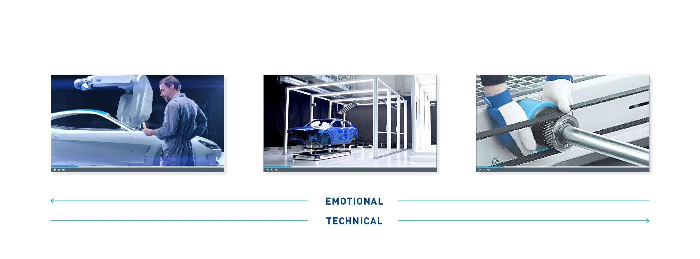
Effect – Each film or animation pursues a different intention and carries a different message.
Animation structure
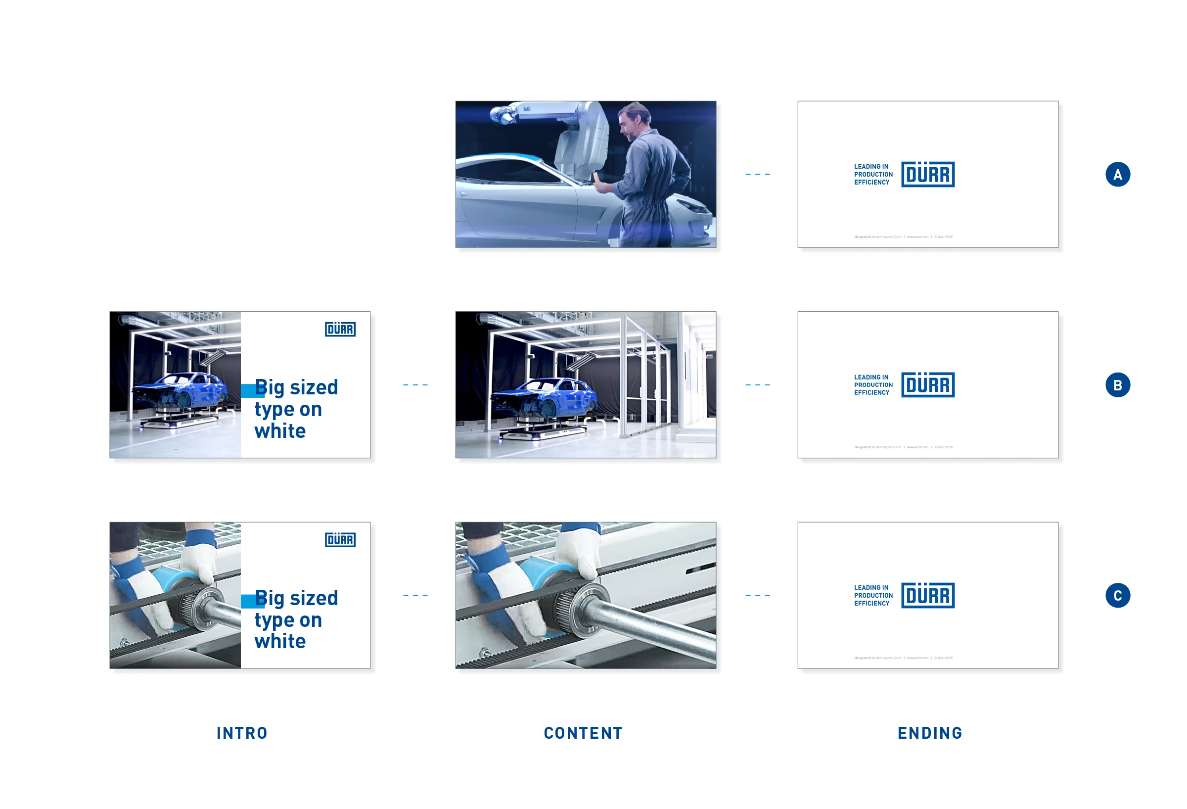
The Dürr logo is not used as a classic corner logo within the film. A logo is inserted only in the introductory animation and in the ending.
(A) Image film – Image films begin directly with the first image without a predefined introductory animation. The ending is always used at the end of the film.
(B) Product film – Product films begin with a uniform introductory animation that contains the film title and the Dürr logo at top right. Here, too, the ending is placed at the end of the film.
(C) Explanatory film – Explanatory films have the same structure as product films.
Film intro
Intros to Dürr product and explanatory films follow a set format. Image films are excluded from this.
Among the available templates for the intro, we recommend using the open after-effects toolkit because it can be applied more flexibly. Further templates are available in the form of static layout PSDs, PNG sequences, or MOV files. In the case of PNG and MOV templates, the headlines can be repositioned using the PSD layouts. The templates are available in the download area of the online manual.
Brand and sub-brands
Example animation Standard – The white area slides from the left to the middle and reveals the product image or product animation. The Quick-Link crosses in the opposite direction from the right to the middle and connects with the image. At the same time, the logo is built up. The headline is revealed line by line. The white surface moves to the left and transitions to the main animation.
Example animation, Partner logo – Partner logos are placed in the top-left corner, vertically centered to the Dürr logo.
Example animation, iTAC – The logos of the sub-brands iTAC, Verind, CPM, and Dualis are always placed in the film intro without the Dürr group logo. The group logo is shown in the film credits only.
Elements and typography
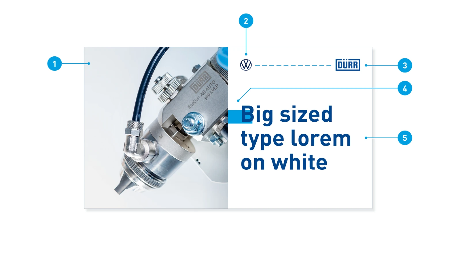
Layout elements – The layout of the film intro consists of elements in fixed positions.
- Product preview: Teaser image or animation of the central product
- Partner logo: The optional partner logo is vertically centered to the Dürr logo
- Sender logo: Dürr Systems AG or sub-brand
- Quick-Link: In the end position of the animation, the Quick-Link is always in the same position
- Headline: 3 to 5 lines
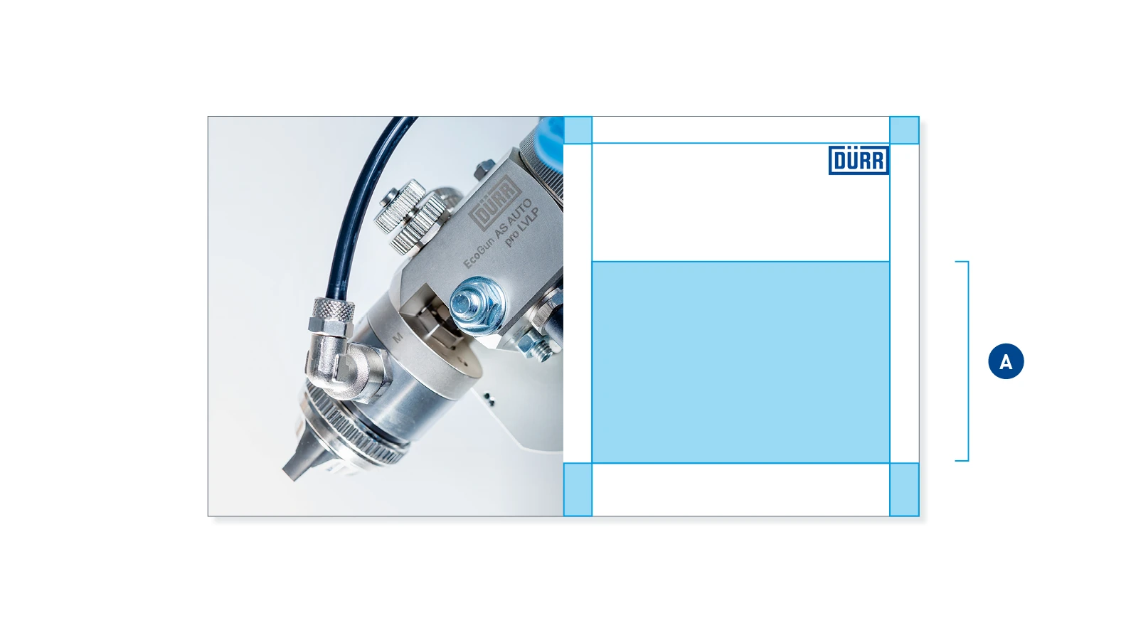
Headline area – The headline may freely extend within the headline boundary (A).
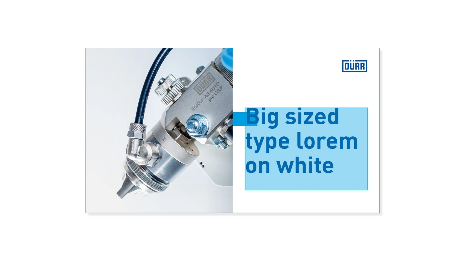
Example of 3-line headline – with a font size of 152 pt. and a line spacing of 160 pt.
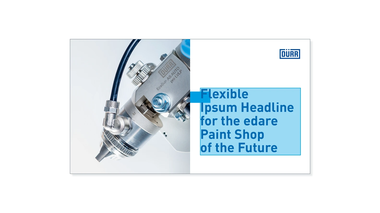
Example of 5-line headline – with a font size of 160 pt. and a line spacing of 108 pt.
Design elements
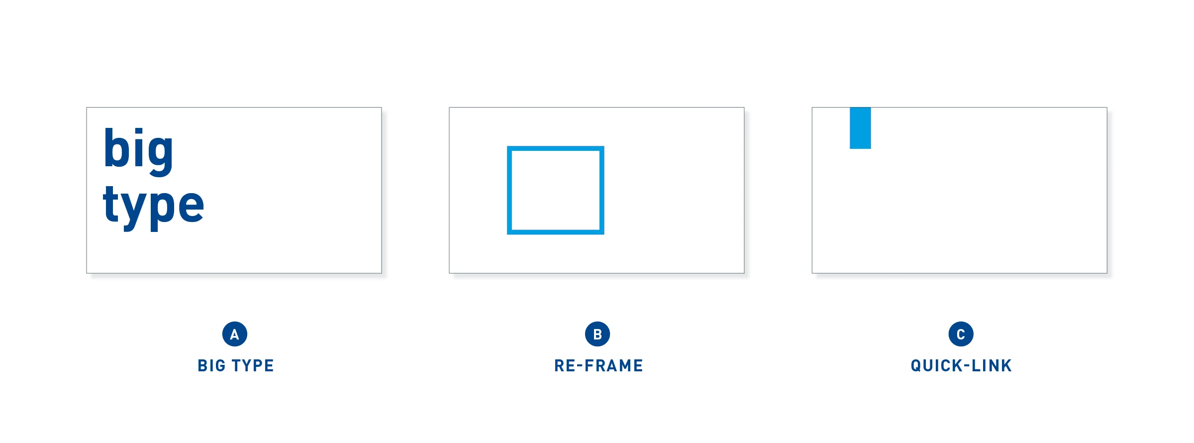
Design elements – The Dürr design elements of Big Type (A) and Re-Frame (B) also play an important role within the new Corporate Design. The Quick-Link (C), however, appears more rarely.
Big Type
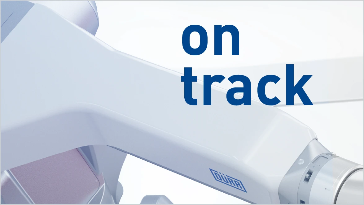
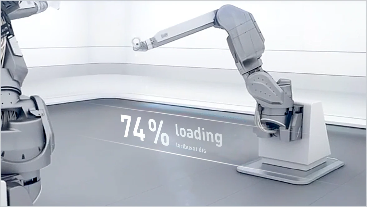
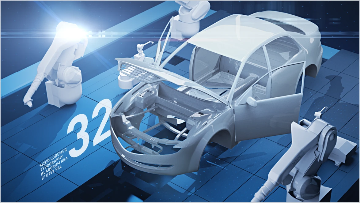
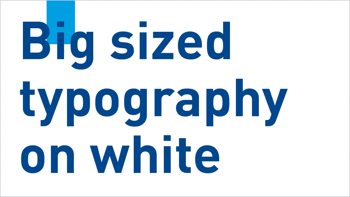
If text is used, it is an active and style-forming element. The Big Type is mainly used for statements, keywords, the emphasis of messages. It is used in the largest and most striking way possible. It can be set on colored full areas and, if necessary, also on image contents – where possible on calm backgrounds. It can turn itself flat to the camera or insert itself into the perspective of the space. The Big Type is mainly used in image films. The typeface is DIN Pro Bold. The font colors are preferably White, Basic Blue or alternatively Light Gray.
Re-Frame
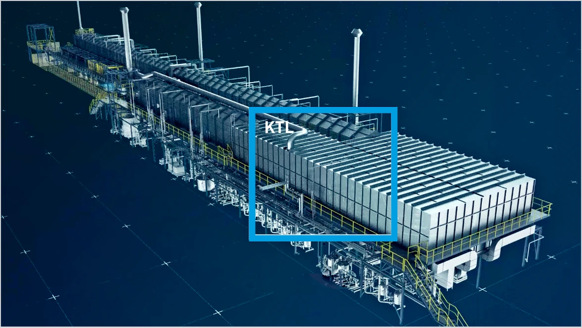
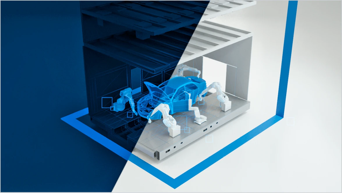
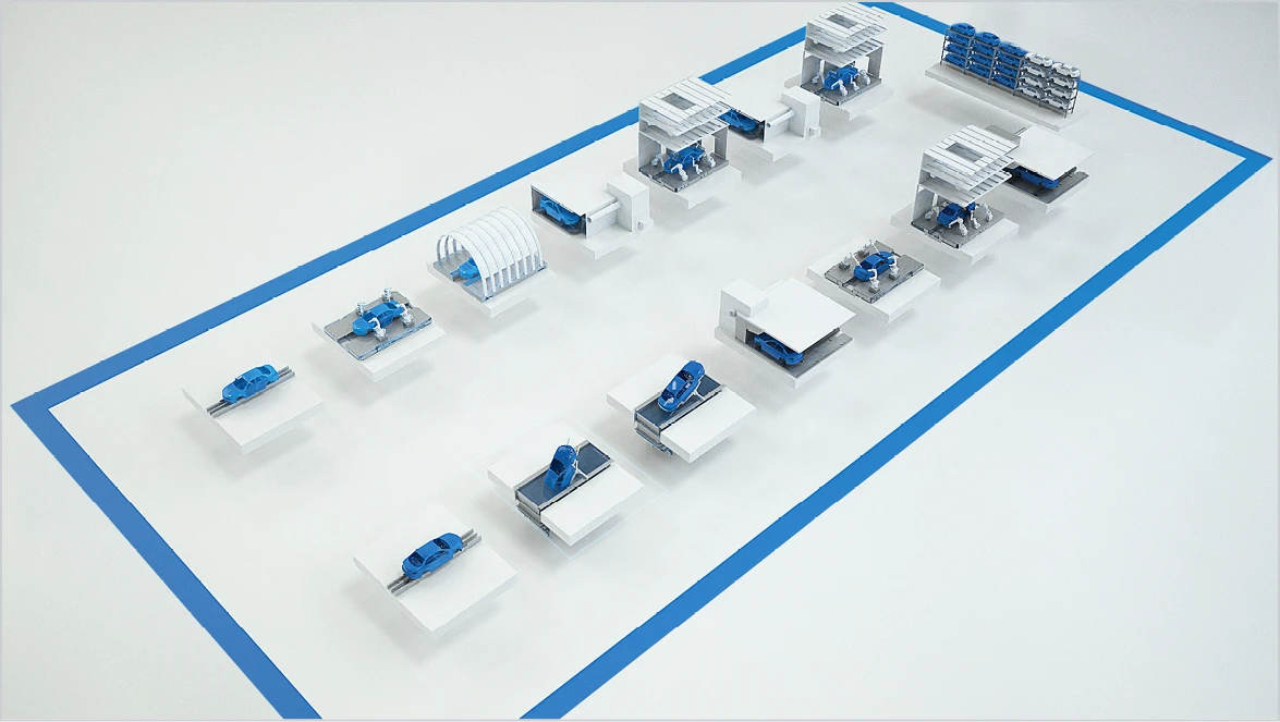
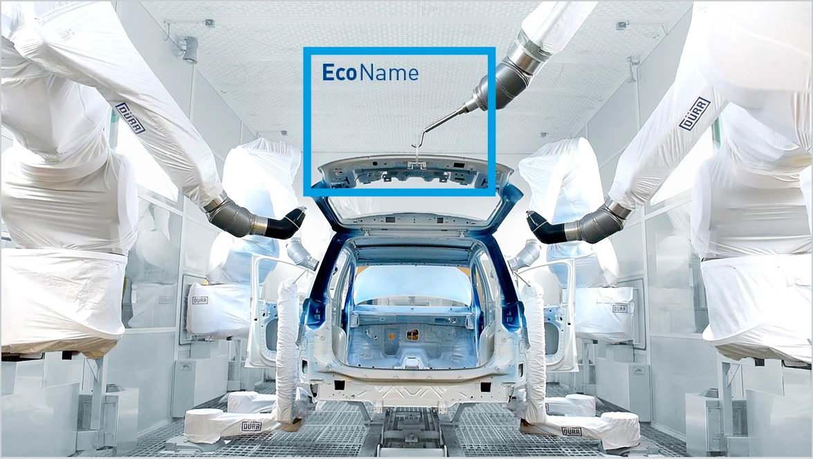
The Re-Frame helps guide the eyes and create a focus – on a technical detail, for example. It can initiate a zoom or accompany a camera pan. As a flat overlay, it can contain typography. The Re-Frame can also become part of the space and take on its perspective. In this way it can limit or define abstract surfaces or connect elements. It should not be used in an inflationary and haphazard manner but in a deliberately thematic way.
Animation guidelines
Re-Frame
The Re-Frame can be animated as required, but its design should not be too busy. Only one Re-Frame should be used for each image content. The Re-Frame is applied only in the color “Digital Light Blue”. Should this not work on the given image content, the Re-Frame is to be dispensed with in case of doubt. In exceptional cases, such as innovation topics, the color “Innovation Green” is also permitted.
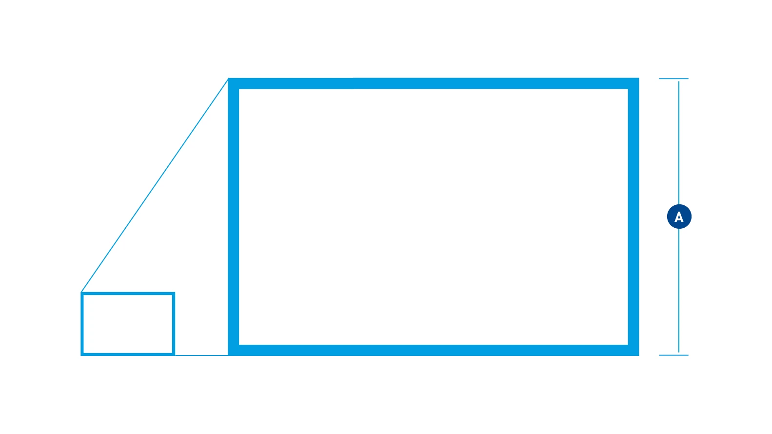
Relation – The line thickness is proportionate to the short edge length (A), for example:
- 100 px edge length / 4 px line thickness
- 200 px edge length / 8 px line thickness
- 300 px edge length / 12 px line thickness
- 400 px edge length / 16 px line thickness
Cutting guidelines
Cutting sequences/speed, transitions, and fades are not defined and depend on the content and design framework.
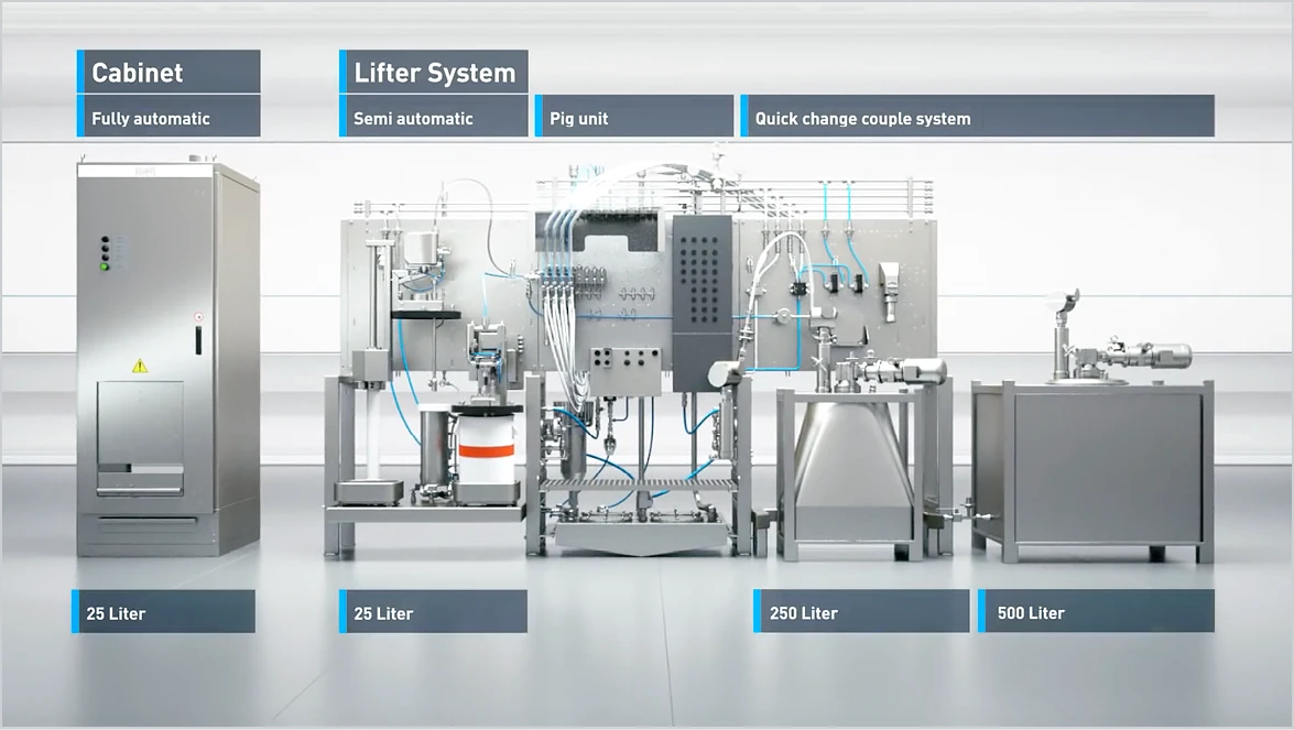
Labeling
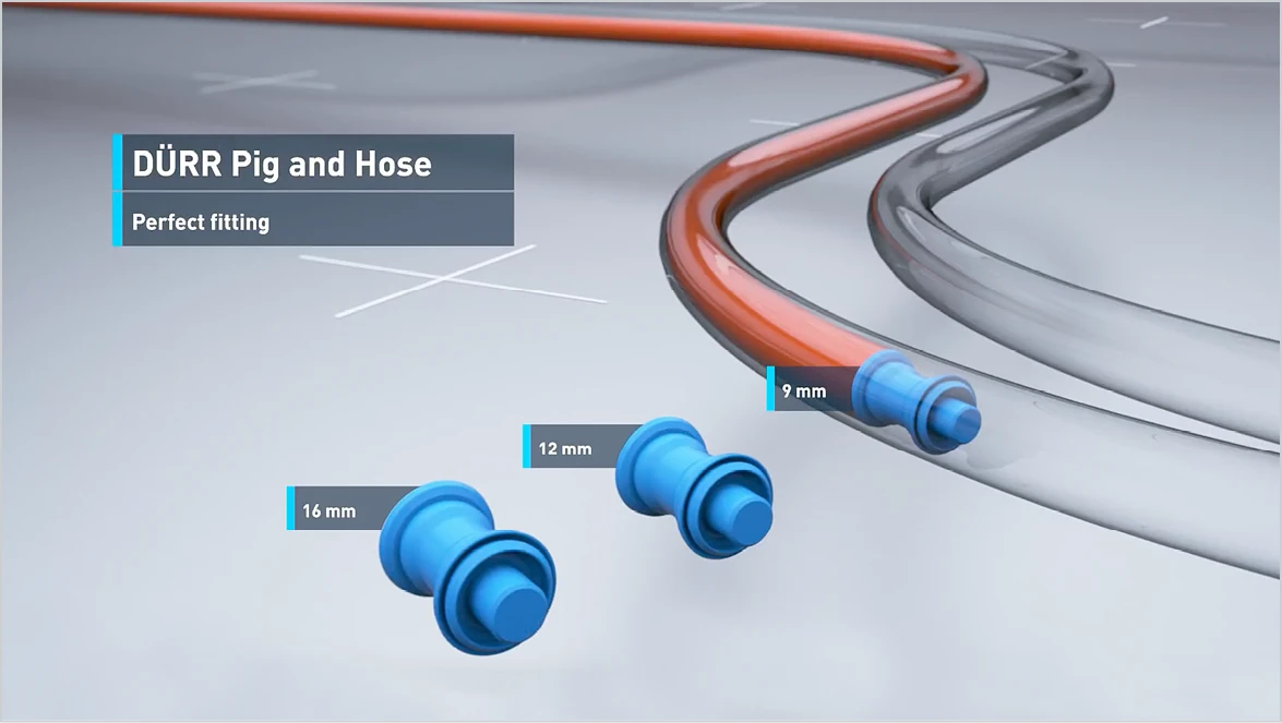
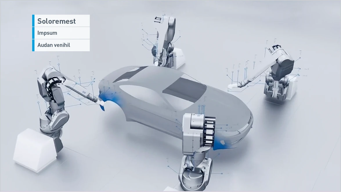
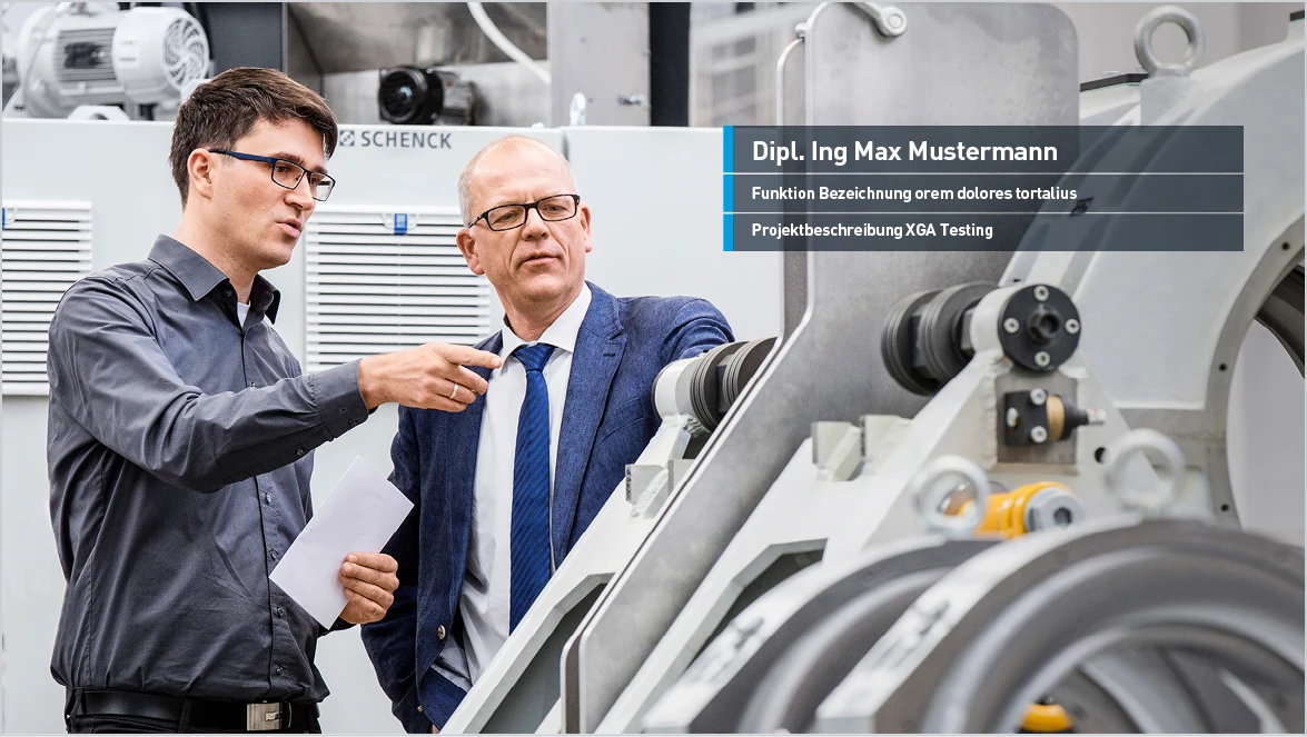
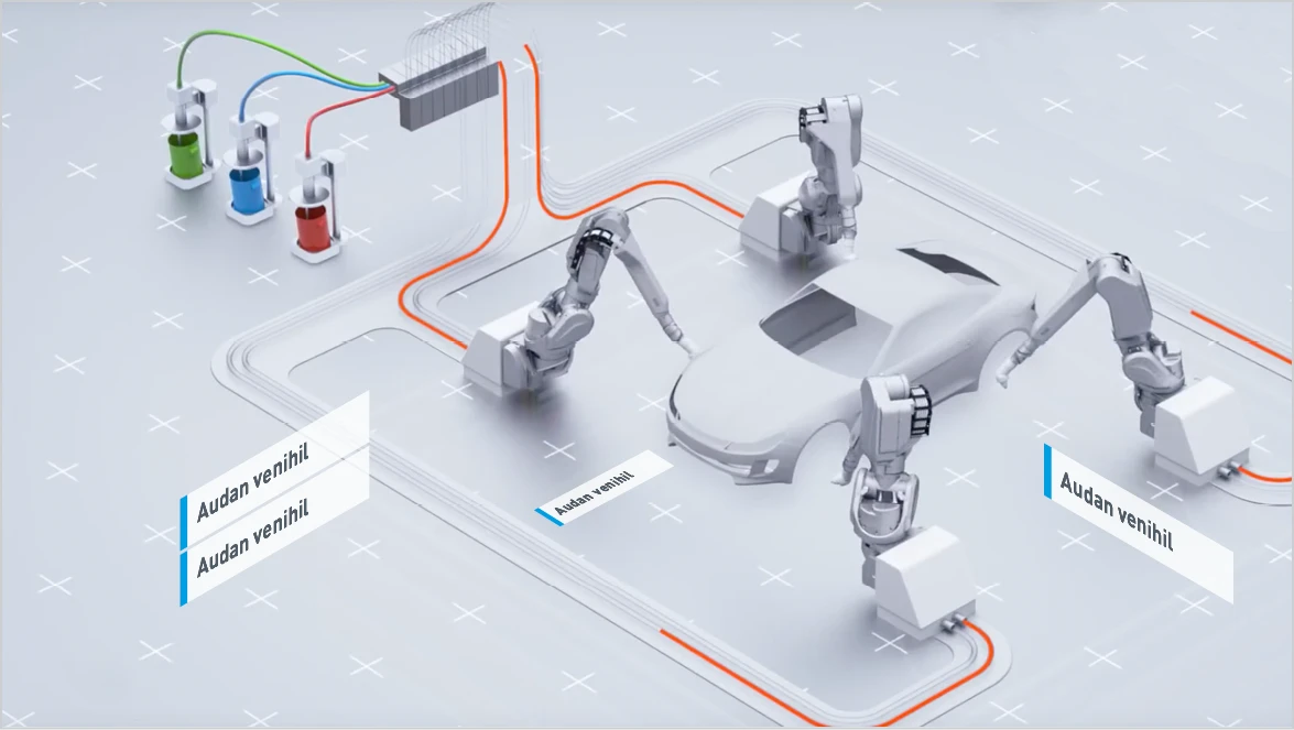
Labeling is implemented consistently for all information in the usual way. Dark or light text panels can be used depending on the tonality. Ideally, the background is a calm, unmoving surface. For ideal legibility, use the font DIN Pro Bold throughout.
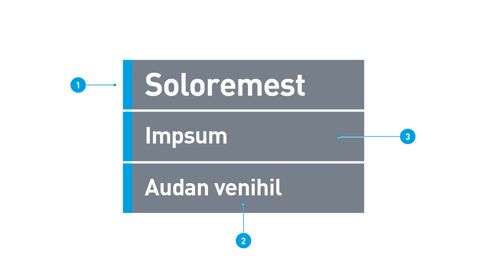
Dark panel
- Marker: 100% Digital Light Blue, fill method normal opacity
- Text: Barlow Bold, 100% White, fill method normal opacity
- Background: 80% Dark Gray, fill method multiply
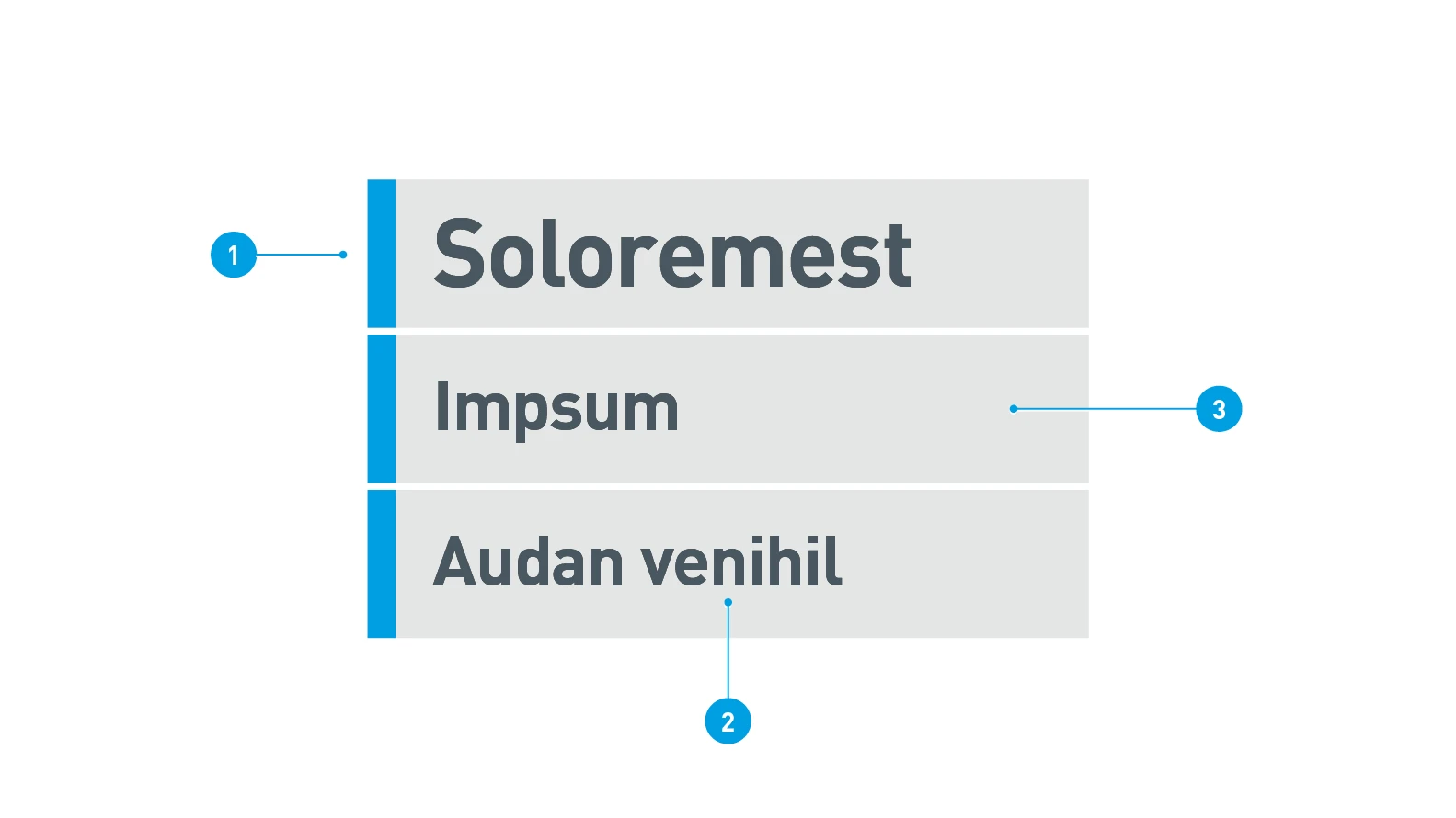
Light panel
- Marker: 100% Digital Light Blue, fill method normal opacity
- Text: Barlow Bold, 100% Dark Gray, fill method multiply
- Background: 100% Digital Light Gray, fill method Hard Light
Subtitles
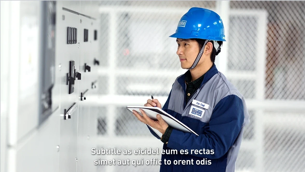
The subtitles follow the trend of popular social media platforms and editing programs with the function of automatically generated captions. For optimal readability, the Barlow SemiBold font in white should be used consistently, with a subtle border in Dark Gray and a drop shadow.
Standard values for subtitle design at 1920×1080px and 1080×1920px:
- Font: Barlow SemiBold, size 50
- Allignment: Centered
- Fill: 100 % white
- Outline: 1.0 px width, Dark Gray (#525F6B)
- Shadow: Fill color 100% black (#0000000)
Opacity: 80%
Angle: 135°
Distance: 3.0
Size: 4.0
Blur: 20 - Distance to bottom edge of format – horizontal format (1920x1080): 0
- Distance to bottom edge of format – vertical format (1080x1920px): -250
Ending
The ending forms the conclusion of the film or animation. It is a fixed, unchanging element. The logo builds up, the claim is brought forward. The ending can be cut hard or used as a transition with alpha channel.
The ending is available as standard as a mov file in DE and EN.
brand and sub-brands
Boilerplate Dürr Systems AG – The standard film boilerplate forms the fixed ending of all Dürr films and animations. Partner logos are never placed here.
Boilerplate sub-brands with group logo – The sub-brands Verind, Dualis, CPM, and iTAC are placed in the outro with the Dürr group logo without exception.
