Web banners
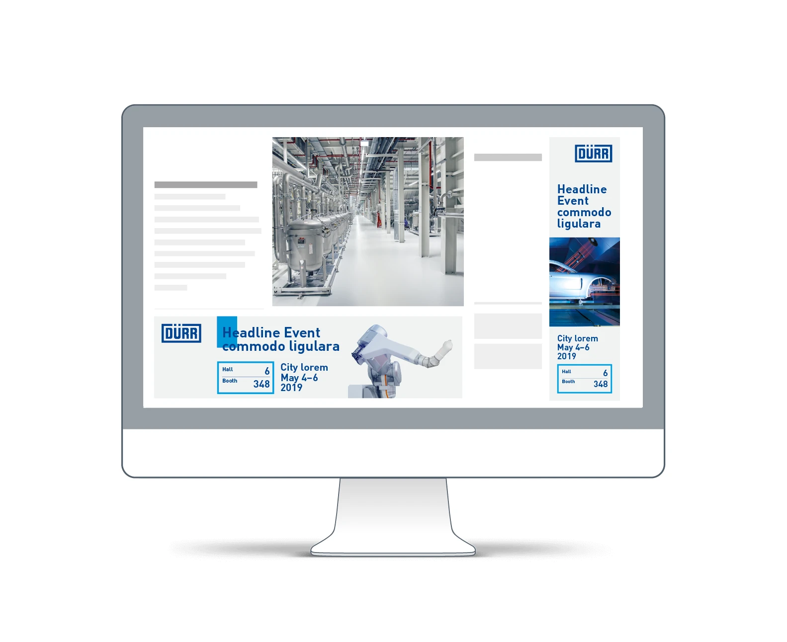
Web banners offer the possibility to address interested parties directly and draw attention to trade fairs and products. They fulfill a teaser function for rerouting users to more in-depth content. Web banners can be static or animated. Despite their small size, they make a big impact.
Table of contents
Design principles
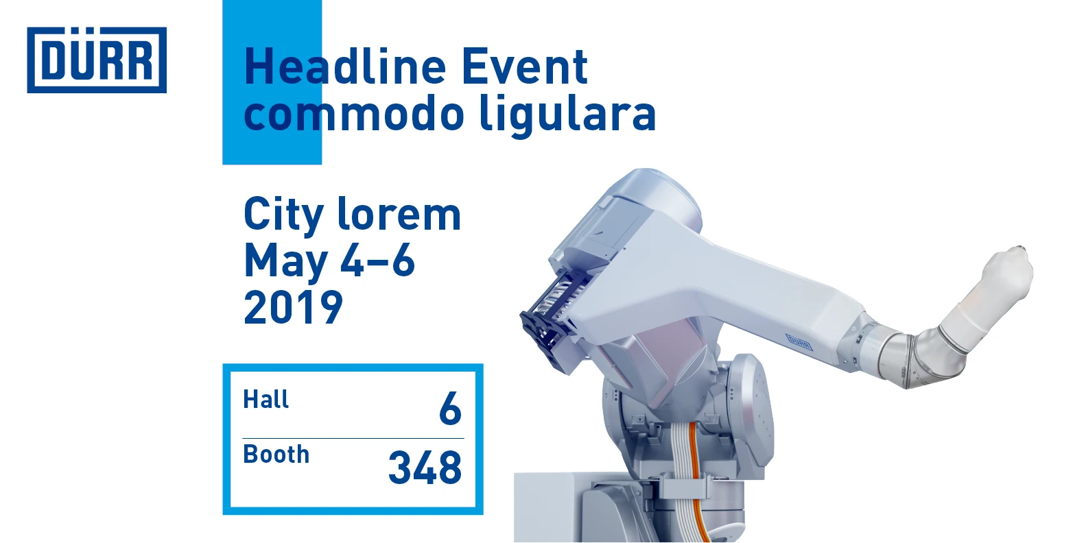
The following guidelines refer to trade fair announcements with special requirements for the conveying of trade fair information. In principle, a distinction can be made here between two design series: the web banners with image and the web banners with knockout. The layout of the web banners is fluid and can range between portrait and landscape format depending on requirements. At the same time, the basic components, proportions and design principles are retained.
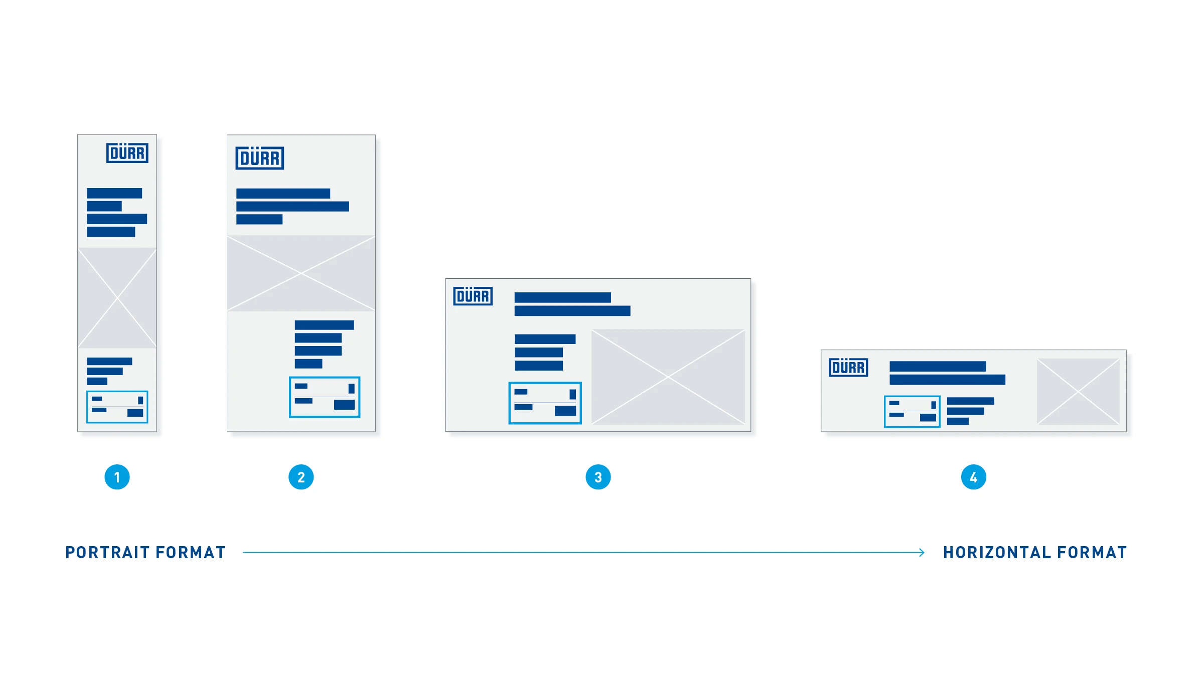
Format examples
- 160 x 600 px
- 300 x 600 px
- 600 x 300 px
- 600 x 160 px
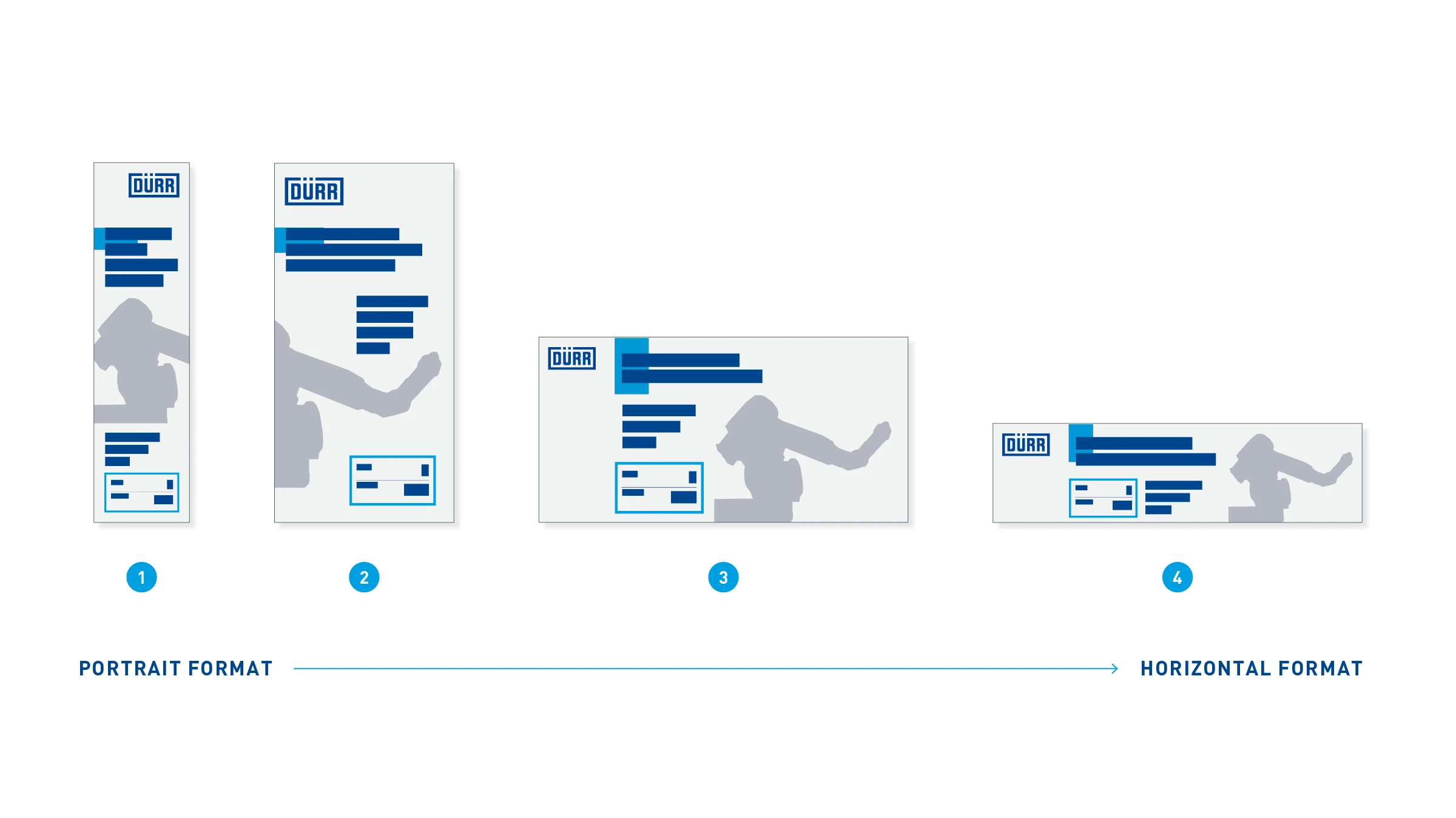
Format examples
- 160 x 600 px
- 300 x 600 px
- 600 x 300 px
- 600 x 160 px
Portrait
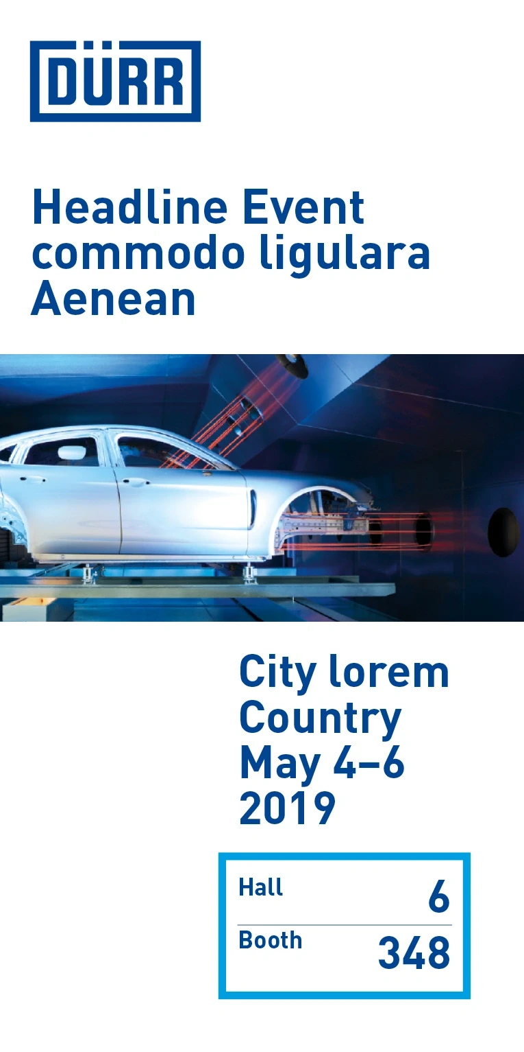
The web banner is essentially characterized by the interaction of image and short blocks of text. The indentation of text blocks creates white spaces and tension within the layout.
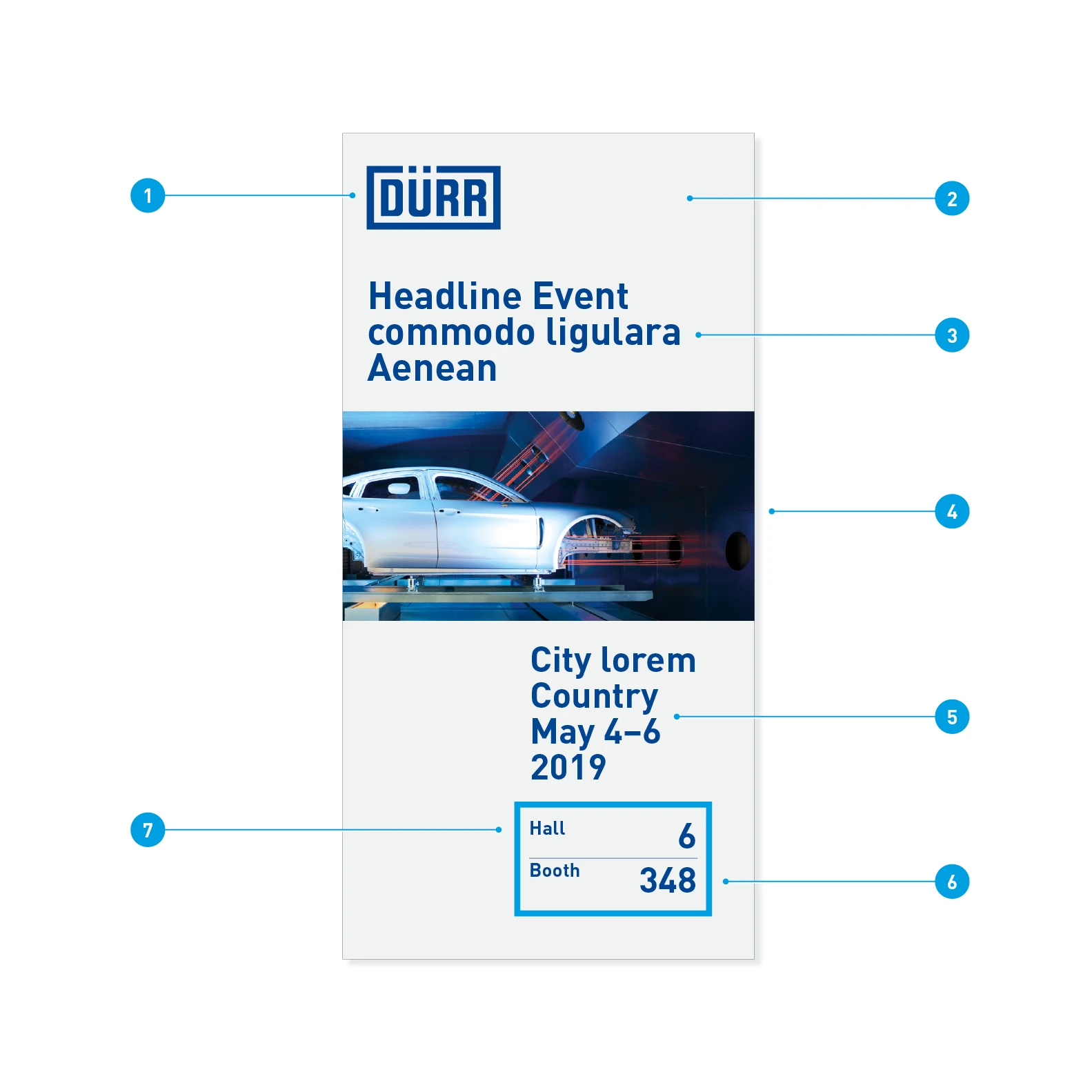
Elements of the portrait format with image –Using the example format 300 x 600 px
- Logo
- Background color: 50% Light Gray
- Headline: Barlow Bold, 28 pt., LS 26 pt.
- Image
- Event details: Barlow Bold, 26 pt., LS 26 pt.
- Location digits: Barlow Bold, 26 pt.
- Location labeling: Barlow Bold, 14 pt.
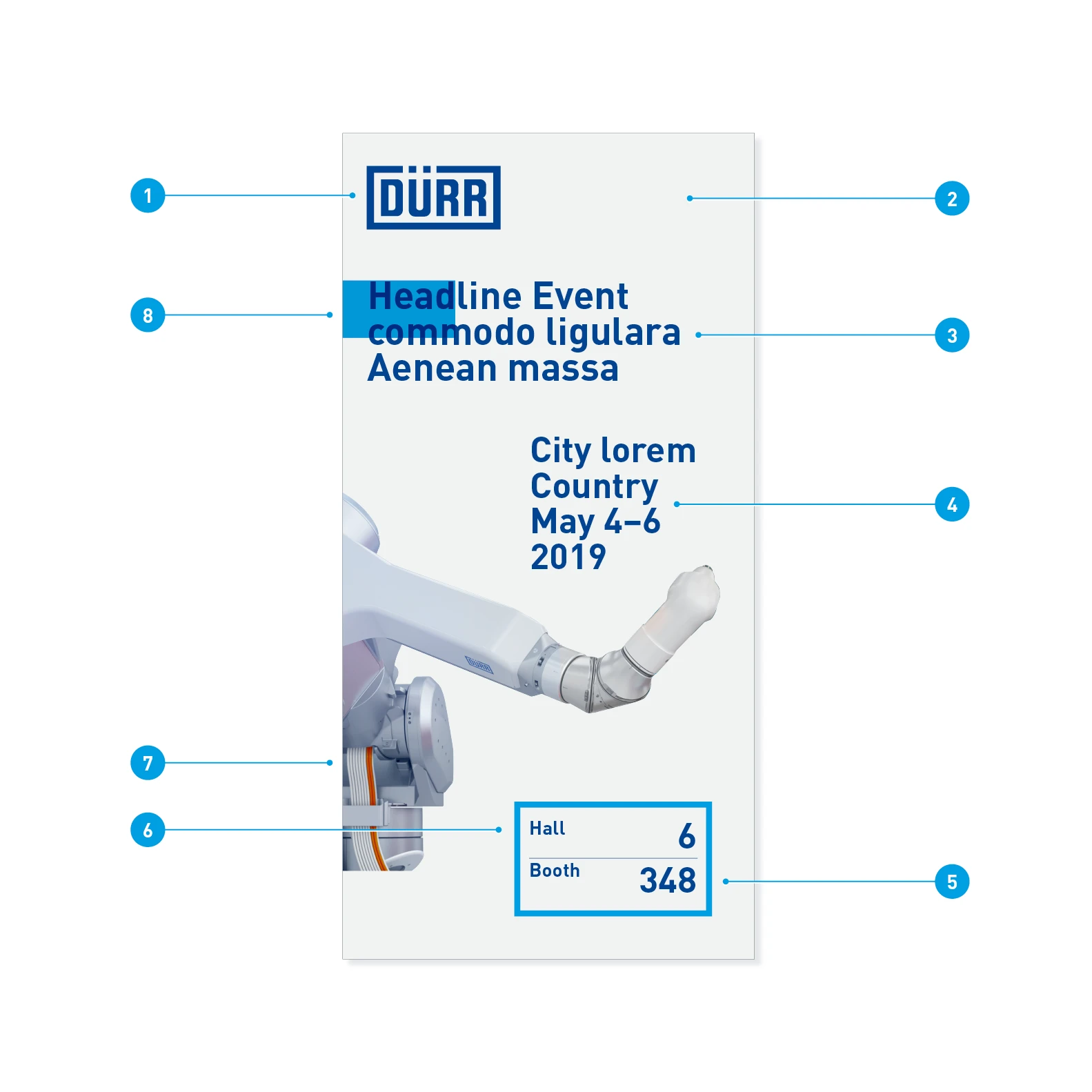
Elements of the portrait format with knockout –Using the example format 300 x 600 px
- Logo
- Background color: 50% Light Gray
- Headline: Barlow Bold, 28 pt., LS 26 pt.
- Event details: Barlow Bold, 26 pt., LS 26 pt.
- Location digits: Barlow Bold, 26 pt.
- Location labeling: Barlow Bold, 14 pt.
- Knockout picture
- Quick-Link
Image and text behavior in different formats
The layout is created so that it can hold different text quantities or image formats. Text and image lengths mutually influence each other. This avoids unwanted empty spaces. Intentional empty spaces create tension.
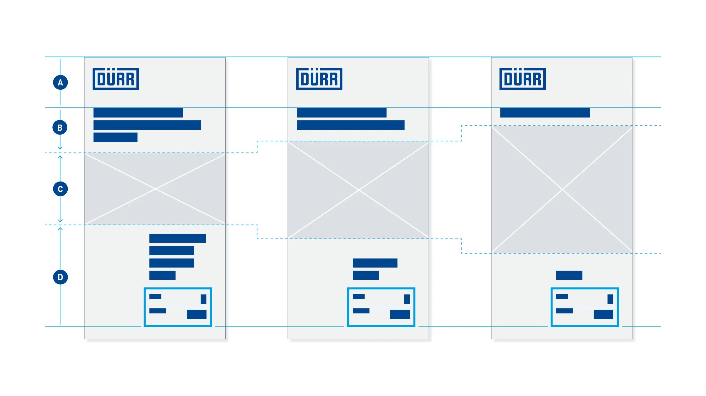
Areas – In each layout adjustment, the logo header (A) remains unchanged. The headline (B) is fixed at the top. If the number of lines of text decreases, more space is created for the image area (C). Conversely, if the image area shrinks, this gives more space for the headline (B) and the information block (D). In principle, the distances between blocks A - D must be kept even and constant.
Landscape
In the landscape format, the logo moves to the top-left corner, while the image orients itself to the bottom-right corner. Text elements and white spaces alternate with each other.
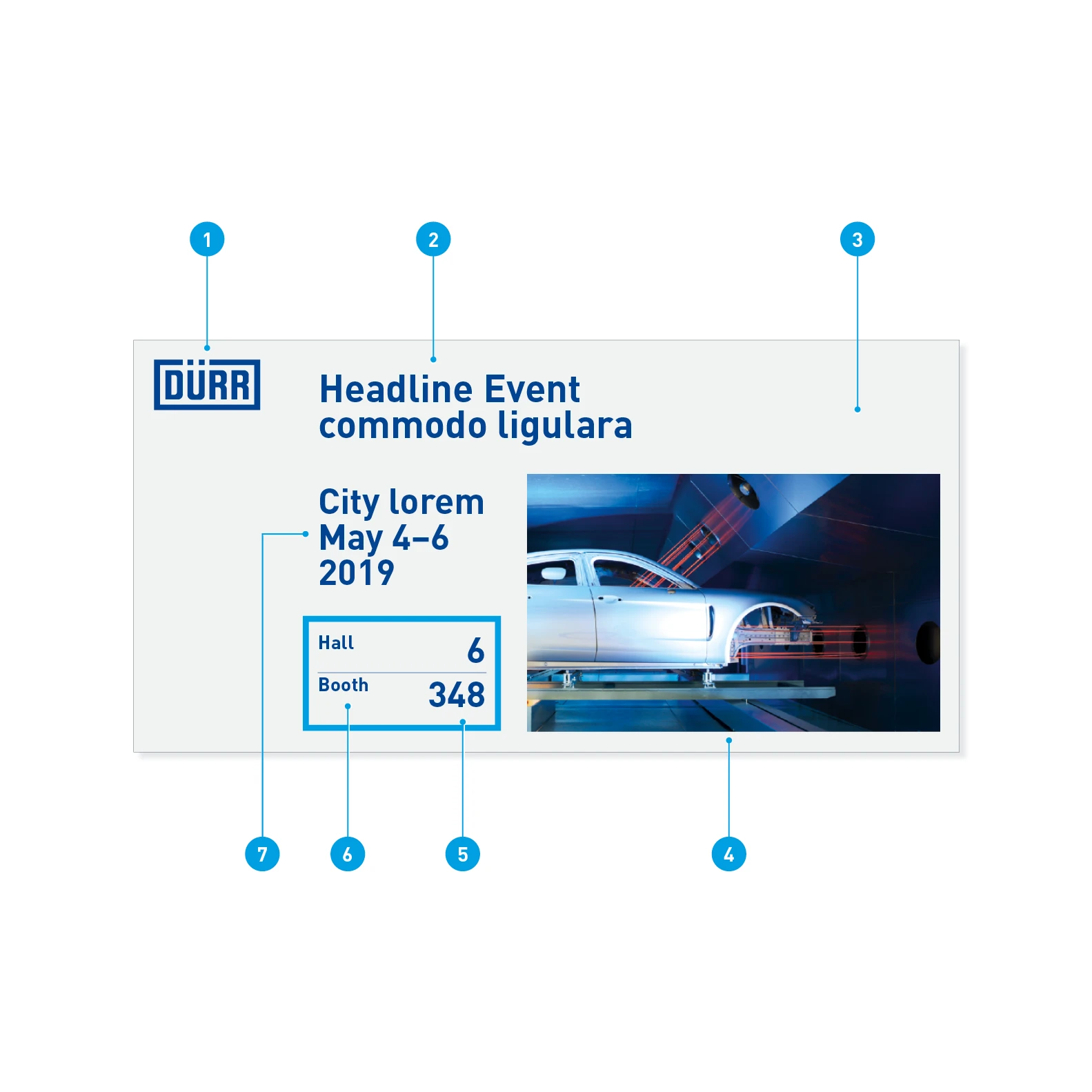
Elements of the landscape format with image – Using the example format 600 x 300 px
- Logo
- Headline: Barlow Bold, 28 pt., LS 26 pt.
- Background color: Light Gray 50%
- Image
- Location digits: Barlow Bold, 26 pt.
- Location labeling: Barlow Bold, 14 pt.
- Event details: Barlow Bold, 26 pt., LS 26 pt.
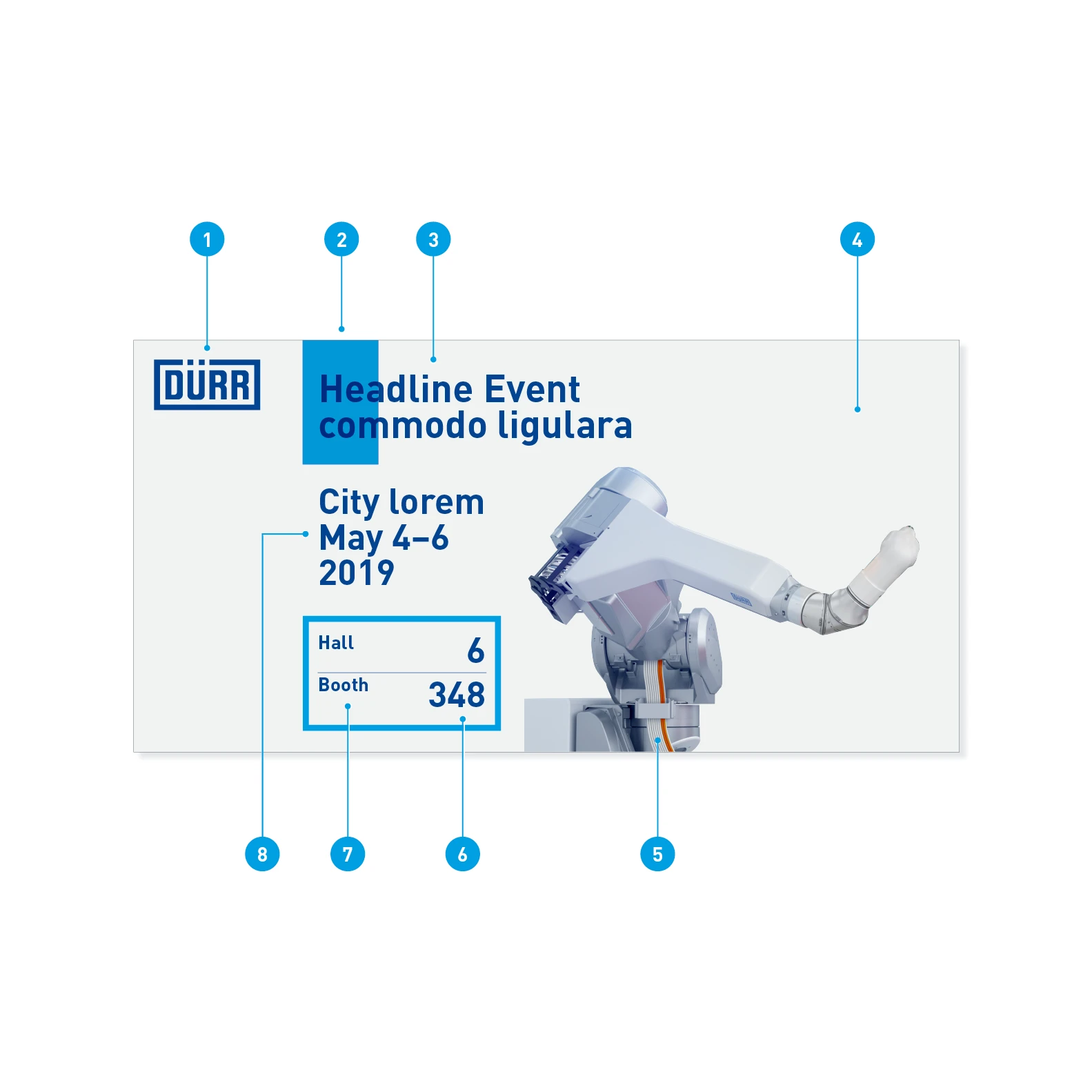
Elements of the landscape format with knockout – Using the example format 600 x 300 px
- Logo
- Quick-Link
- Headline: Barlow Bold, 28 pt., LS 26 pt.
- Background color: Light Gray 50%
- Knockout picture
- Location digits: Barlow Bold, 26 pt.
- Location labeling: Barlow Bold, 14 pt.
- Event details: Barlow Bold, 26 pt., LS 26 pt.
Image and text behavior in different formats
The layout of the landscape format is created so that it can hold different text quantities or image formats. Text quantity and image size mutually influence each other. This avoids unwanted empty spaces; intentionally used empty spaces, on the other hand, create tension.
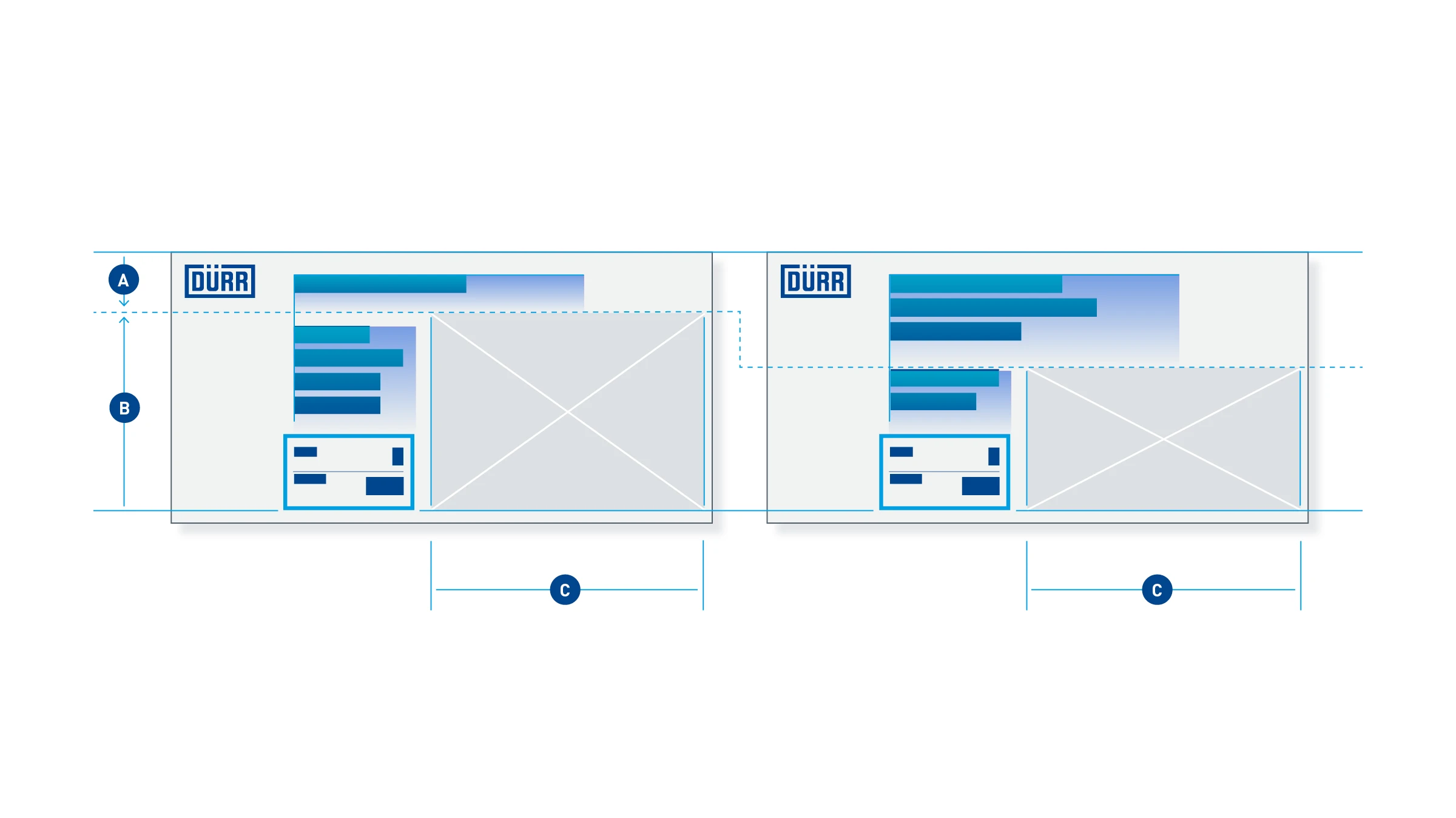
Areas – In layout adjustments, the logo is left outside. The headline is fixed at the top. The entire headline area (A) can expand downward, which pushes the content area (B) downward, and vice versa. If the content area expands, this shortens the headline. The width of the image area (C) remains unchanged.
