Flyers
Fleyers are small, concentrated and quickly understood print products. Dürr Corporate Design defines clear guidelines for flyers, but also offers enough flexibility for special applications. The design of a flyer can therefore be striking and loud but also elegant and informative. The layout is based on the underlying design principles for Dürr print communication.
Table of contents
Basic flyer
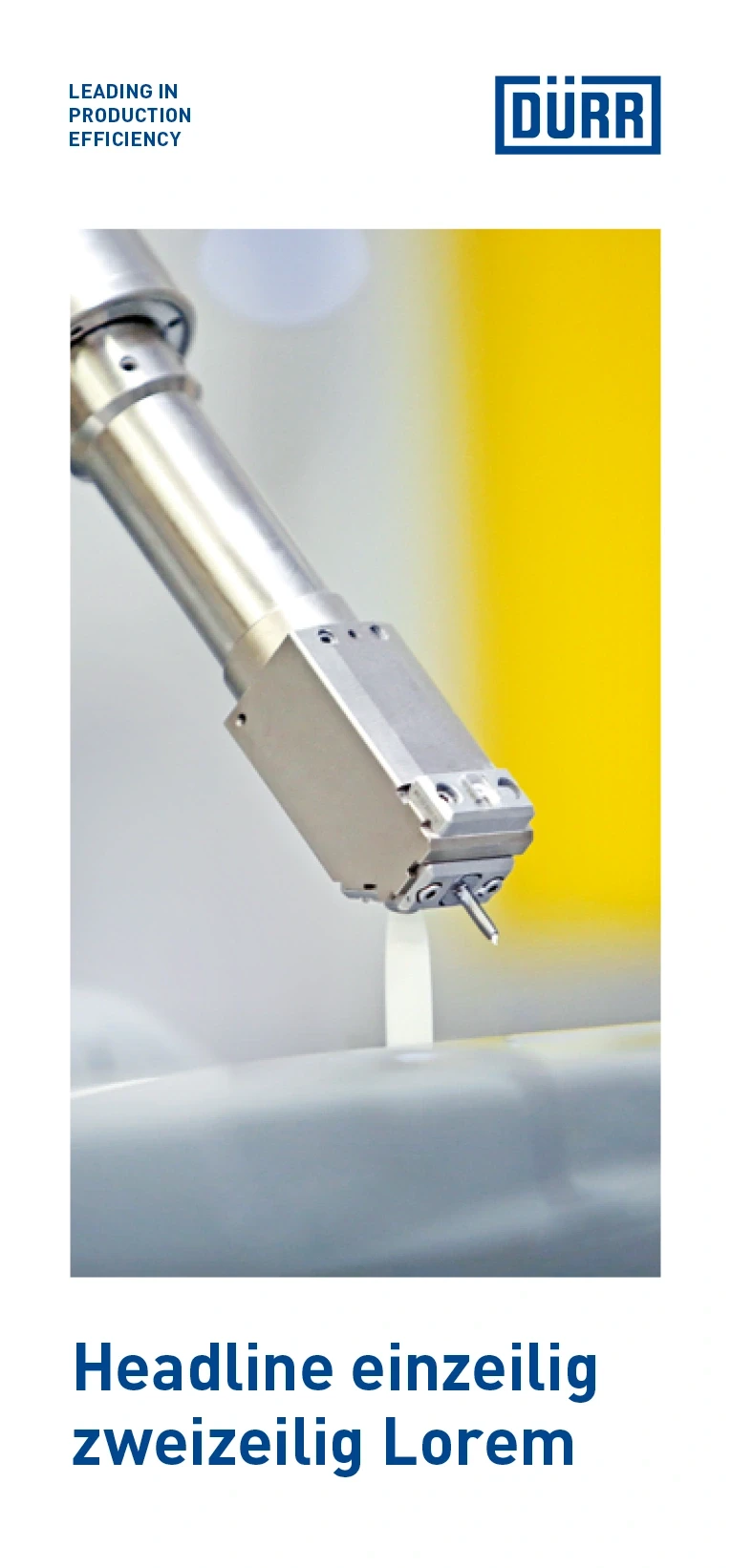
The information in the basic flyer is conveyed in a factual, concentrated and informative manner. The layout is structured with the help of targeted statements and font hierarchies. The DIN Long flyer is one of the standard sizes for flyers.
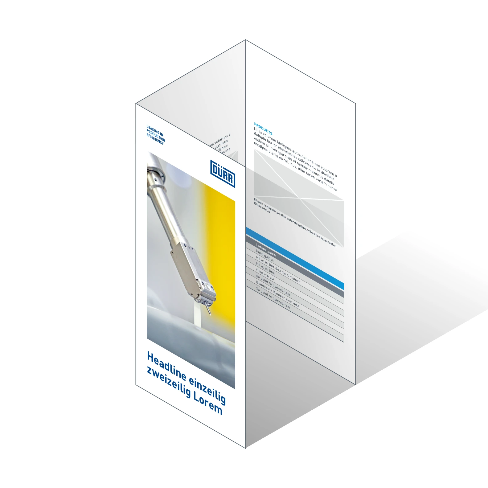
Example of a basic flyer – Six-sided folded flyer in the DIN Long format.
OUTSIDE PAGES
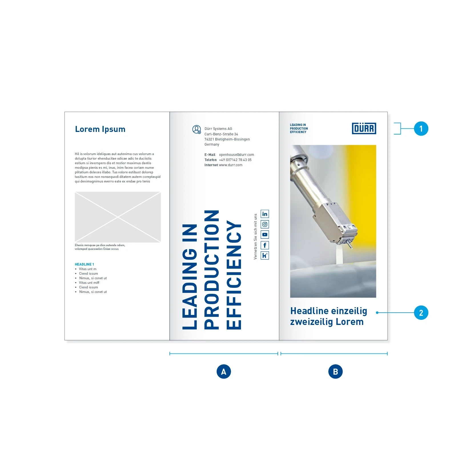
Example of outside pages – The layout of the front (B) and back (A) is fixed. The front makes an impact with a big image, the back with a loud finish in the form of an upended claim.
- Logo height: 10.5 mm
- Headline: Barlow Bold, 25 pt, LS 28 pt, Basic Blue

Outside pages, cover page positions
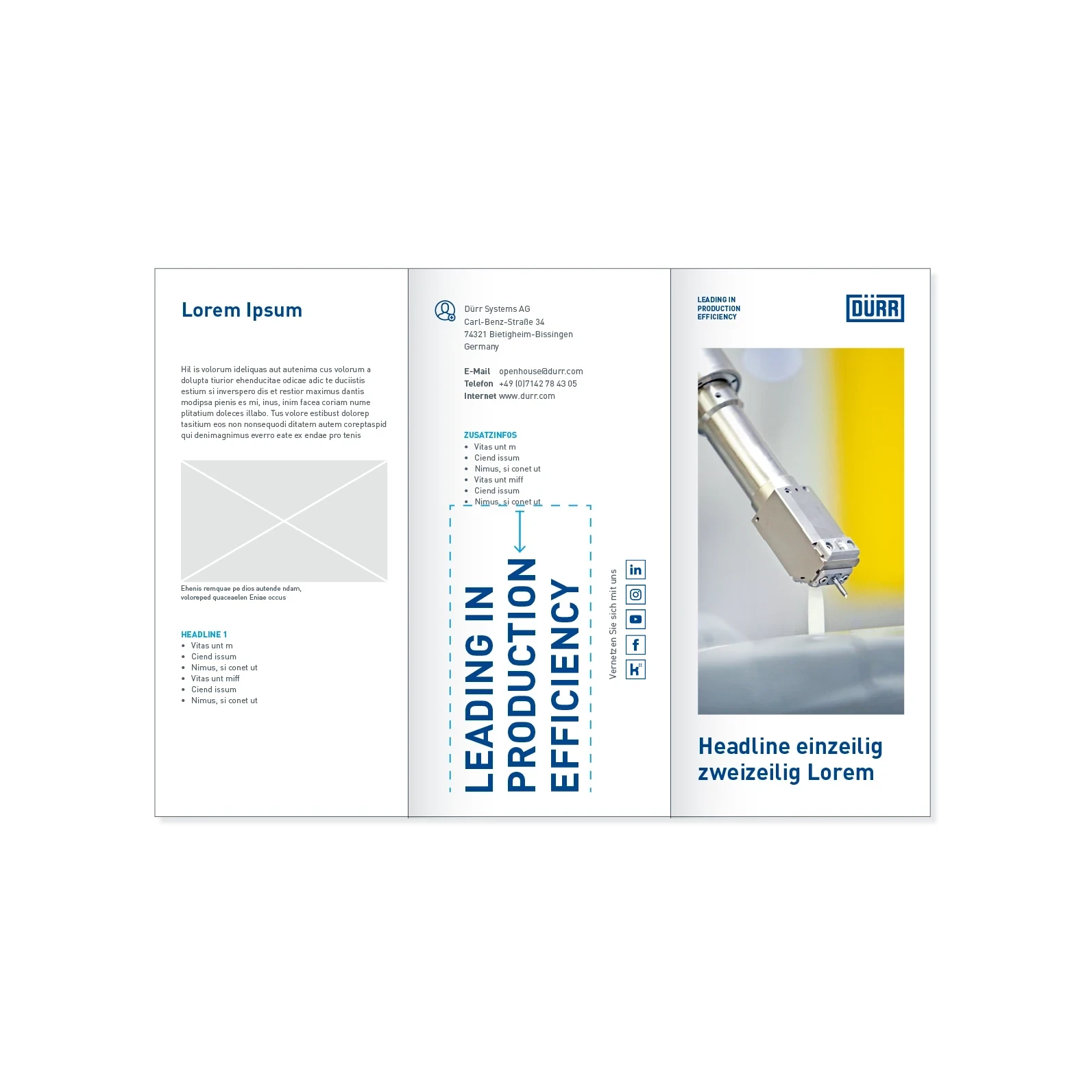
Example of outside pages variant – The contact information can be expanded by reducing the size of the claim.
INSIDE PAGES
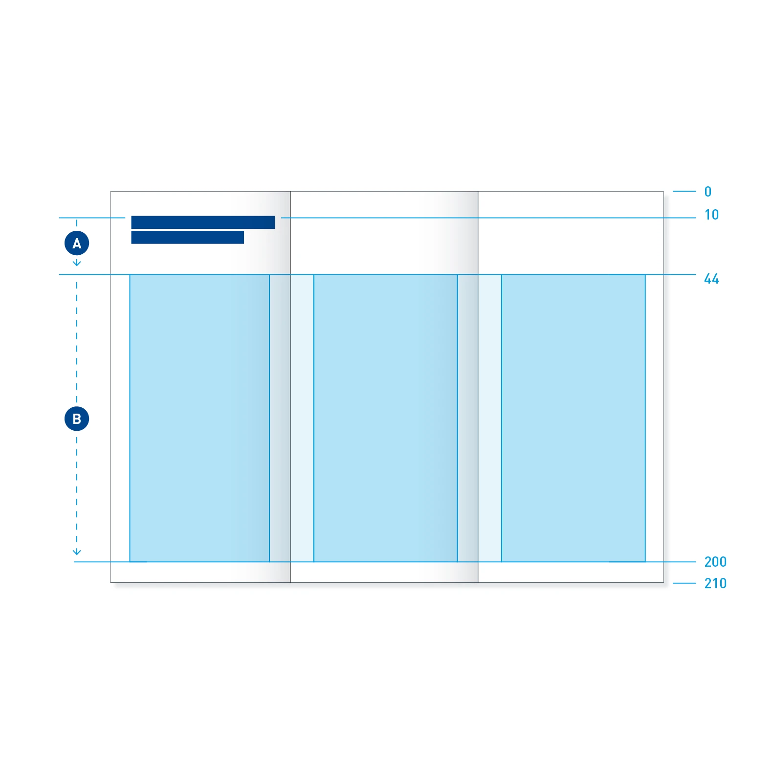
Inside pages print space – Headline area (A) with fixed shoulder and downward flexibility. Print space and content area (B) pegged at the top according to the washing line principle. White spaces in the lower area are possible.
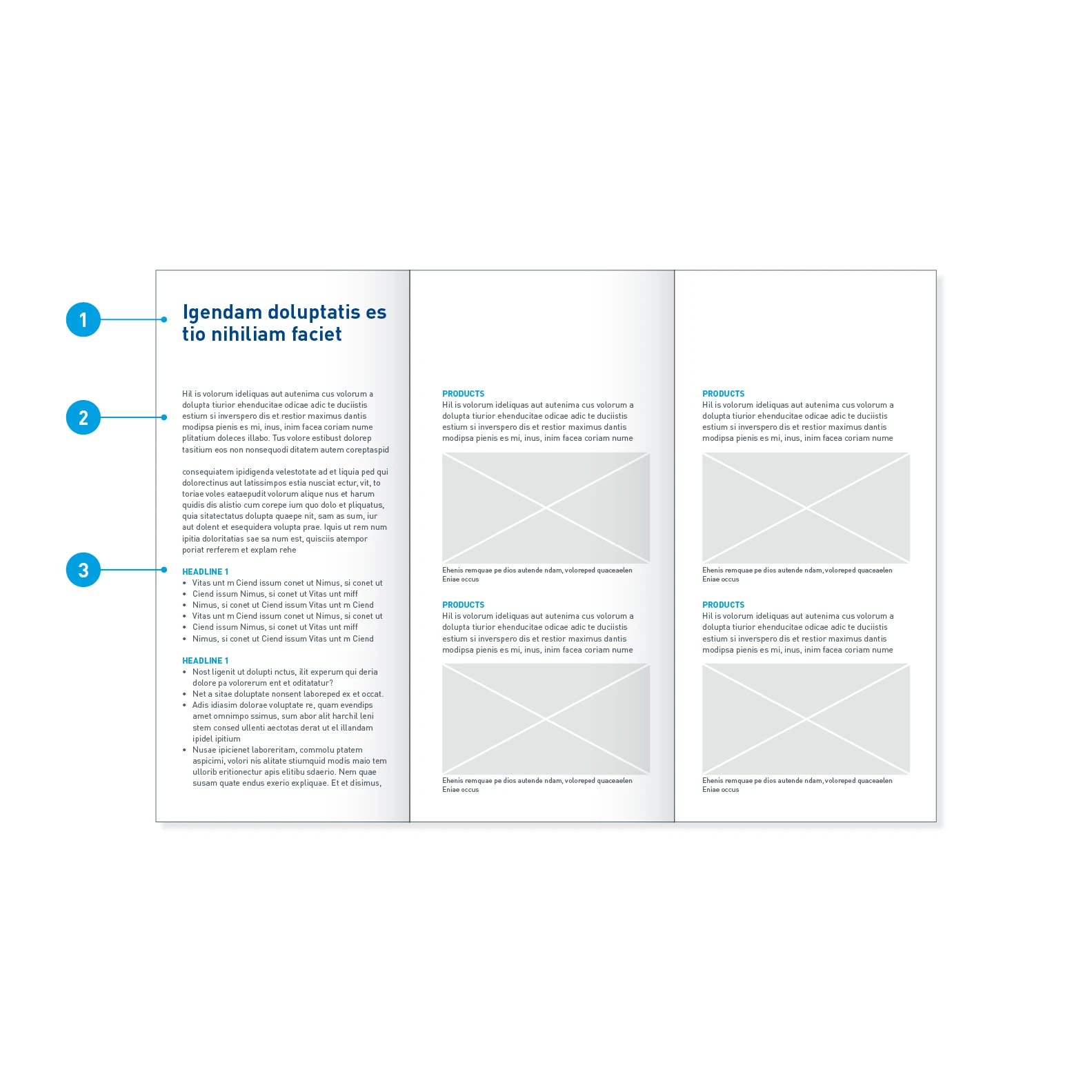
Inside pages font sizes – The ratio of text to image quantity is variable within the print space.
- Headline: Barlow Bold, 22 pt, LS 24 pt, Basic Blue
- Copy: Barlow Regular, 9 pt, LS 12 pt, Dark Gray
- Intermediate headline: Barlow Bold, 9 pt, LS 12 pt, uppercase, Digital Light Blue
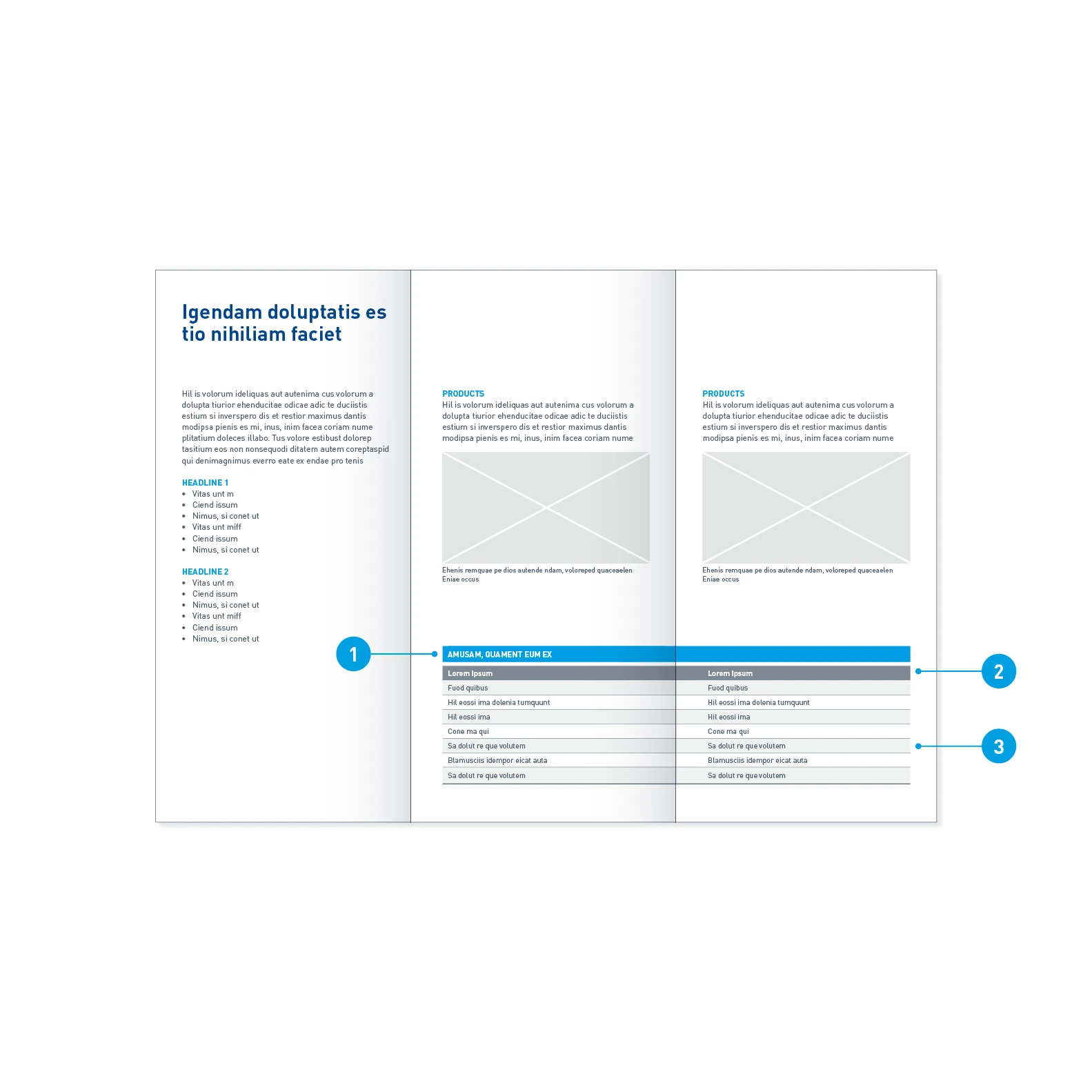
Inside pages with table
- Header: Background in Digital Light Blue, font in Barlow Bold, 8.5 pt, uppercase, White
- Column header: Background in 70% Dark Gray, font in Barlow Medium 8 pt, White
- Table row: Background alternately in 50% Light Gray and White, font in Barlow Regular, 8 pt, Dark Gray
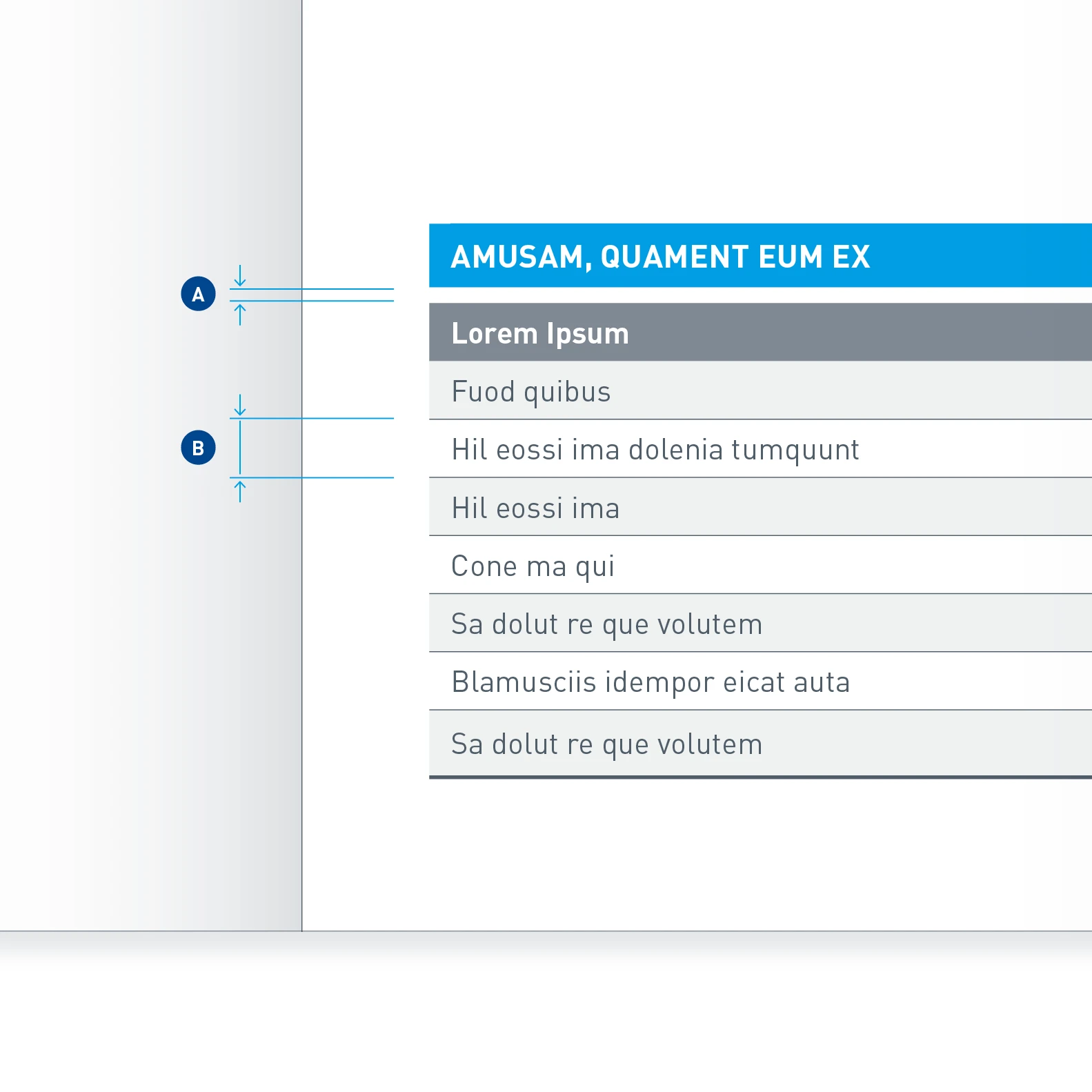
Distances in tables – The distance between header and table (A) is 1.5 mm. The line height (B) is 5.5 mm.
Program flyer
A program flyer packs lots of information into little space. It is a compact medium with a pocket-sized format. The design of the front and back is uniform, while the inside pages can be arranged as required. Depending on the scope of the content, the flyer can be supplemented with additional pages or be folded in a different way.
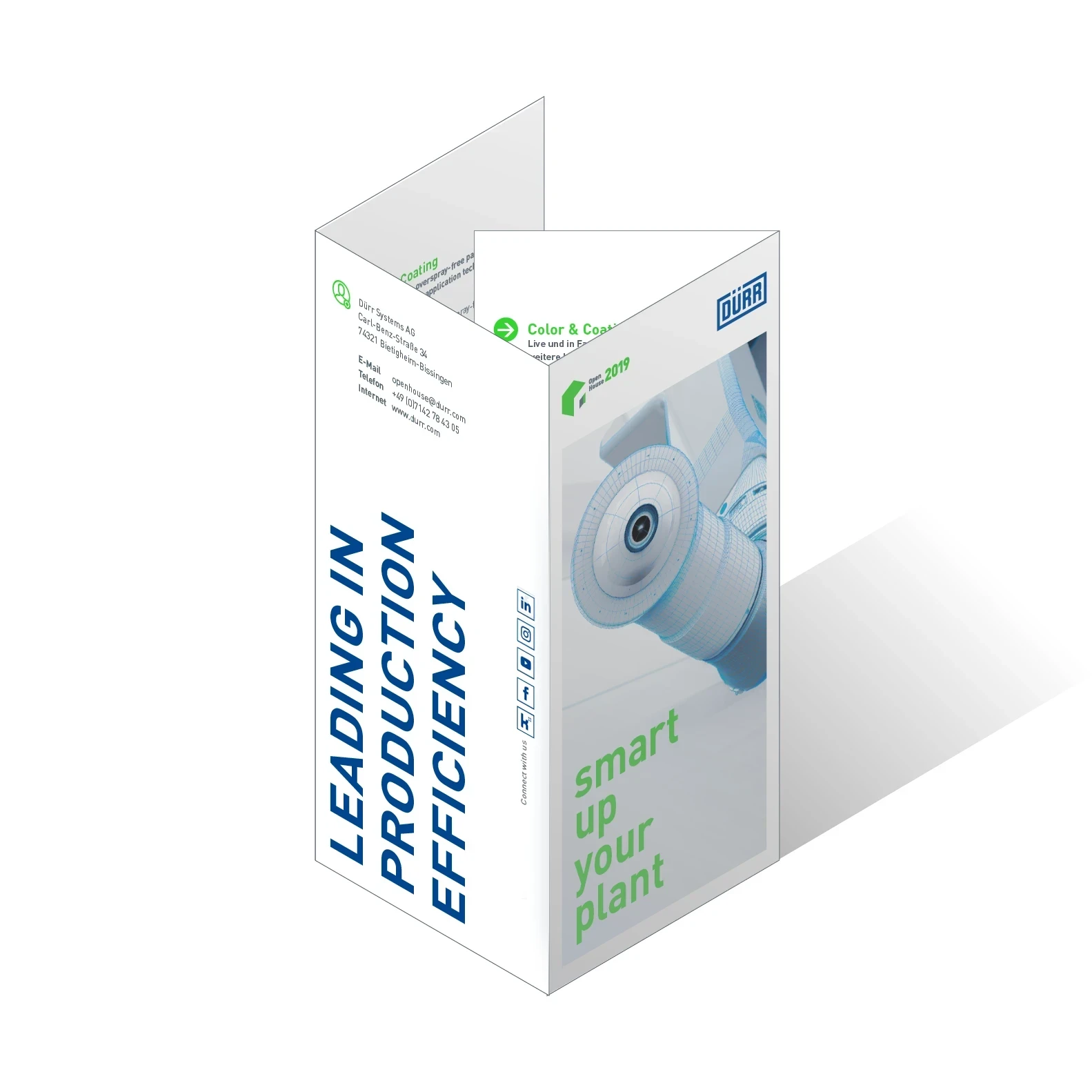
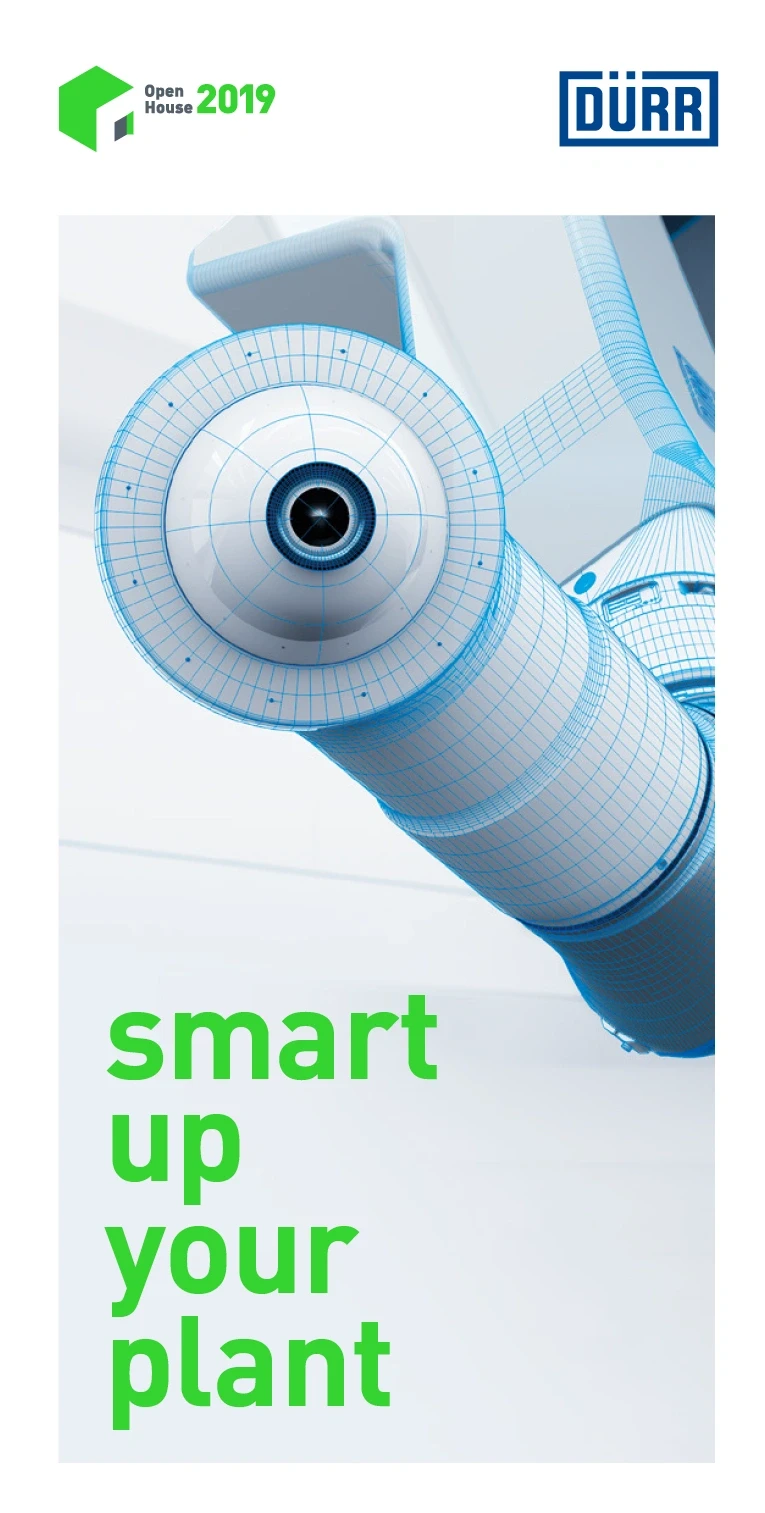
Example of an Open House program flyer – The focus on innovation at Open House 2019 is emphasized here with the accent and special color Innovation Green. The flyer contains a program of events and a site plan. It is an eight-page flyer in the DIN Long format with gatefold.
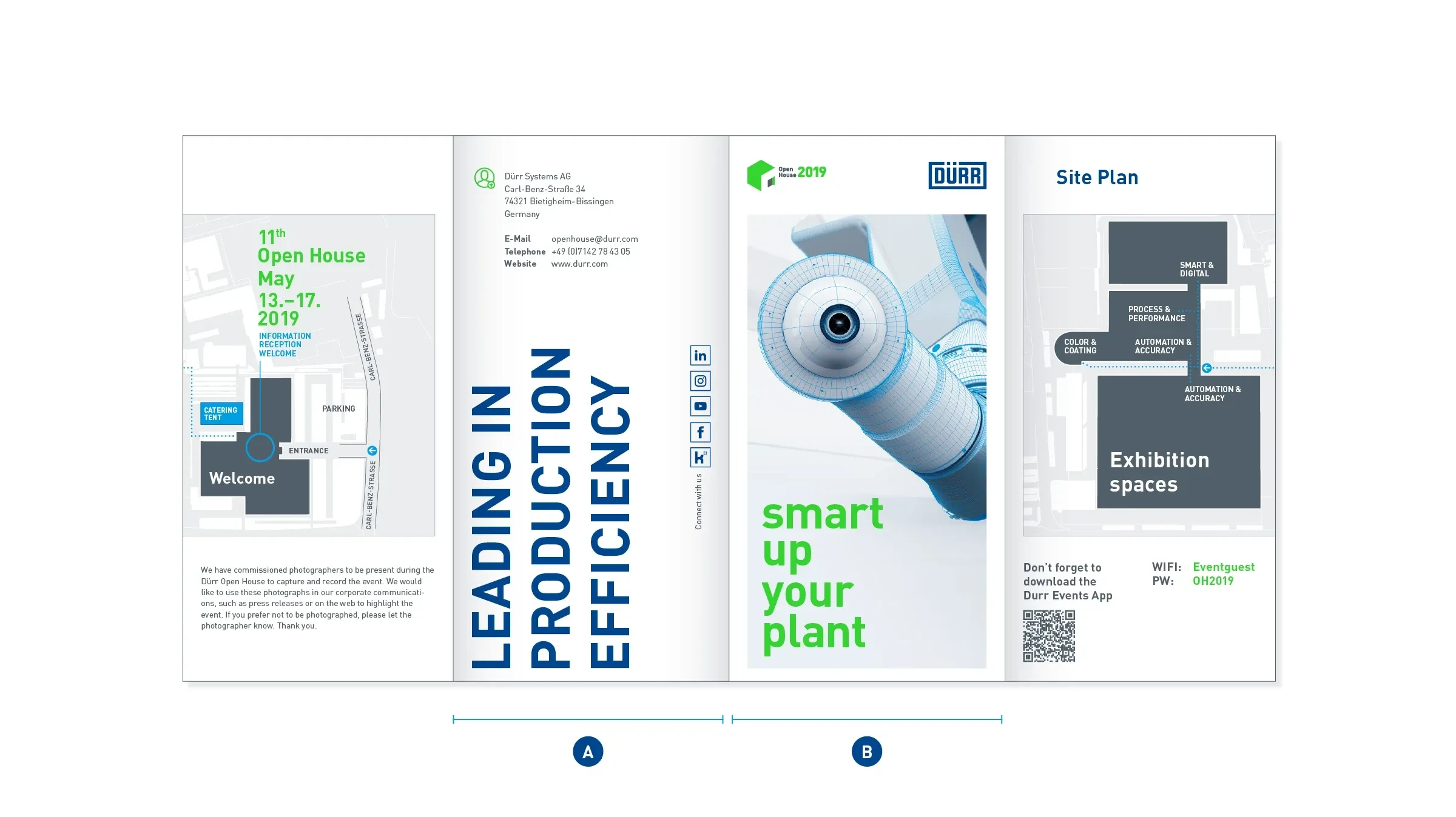
Example of the outside pages of an Open House flyer – The front (B) presents the motto of the event in a Big Type format, which is placed directly on the image. The back (A) closes with the contact details and – even louder – with the upended Dürr claim.
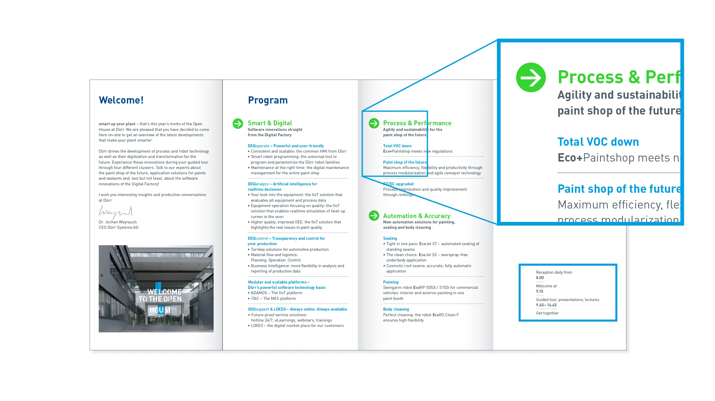
Example of the inside pages of an Open House flyer – The inside pages are condensed and informative. Variety is achieved through fine typographic statements, the bullet point or the Re-Frame.
Invitation flyer
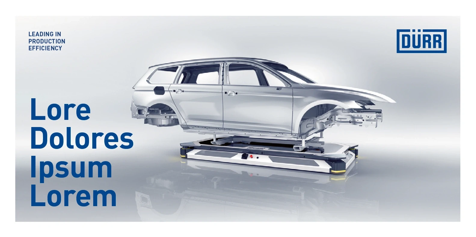
Like all Dürr means of communication, the landscape invitation flyer makes use of loud and quiet typography to create suspense. Great importance is attached to the cover image in this format. Since the Dürr logo, the Dürr claim and the Big Type headline are placed directly on the picture, a calm background is necessary.
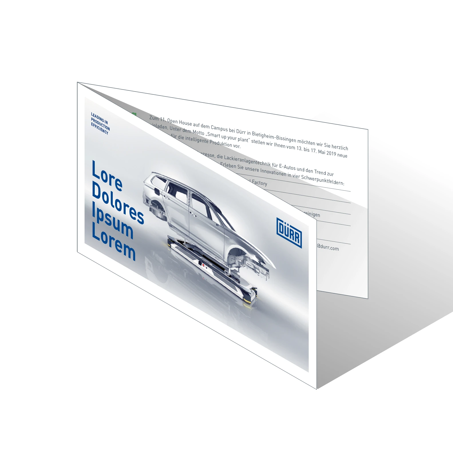
Example of an invitation flyer – Four-sided DIN Long flyer in landscape format
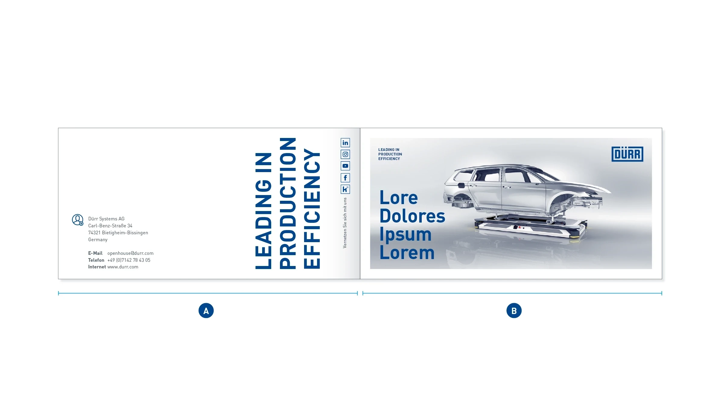
Example of outside pages – The front of the flyer (B) works with a compact Big Type headline. The back (A) concludes loudly with the upended Dürr claim. In addition, there is the address block, which clearly defines the white space.
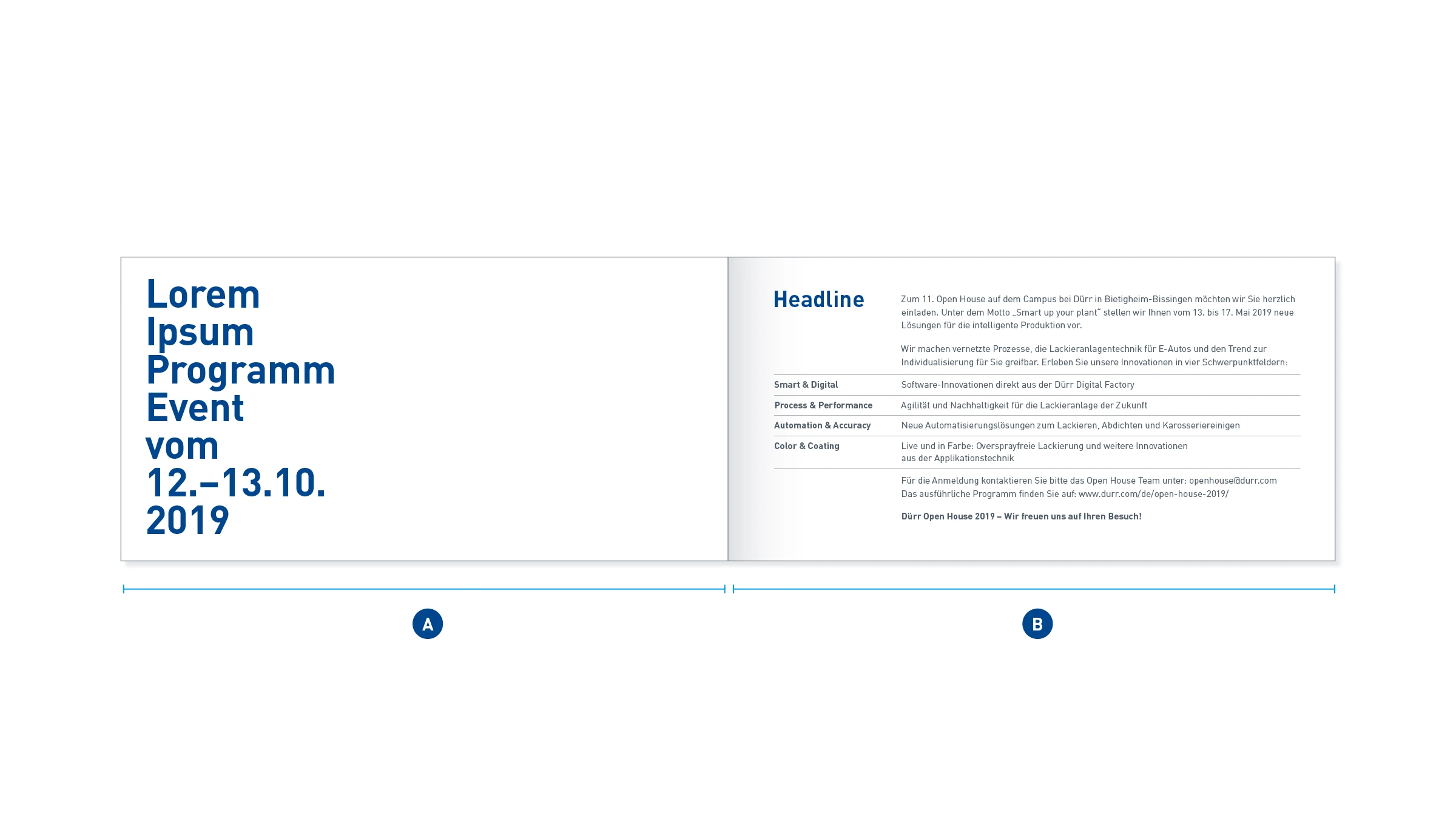
Example of inside pages – On the left inside page (A), the date announcement in Big Type is strikingly set on short lines with a ragged margin. This defines a generous white space towards the fold. A compact, detailed table on the opposite side (B) contrasts with this.
