Trade fair display
Every good trade fair display has to be able to stand out from the wealth of other advertising around it. The purpose of Dürr’s design elements, images and infographics, typography, and clear layout is to attract visitors’ attention from a distance and to provide them with more information when they approach the display. Having a variety of layouts allows for greater design scope to achieve different impacts for the trade fair visitors.
Table of contents
Application
Display walls and curved pop-up display stands offer an alternative to the classic roll-ups. They are very versatile and are used for stands at in-house as well as standard trade fairs, for example. A curved pop-up display is a very lightweight and compact display made of fabric. The image is fixed securely to the presentation system and is not disrupted by any seam. A display wall is an intelligent and extremely versatile modular system that is easy to transport and quick to assemble.
Different perspective views
Different spatial environments are a feature of trade fairs and exhibitions. The display is usually used as a backdrop with furniture placed in front of it. The display should first and foremost attract visitors’ attention from a distance but also provide useful information when read from close range. We have demonstrated the design guidelines below using a 2.86 x 2.35 m trade fair display.
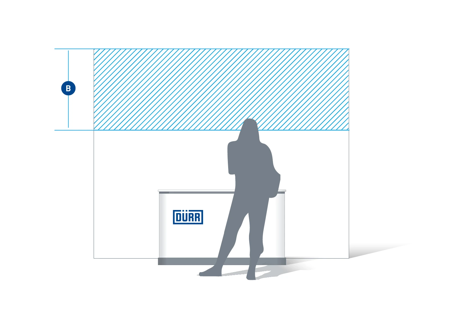
Full view – the print space (A) is framed by a full and uniform white border.
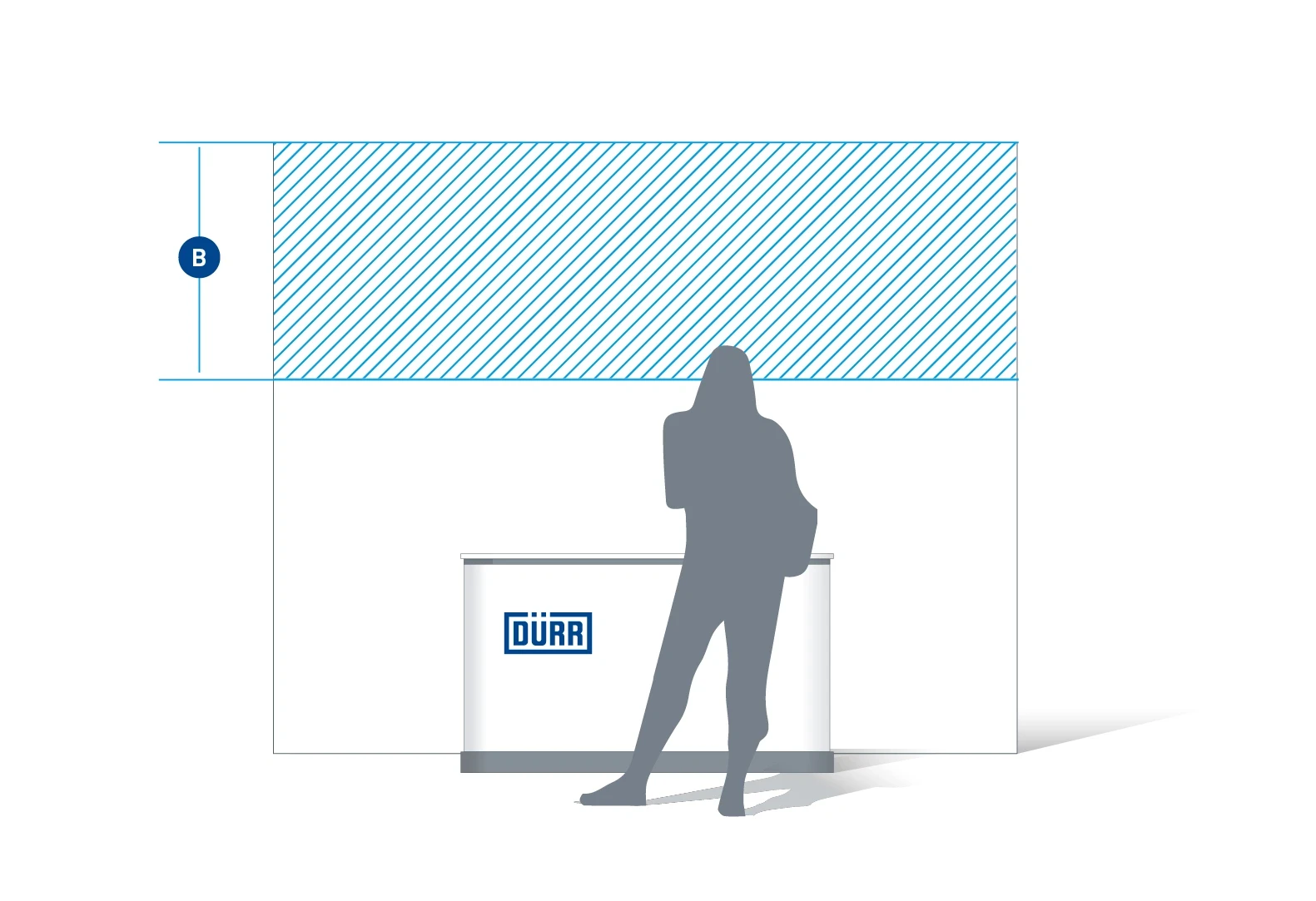
Long-range section (B) – this is where the most important information is positioned. The logo header and the headline in particular should be visible from a distance.
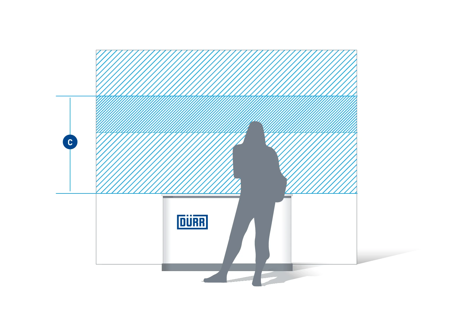
Close-range section (C) – this area is appropriate for more detail and more text, which should be easily legible for standing visitors.
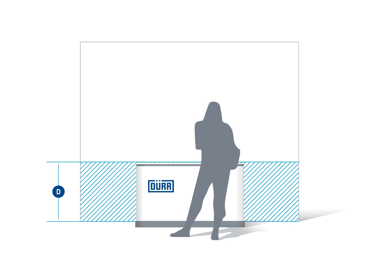
Lower section (D) – the section behind the furniture and exhibits should be free of any text and should only be used for evocative images.
Design principles
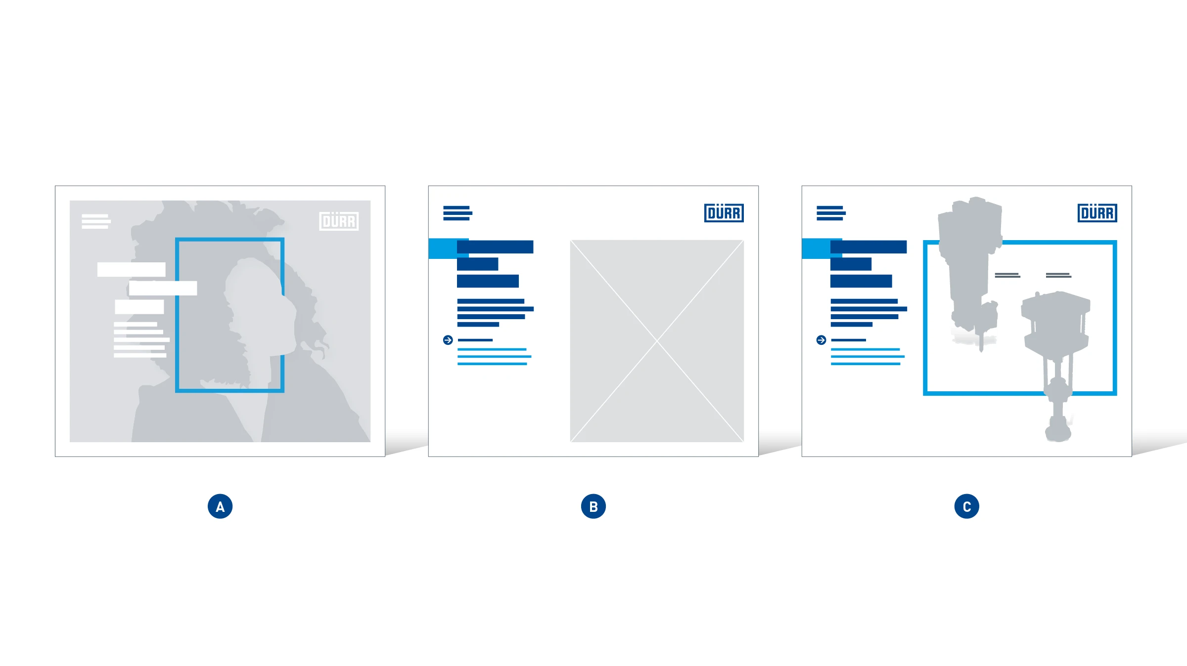
Display series – depending on the space restrictions and the main topic, there are three principles of display design to choose from: Image displays (A), usually with a full-screen image, product displays with an image (B), and product displays with a knockout image (C).
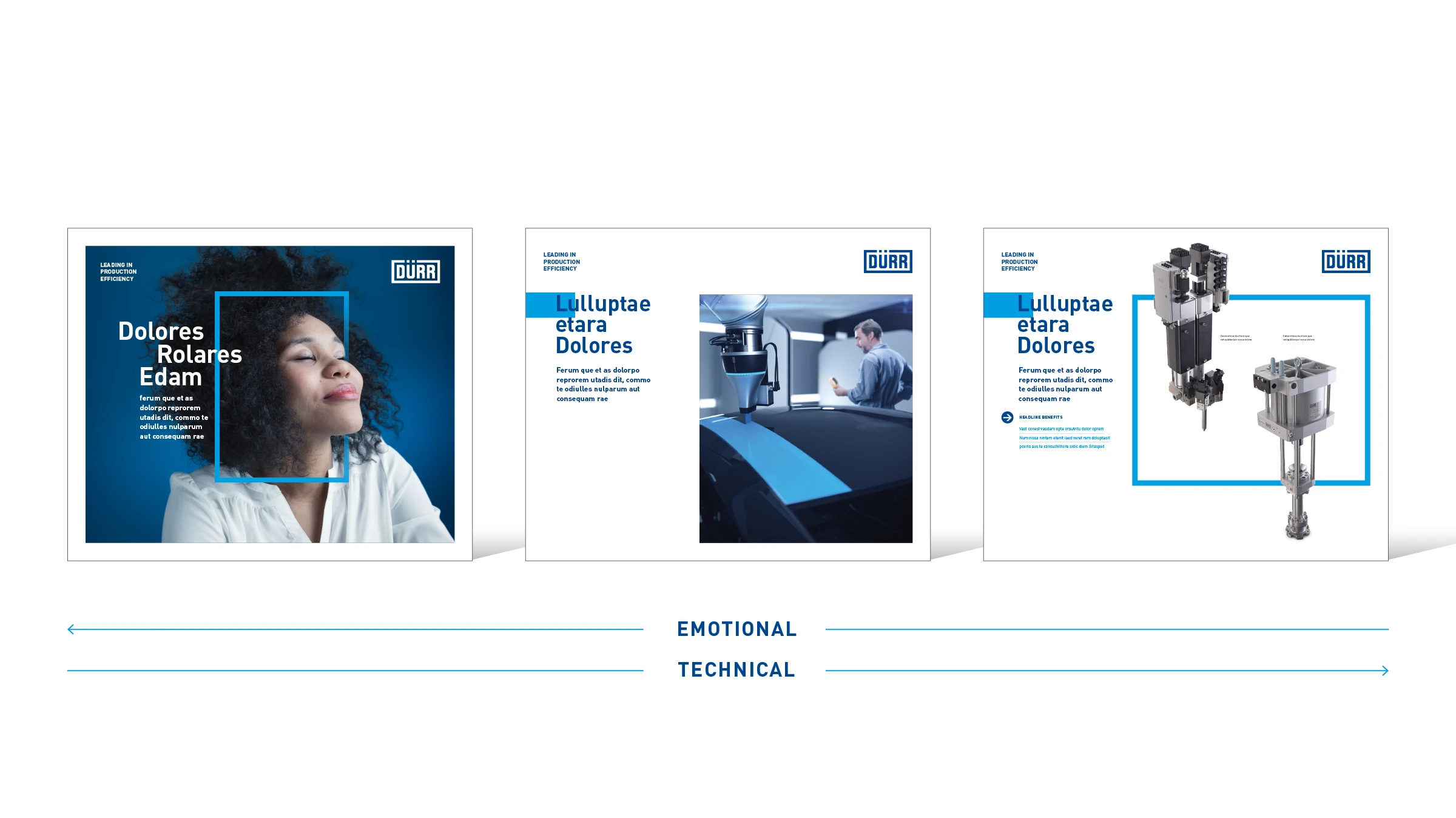
Effect – each of the display versions has a different purpose and conveys a different message. Image displays (A) are brand-focused, and product displays with an image (B) function at the halfway point by showing technology used in context. Displays with knockout images of products (C) convey predominately technical information.
Image display
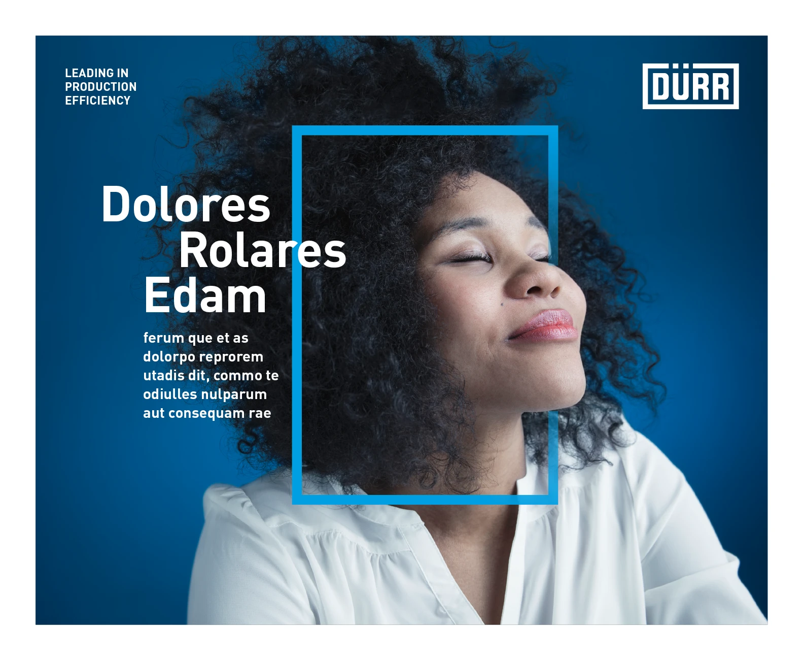
In terms of content and design, image displays are specific to the communication objectives relevant at a given time. As the design can change at a later point, this display is shown purely as an example.
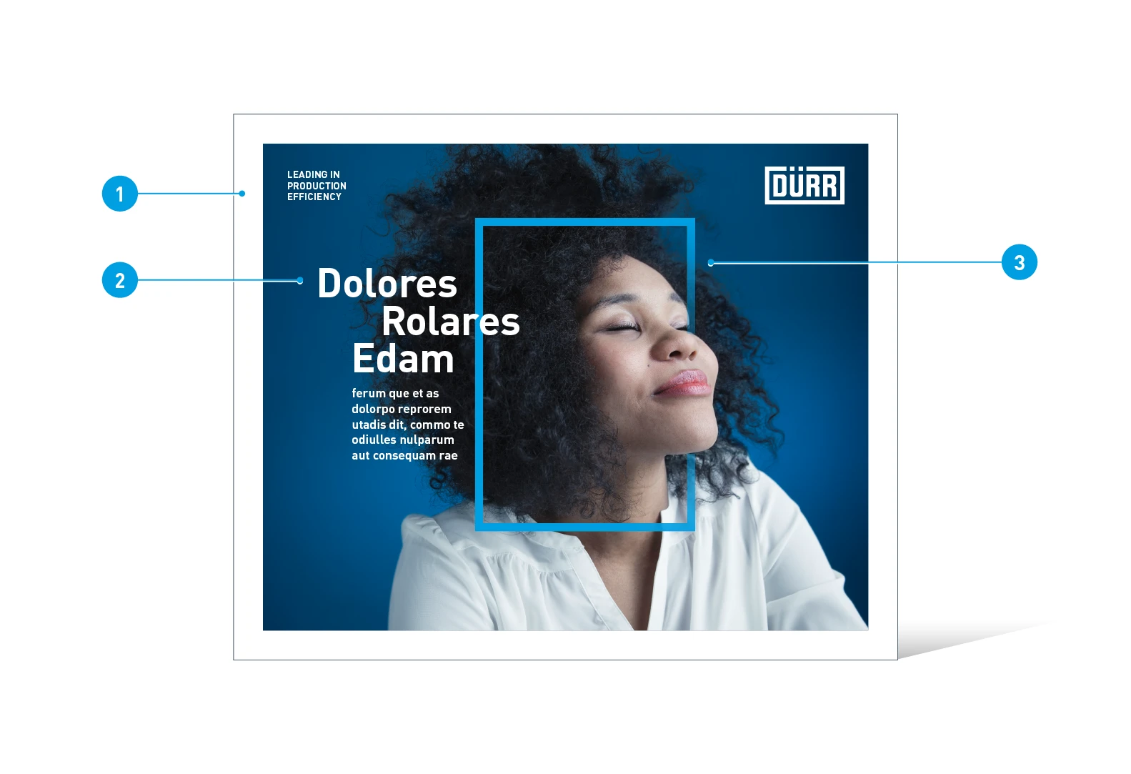
Image displays with a full-screen image – example of an image campaign on the topic of “Odor Control”
- Frame: The image is framed by a full and uniform white border.
- Headline: Individual words are positioned off-center from each other and overlap the re-frame.
- Re-frame: The re-frame is integrated as a two-dimensional shape into the visual depth of the image.
Trade fair displays with an image
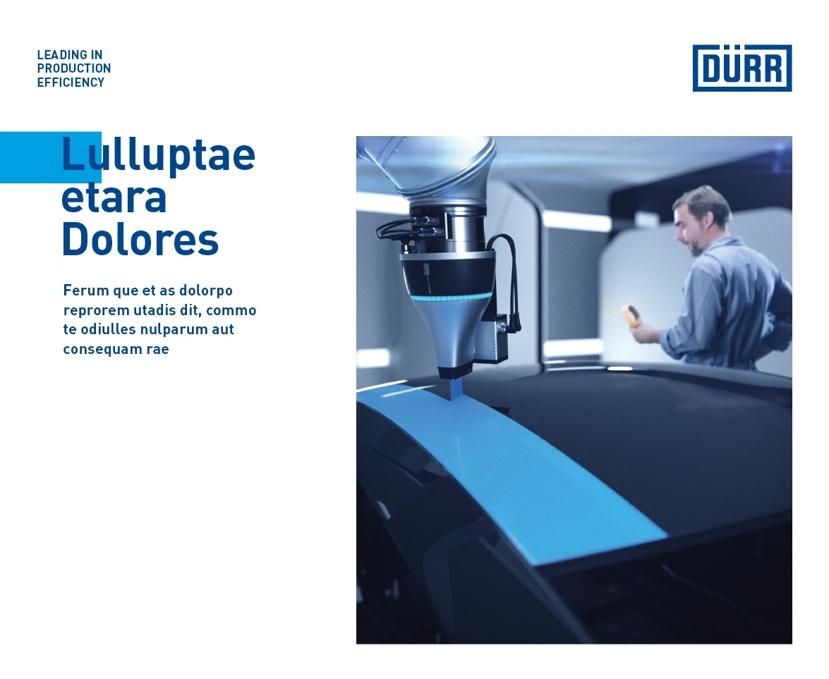
Trade fair displays with an image usually show the application and benefits of a particular Dürr solution in a context that is relevant to the end customer. The image is crucial for conveying character and message. The role of the headline is to stimulate interest and encourage visitors to approach the stand.
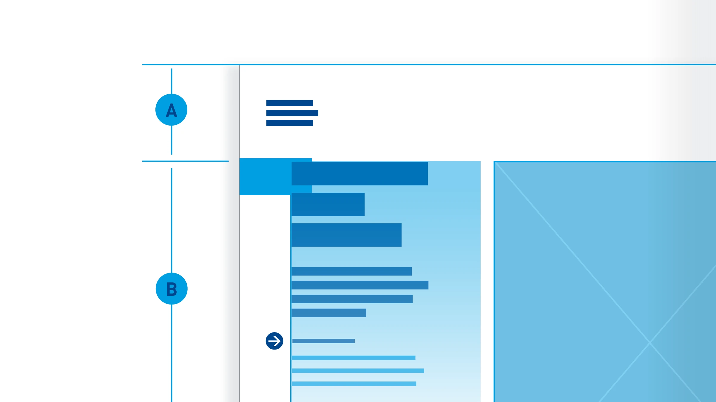
Building blocks

Logo

Slogan

Image

Headline

Subheading

Quick-Link
Layout of the different elements
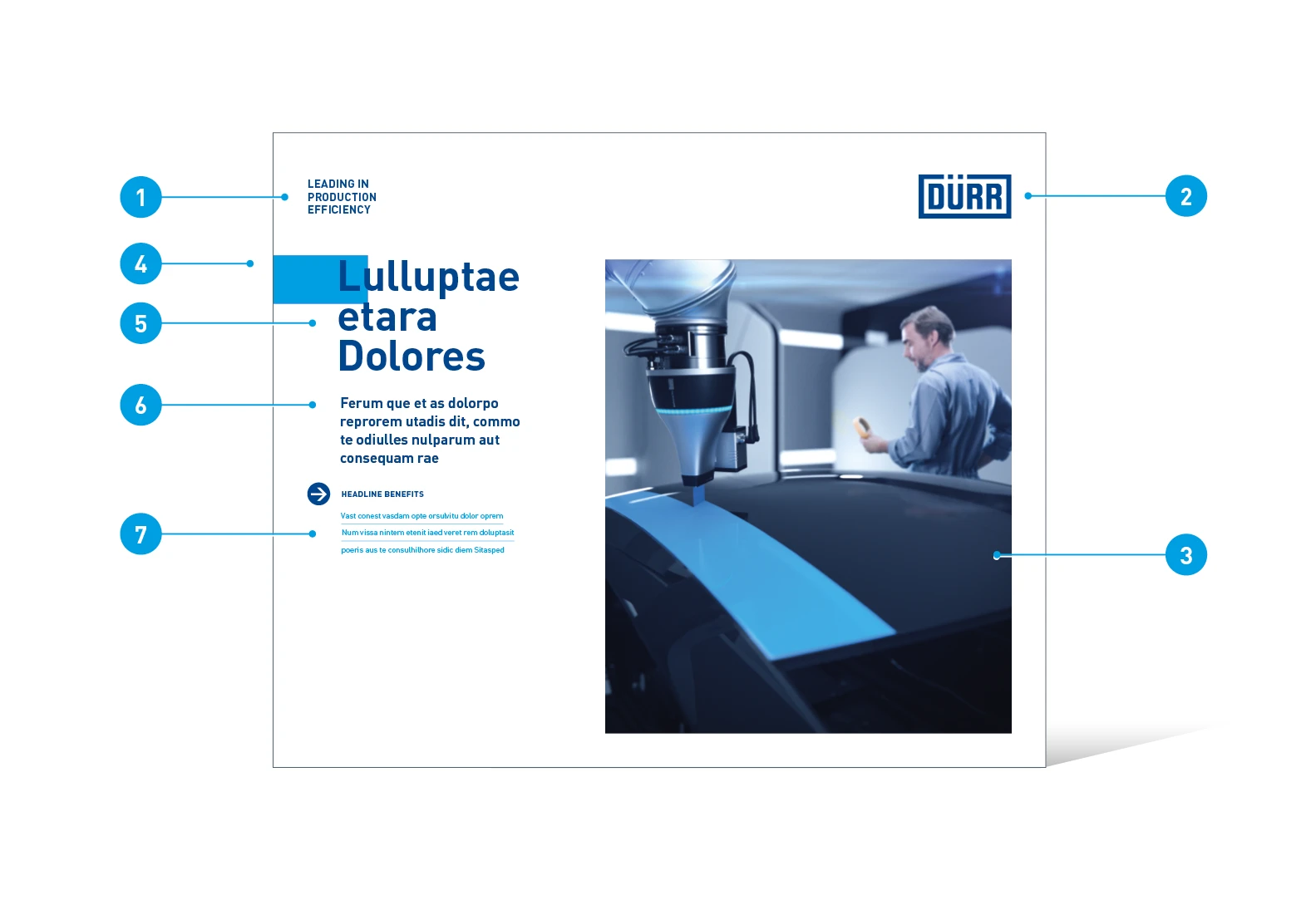
Elements of trade fair displays with an image
- Slogan
- Logo
- Image
- Quick-link: connects the headline to the edge of the medium
- Headline: effective from a distance
- Subheading: answers possible questions arising from the headline
- Benefits (optional)
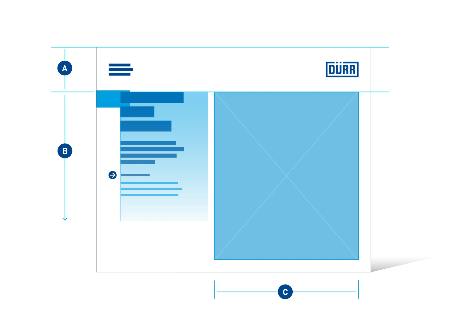
Image and text positioning – the layout of trade fair displays with an image is divided into two columns. The image (C) is always positioned on the right-hand side and the text (A) on the left-hand side. The logo header (A) cannot be changed. The text area (B) is fixed to the upper section of the display and aligned with the upper section of the image. It can extend downwards so long as it is still within viewing height. The image area (C) remains firmly in place.
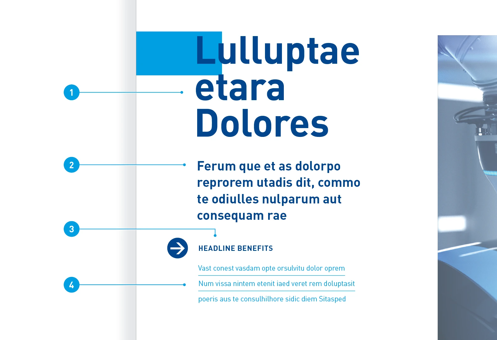
Elements
- Headline: Barlow Bold, 450 pt, ZAB 420 pt. The headline can be set to 1 to 4 lines, long or short lines.
- Subheading: Barlow SemiBold, 150 Pt, ZAB 190 Pt
- Benefits headline: Barlow Bold, uppercase, 84 pt, ZAB 114 pt
- Benefits: Barlow Regular, 84 Pt, ZAB 114 Pt, spacing after paragraph: 22.4 mm
Trade fair displays with knockouts
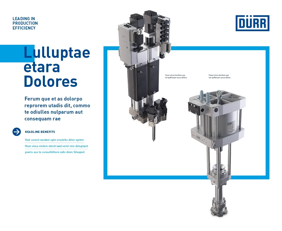
Trade fair displays with knockouts focus on conveying technical information. As knockouts can be positioned freely in the white spaces, this version looks especially dynamic. The re-frame gives additional emphasis to the knockouts while also giving them support within the layout as a whole.
Building blocks
Logo

Headline

Quick-link
Slogan

Subheading
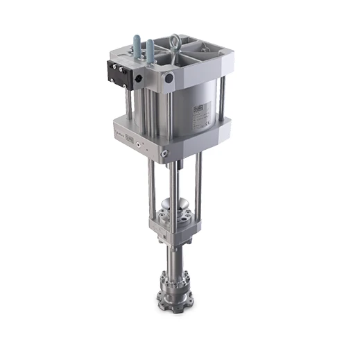
Knockouts

Re-frame
Knockouts in portrait
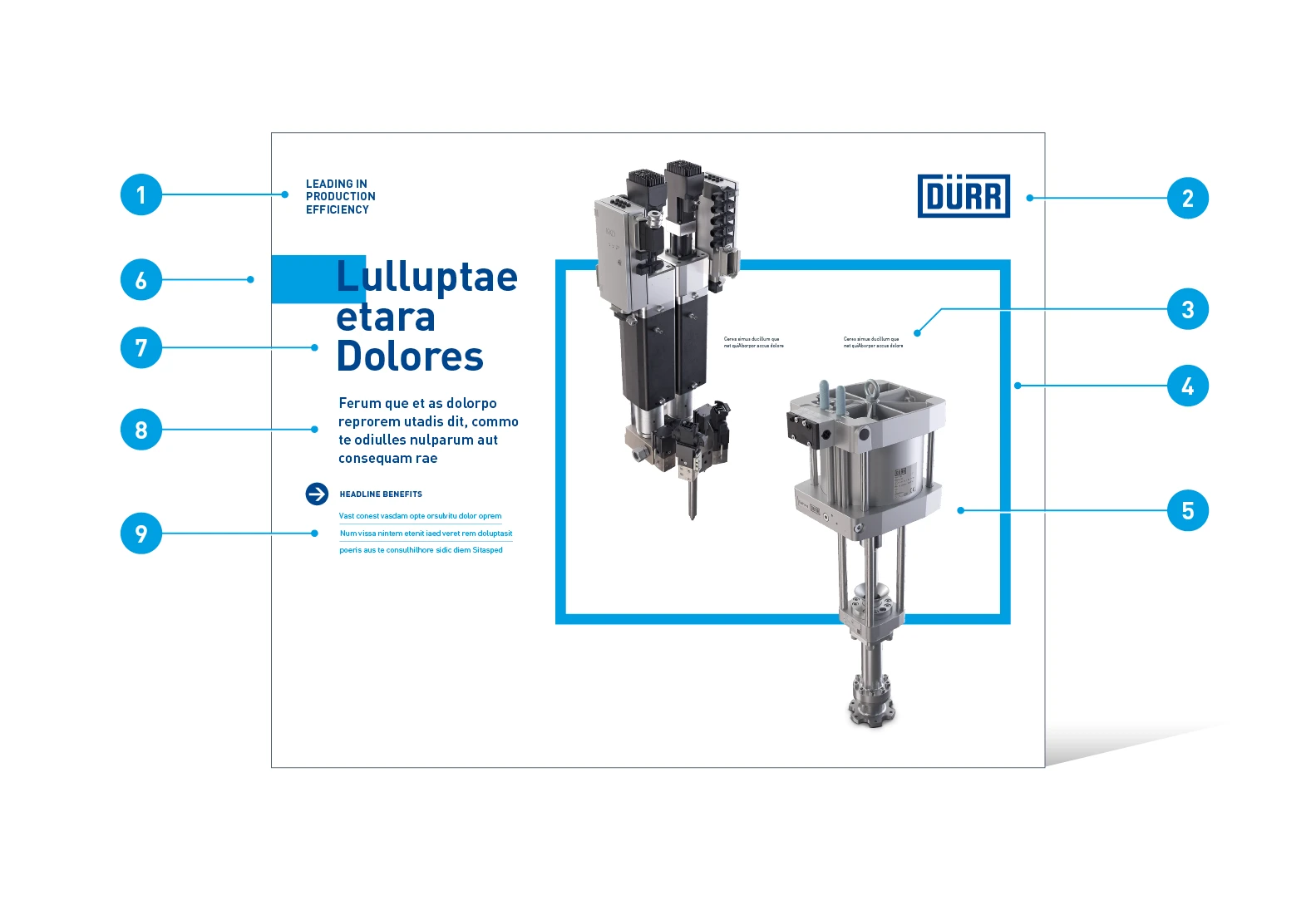
Elements of trade fair displays with an image
- Slogan
- Logo
- Image captions (optional)
- Re-frame: anchors the knockout images within the layout
- Product knockouts: one or several images or illustrations
- Quick-link: connects the headline to the edge of the medium
- Headline: effective from a distance
- Subheading: answers possible questions arising from the headline
- Benefits (optional)
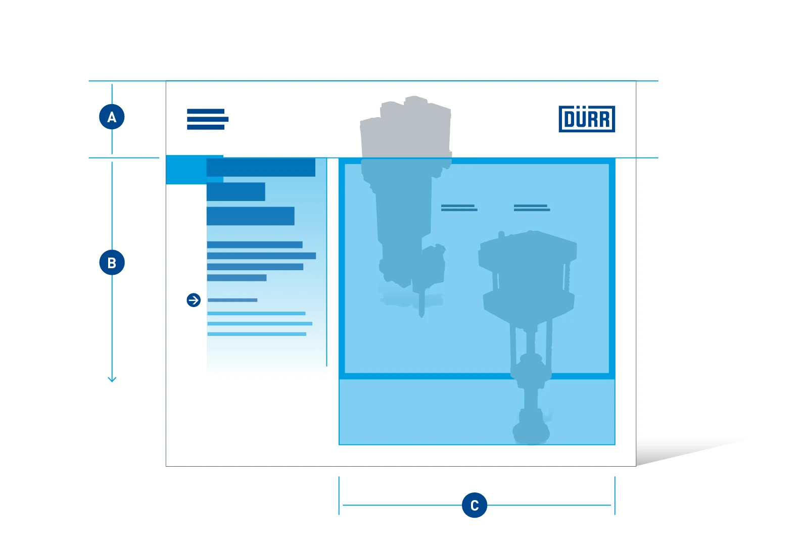
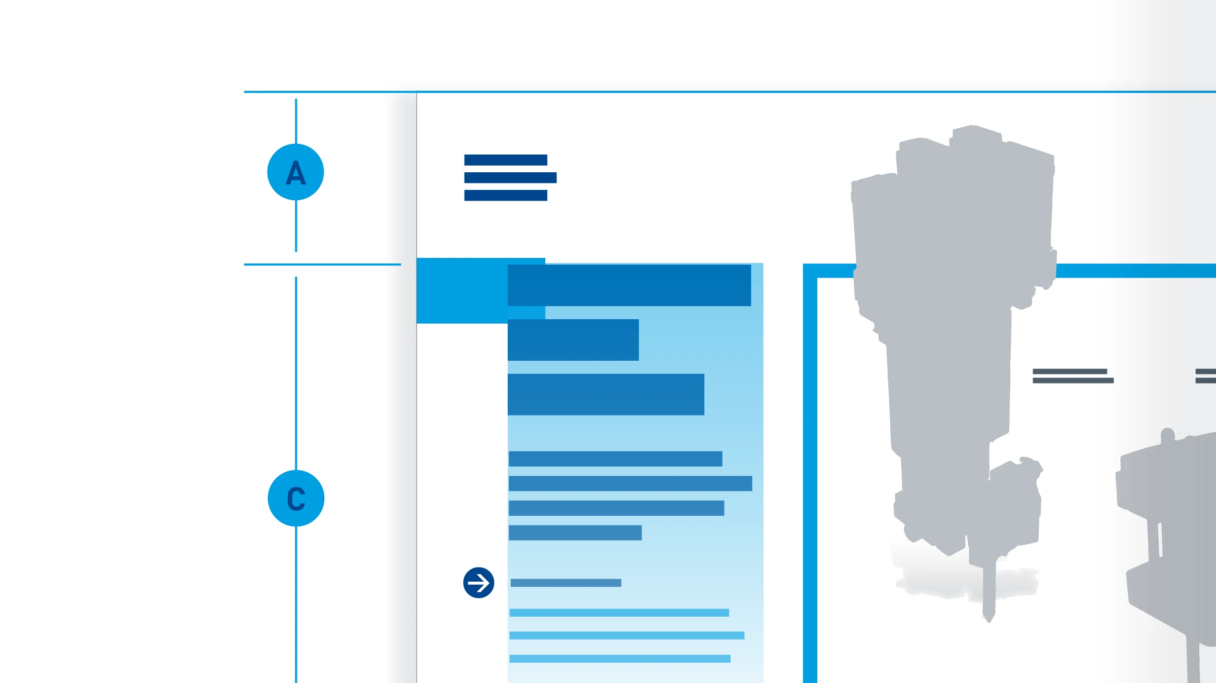
Image and text positioning – the layout of trade fair displays with knockout images is divided into two columns. The knockout images (C) are always positioned on the right-hand side and the text (B) on the left-hand side. The logo header (A) cannot be changed. The text area (B) is fixed to the upper section of the display and aligned with the upper section of the image. It can extend downwards so long as it is still within viewing height. Apart from in the fixed upper section, the re-frame can be placed anywhere within the image area (C). Images can be placed outside of the image area.
Knockouts in landscape
In some cases, a wide image format is necessary. In order to make room lengthwise, the subheading moves to the right-hand side and is positioned horizontally above the re-frame.
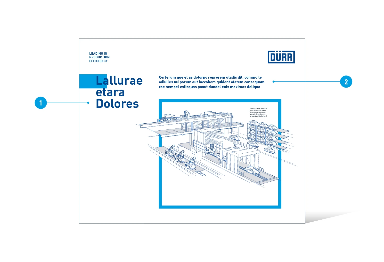
Elements of trade fair displays with landscape knockouts
- Headline
- Subheading
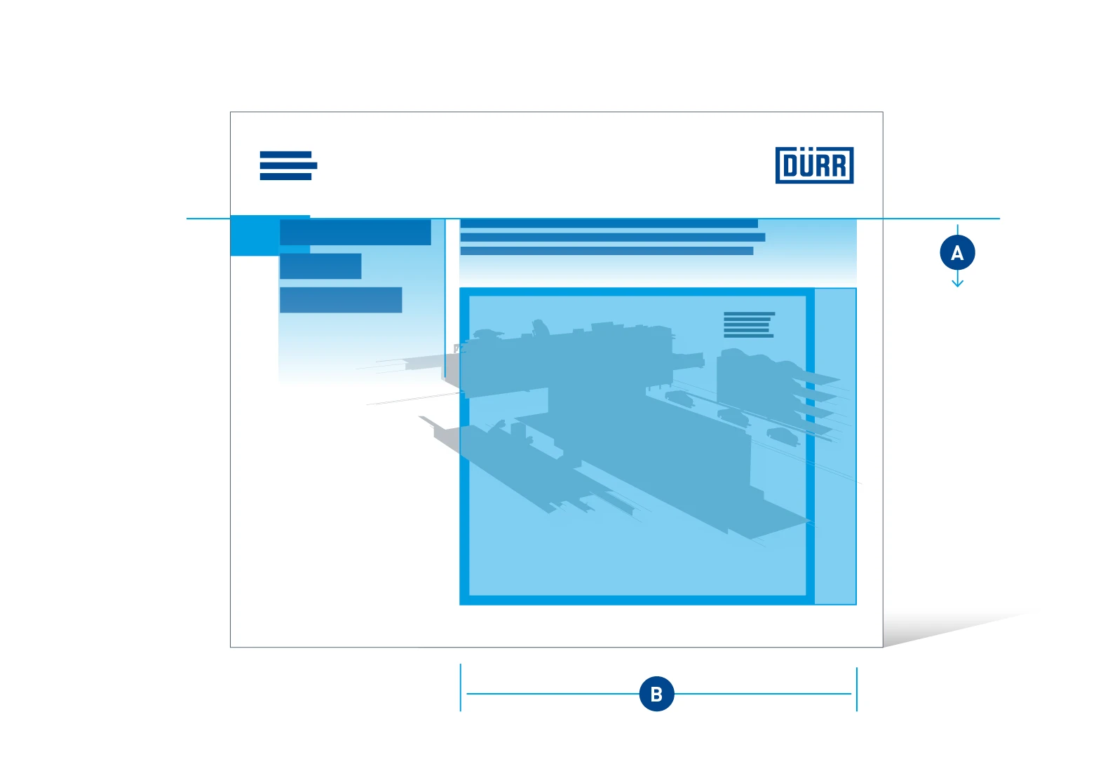
Image and text positioning – the subheading (A) is justified with the upper part of the headline. From there it can extend up to four lines in length. The image area (B) is restricted to the re-frame, but images can overlap it.
