Charts
Charts convey more than just numbers. The graphics can contain precisely prepared data, but also, for example, communicate messages that tell a story. Our design makes it possible to create serious, discreet and detailed charts, but also to stage more striking applications.
TABLE OF CONTENTS
Numbers are visualized in charts as dots, lines, bars, circles or areas. Data can be presented with two axes in a bar chart or radially as a pie chart. The message determines the type of presentation. It is important to highlight the facts and reduce the wealth of information to a minimum.
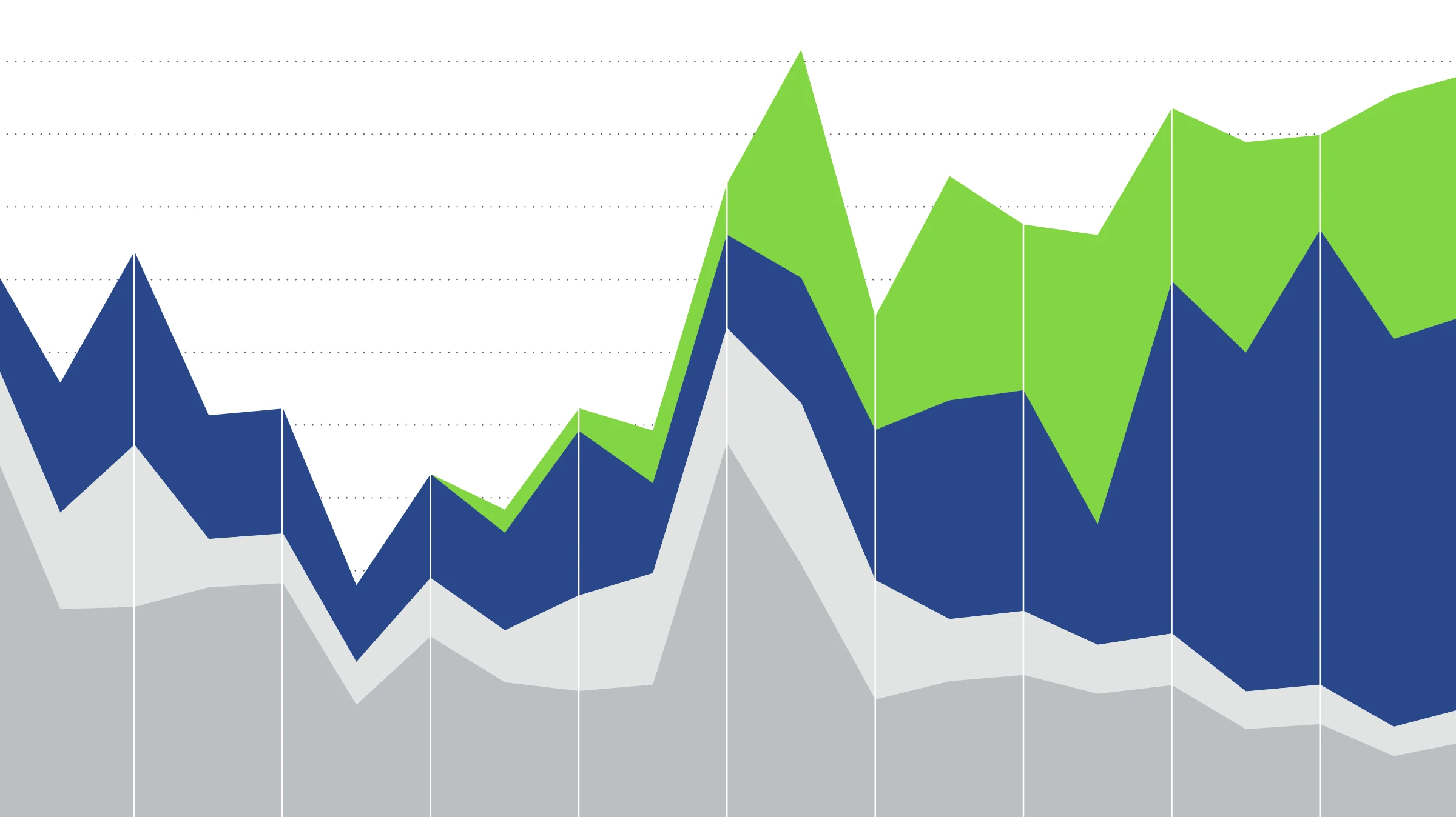
COLORS
Our charts are noted for their deliberate use of color. Each category in a chart is given its own color. For the sake of clarity, the number of categories should not exceed five.
Axis charts
BAR CHARTS
Bar charts show the absolute values of individual categories and their relationships to one another.
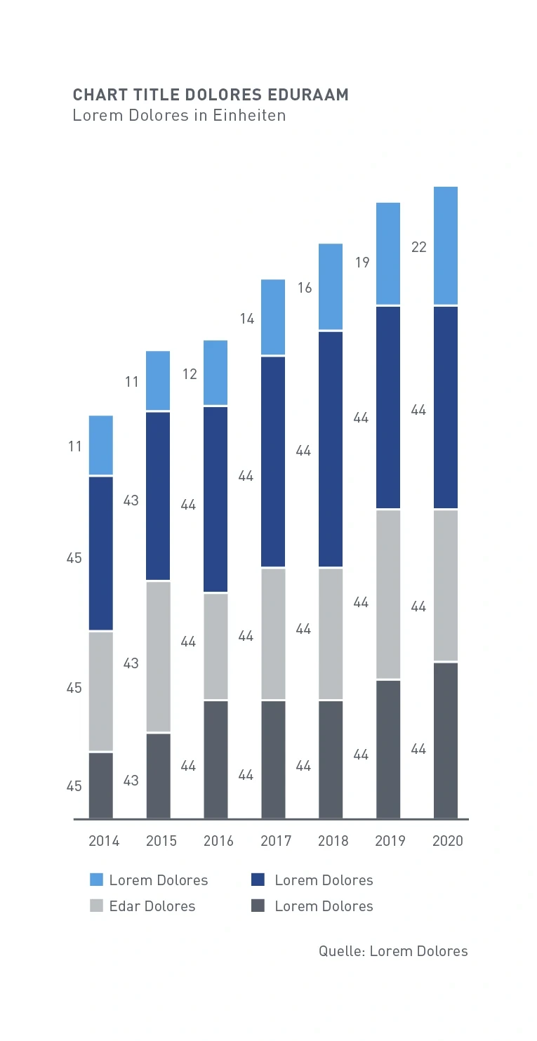
Stacked bar chart – The values of the individual segments are arranged at the side of the bar. Labeling of the y-axis is optional.
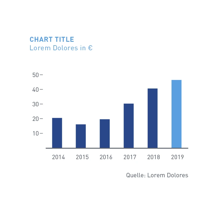
Bar chart – A bar is specially emphasized through the use of Digital Light Blue.
LINE AND SCATTER CHARTS
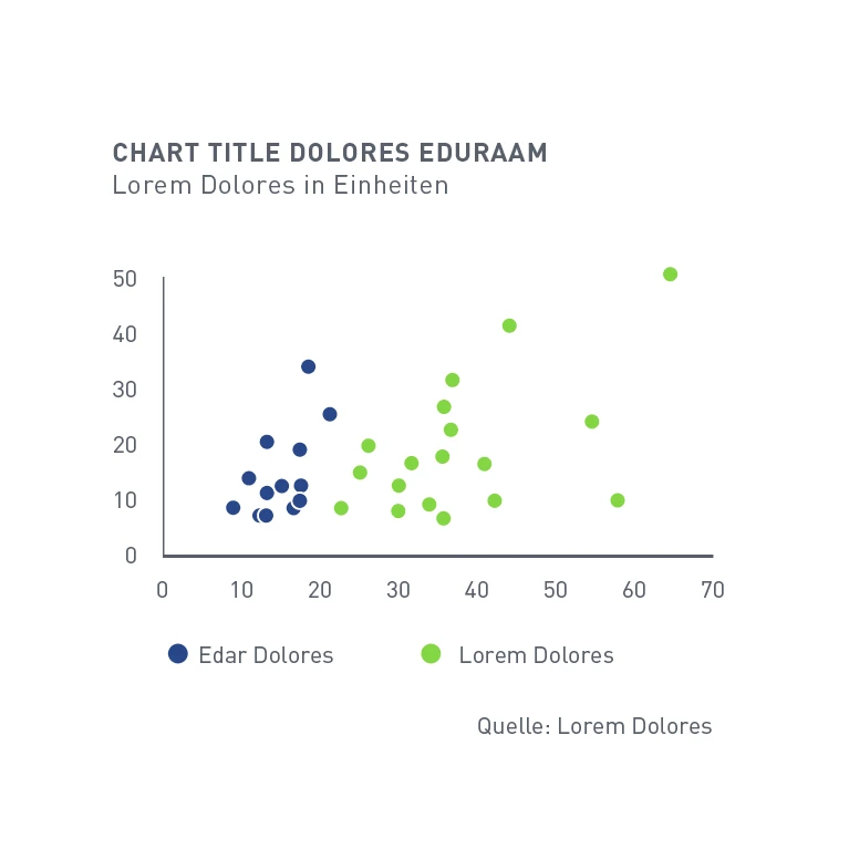
Dot chart – Dots are positioned on two value axes. The categories can be differentiated by the color of the dots.
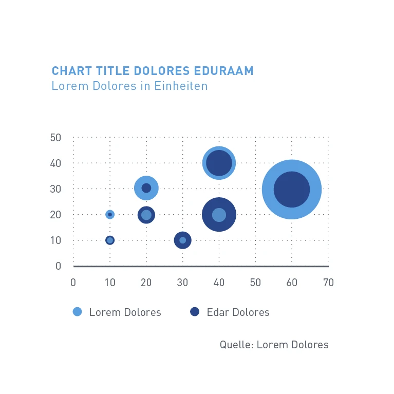
Bubble chart – Resembles a dot chart with two value axes. The size of the bubble represents an additional dimension of the data.
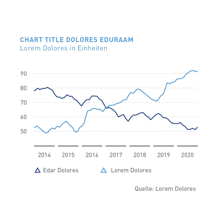
Line chart – All data points are connected to each other with a line.
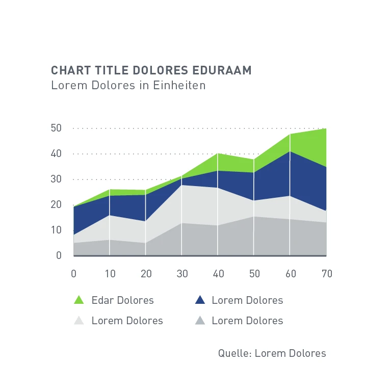
Area chart – Stacked area chart with absolute values.
Chart details
GRID AND AXIS LABELING
A line grid consists of dotted lines and can be shown in various levels of detail. It sits in the background of the chart.
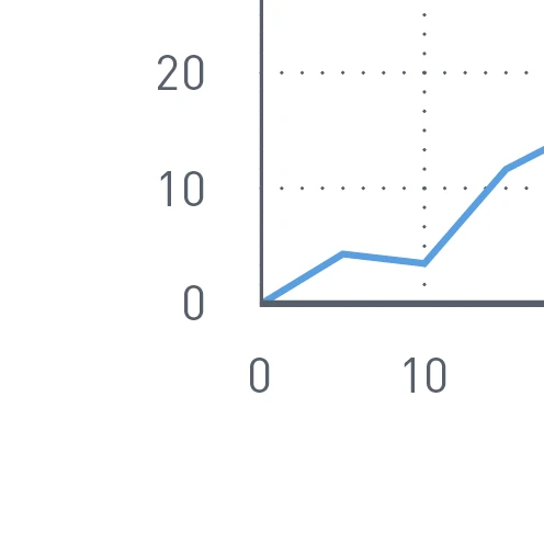
Line grid – Dotted axis lines horizontally and vertically
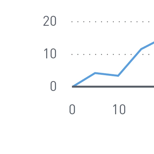
Line grid – Dotted axis lines horizontally
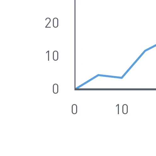
Line grid – Without dotted axis lines
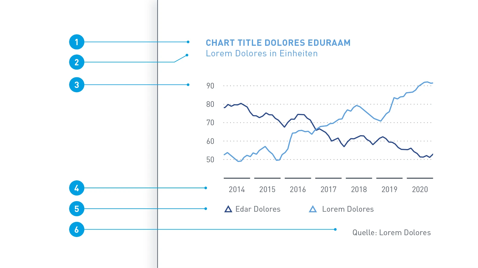
Font sizes – The font sizes in the charts are dependent upon the communication medium. The values are not fixed but their ratios should serve as a guideline.
- Headline: 7 pt, font color Dark Gray or Digital Light Blue
- Subheadline: 7 pt, uppercase, font color as for headline
- Value axis labeling: 6 pt, font color Dark Gray
- Category axis labeling: 6 pt, font color Dark Gray
- Legend: 7 pt, font color Dark Gray
- Source citation: 6 pt, font color Dark Gray
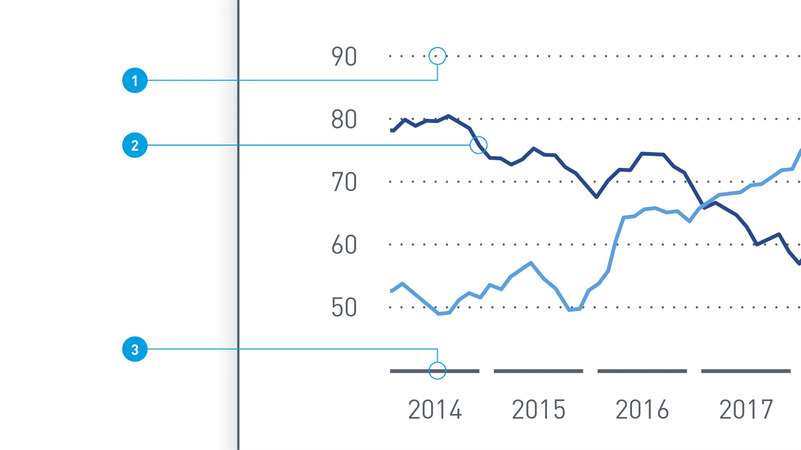
Contour thicknesses – the contour thicknesses in charts are also dependent upon the size of the medium. The values shown here are examples.
- Grid line: 0.5 pt, dot spacings 2 pt, contour color Dark Gray
- Data line: 0.75 pt, contour color variable
- Base line: 0.75 pt, font color Dark Gray
Pie charts
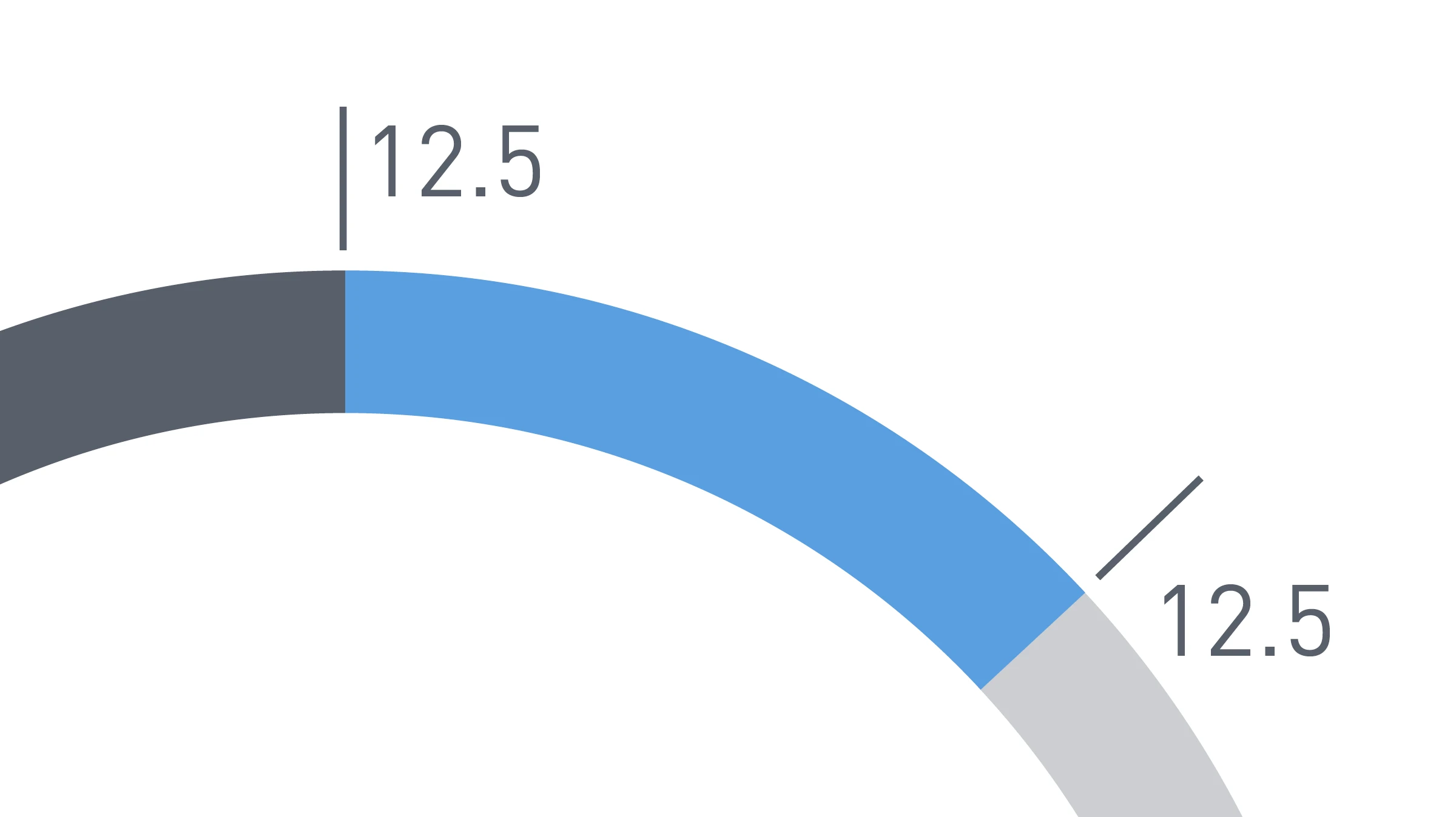
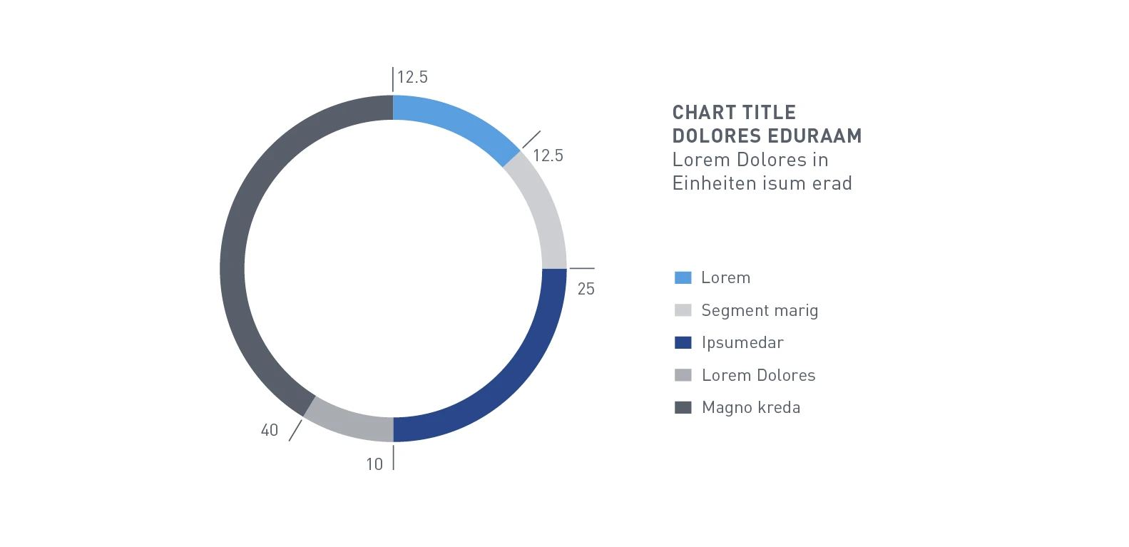
A pie chart shows sub-values that together produce a whole. The category labeling is shown alongside as a legend. The differentiation is achieved solely by means of colors. The number of segments should be kept to a minimum for the sake of clarity.
PIE CHART ALTERNATIVES
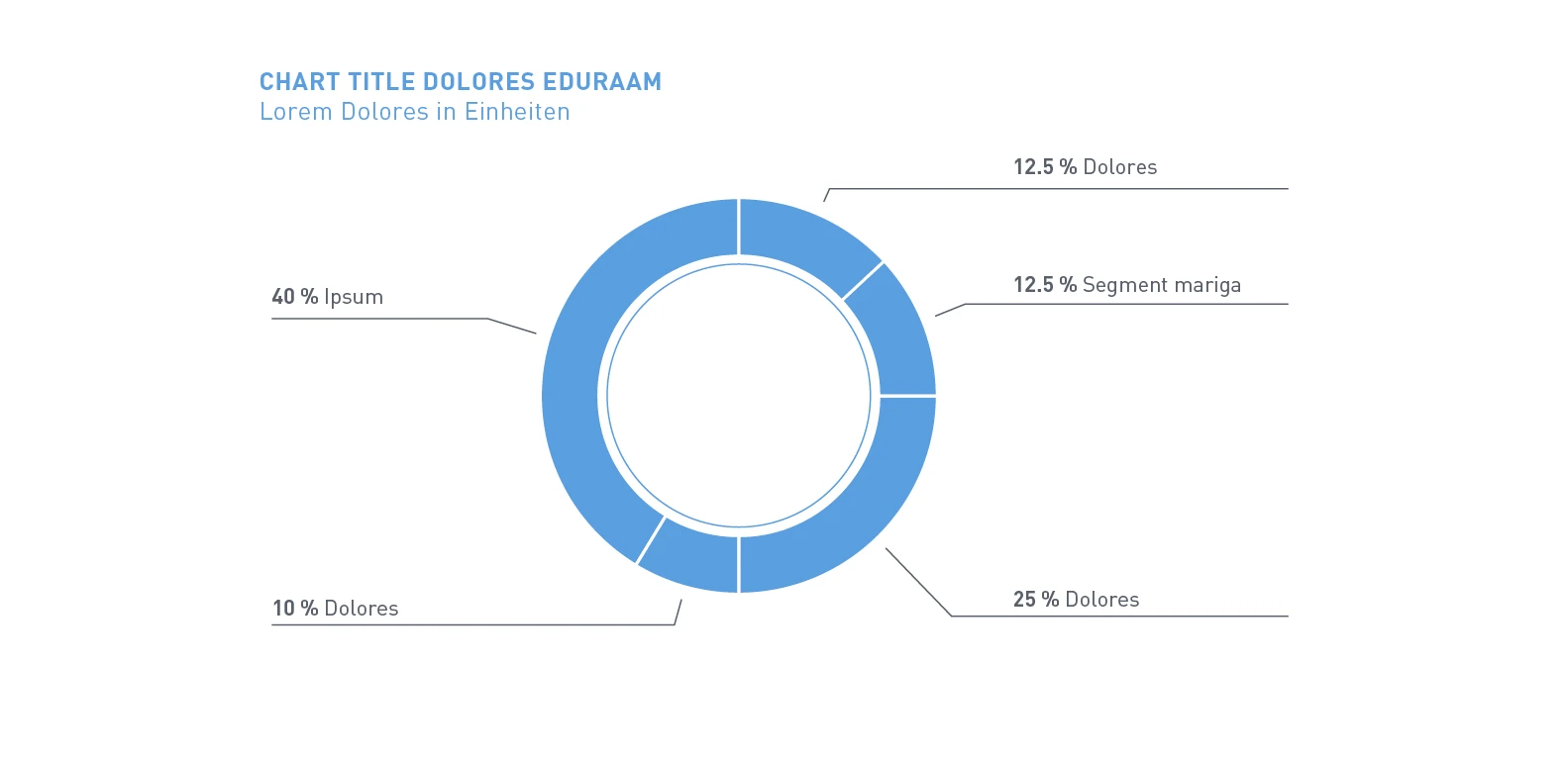
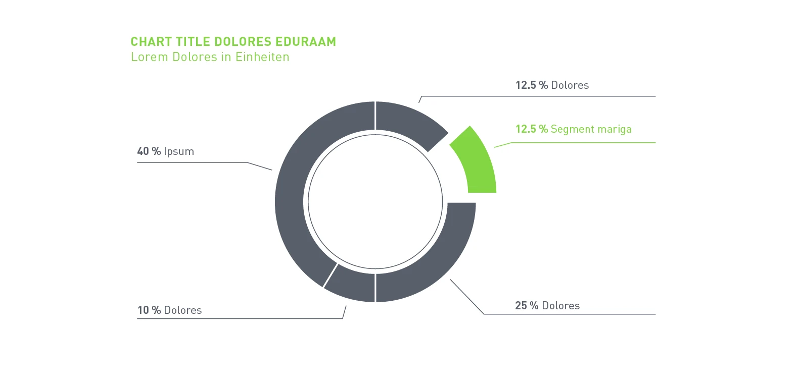
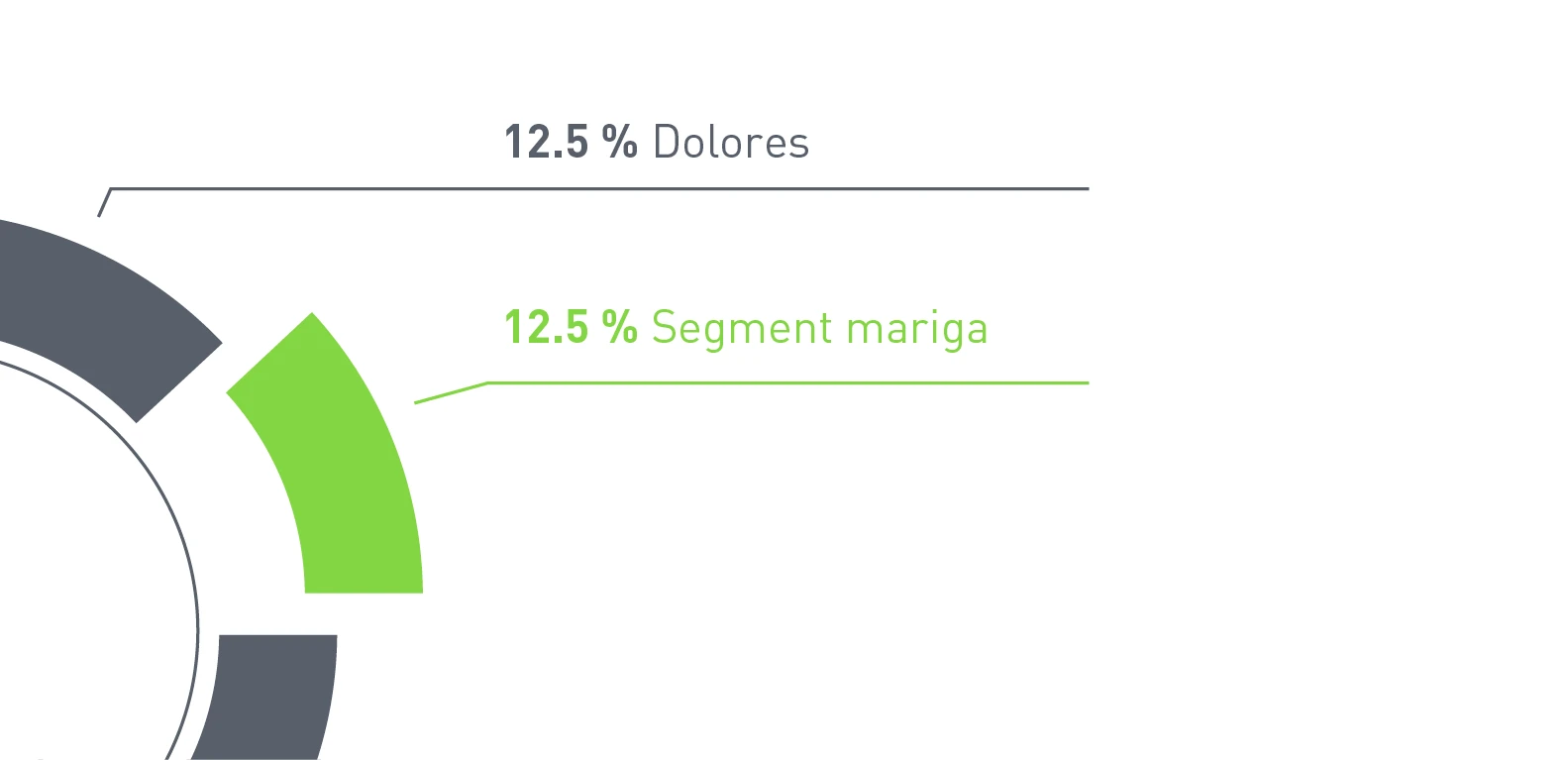
A variant with direct peripheral caption is also possible and is suited for areas such as Editorial Design. The implementation is a bit freer and needs fewer colors.
Schematics
Schematics show processes or structures such as organizational charts or flowcharts.
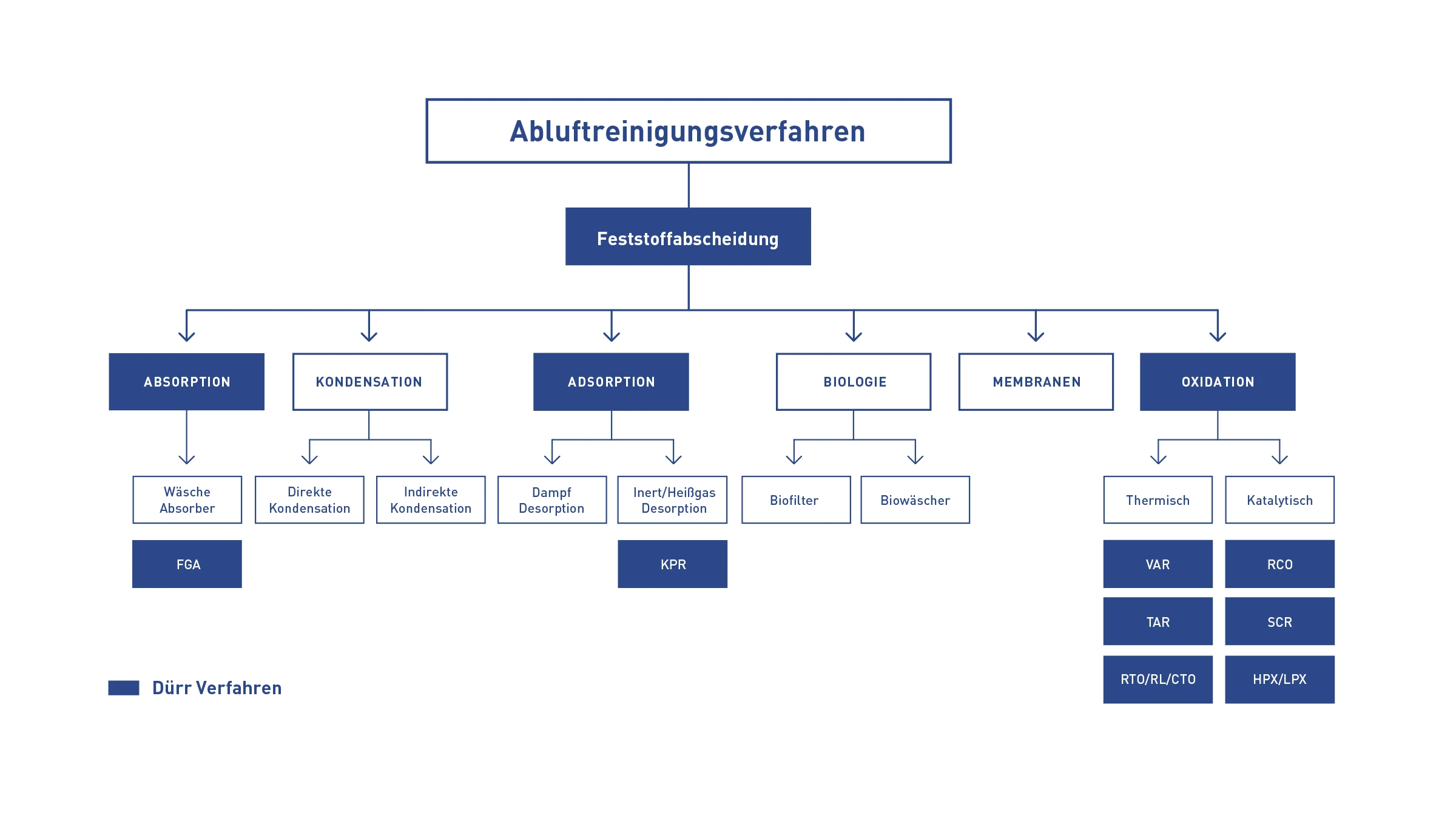
Example flowchart – Follows a clear hierarchy from top to bottom: the gradings are represented by the size of the boxes and fonts. A category is highlighted by the color Basic Blue.
