Illustrations
Illustrations are an important element of our design. They are an expression of our technical expertise. Their look is clean and minimalist. The impact is cutting-edge, both technically and graphically.
TABLE OF CONTENTS
Technical illustration
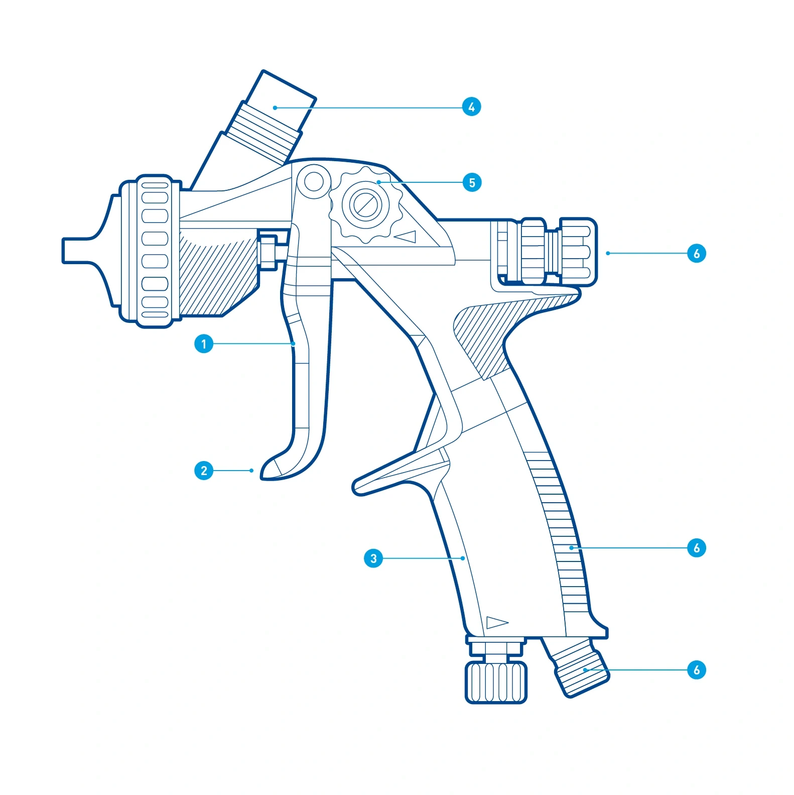
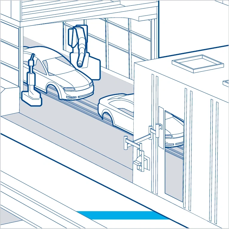
Our illustration style is based on traditional line graphics with dimensions. This stylistic device reflects our technical precision. In the illustrations, we form areas and objects through contours – the main color is Basic Blue, the highlighting color mostly Digital Light Blue. We pick out areas within the illustration using solid areas and hatching. Vanishing point perspectives or parallel perspectives can be used as required.
APPLICATION EXAMPLES

Individual elements
CONTOURS
In principle, Basic Blue is used as the base color for outlines and all important active elements. However, outlines in Dark Gray or Digital Light Blue are not ruled out.
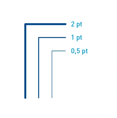
Contour thicknesses – Example scaling of contour thicknesses. The specific contour thickness depends on the degree of detail of the object and the size of the medium.
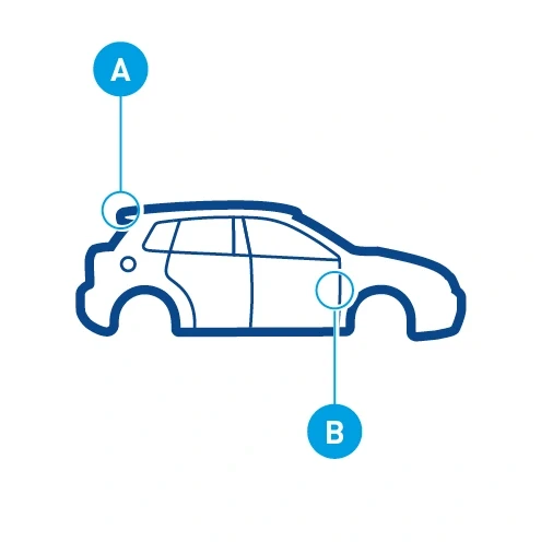
Contour application – A thick outline (A) surrounds a closed object and separates it from its surroundings. Thin lines define details.
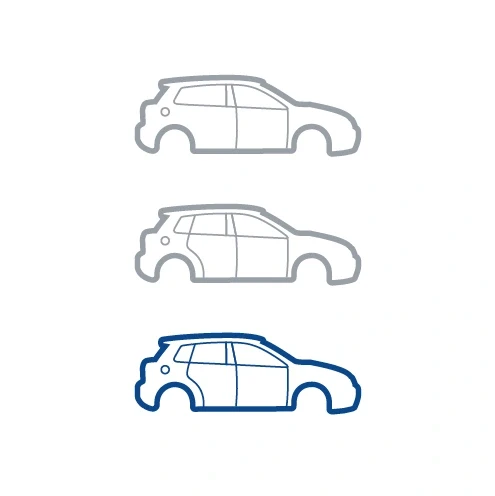
Gray contour – Objects are shown in Gray in order, for example, to create comparisons or to distinguish active from passive elements.
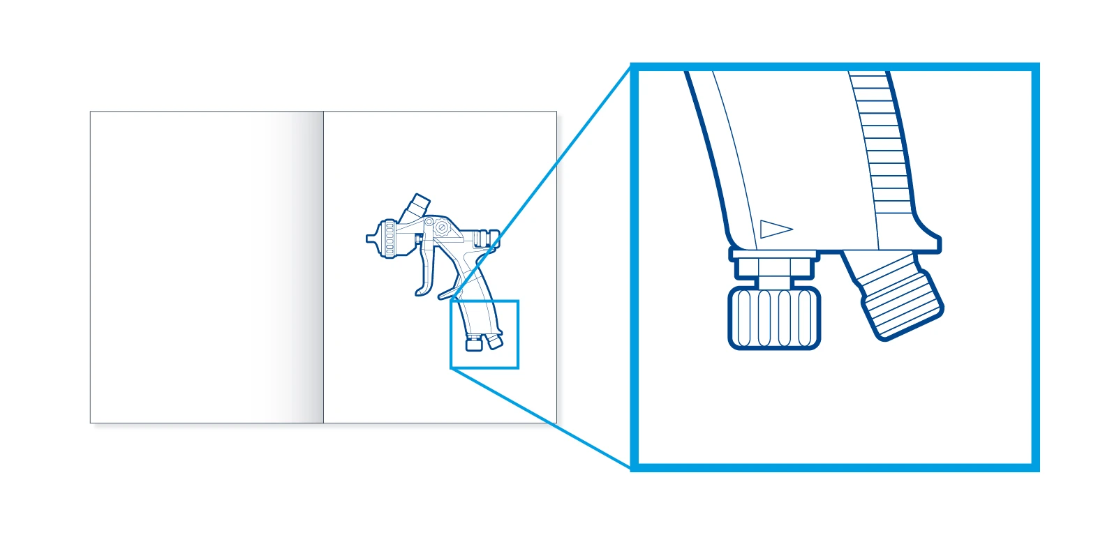
Large presentation – A thick surrounding contour (2 pt) is used on the outside and defines the object. Fine lines and hatching (0.5 pt) form details and surfaces.
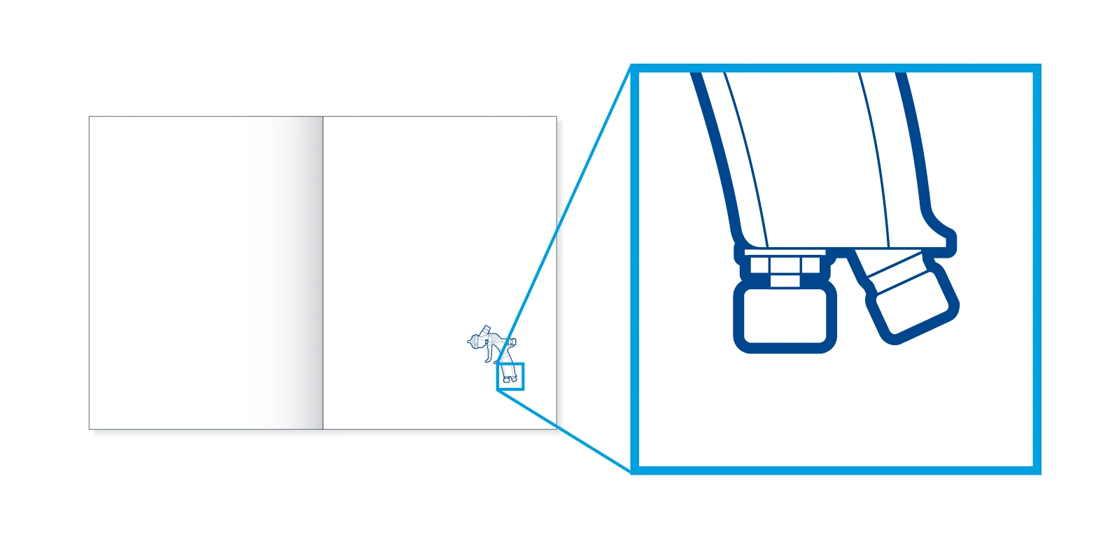
Small presentation – In a reduced presentation of the same object, details are omitted. However, the line thicknesses are retained and therefore not scaled with the rest of the illustration. This makes the illustration increasingly abstract, giving it the character of an icon.
HATCHING
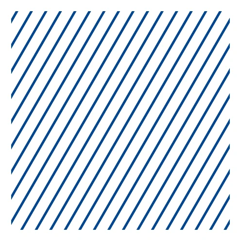
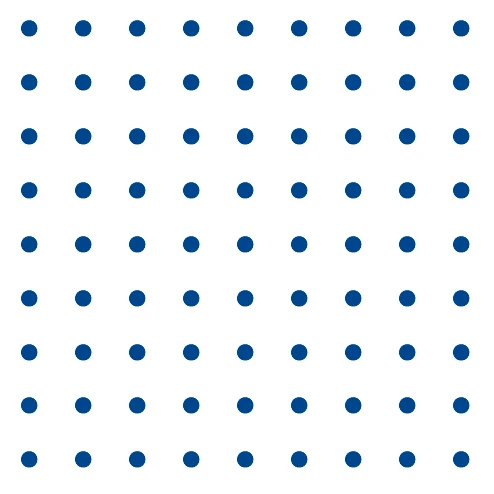
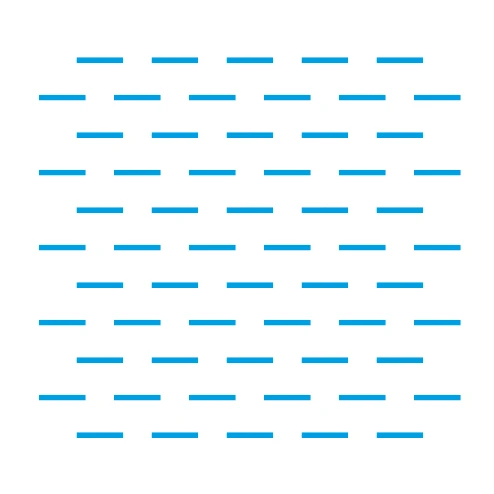
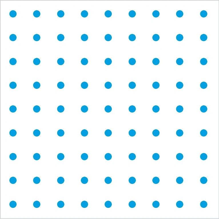
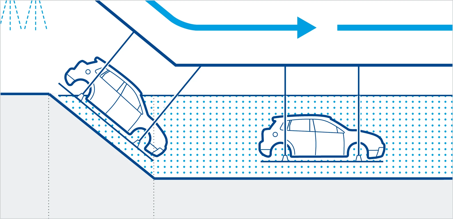
Hatching – Surfaces and hatching define areas. Hatching, dot grids or patterns can be assigned content and represent, for example, rough surfaces or liquids. They are also used to texture backgrounds.
AREAS
Gray areas – These areas mostly mark passive areas. They are used in different color gradations, mostly of less than 100%. In the example shown here:
- 50% Dark Gray
- 100% Light Gray
- 40% Light Gray


Blue areas – More active or more emphasized areas can also be depicted in Dürr’s blue spectrum. Ideally, these are shown in 100%. Gradations are possible in exceptional circumstances.
- 100% Basic Blue
- 100% Digital Light Blue
APPLICATION EXAMPLES
GRAPHIC SUPPLEMENTS

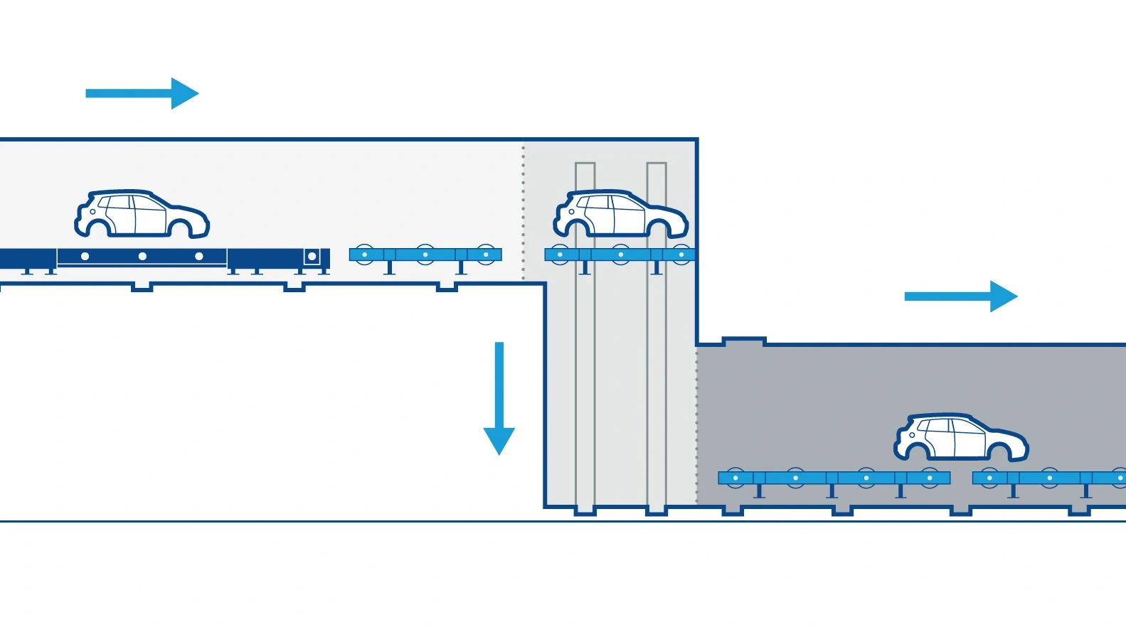
Activity arrows – Represent movements or fluid flows.
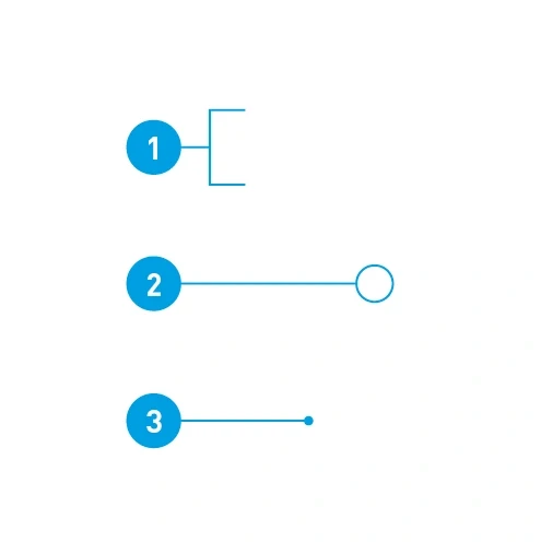
Peripheral captions – Can be created with running numbers:
- Areas included
- Details emphasized
- Objects described
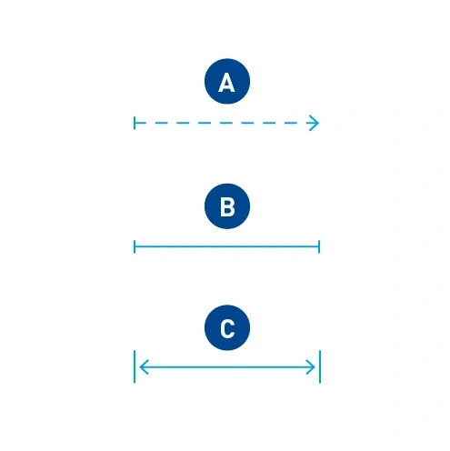
Measurements
- Flexible areas
- Fixed widths
- Width with indication of dimension
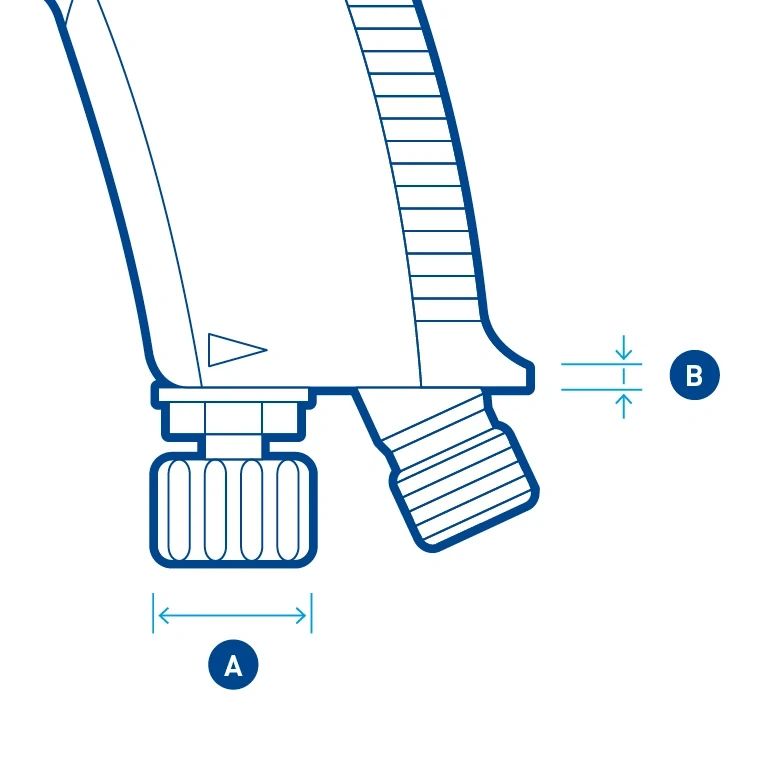
Dimensions – Are placed slightly away from the object. The arrow usually fits within the delimitation lines (A). For small dimensional distances, the arrows point from outside to inside (B).
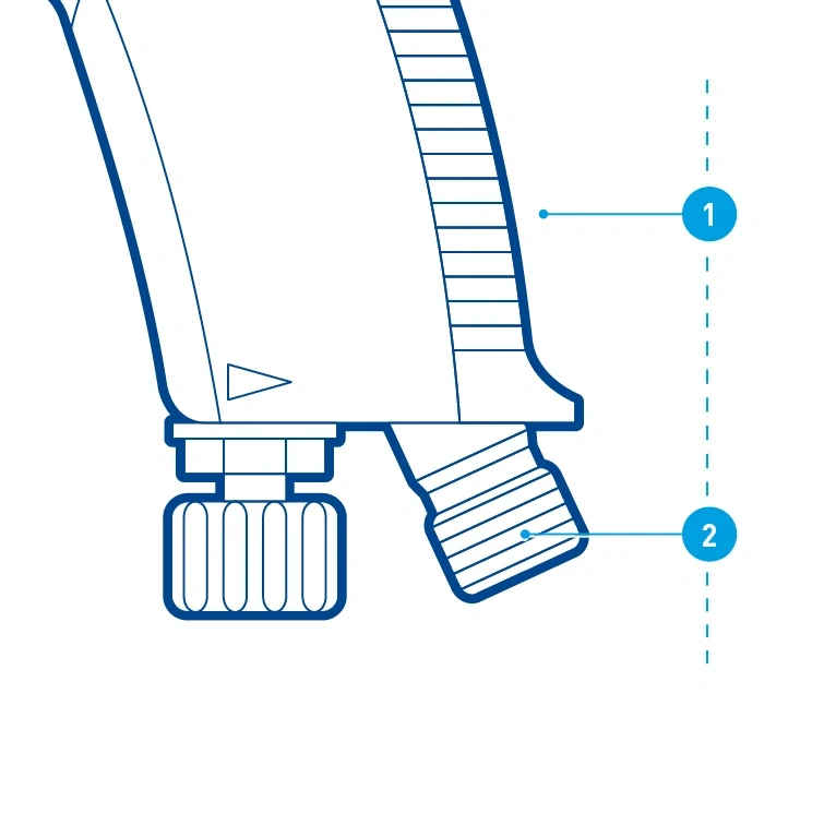
Peripheral captions – The peripheral caption points follow each other chronologically within an illustration and are ideally aligned with each other.
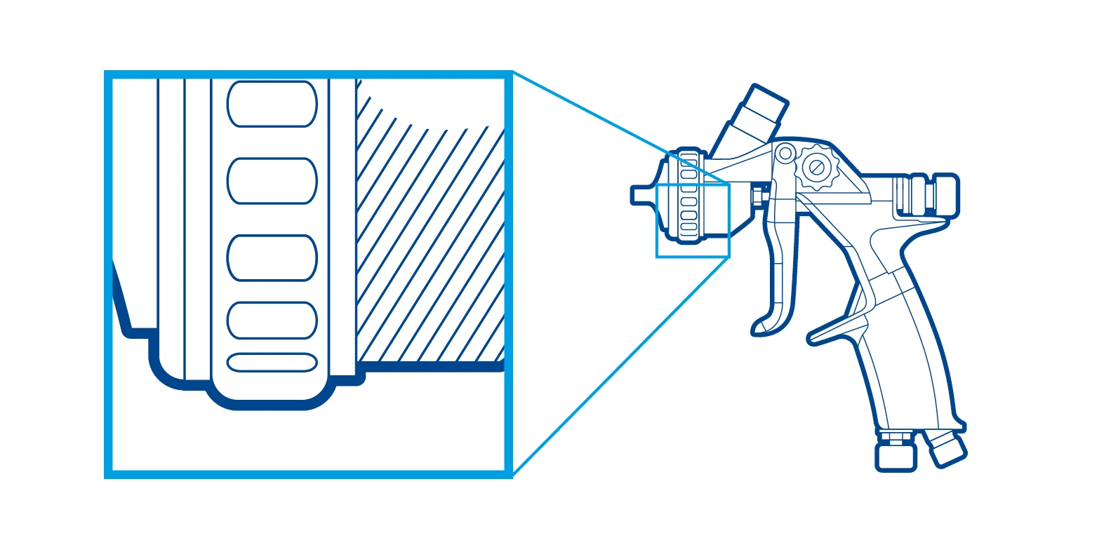
Zooms – Innerhalb einer Illustration werden Zooms mit Re-Frames in Digital Light Blue dargestellt. Die Form ist quadratisch oder rechteckig mit einer zunehmenden Strichstärke.
Maps
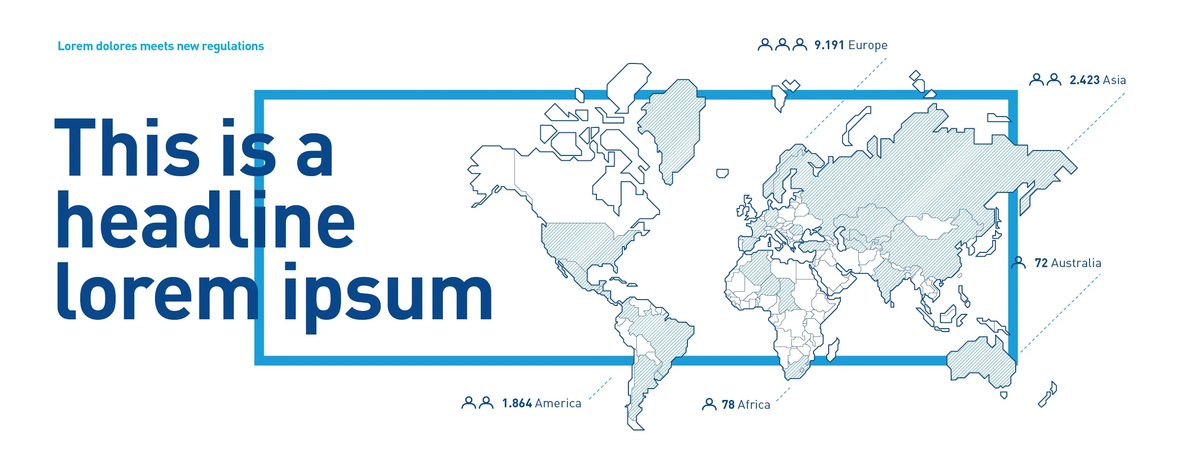
Schematic maps – Are more than just a localizing tool. They can be used to convey information with an additional level of detail. The graphic presentation remains minimalist.
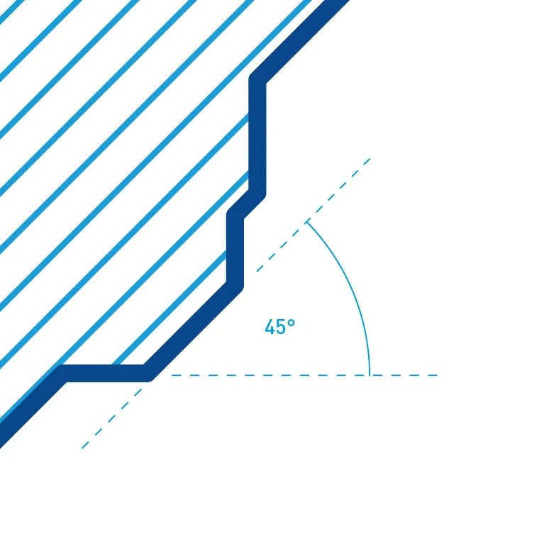
Angle – Outlines and hatching follow 45-degree angles.
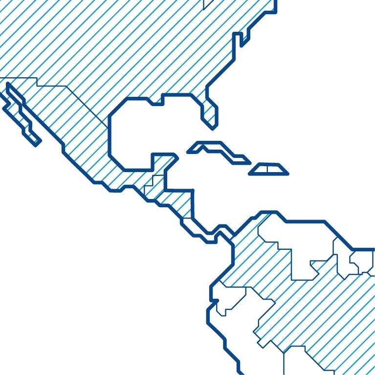
Contours – The continents are edged with thick outlines, nations subdivided with thinner border lines. Individual countries can be emphasized through hatching.
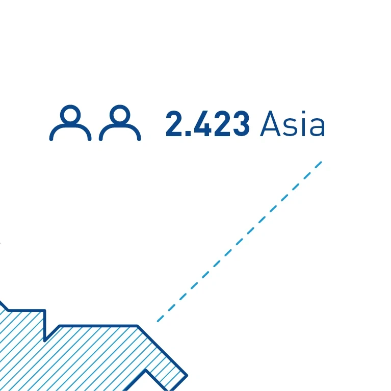
Peripheral captions – Example peripheral caption with icons, numbers and description.

