Multi-brand signage
At many of the Dürr Group sites, more than one of the main brands are represented. If this is the case, the logos of the various brands appear on the interior and exterior signage of the buildings.
Table of contents
Size
All the brand logos must be given the same visual treatment, taking into consideration their length, width, area, colors and brightness. This allows the proportions of the logos to be defined in relation to one another, which makes it easier and quicker to use them.
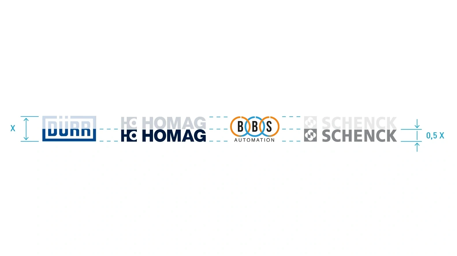
Brand logo sizes – The Schenck and HOMAG logos are half the height of the Dürr logo.
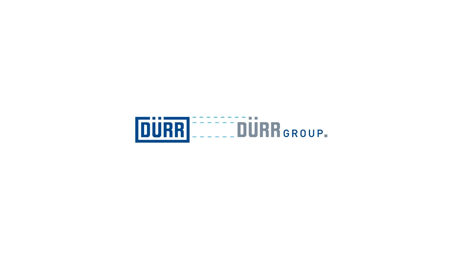
Dürr Group logo size – The height of the capital letters in the Dürr wordmark is the same for both logos.
Arrangement
The logos are arranged on a surface in relation to one another either horizontally or vertically. The order of the logos corresponds to the size of the brands. The Dürr Group logo comes at the end. The logos must be a suitable distance apart in order to make an appropriate impact.
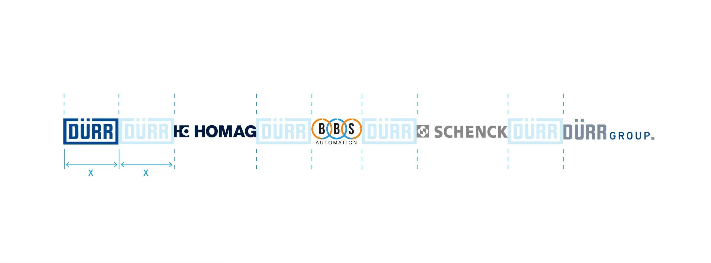
Horizontal – Unless there are different requirements, the logos are arranged on a horizontal center axis. The horizontal distance between the logos is the width of the Dürr logo.
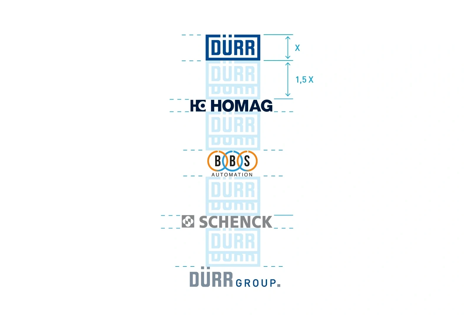
Vertical – Unless there are different requirements, the logos are arranged on a vertical center axis. The vertical distance between the logos is the 1.5 times the height of the Dürr logo.
Exterior
In contrast to interior areas, in exterior settings all the brand logos appear in their own colors. In exterior areas, it is important that the individual brands and their colors can be distinguished from one another.
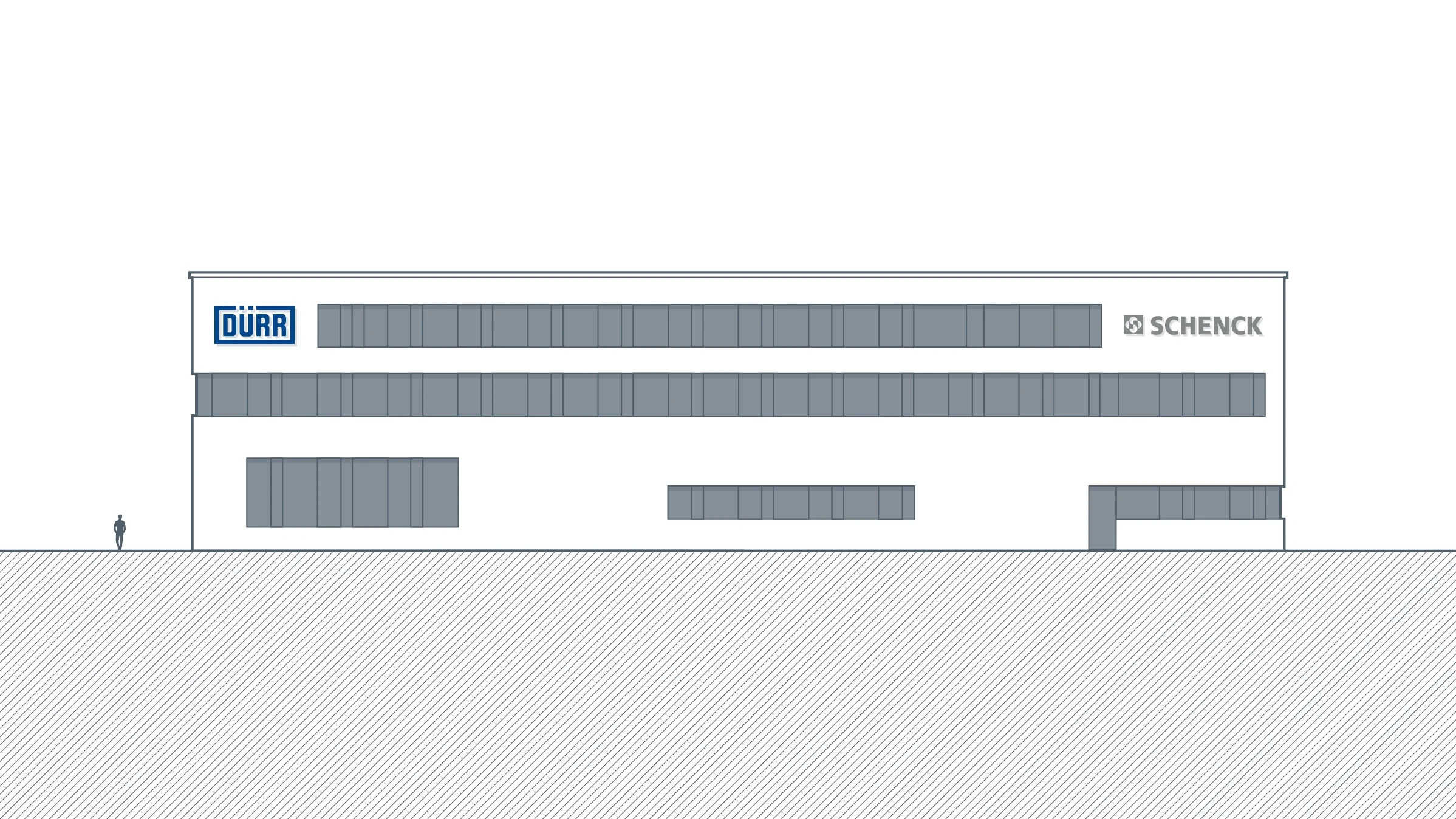
Facades – On the facades of buildings, the logos of the main brands should be positioned in such a way that they make the best possible long-range impact (see also > Logo). To ensure that the brands are kept visually separate, the logos can be positioned far away from one another, for example in the top corners of the facade. The logos are arranged on an axis, for example in this case centered horizontally. However, the second logo can also be positioned on another side of the building facade. The logos should fit in with the existing facade divisions. Please ensure that there is sufficient white space and that each brand has the appropriate amount of free space.
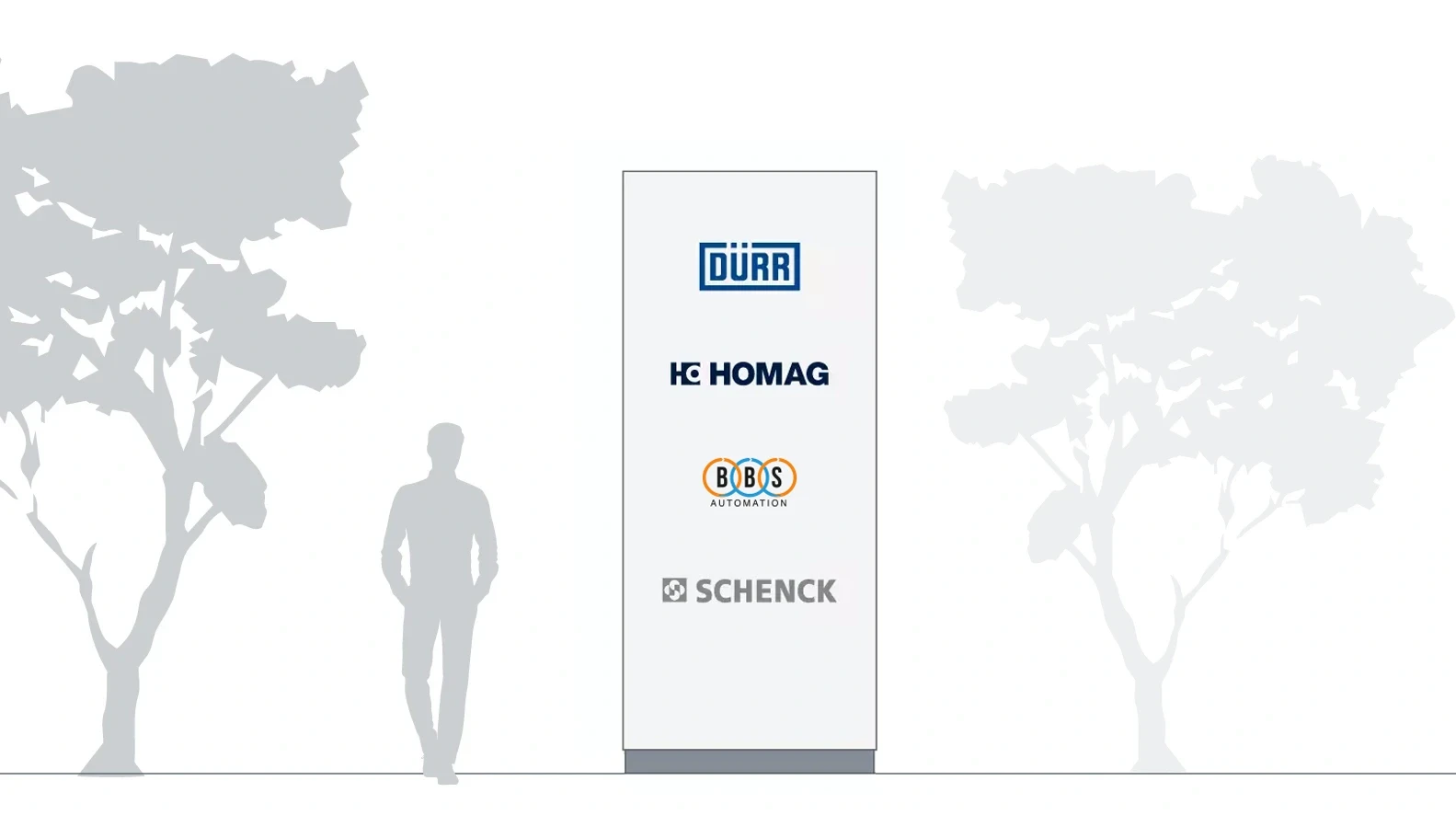
Columns – This is an example of the logos positioned vertically on a column on a Dürr site where all the four main brands are represented. The size of the logos depends on the available space.
Interior
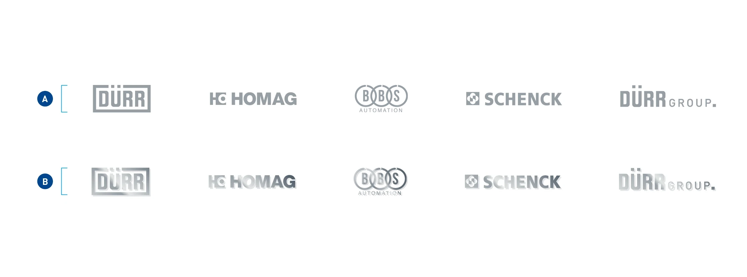
Materials – If the brands appear together inside a building, for example on a reception desk in a foyer, the logos must be the same color. Printed logos are all in the 60% dark gray shade of Dürr Systems AG (A). The logos should preferably be laser-cut onto panels (B) that are offset from the wall using spacers. The surface can consist of matte polished metal in silver or of plastic in a shade similar to the 60% dark gray.
EXAMPLES OF POSITIONING
In interior areas, the logos are centered in relation to one another in an otherwise empty space. The absolute size of the logos depends on the available space.
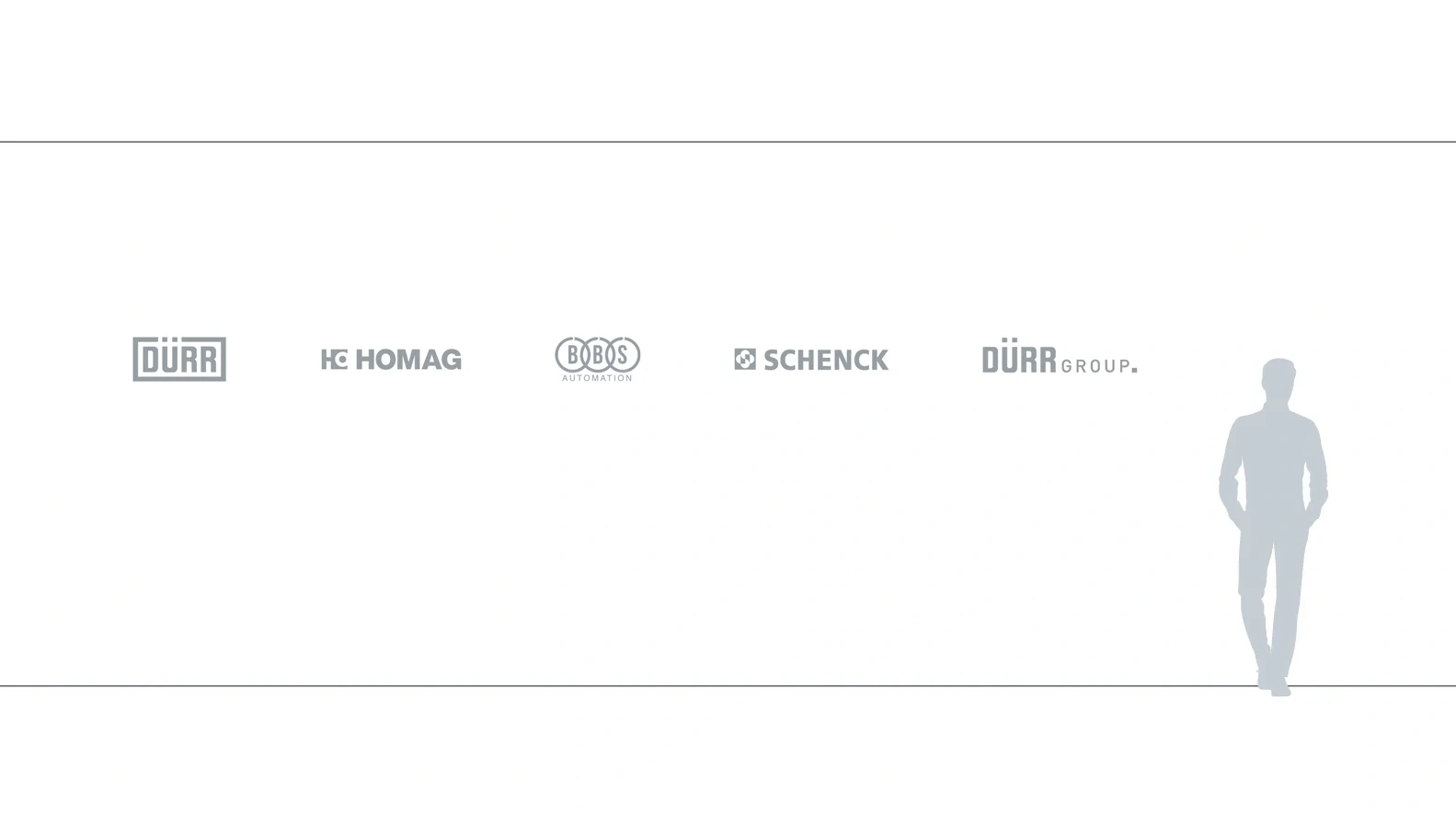
Horizontal – Four brands and the Dürr Group
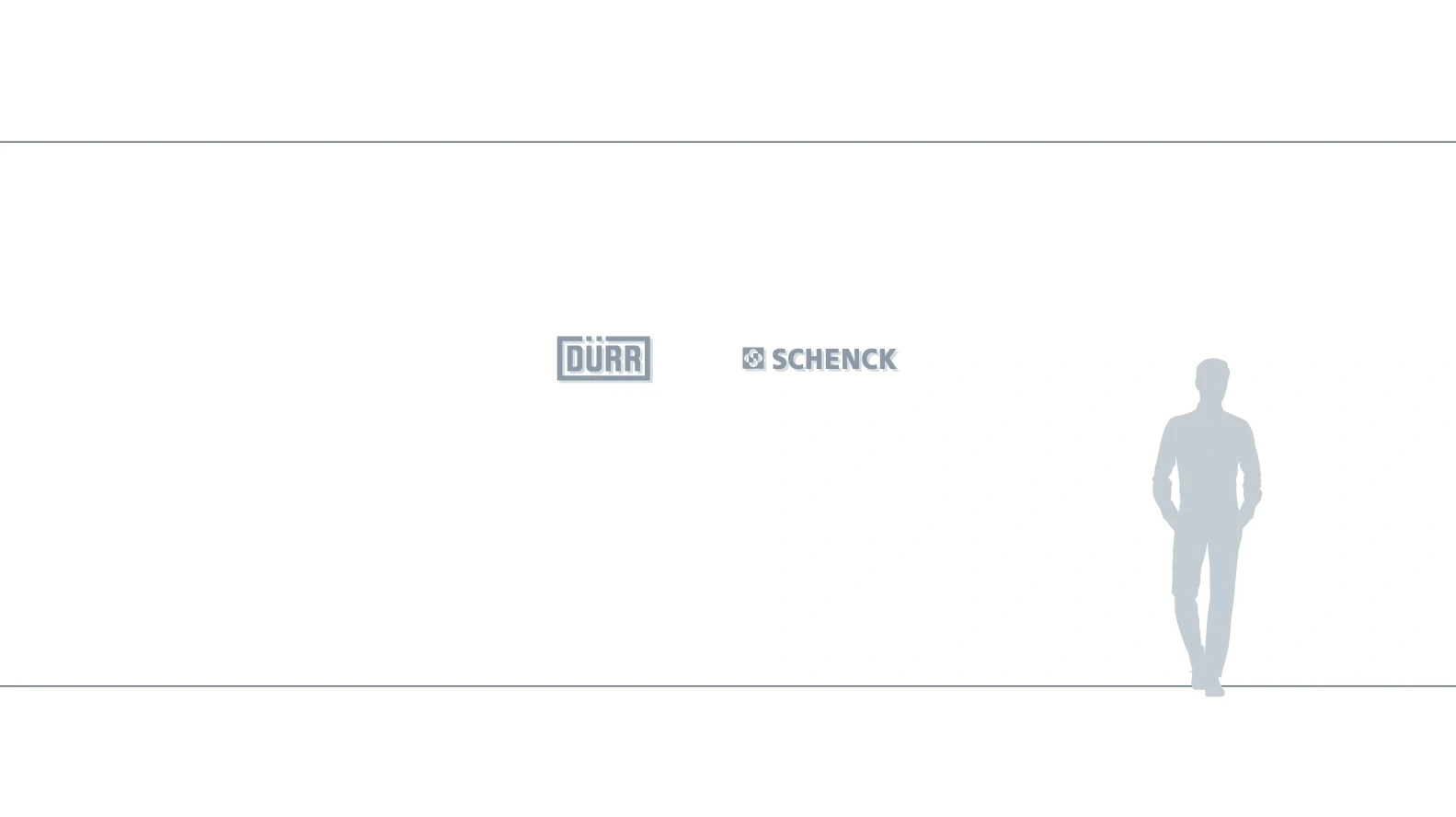
Horizontal – Two brands
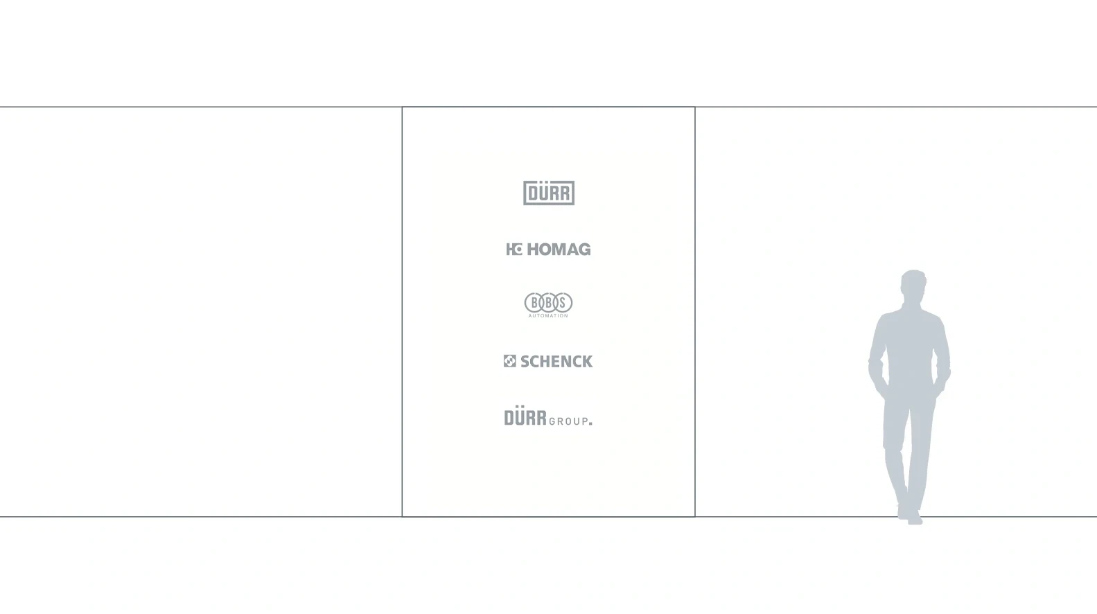
Vertical – Four brands and the Dürr Group
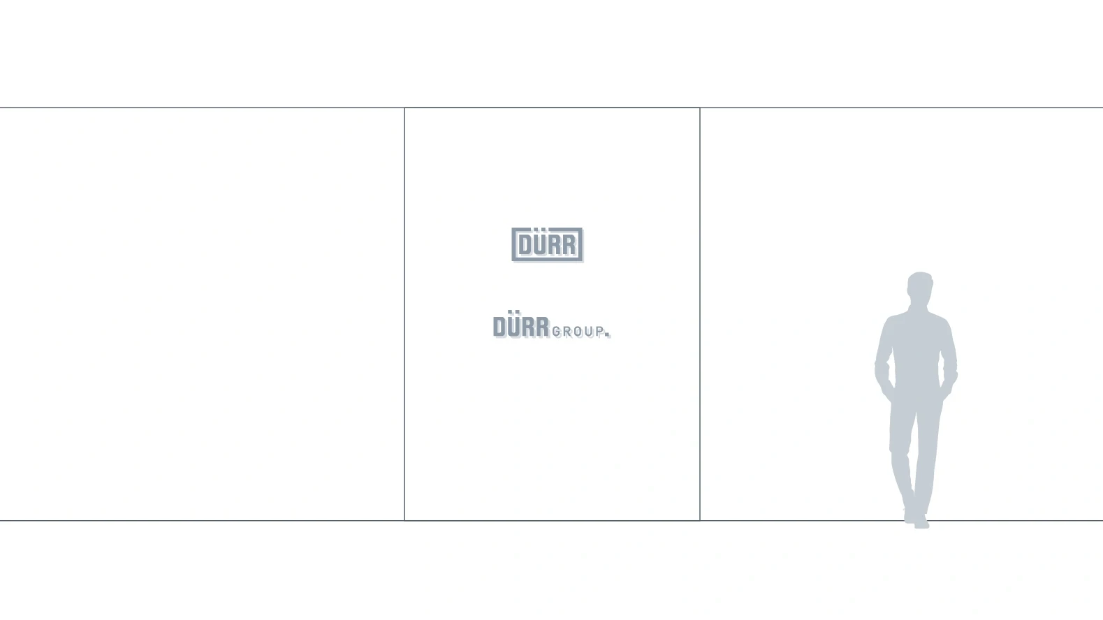
Vertical – Dürr and the Dürr Group
