Logo
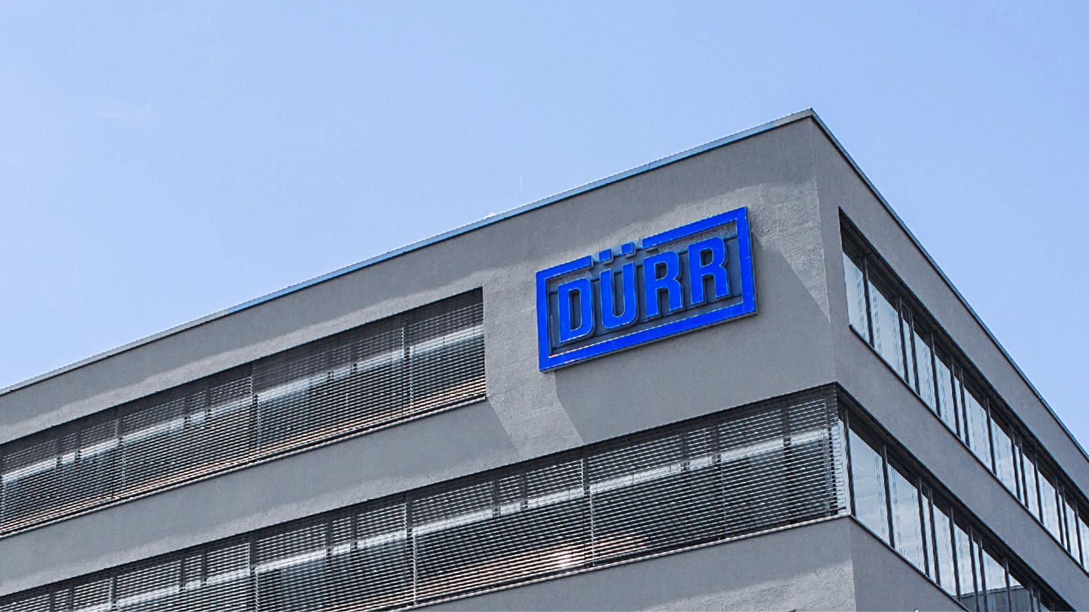
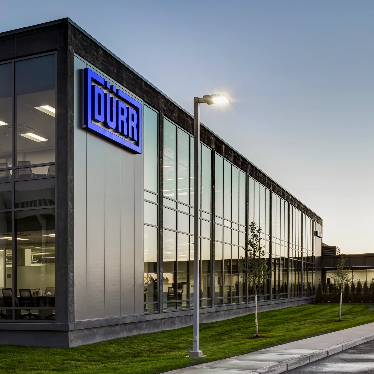
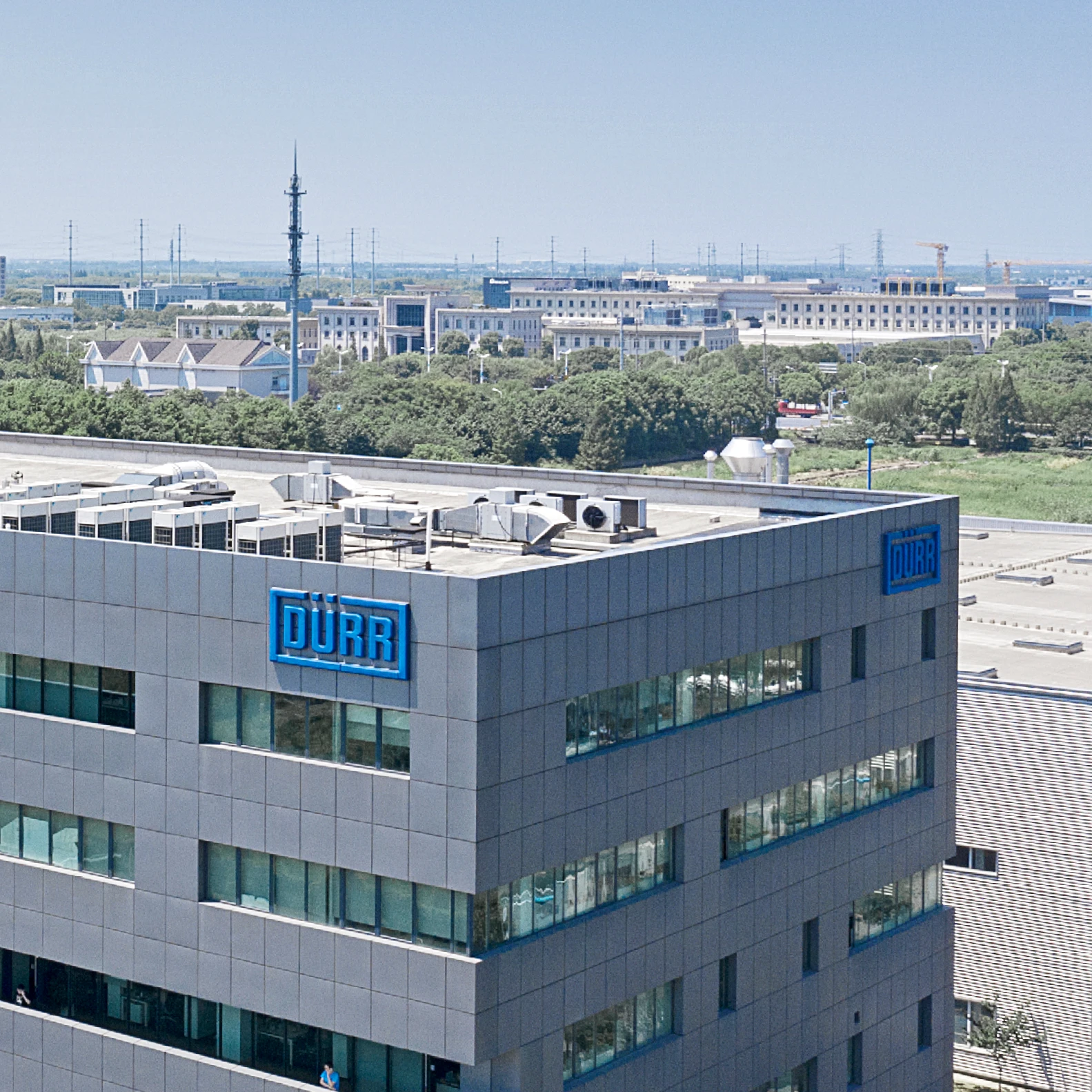
Das Logo ist auch in der Standortgestaltung die deutlich herausragende Kennzeichnung. Es wird an einer freien, exponierten Fläche der Gebäudefassade angebracht, um bereits von Weitem auf den Standort aufmerksam zu machen. Das Logo sollte sich nahtlos in die Fassadenteilungen integrieren.
Forms
Depending on the application and the budget, a selection of different forms and materials is available. The logo with depth (A) is preferable to the other variants. Use weatherproof, color-fast materials such as aluminum, colored acrylic glass or acrylic. The following variants of the logo have a different emphasis and are recommended for close-range or long-range use.
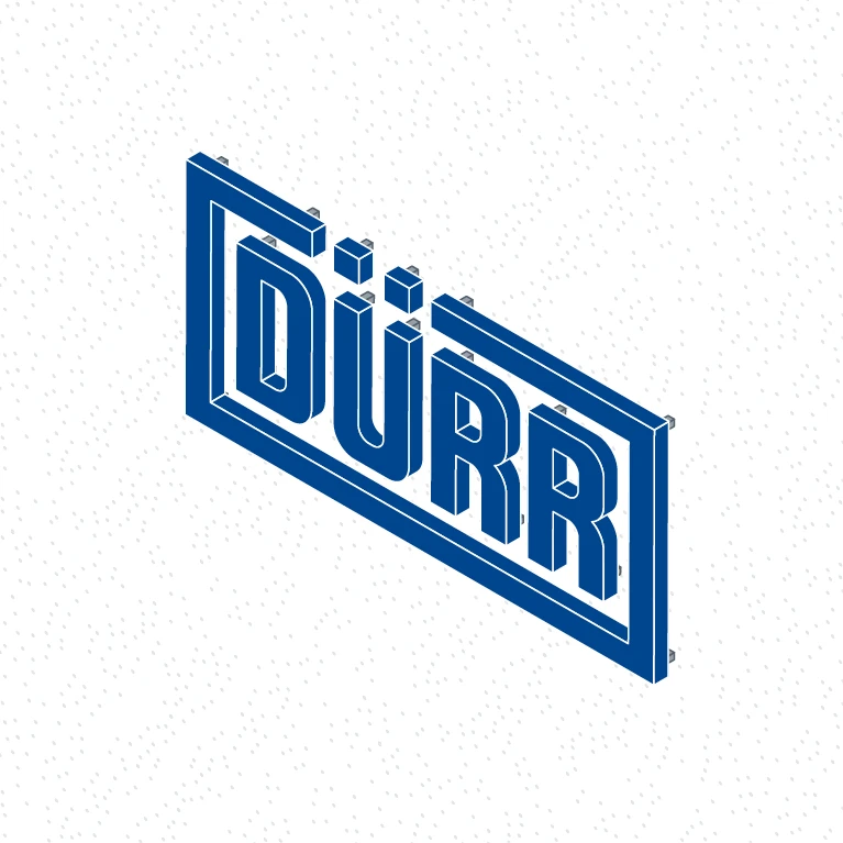
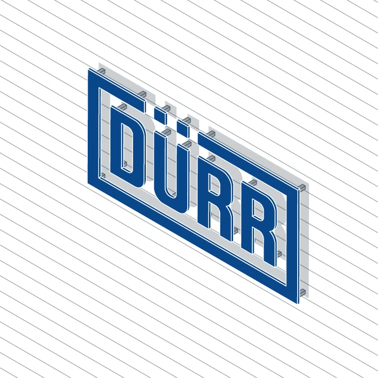
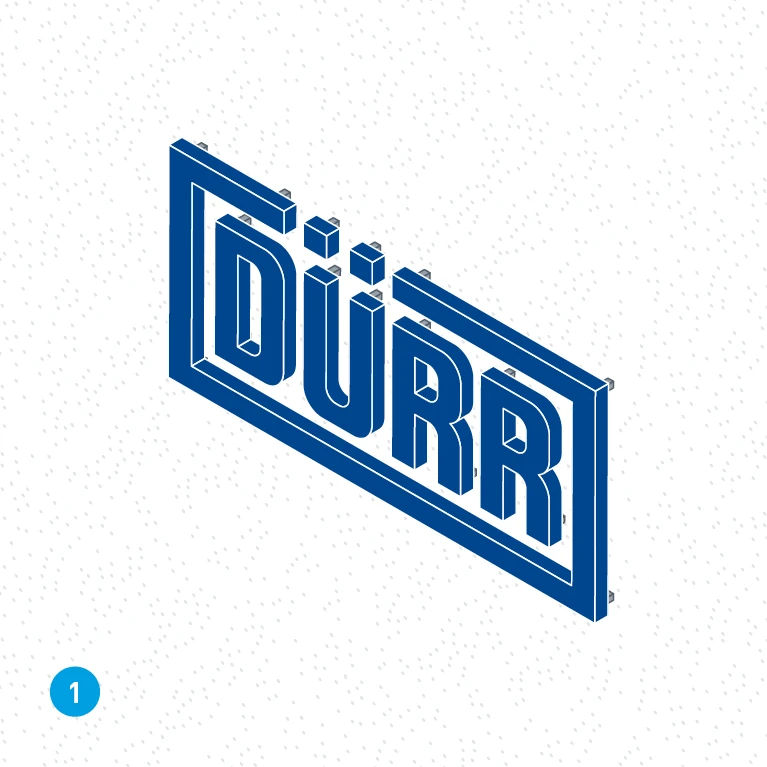
Variant A: Raised – logo with visible depth. Recommended for long-range use as the main logo on a building facade.
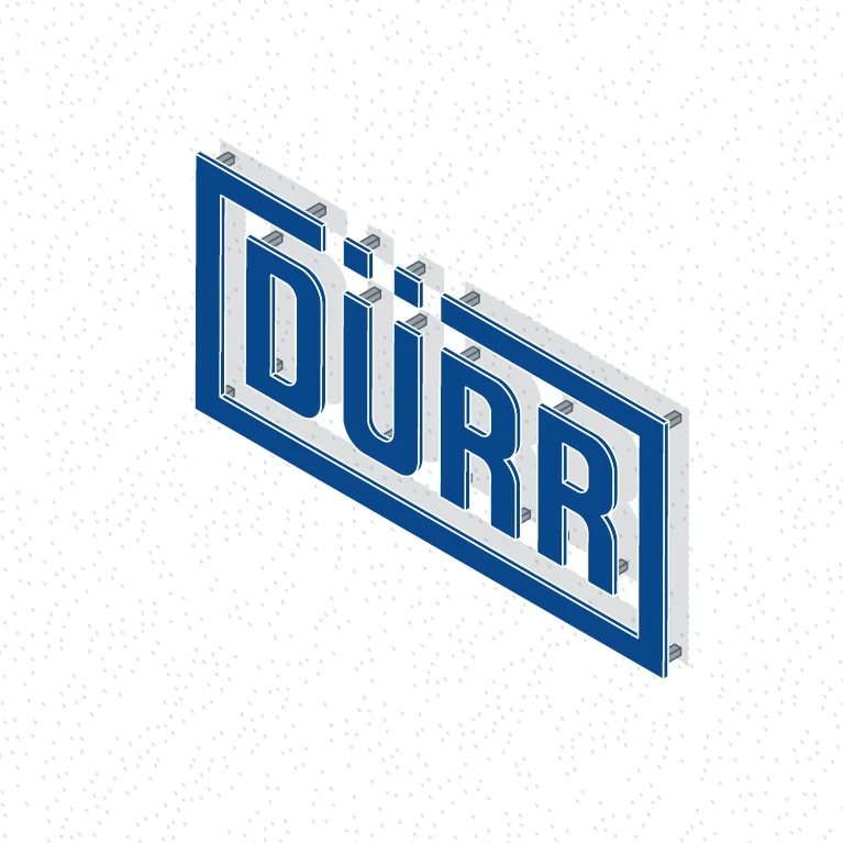
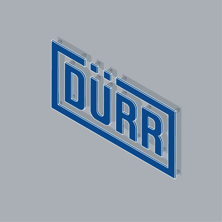
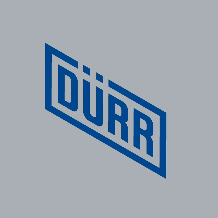
Variant B: Cut-out – flat cut-out, for example lasered metal. This is mounted on walls with spacers. Recommended for long-range and close-range use.
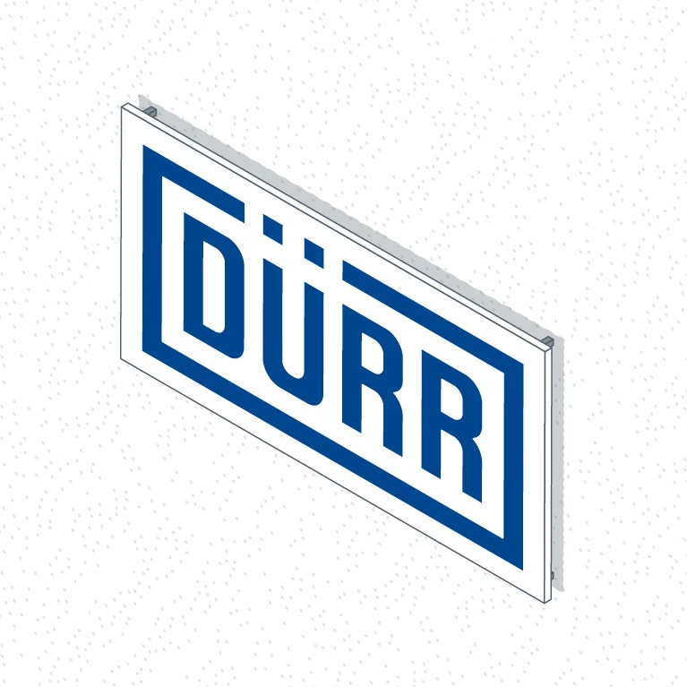
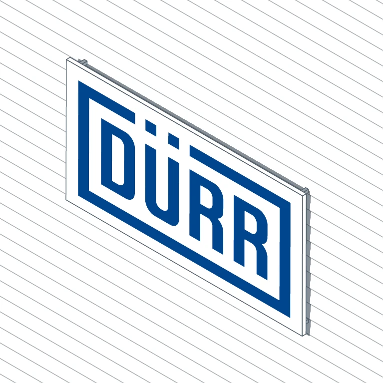
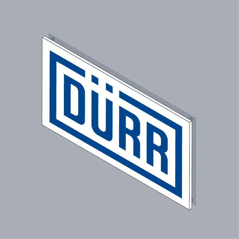
Variant D: White back panel – direct printing or adhesive film on a white back panel. Optional for close-range use.
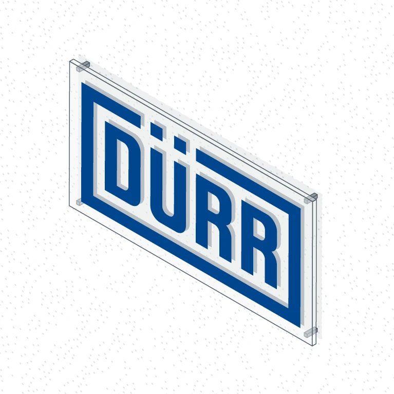
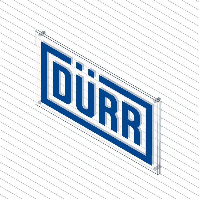
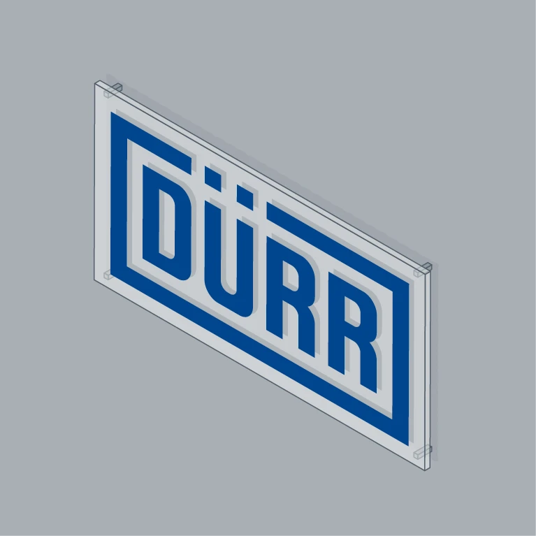
Variant C: Transparent back panel – direct printing or adhesive film on a transparent back panel, for example acrylic glass. Recommended for close-range use.

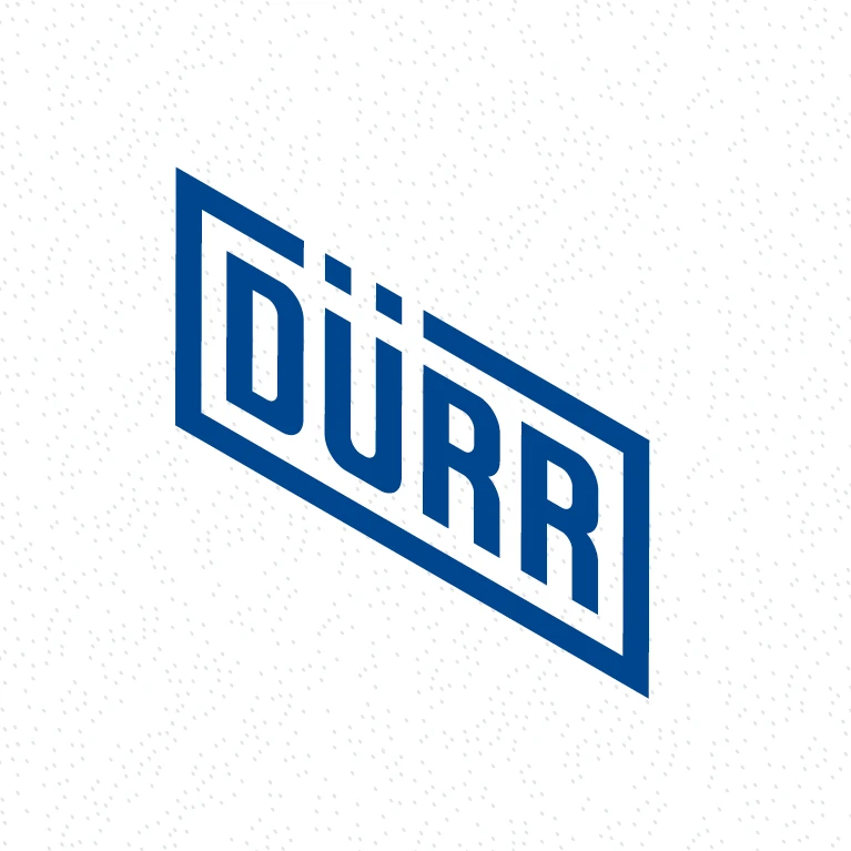
Variant E: Direct application – paint applied directly to a wall using film stencils or created using a cutting plotter for interior use on smooth surfaces.
Backgrounds
The logo must stand out clearly from the facade and the building signage for design and aesthetic purposes. For this reason, we recommend the use of spacers. Below are examples of the form variants described above on different backgrounds.
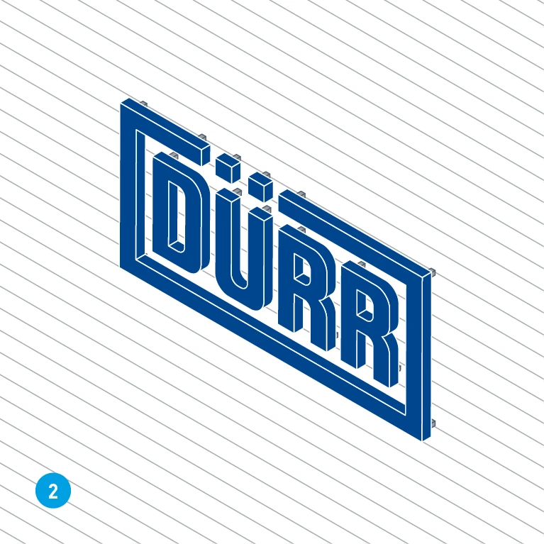
Variant A: Raised – on a quiet surface with a rendered finish (1) and on a busy surface with horizontal slats (2). We recommend always choosing the quiet option 1.
Colors
The colors are based on the Dürr corporate design colors (> Colors). There should be as much contrast as possible between the logo and the background, particularly for long-range use. In exterior settings, only the logo in basic blue is used.
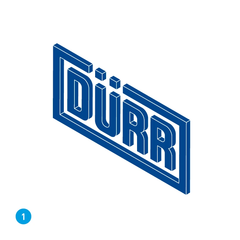
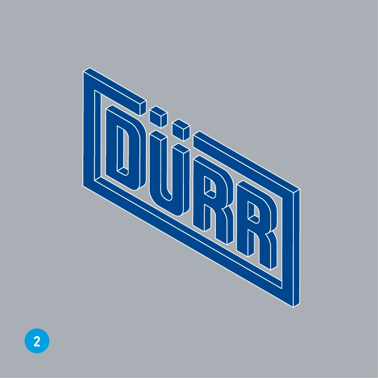
Variant A: raised – Variant (1) is recommended for long-range and close-range use: basic blue on white. As an alternative a mid-gray background with a maximum of 50% dark gray is possible (2). This applies to all the form and background variants shown above.
Lighting
Illuminating the logo is optional, but this increases its long-range impact and presence at any time of day or night and also creates a high-quality impression.
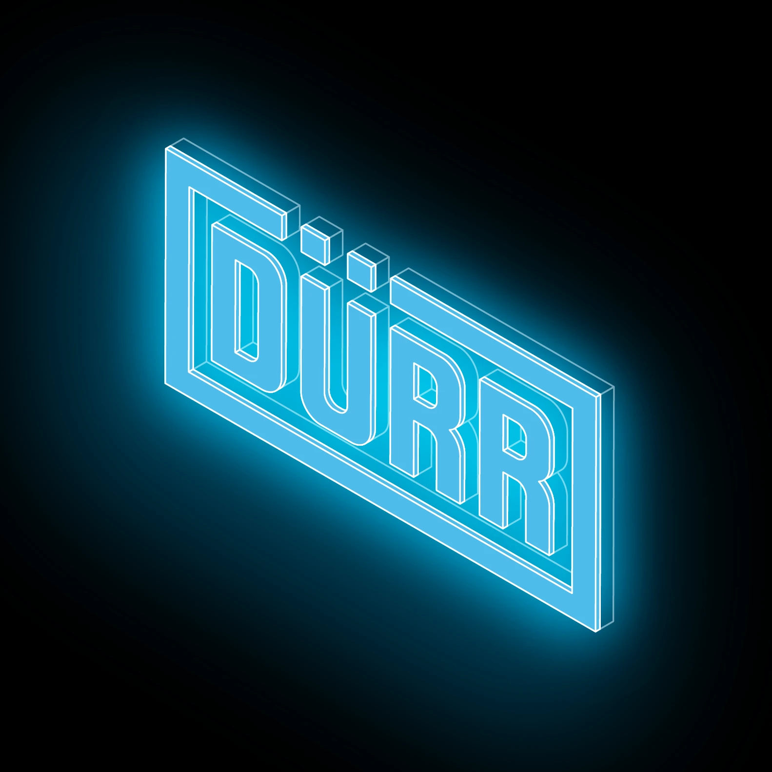
Front lighting – We recommend interior lighting for long-range and close-range use. The front panel in basic blue is translucent. The lighting elements are inside the body of the logo.
Mounting
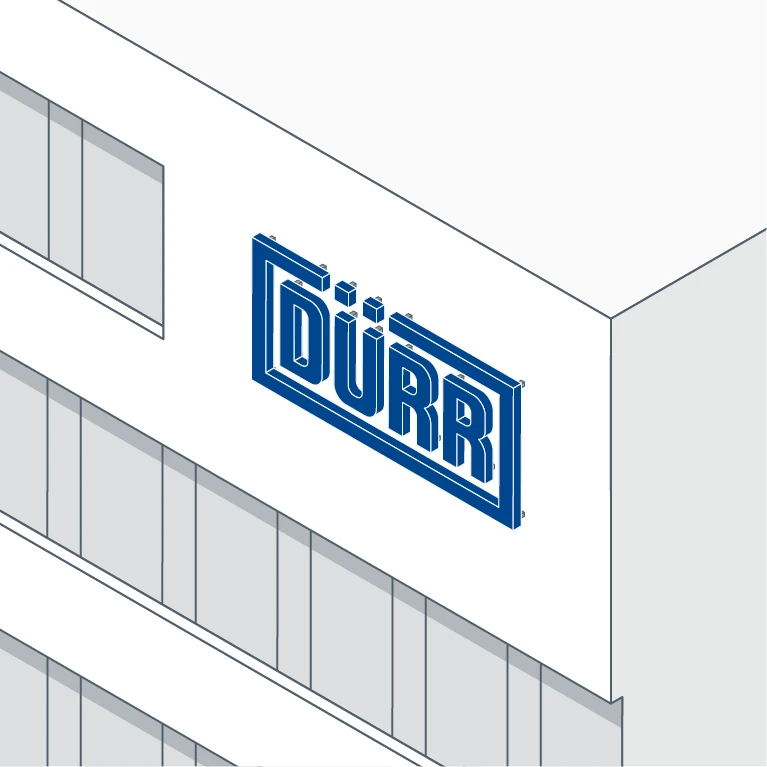
Wall-mounted (recommended) – If a large enough area of the facade is available, we recommend mounting the logo element on the wall.
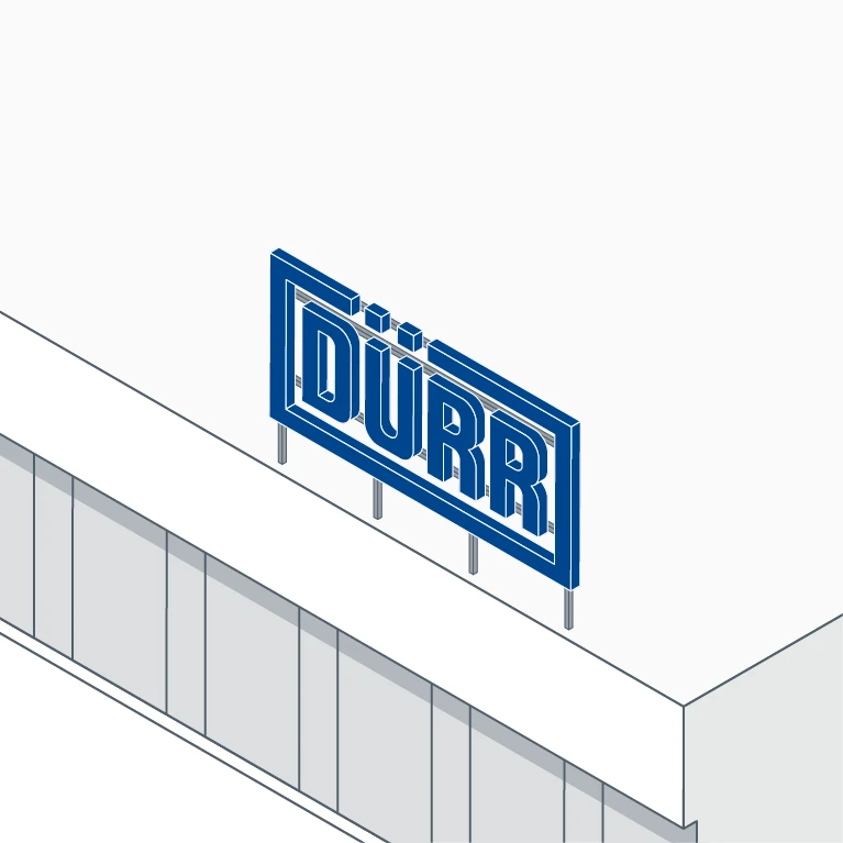
Roof-mounted (exception) – In exceptional cases, for example if there is no free space available on the facade, logo variant A can be mounted on the roof. Structural elements such as supporting rods should be as well-concealed as possible.
Positioning on facades
The logo is scalable and can therefore be adapted to buildings of different shapes and sizes. An eye-catching free space on the building that is as high up as possible should be chosen for the logo. The position of the logo should fit in with the existing facade divisions, such as rows of windows. The necessary clear space (> Logo) must be left around the logo. The height of the logo must correspond to around half the height of a story of the building.
EXAMPLE OF AN OFFICE BUILDING
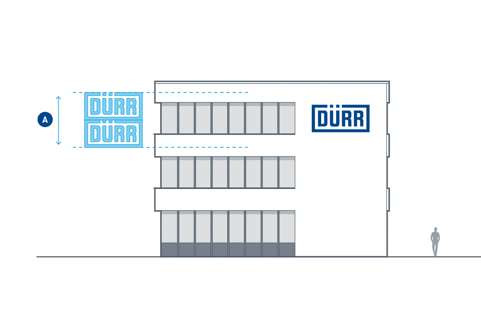
With a total building height of up to 5 stories, the height of the logo element must correspond to around half the height of a story (A). For example, if a story is 3.5 m high, then the logo is 1.75 m high.
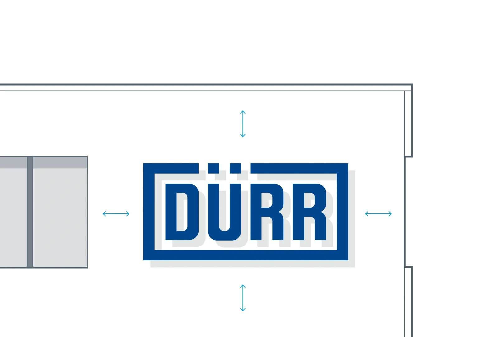
Enough free space must be available for the logo. It is generally important to ensure that the position of the logo fits in with existing facade divisions. For example, here it is centered vertically with the row of windows.
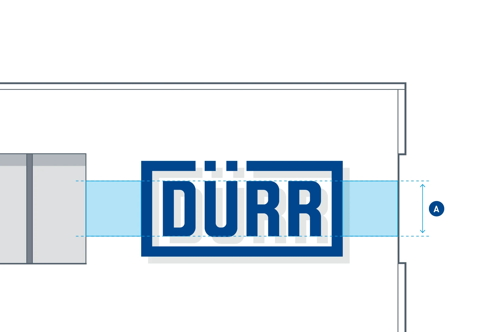
The logo must be surrounded by a clear space of at least half the height of the logo (> Logo). However, we recommend a slightly larger distance that corresponds to the cap height (A) of the logo font.
EXAMPLE OF A PRODUCTION BUILDING
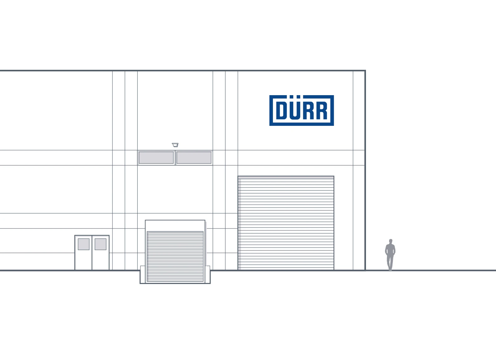
This production building can be assumed to have stories that are 3.5 m high.
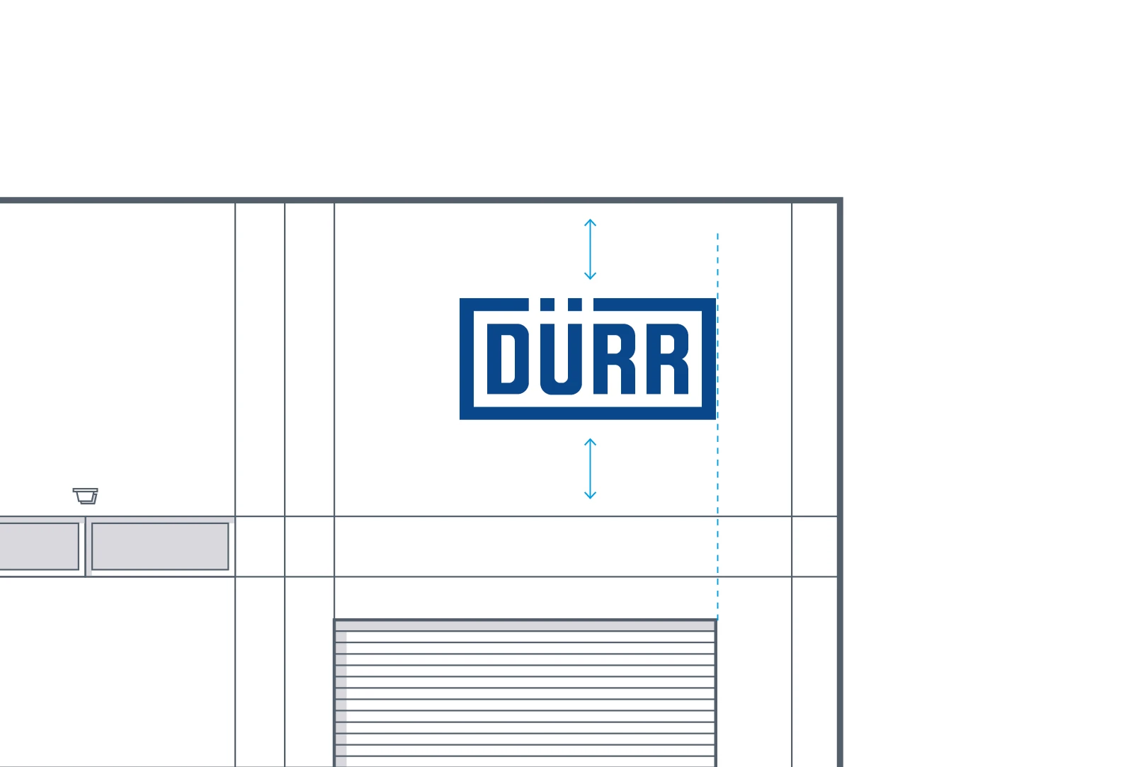
Firstly, the logo must be aligned vertically in the available space. The eye-catching roller shutter door is included in the positioning. The logo is aligned flush right with the opening in the facade.
Examples
