Icons
Icons visualize abstract concepts and add variety to the layout. They have become indispensable for spatial orientation or for navigation in the web. The Dürr icon style is graphically minimized and technically precise. This style guide forms the basis for a continuously expandable system of icons.
TABLE OF CONTENTS
EXAMPLES


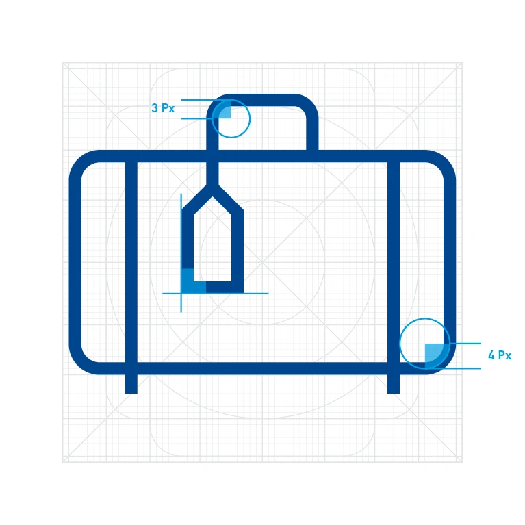
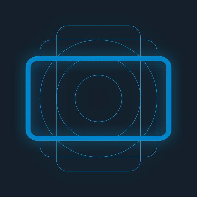
Definition and scope
This style guide forms the basis for using and designing Dürr icons for all digital or print media from Dürr. It should be defined in advance whether an icon or an illustration is required. Both formats have their special qualities.

Icons are simple graphical symbols that represent a specific topic – passenger cars in this case. Dürr icons consist of simple basic geometric shapes with a uniform line thickness. This style guide describes only icons with these properties.
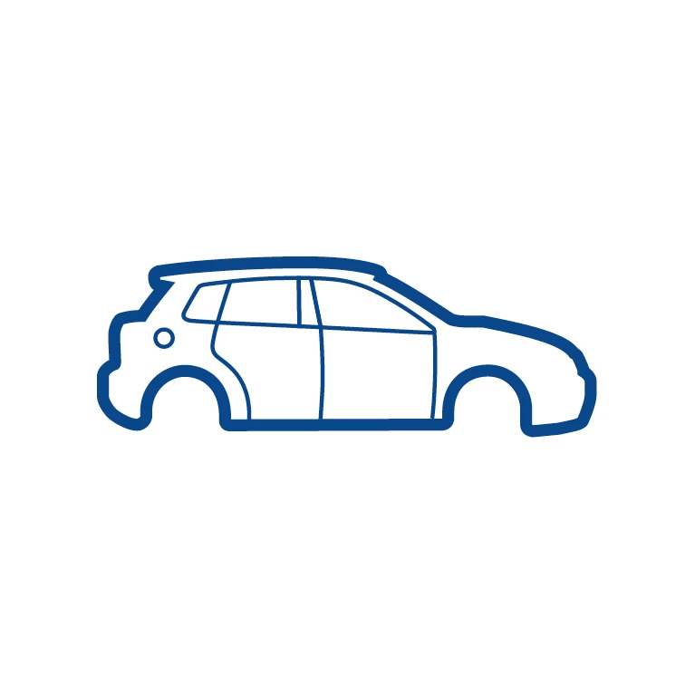
Illustrations are realistic, complex and sometimes multi-part line graphics with a medium or high level of detail. They often incorporate different line thicknesses. Refer to the illustration style guide (> Illustrations) for more information.
Style
Dürr icons are used in communication media exclusively in the outline style. Solid, filled-in icons are impermissible here. The exception are presentations. Filled-in icons can be used here.

Do.

Don't.
Grid
The icon grid helps to maintain consistent aesthetics across all Dürr icons, and is particularly helpful when creating new icons. The Dürr icon grid described here is based on pixel dimensions, but it can be scaled to print dimensions as well. As a basic rule, designers should work precisely within the pixel grid. The design grid does not only set limits, however. It also provides assistance and opens up possibilities for creative expansion of the Dürr icon range.
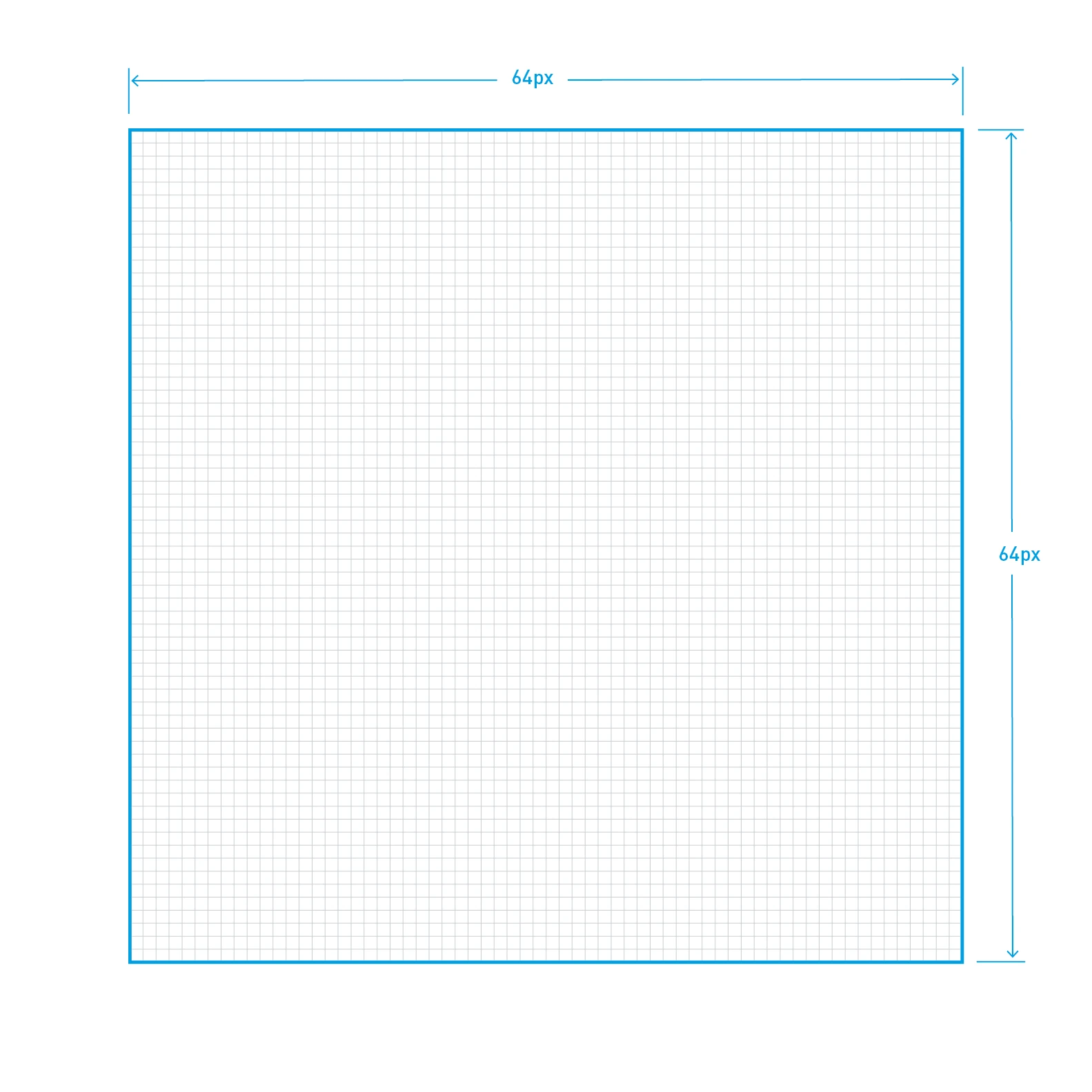
The overall media format of an icon is 64 x 64 pixels.
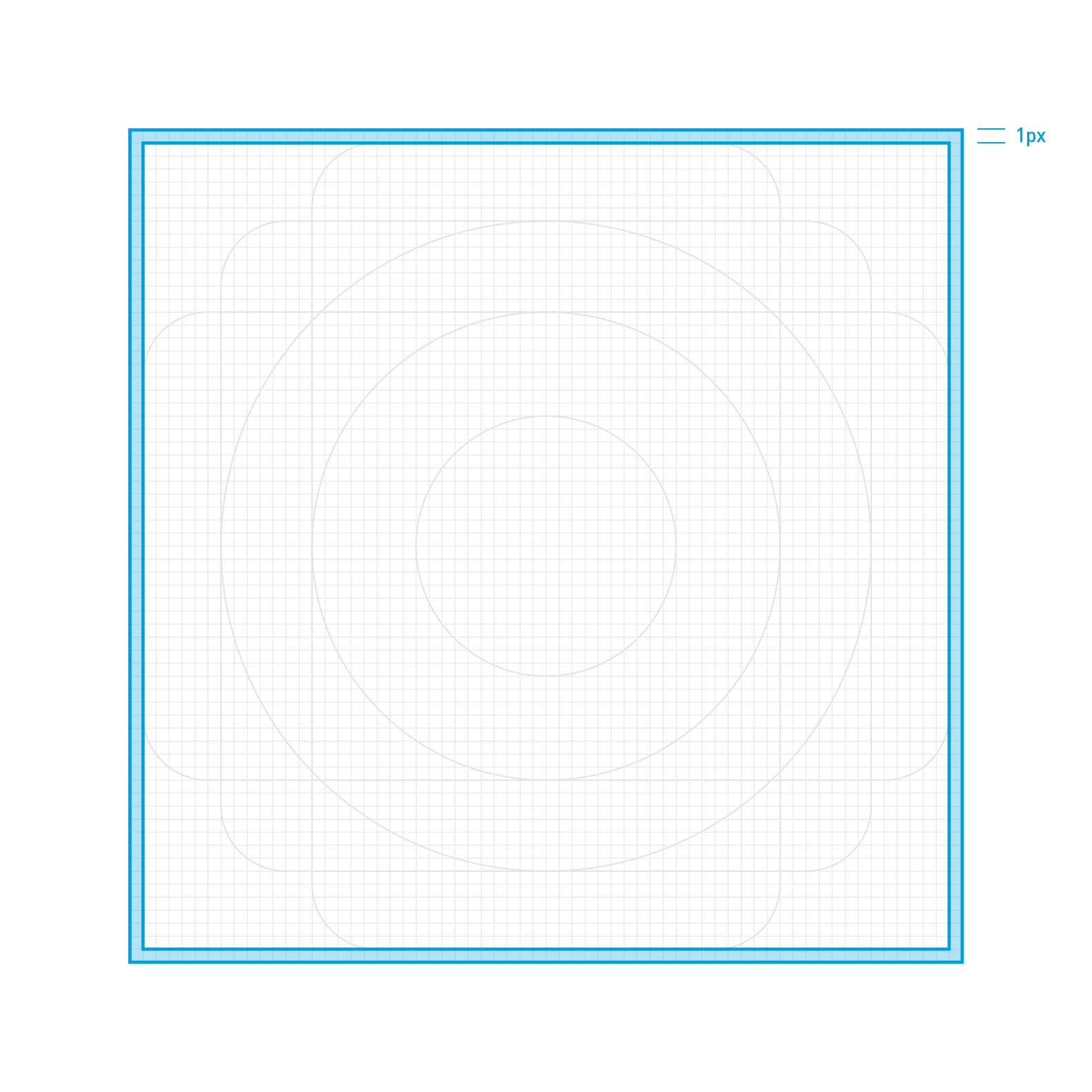
An all-round clear space measuring one pixel in width is defined within the grid limits. Icons must not extend into this space.
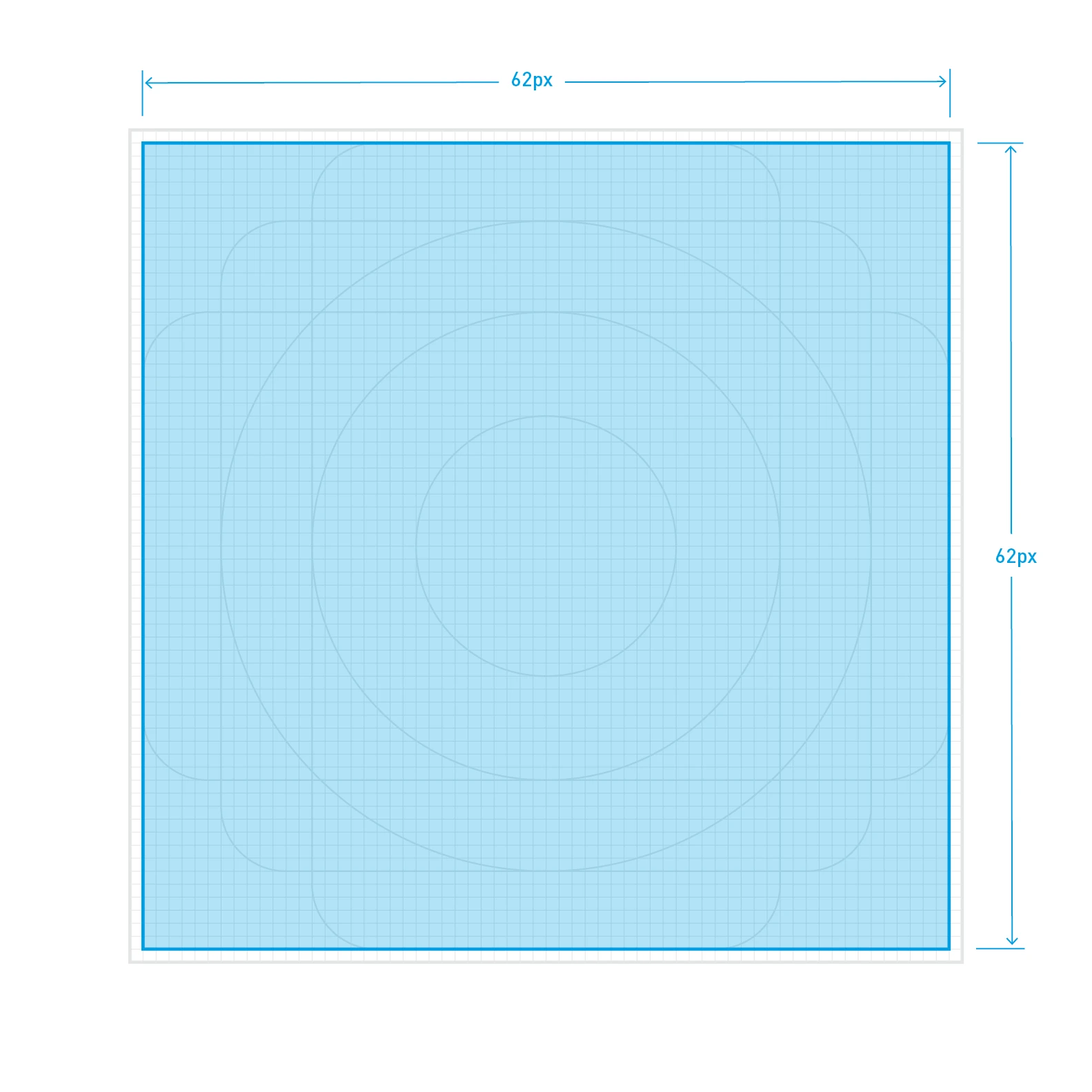
The total area minus the clear space is the maximum net design area that the icon may occupy.
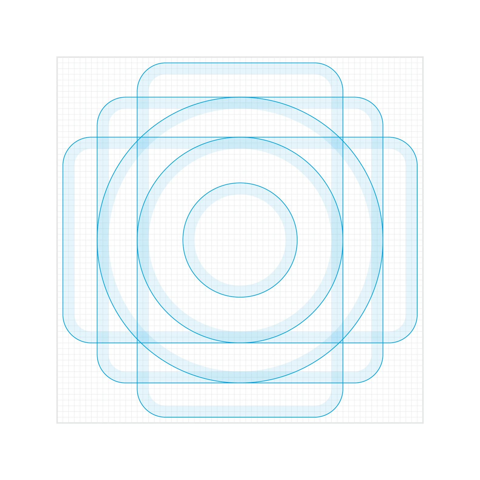
Basic geometric shapes comprising rectangles, squares and circles serve as shape templates. They simplify creating new icons and ensure a uniform look.
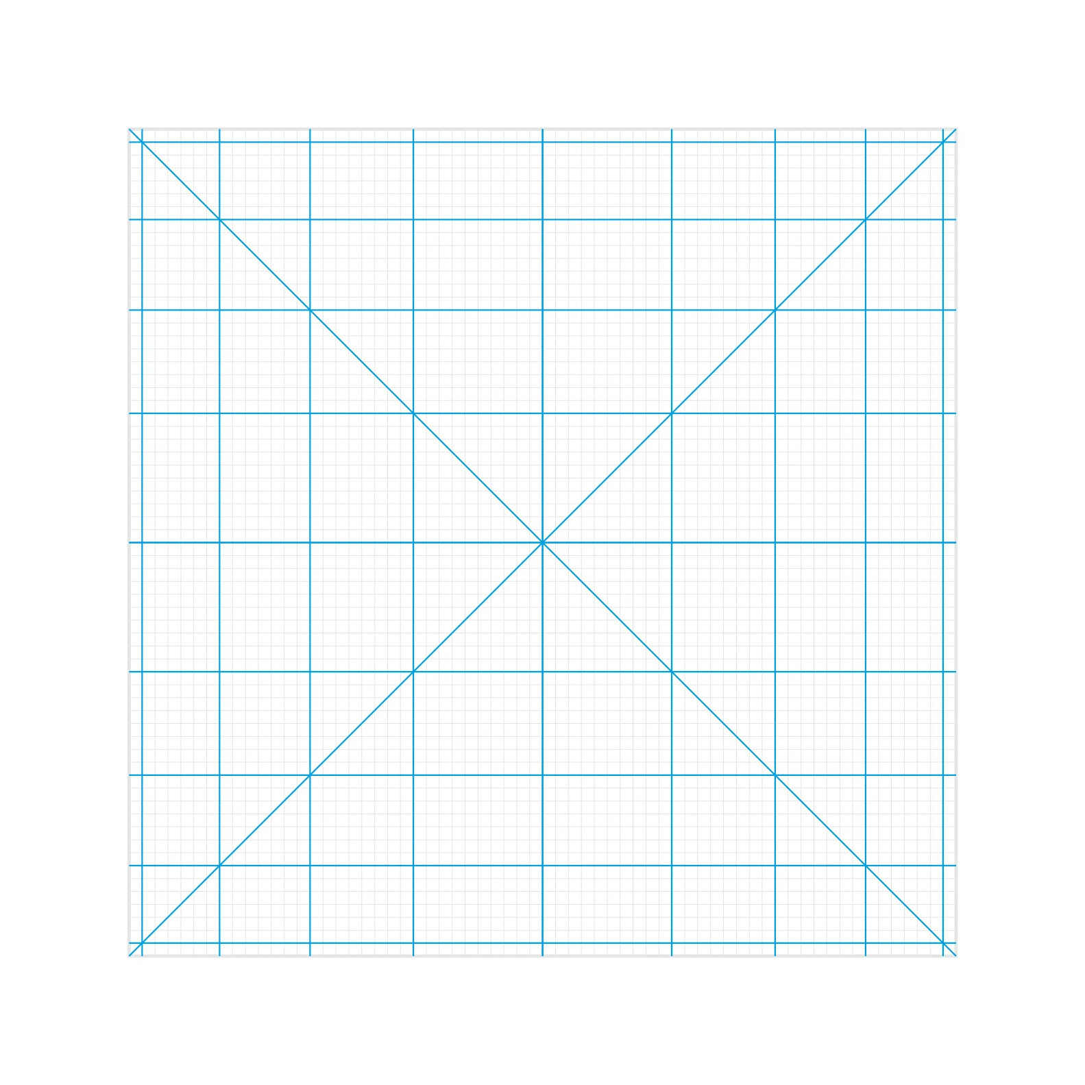
Diagonal and orthogonal lines are used for orientation. Intermediate steps are possible.
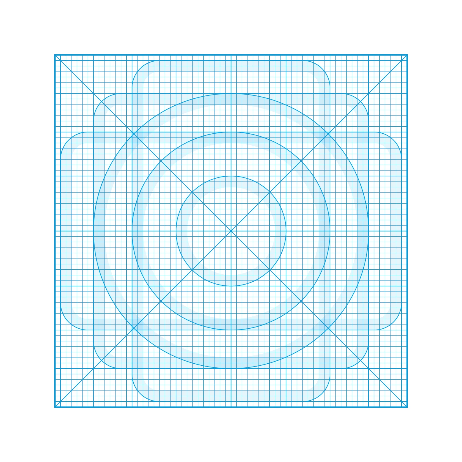
In summary, the grid sets limits and provides orientation while allowing creative leeway.
NOTICE
The basic grid measures 64 x 64 pixels with a line thickness of 2 pixels. It can be scaled proportionately – for example, to 128 x 128 pixels with a contour thickness of 4 pixels. If a different format is required for a specific application, please contact the central marketing department first. An icon grid template for creating new icons is available via > Downloads.
Basic shapes
In terms of content, Dürr icons can be reduced to just a few characteristic features. In design terms, they consist of simple geometric building blocks. This simplifies creating the icons and enables rapid interpretation by the viewer.


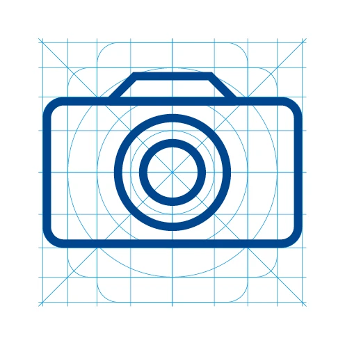


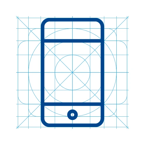


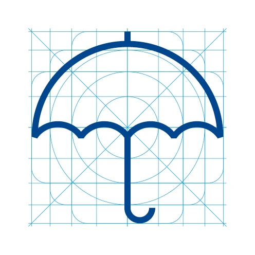
NOTICE
A uniform level of detail and an associated, uniform gray value ensure that the icons are mutually compatible. When creating the icons, make sure that they are centered and balanced.
Contour
The line is a central graphical element of the Dürr Corporate Design. As a frame, it forms part of the Dürr logo and can be found in the Re-Frame design element. This is why all icons are created using the line style at Dürr. The line represents technical precision while allowing creative freedom at the same time.
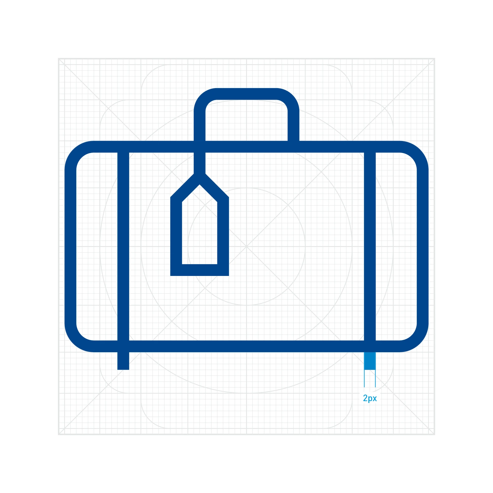
There is a precise ratio between grid and contour. With this basic 64 x 64 pixel grid, the fixed contour thickness is 2 pixels. Contours end sharply without rounding.
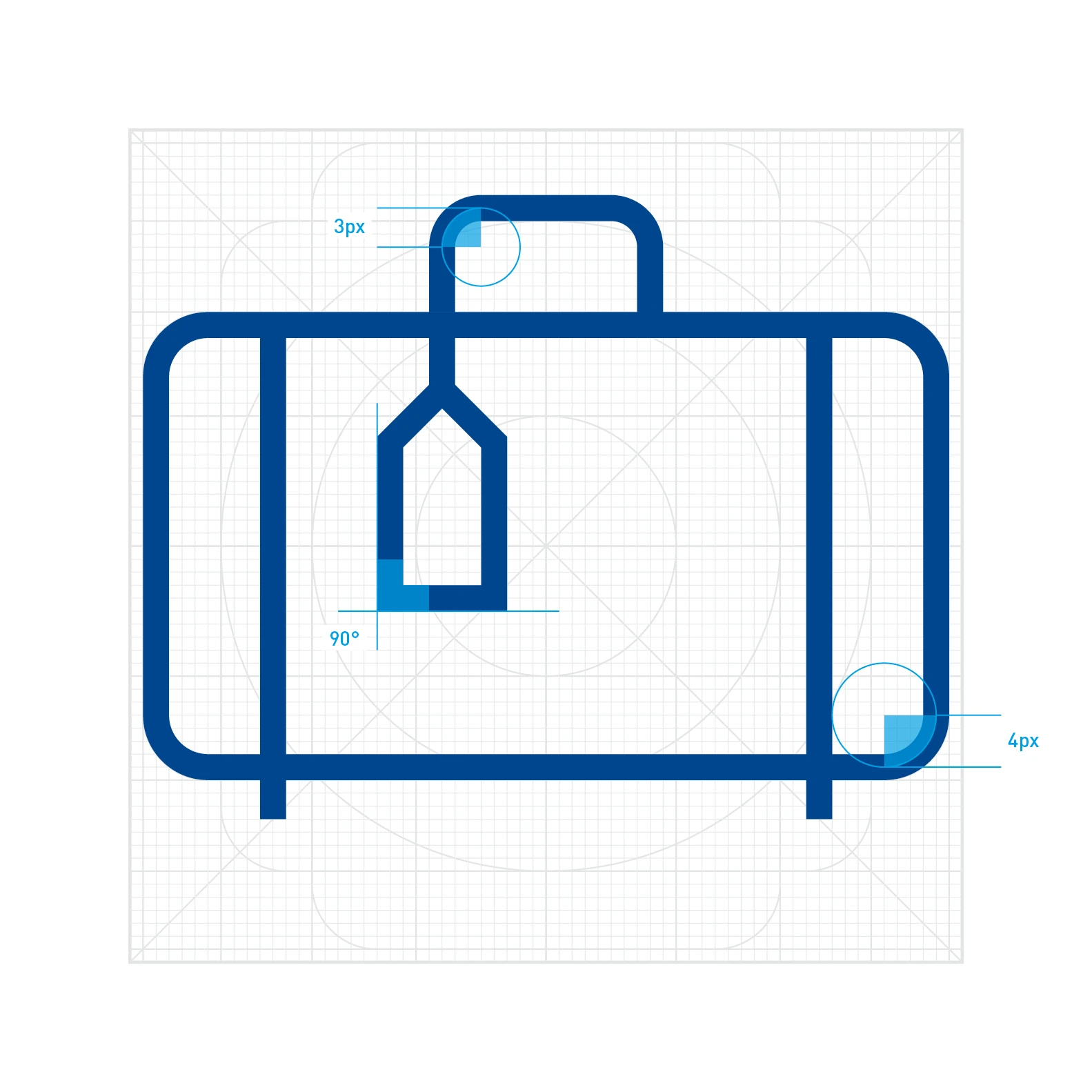
Radii of Dürr icons are generally measured at the middle contour. Right angles can be rounded with a radius of at least 2 pixels. Sharp right angles are also possible.
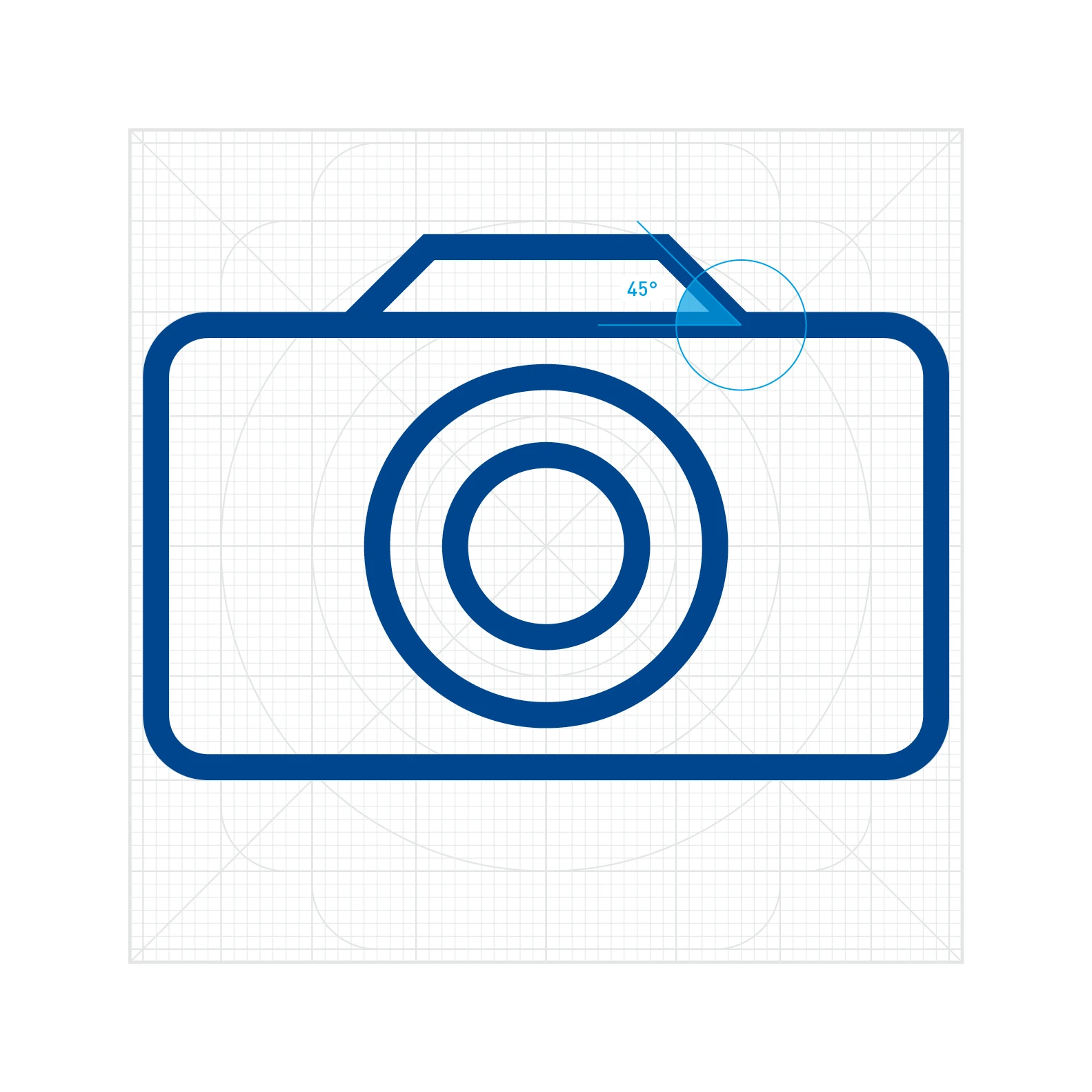
Whenever possible, slants must be angled at 45 degrees. Deviations are possible if necessary, however.
DOS AND DON'TS
The ratio between contour thickness and icon size may not be varied at will. Therefore, contour thicknesses of one or three pixels are not allowed for a 64 x 64 pixel grid.
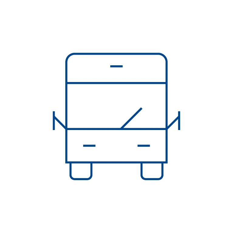
Don't.

Do.

Don't.
Color and background
As a rule, Dürr icons can be depicted in a single color from the Dürr color palette (> Colors). The standard color for the icons is Basic Blue on a white background. Highlighting colors may be used only sparingly and for a specific purpose. Negative color variants are less common, but possible.


DO'S AND DONT'S
Dürr icons are used exclusively in the outline style and in a single color. Multi-color icons, 3D effects such as shadows, flattened edges or reliefs are not allowed.

Do.
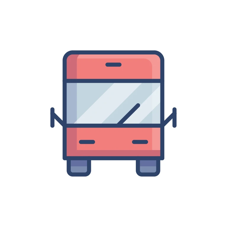
Don't.
Filled-in, solid icons are not allowed, but negative icons on a dark background are permissible. The exception are presentations.
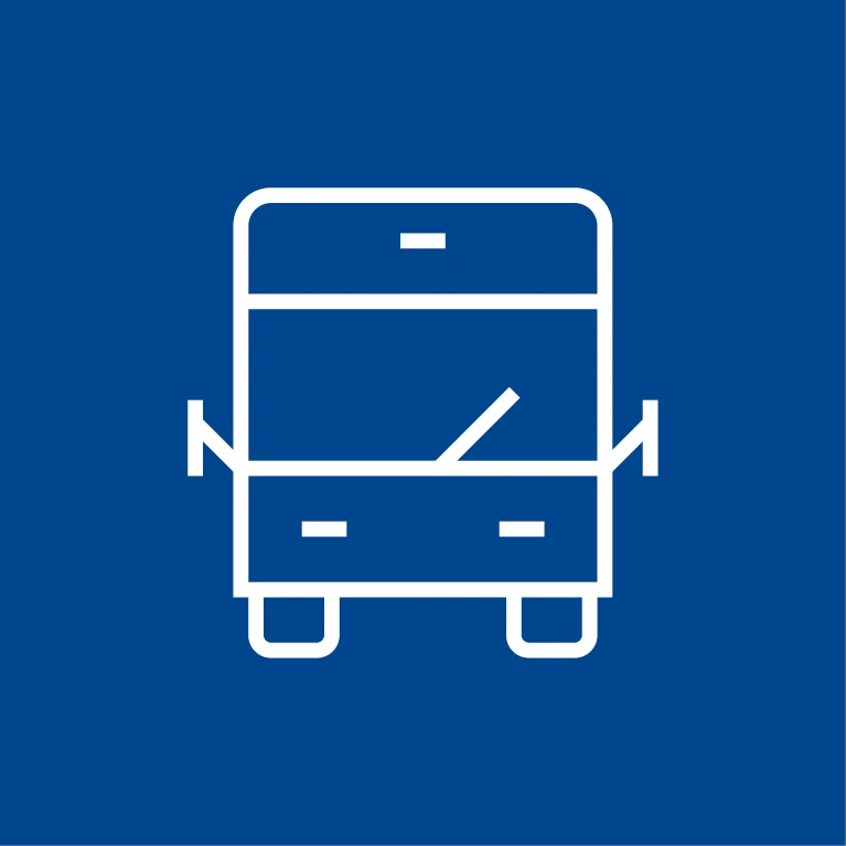
Do.

Don't.
Ensure there is sufficient contrast between the icon and the background.
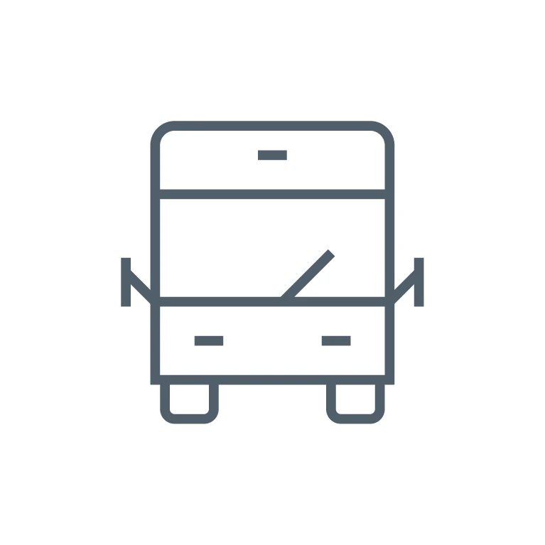
Do.
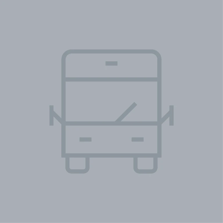
Don't.
Icon Package
Dürr uses the Orion Icon Library for basic icons. This library includes packages covering various topics such as transportation, e-commerce, hardware and software.
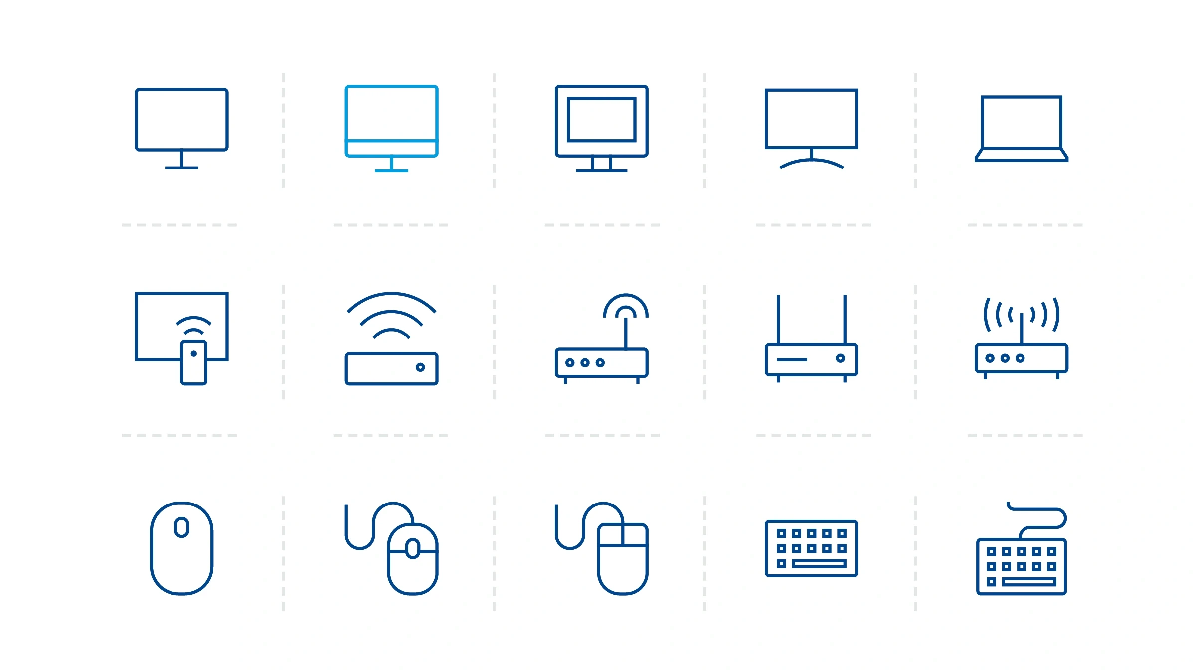
Sample icons from the hardware and software package.
