Infographics
An infographic is a basic element that provides more information than a picture and illustrates a subject better than text. This makes infographics ideal for explaining complex concepts in simple terms or making abstract ideas tangible. They are the best way of conveying expertise and represent the brand values “quality-oriented” and “smart.”
Overview of infographic types
Infographics are used to present facts, products and processes. We distinguish between the following types of infographic on the basis of their visual form:
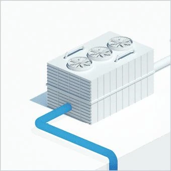
Pictorial infographics – Generally a simplified representation of objects, functions and processes
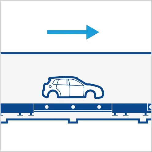
Illustrative infographics – An abstract representation ideal for scaling or animations
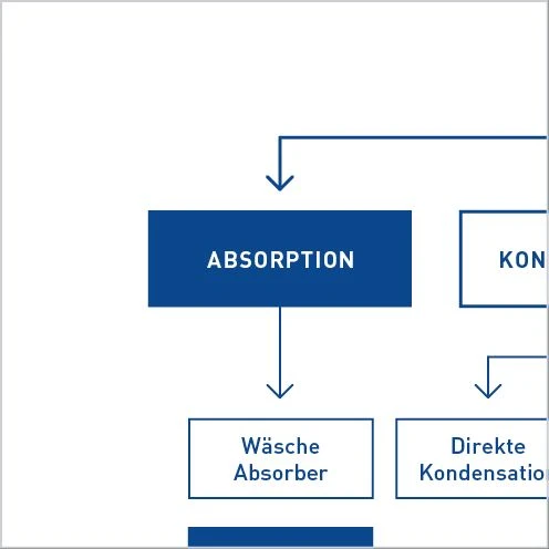
Schematics – Representation of workflows or responsibilities in an organization chart or flow diagram
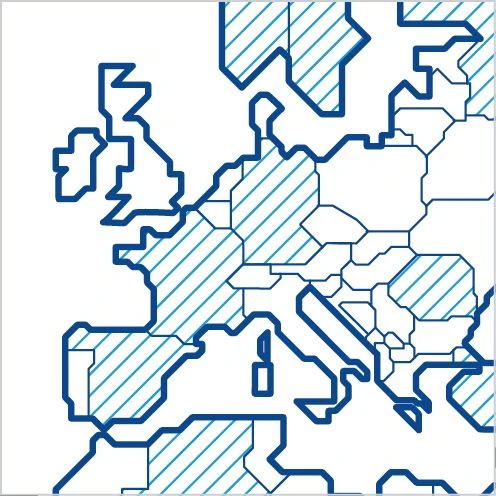
Maps – Representation of sites and service areas
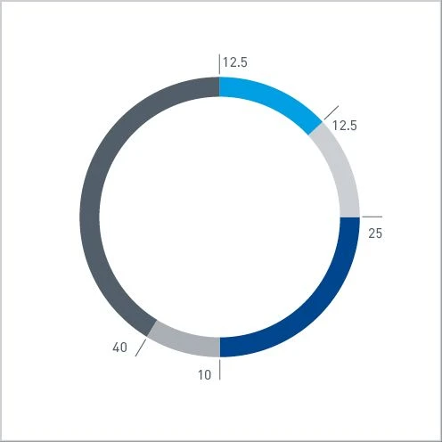
Number diagrams – Communication of numbers > Diagrams
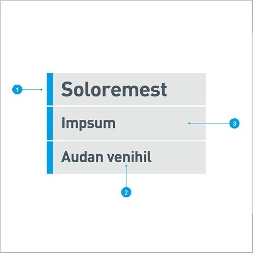
Animated infographics – Labeling in films > Animations
Infographic levels
Infographics consist of a combination of picture, graphic and text levels. A specific message can only be conveyed using a combination of the levels. Depending on the content, only two levels need to be used, but, as a general rule, all three levels are included.
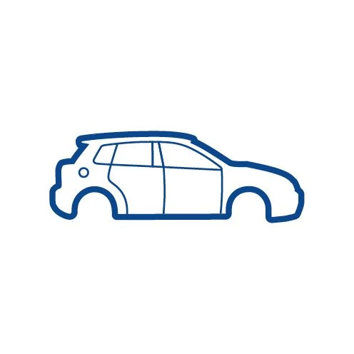
Picture level– To illustrate facts
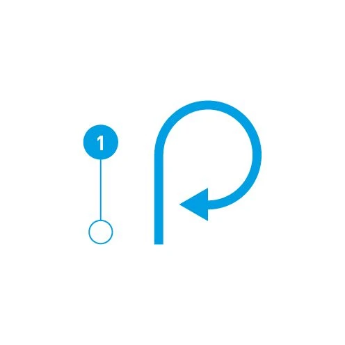
Graphic level – To highlight elements or represent processes
Text level- To add text to the message being conveyed
PICTURE LEVEL
The choice of a 3D rendering, a photograph or an illustration as the basis for an infographic depends on several factors, such as the required level of detail and the possible complexity and cost of the creation process.
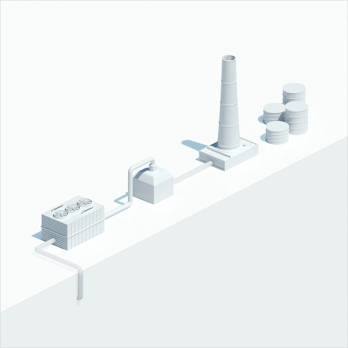
Rendering – A white model that reduces objects to their essential features is particularly suitable as the basis for a functional representation. Other rendering styles can also be used. Matt, white surfaces, few reflections and hard shadows to give the object volume are the ideal choice. Suitable for large representations. More complex and costly to create.
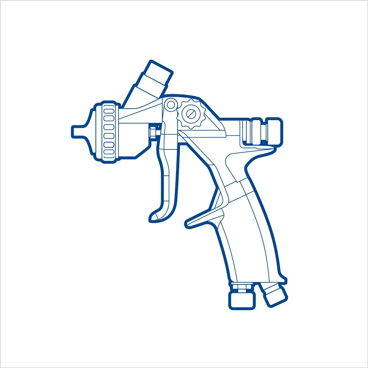
Illustrations – Must follow the illustration style guide (> Illustration). Contain only as many details as are needed to understand the subject. Alongside technical perspectives, isometric views and open perspectives, if these are justified by the content, are also possible. Suitable for smaller representations. Simpler to create.
GrAPHIC LEVEL
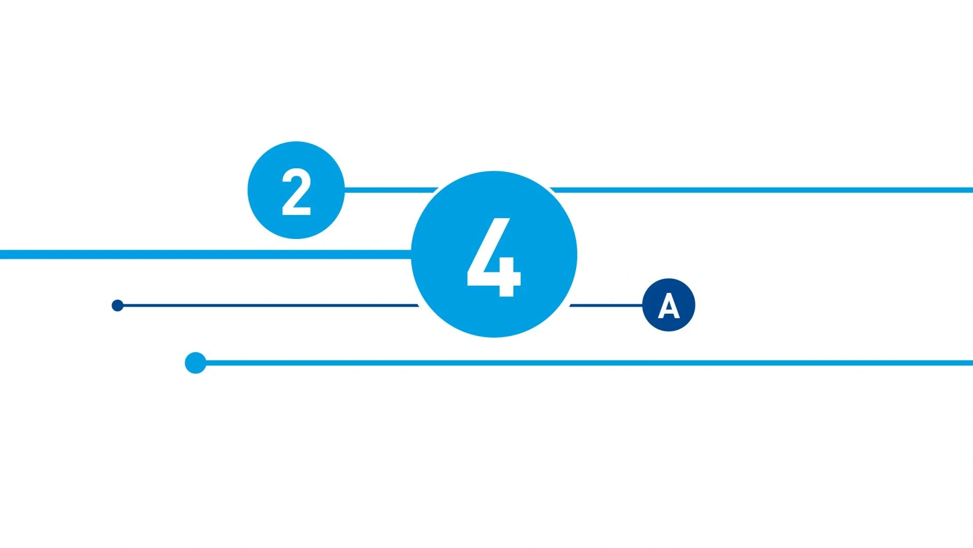
The heart of the infographic is the graphic level, which visualizes the invisible and identifies details, while also giving a concise description of them. It is an essential component of every infographic, even though some elements are not always used. Some examples:
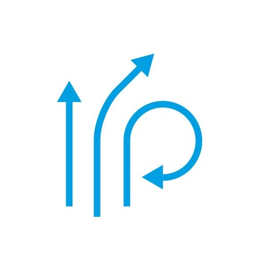
Activity arrows– Represent movements or flows. By contrast with dimension arrows, the head of activity arrows is filled and therefore more visible.
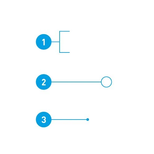
Callouts with filled circles – With sequential numbers
- Enclosing areas
- Highlighting details
- Describing objects
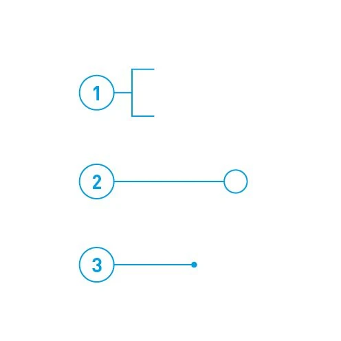
Callouts with outlined circles – With sequential numbers
- Enclosing areas
- Highlighting details
- Describing objects
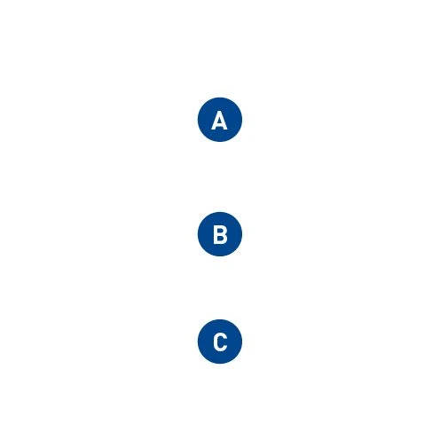
Callouts – Letters stand out from numbers. Circles in Basic Blue can also be distinguished from other elements in Digital Light Blue.
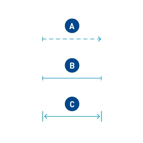
Dimensions – Examples of flexible distances (A), fixed widths (B) and widths with a measurement given (C).
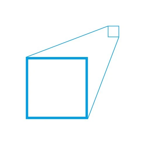
Zoom – Taken from the Re-Frame to enlarge elements of a picture or an illustration.
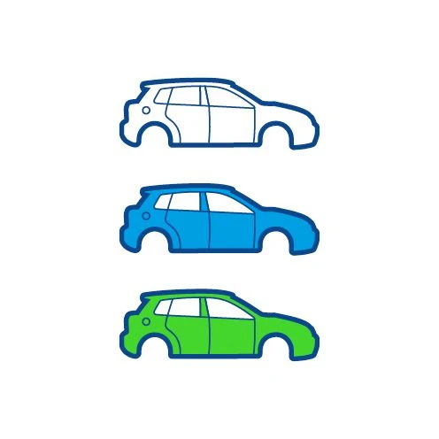
Highlighting – Simple emphasis using color. However, color can also have a meaning (water, cold) and, in this case, should be described in the legend.
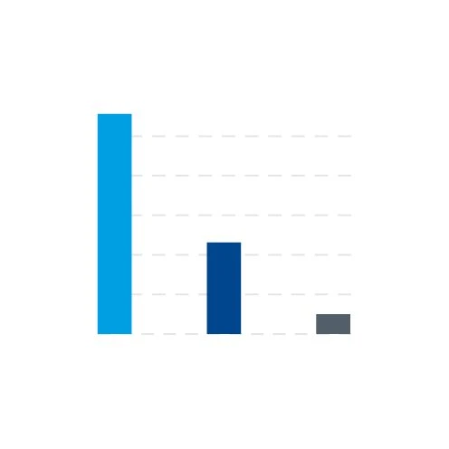
Colors – As a general rule, Digital Light Blue is used for the graphic level. However, Basic Blue and, in exceptional cases, Dark Gray are also options.
POSITIONING GRAPHIC ELEMENTS
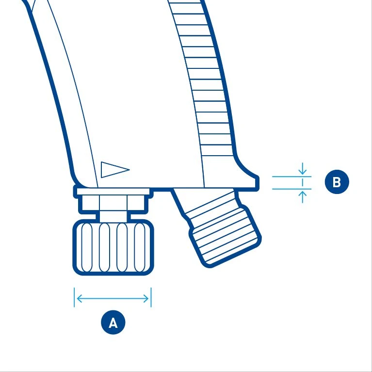
Dimensions – Positioned a short distance from the object. The arrow usually fits within the delimitation lines (A). For small dimensions, the arrows point from outside to inside (B).
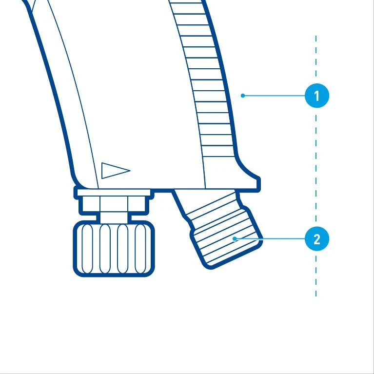
Callouts – The callouts are in chronological order within an illustration and should ideally be aligned with each other.
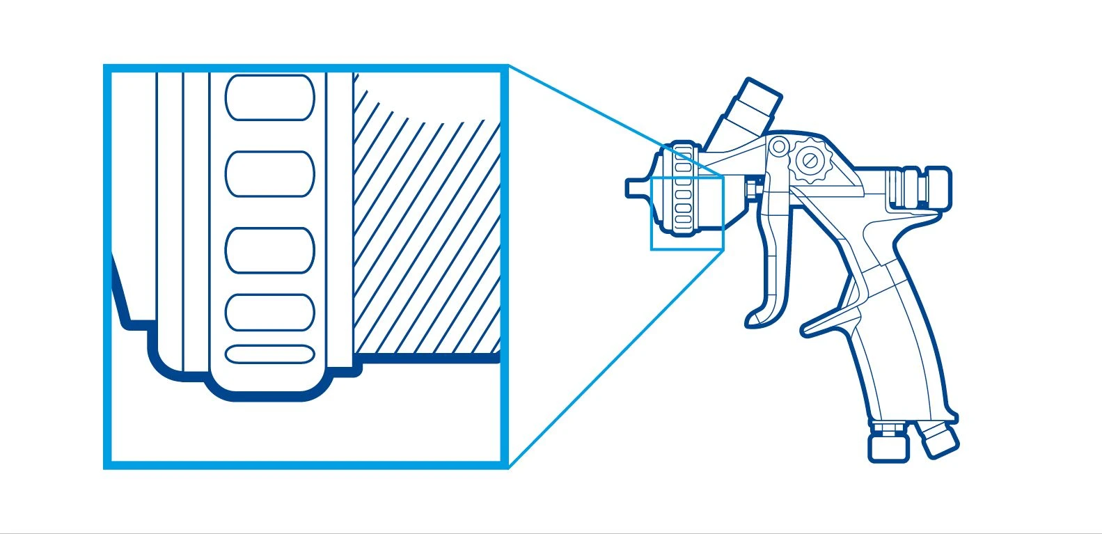
Zooms – Within an illustration, zooms are shown with Re-Frames in Digital Light Blue. The shape is square or rectangular with an increasing line thickness.
TEXT LEVEL
The choice of label type depends on the medium, the callouts and, not least, the position and scope. The text in the examples is very short, but it is also possible to have short paragraphs consisting of a headline and subheadline.
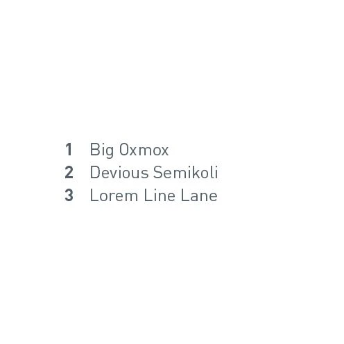
Caption – Separate from the picture and can be positioned anywhere in the medium. Particularly suited to the web. Consists of a sequential number or a digit.
Legend – For areas with different materials or functions. Consists of a cutout of the hatching or color and a short line of text.
Direct labeling – If there is enough space in the layout. Normally consists of a short line of text and underneath a line to the corresponding element.
CAUTION WHEN USING LABELING
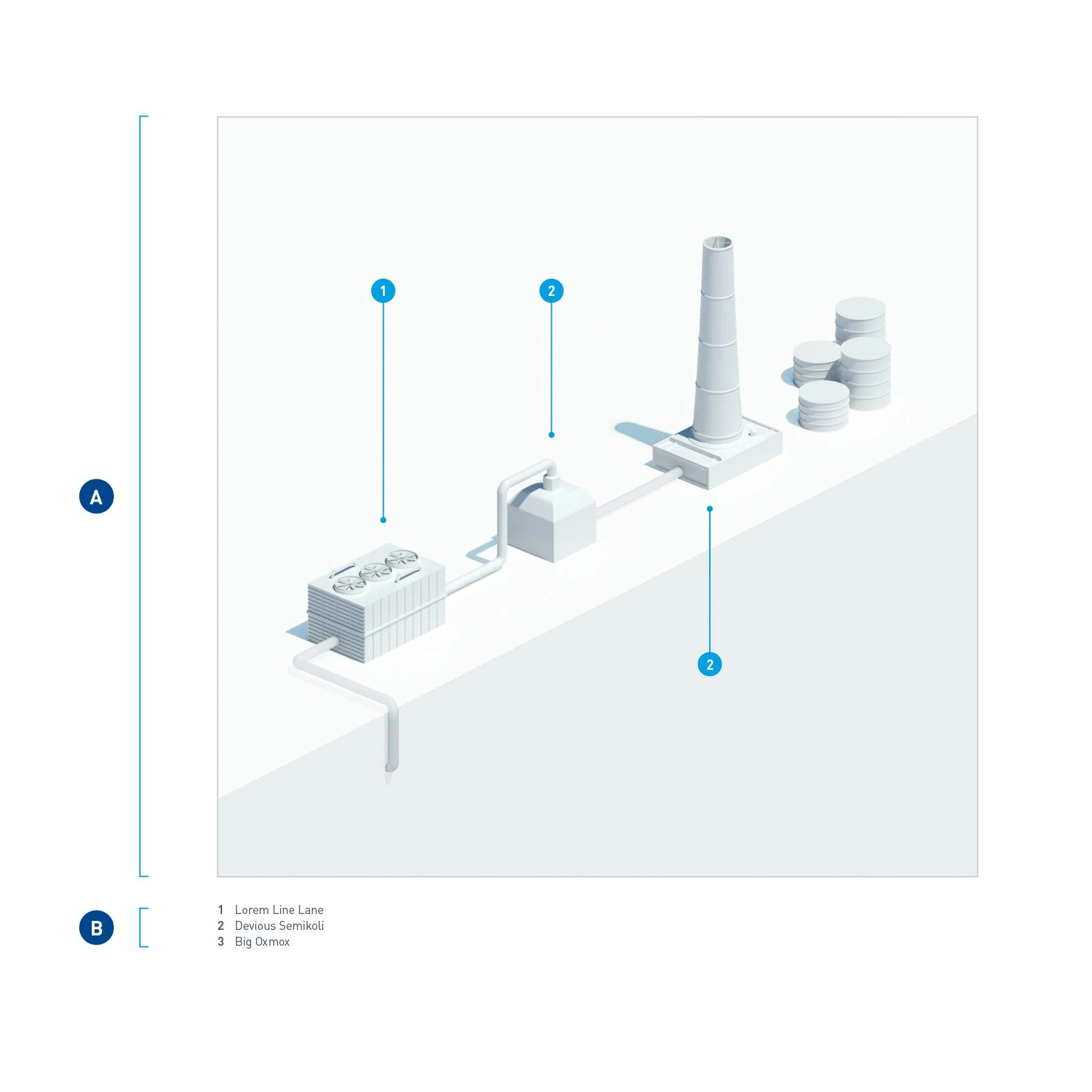
The labeling should never be scanned together with the picture. This applies in particular to digital applications. Otherwise, the labeling cannot respond to different display sizes, which has an impact on its legibility. Scanning the text also means that it is not possible to search for it and it is not accessible for people with disabilities. On websites, we recommend using callouts in the picture with dots and numbers (A) and separate descriptive text in the caption (B).
Pictorial infographics
These are examples of different descriptions that depend on the information to be conveyed and the space available. We have deliberately not used elements such as headings and descriptions here. However, both of these are theoretically possible depending on the communication channel. The starting point consists of rendering a white model.
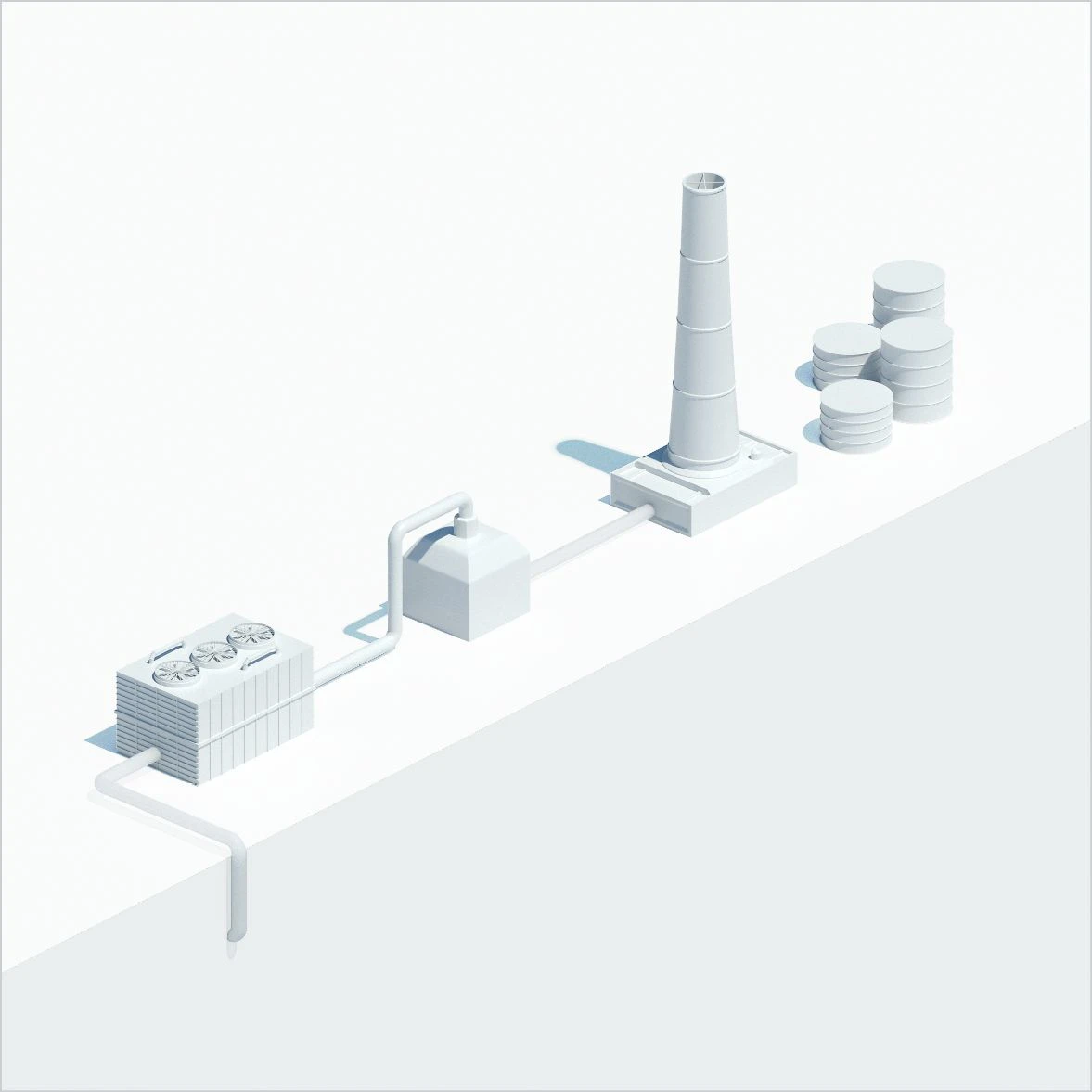
A white model of a process plant with components in chronologically correct order. By creating abstract surroundings, the components can be positioned anywhere and can also be of different sizes in relation to one another to create a greater impact. If possible, an isometric view should be chosen, because the contents created in this way are modular and can be linked with other graphics and used elsewhere.
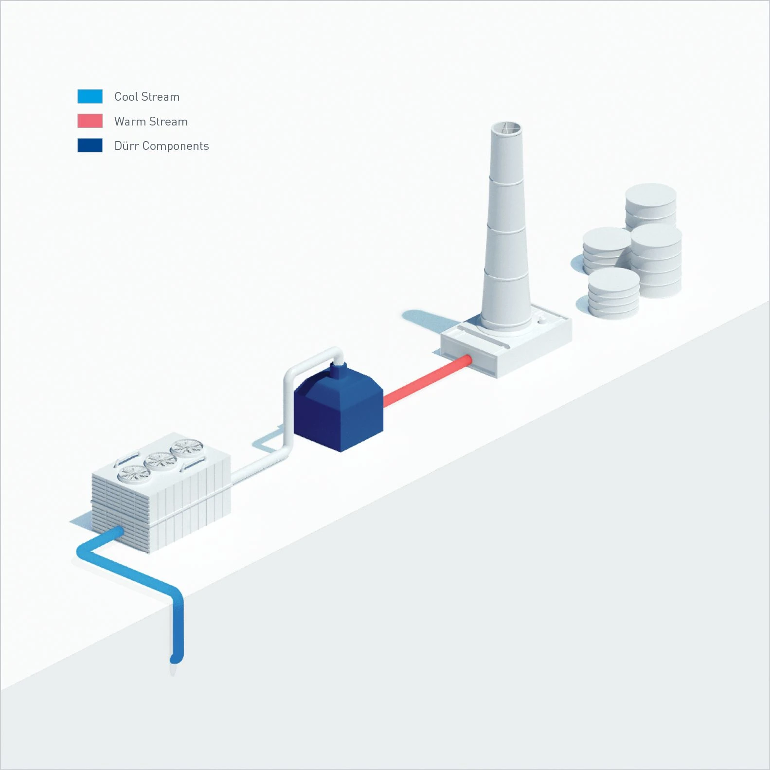
Coloring objects to differentiate them from other areas. The explanation of the colors should take the form of a legend in the caption.
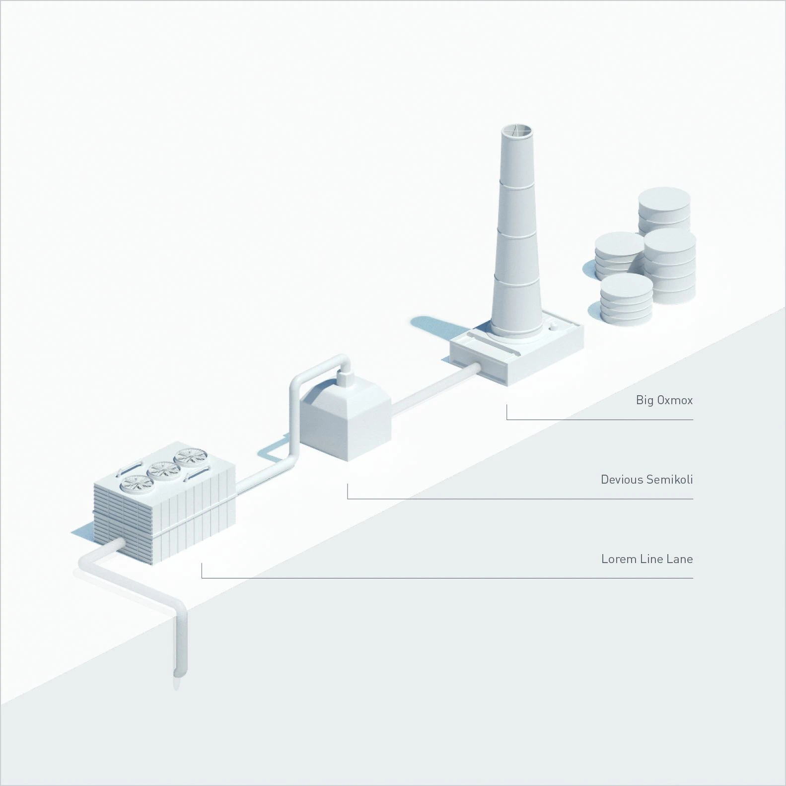
Direct labeling is generally used when there is a large amount of space around the object. This type of callout requires a relatively large area. It is ideal for giving a structure to empty space.
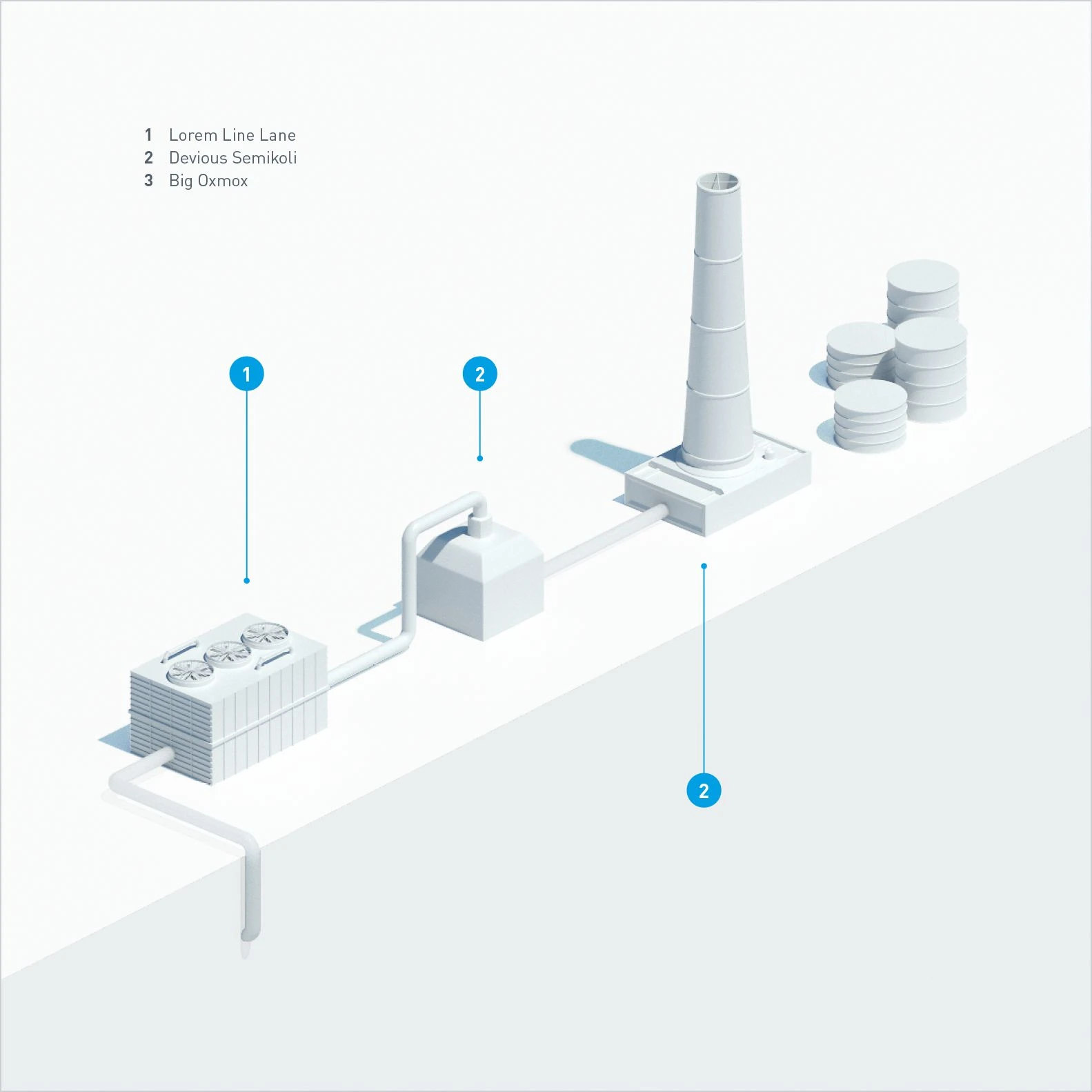
Callouts with numbers for the objects. The descriptive text is positioned in an empty space in the picture. A good design solution where there is a large number of callouts. A good content solution where you simply need to locate and identify objects.
Illustrative infographics
Examples of different descriptions depending on the information to be conveyed. We have deliberately not used elements such as headings and descriptions here. An animation would also be possible, depending on the communication channel. The starting point is the illustration of a process. In illustrative infographics, technical views (lateral view, plan view) or isometric perspectives are preferable.
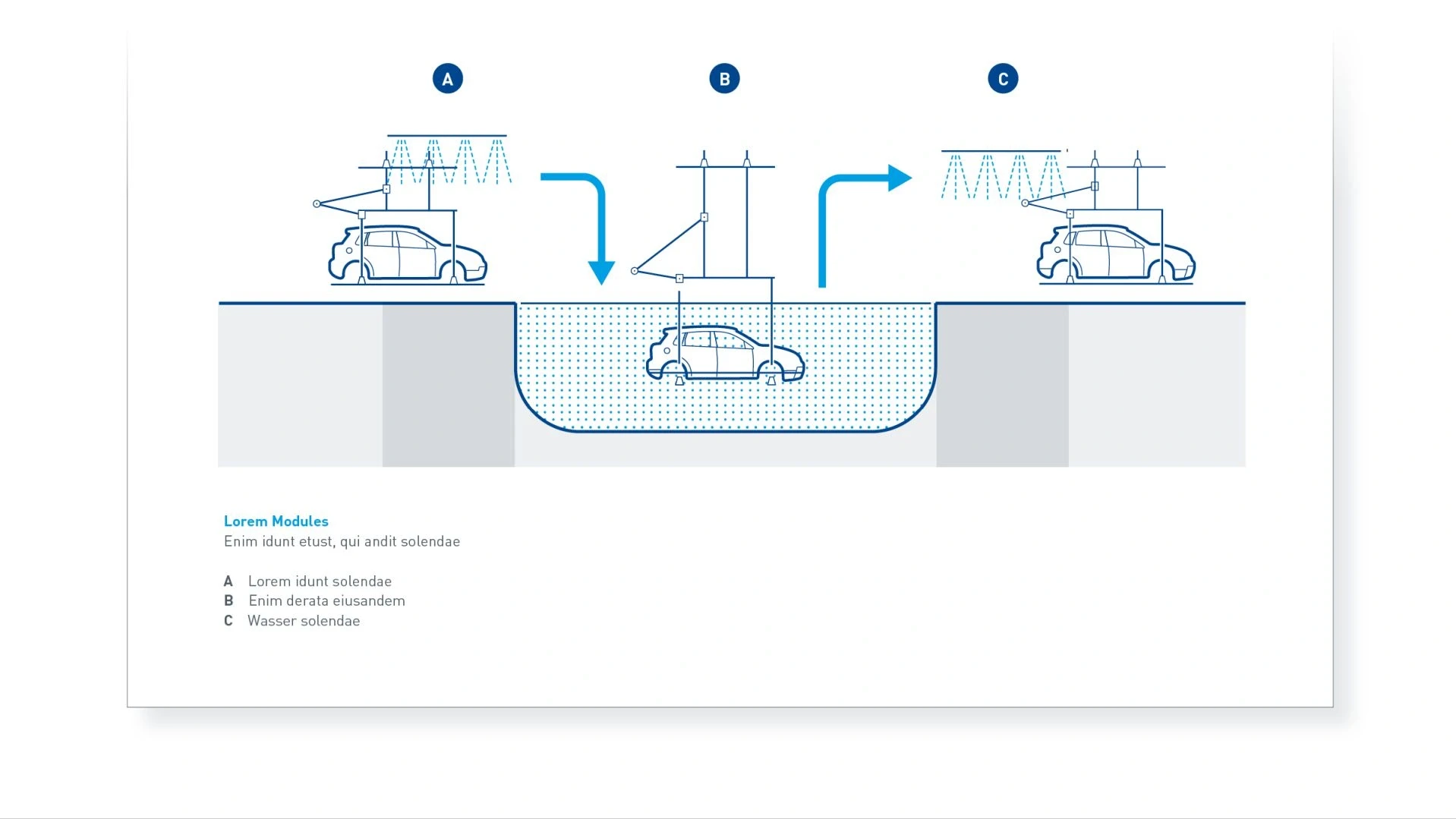
The circles in Basic Blue stand out clearly from the hatching and arrows in Digital Light Blue. The increased contrast allows them to be seen more quickly.
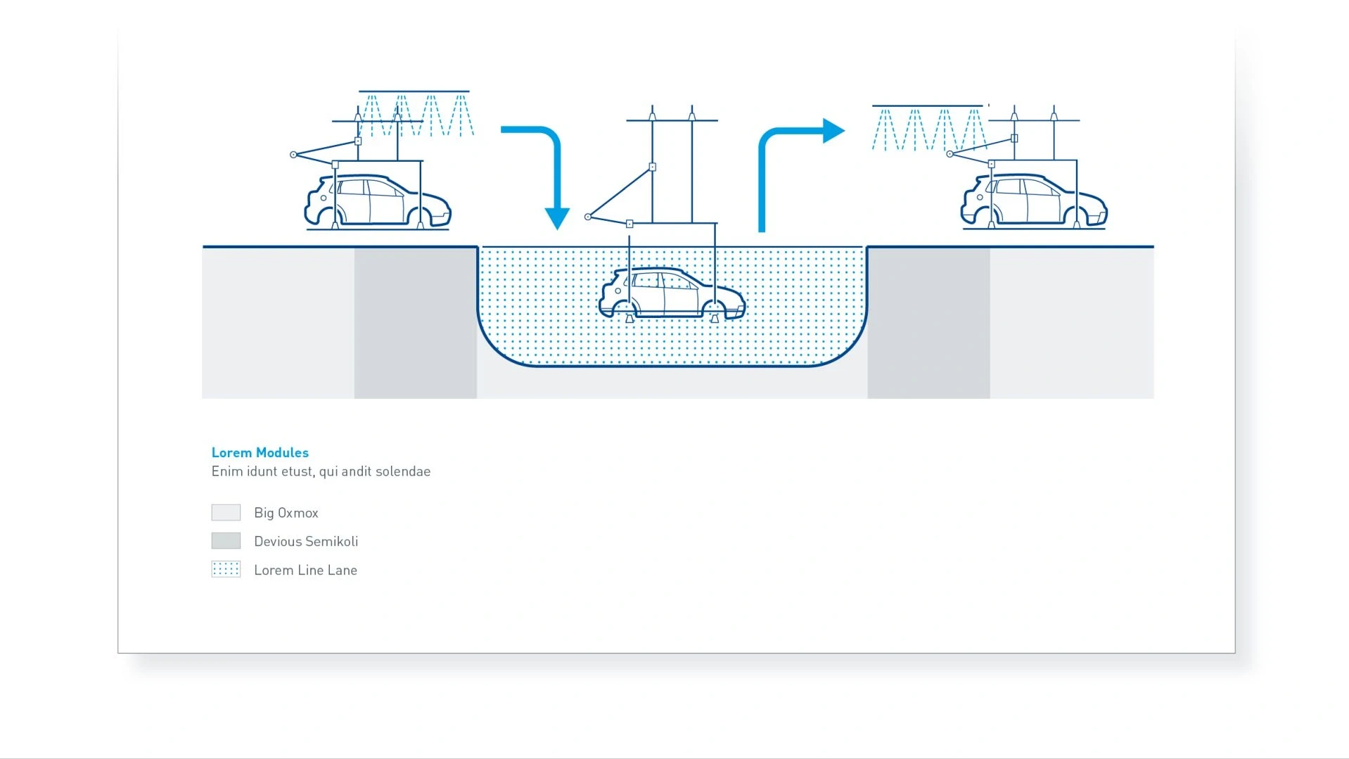
Hatching or colors are shown in the caption as rectangles (with optional borders)
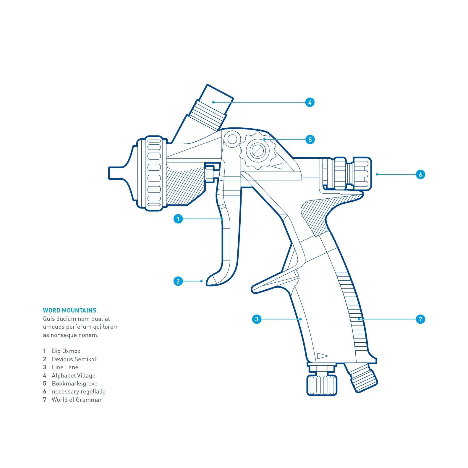
In the technical perspective, the callout lines should wherever possible be parallel to one another, either all horizontal or all vertical. The circles containing the numbers should have as few lines connected to them as possible. This example has filled circles which are recommended as visual highlights. The caption is a compact list.
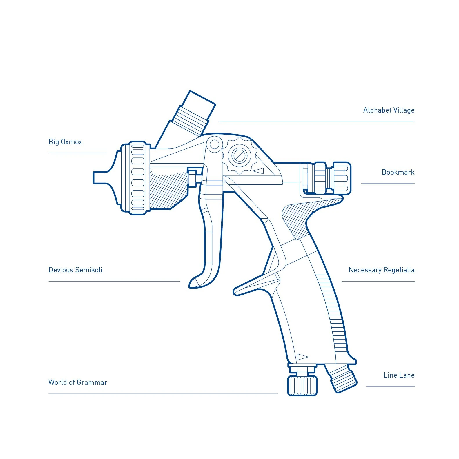
Where direct labeling is used, the callout lines should be uniform (horizontal) in this perspective. The lines should be aligned with the outside edge of the label text.
Schematics
Schematics show workflows or structures, for example in organization charts or flow diagrams.
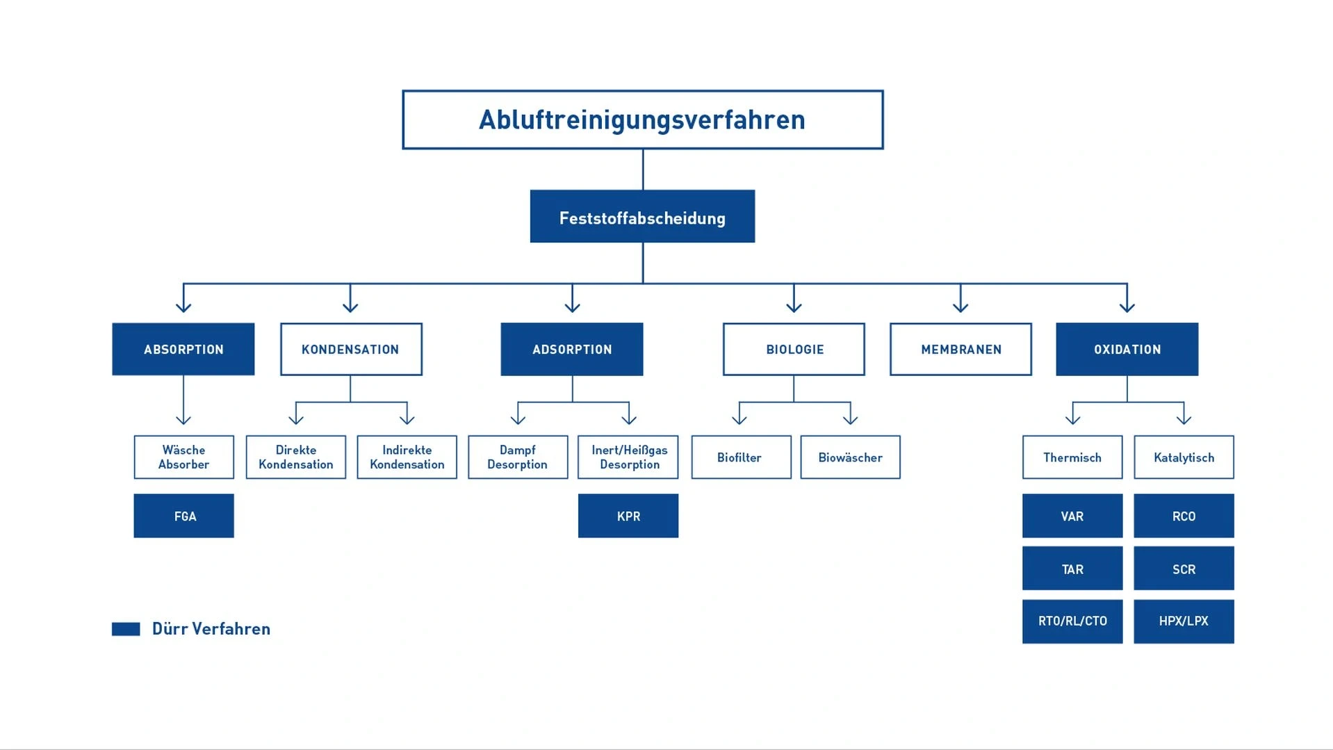
Example of a flowchart – It has a clear hierarchy from top to bottom. The levels in the hierarchy are indicated by the size of the boxes and fonts. Colored highlighting can also be used.
Maps
The Dürr map of the world is more schematic, technical and geometric than a geographical map. It reduces the information to the essentials, in this case marking and naming the countries where Dürr sites are located. In addition, the geometric style of the map makes it easily recognizable.
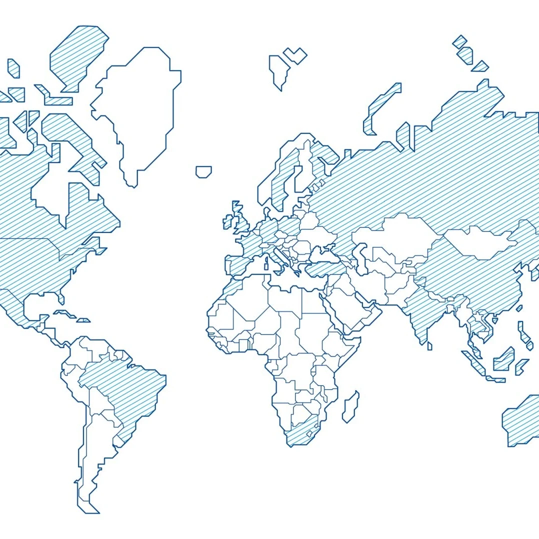
Schematic maps – More than just a means of locating Dürr sites. They can be used to convey information with an additional level of detail. The graphical design is still simplified.
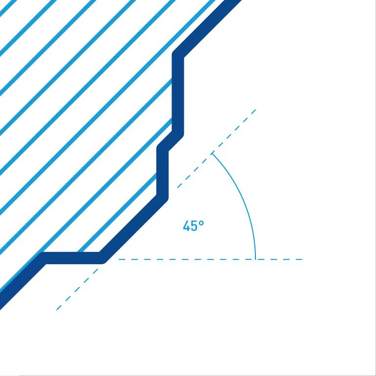
Angles – Outlines and hatching have 45-degree angles and are always parallel with one another. The hatching is in Digital Light Blue, while the country borders are in Basic Blue.
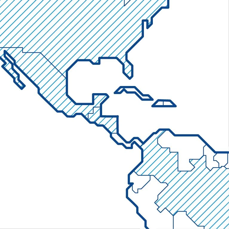
Outlines – The continents have thick outlines, while the country borders are thinner. Individual countries can be highlighted using hatching.
